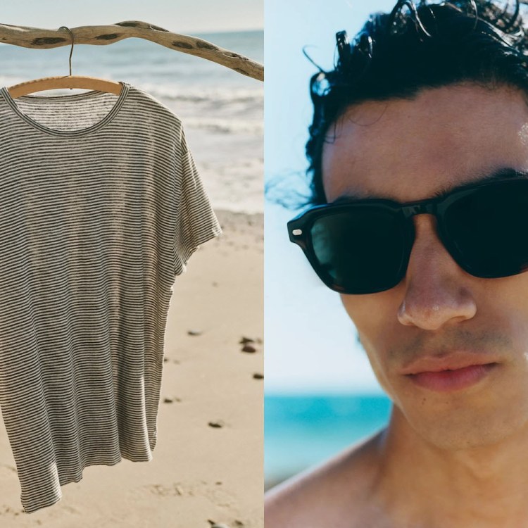
Now that it’s officially spring, I’ve started doing an inventory of my wardrobe. While I’ve never been one to shy away from color, I do tend to notice that mine has something of a hangover from winter, with blacks, greys and blues dominating the walk-in. Sure, neutrals are easy to style, but where’s the excitement? The pop? The fun?
If you’re like me, you’re probably going through a similar springtime identity crisis. I’ve tried to avoid looking like the Easter Bunny, so pastels are out this time of year. But where does that leave me this season? I spoke with a few menswear veterans and industry professionals to get the pulse on which colors are trending this spring. And the consensus? You don’t have to reinvent your wardrobe to make an impression, but you should probably try a little harder than adding a fourth white OCBD into your rotation.
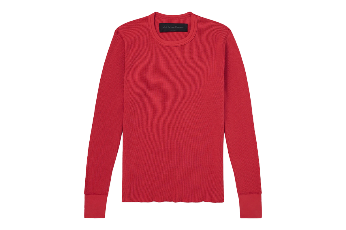
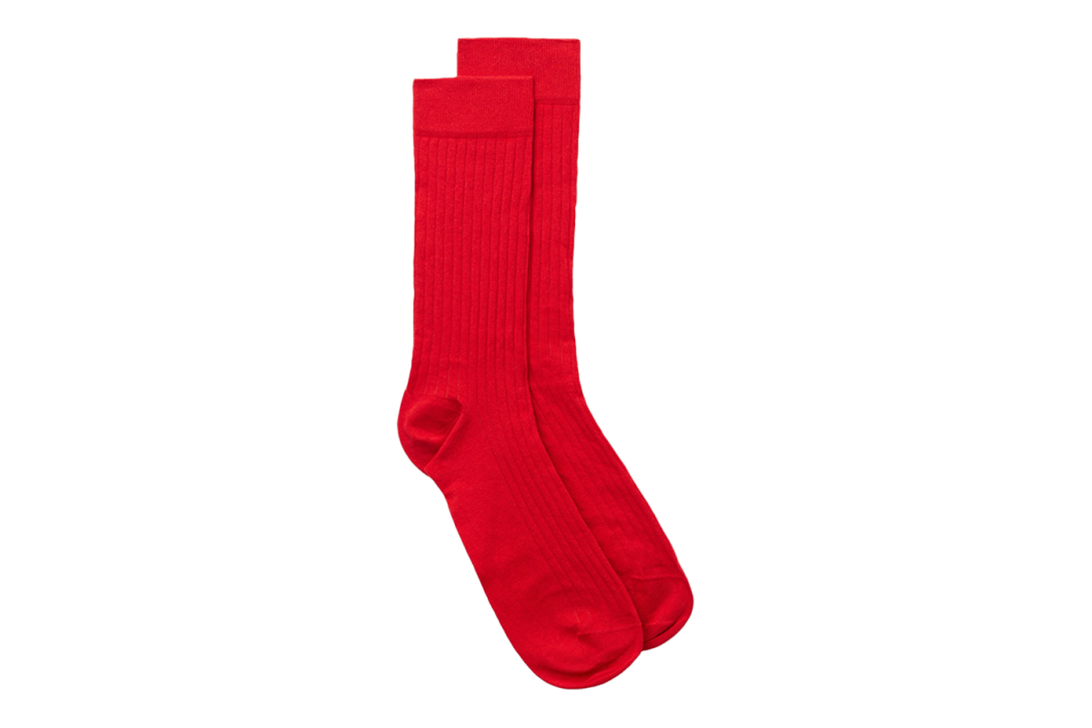
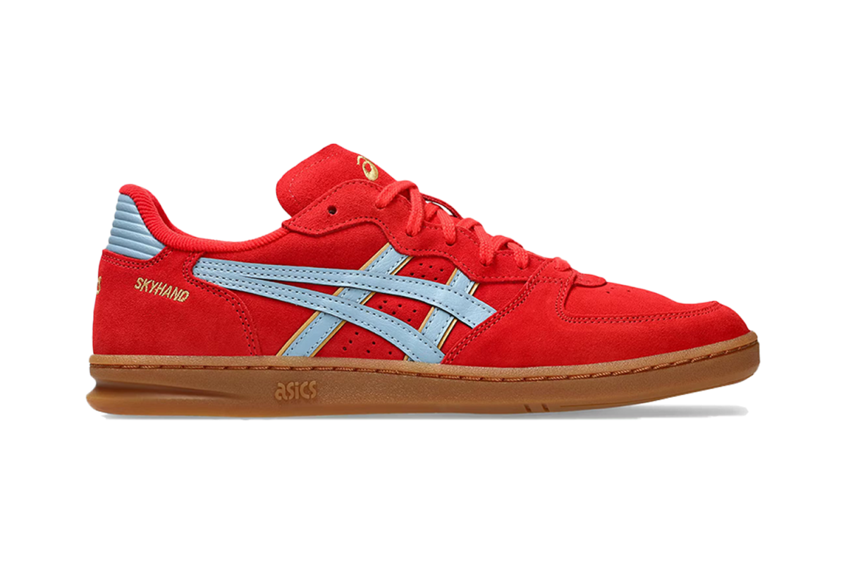
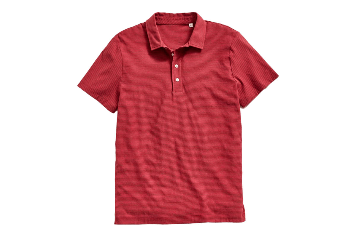
Keep the Crimson Continuity
For Jordan Page of Colour Plus Companie, it’s go big or go home, with a bit of designer education to back it up. Page notes that “almost intense shades of red” are trending this season, pointing to Celine, Chanel and Ralph Lauren as runway references. For Page, the shade’s impact and popularity are as much about the people wearing it as it is the visual. “I think the color reflects the dominance, passion and visuality people are wanting from their clothing,” he says. It’s a color that inherently leans into individuality, rather than fading into the background in a sea of black puffer jackets or navy blazers.
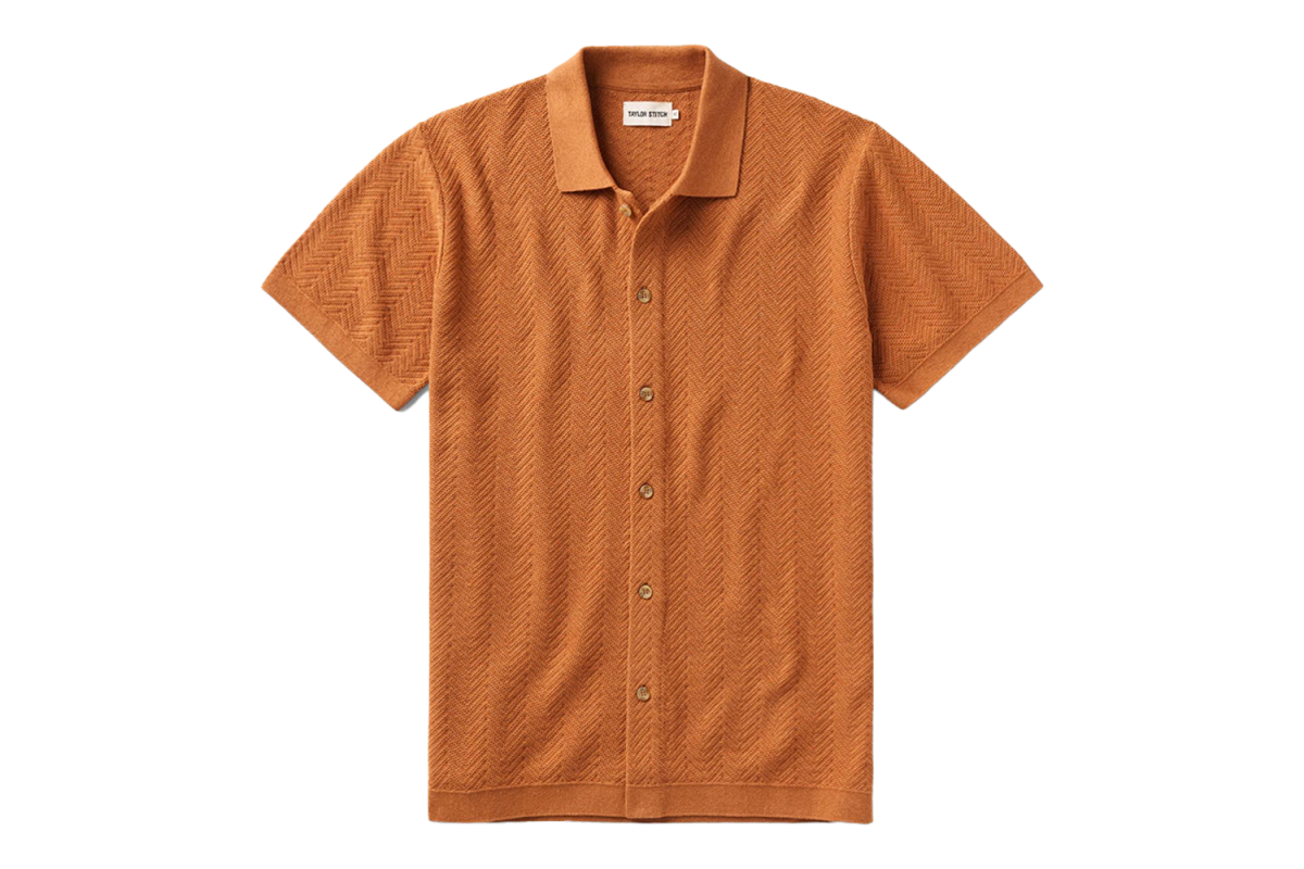
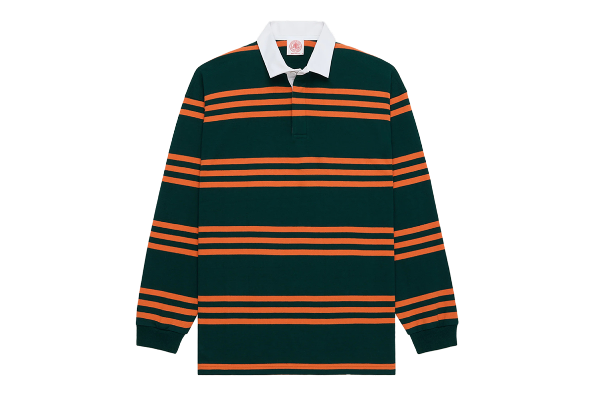
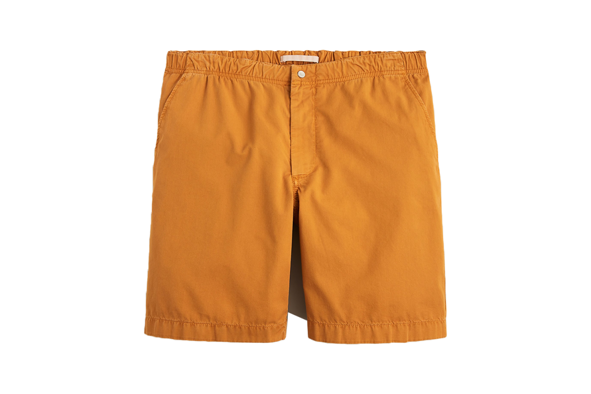
Test Out Tangerine
Keeping with the bold theme, Jack Carlson, president and creative director of J. Press, has his sights set on orange as the color of the season, having included it heavily in his own Spring/Summer 2026 runway collection this past February. “It’s bright and provides a great pop of color this time of year without looking like an Easter egg,” he says.
Carlson sees orange working equally well as a statement piece (a rugby, a sweater thrown casually over the shoulders like an Ivy Leaguer home for spring break) as it does in smaller doses, like a belt, a sock or a watch strap. From there, Carlson notes, the palette can extend to more adaptable, softer hues of gold and salmon as more neutralized accents against the intensity of orange this season.

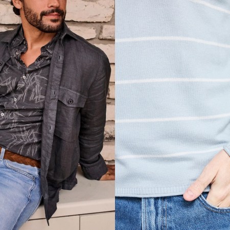
Opt for Saturated Pastels
Not ready for the big, bold reds and oranges? There’s a middle ground worth exploring. Freelance writer Max Berlinger says this spring is about colors that sit between a faded pastel and a full-throated primary, pointing to this past season’s Versace runway opening looks as his reference point, and one he suspects will leave its impression on menswear this season.
Will Cooper, founder of William White, is in the same camp. “I am excited about giving saturation to pastels,” he says, describing them as “bold tones of red, blue, yellow and green — not exactly primary and secondary, but washed versions of those brighter colors.” The goal, for Cooper, is a color that doesn’t clash with the neutrals most men already have in their wardrobe and adds more life into classic shades like navy, brown and tan that can get stale otherwise.
Nico Lazaro, menswear writer and stylist, makes the case for green — specifically mints and faded shades — as a neutral in its own right, giving a cleaner, fresher alternative to the khakis and tans already in rotation. Green, he argues, “has always been there, but rarely gets called out.” Well, this spring, that’s about to change.


Meet your guide
More Like This
This article appeared in an InsideHook newsletter. Sign up for free to get more on travel, wellness, style, drinking, and culture..