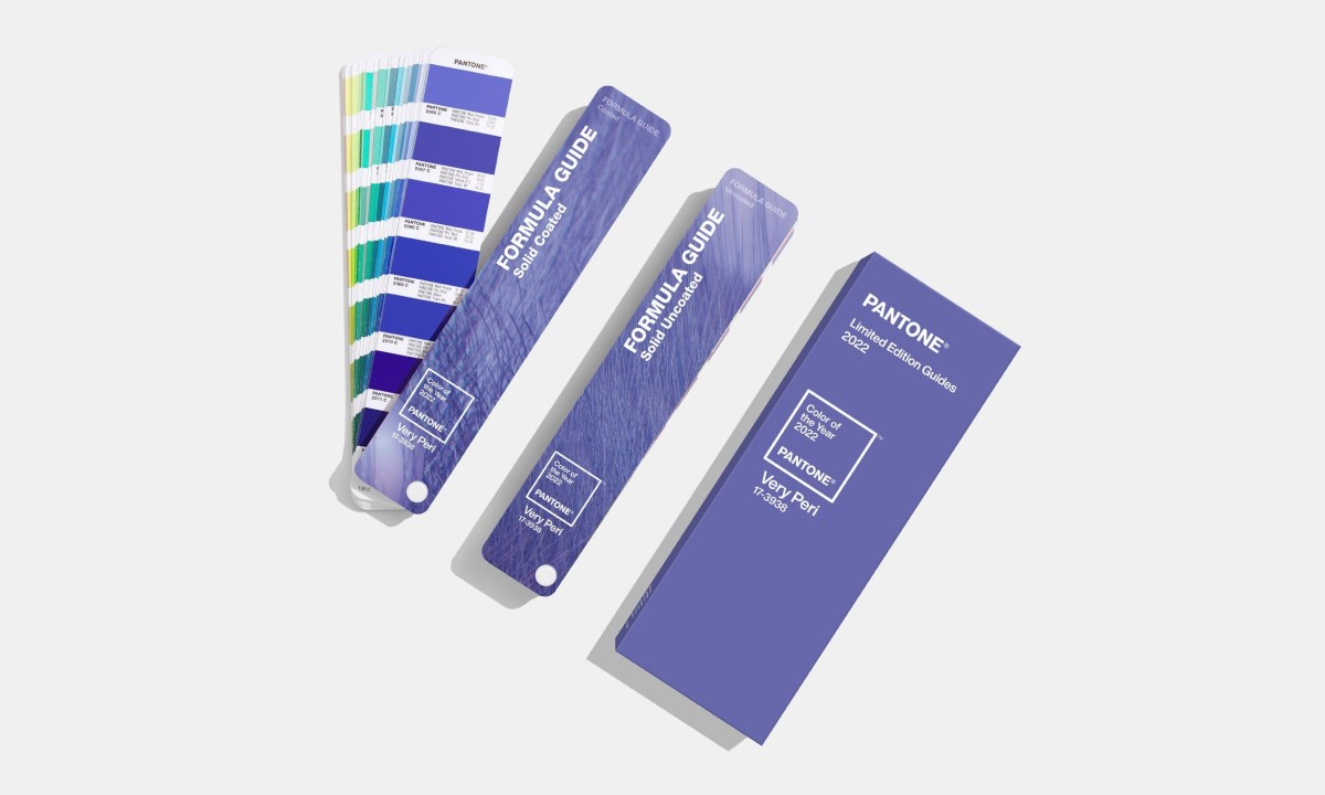
According to Pantone, next year might look a little more periwinkle than this one. The company, known for its color matching system, also has a penchant for matching colors and years. And thus, it’s determined that the hue that most embodies the coming year is Very Peri.
While the name might call up memories of a certain spice used in hot sauces and a wide array of cuisines, Very Peri has a mellower look to it — it’s steady and even without running headlong into pastel territory.
Leatrice Eiseman, the Executive Director of the Pantone Color Institute, offered some insights into the decision. “Encompassing the qualities of the blues, yet at the same time possessing a violet-red undertone, PANTONE 17-3938 Very Peri displays a spritely, joyous attitude and dynamic presence that encourages courageous creativity and imaginative expression,” Eiseman said in a statement.
A report at ARTnews offers even more information on why Very Peri was selected. The short version? It has to do with its increasing popularity in online spaces — as well as its association with creativity. Pantone’s press release about Very Peri cited both the metaverse and online gaming as having factored into its decision.
The selection of only one color hearkens back to the company’s traditional selection process. Pantone broke from that last year, naming two distinct colors as colors of the year for 2021. At this time next year, will we be looking back on the year that was and thinking, “That really was a periwinkle year, wasn’t it?” In 12 months, we’ll know for sure.
Meet your guide

More Like This


Thanks for reading InsideHook. Sign up for our daily newsletter and be in the know.