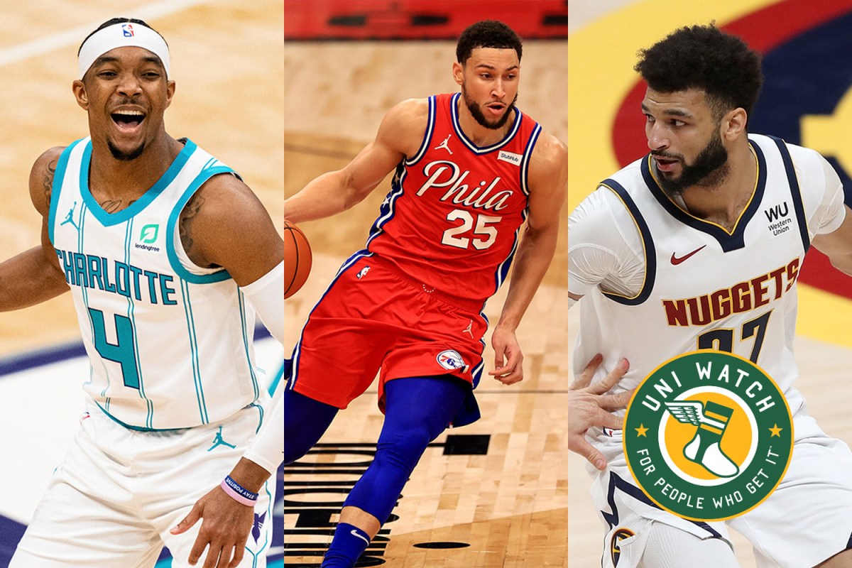
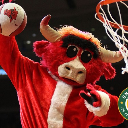
The NBA postseason — the real postseason, not the play-in round — is about to kick into high gear, which makes this a good time to roll out a set of Uni Watch NBA Power Rankings.
Just one problem: NBA uniforms are such a mess right now that ranking them is a particularly chaotic exercise. Here’s why:
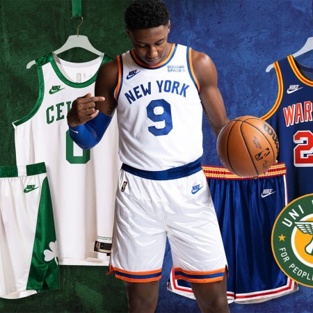
- Every NBA team has at least four uniforms. Some of them have five. And three clubs — the Lakers, Mavericks and Nets — have six.
- There are no more designated home or road uniforms. Since 2017, the rule has been that the home team can wear whatever it wants and the road team must wear something of sufficient contrast, with neither team required to wear white.
- Thanks to Nike’s penchant for pushing the boundaries of conventional uniform design (or, depending on your point of view, Nike scraping the bottom of the creative barrel after having long ago run out of viable ideas), most teams have at least one uniform that looks nothing like any of the others, often with completely different team colors, graphics, typography and so on.
- Most of these uniforms are programmed to rotate in and out of the teams’ wardrobes in one- and two-year cycles, meaning the teams’ on-court looks are constantly in flux. Just when you’re finally getting used to one of the incongruous new uniforms, it gets mothballed and replaced by something else.
Add all of that up and it’s not surprising to hear some fans (maybe including you) say that they often have no idea who’s playing when they turn on the TV. For many teams, there’s no design consistency, no visual through-line, no long-term uni stability — all of which makes it hard to rank or assess the uniforms.
Moreover, there’s no rhyme or reason regarding which uniforms get worn most or least. Some teams lean heavily on their primary white or colored uniforms (the so-called Association and Icon designs); others choose to emphasize the various alternate and throwback uniforms (the City, Statement, Earned and Classic designs). To put this in some perspective, consider this: The Bucks’ second-most-worn uniform of this season has been their Earned uni — a design that wasn’t even unveiled until March 10 and will be retired after the playoffs.
That gave your friendly columnist an idea: Instead of ranking the full uni sets, what if we looked at each team’s most frequently worn uniform for this season and ranked all of those? That way we’d be ranking the uniforms that the teams themselves have chosen to showcase above the others.
For most leagues, tabulating which team wore which uniform for which games would be a logistical nightmare. But it’s fairly simple for the NBA, because the season’s entire uniform schedule is publicly available on the league’s invaluable LockerVision website. With a bit of number crunching, the following facts and figures emerge:
- Since the vast majority of NBA teams have several colored uniforms but just one white uniform — the Association design — all of a team’s white-uni games are typically channeled into one design option, while the colored-uni games are divvied up among several designs. As a result, the most-worn uniform for 20 of the league’s 30 teams this season was the white Association design, even though every single team wore color more than white overall.
- The single most-worn uniform this season was the Knicks’ white Association uni, which the team wore for 35 of its 72 regular season games.
- The least-worn uniforms were the Earned designs for the Heat and Magic — just three games apiece.
- The annual release of the City designs always generates a lot of social media buzz. But despite all the hype, only one team — the Celtics — made their City design their most-worn uniform of the season. And for four teams — the Bucks, Bulls, Hawks and Raptors — the City design ended up being their least-worn uni. Makes you wonder what all the fuss is about.
Want to learn more? If you want to see how many times each uniform was worn during the regular season, here’s a breakdown by team and by uniform type. And since everyone loves data visualizations, we’ve also got a nice bar graph:

Okay, enough preliminaries — let’s proceed with our first-to-worst rundown of this season’s most-worn NBA uniforms. As is always the case with uniform rankings, this list will no doubt provoke lots of eye-rolling and disagreement (otherwise what’s the point, right?). So take a deep breath — ready, set, argue!

1. Golden State Warriors (Association Uniform, 20 games)
Round chest insignia don’t usually work on basketball uniforms. But in this, as in so many other things, Golden State is the great exception. The logo design, based on the team’s late-1960s “The City” jersey, continues the franchise’s long run of aesthetic excellence. Nothing else like it in the NBA. First rate!
Frequency of other uniforms: City, 15; Statement, 15; Classic, 12; Icon, 10

2. Utah Jazz (Association Uniform, 27 games)
Okay, so we all know the drill by now: “A team called the Jazz doesn’t make sense in Utah!” True enough. But once you get that out of your system (which you really should, as it’s now been more than 40 years since the team moved from New Orleans to Salt Lake City), the Jazz are a pretty good-looking team these days, never more so than when they wear their primary whites. It’s not clear how long they’ll stay with this logo, as they’ve been pushing the red rock-themed designs for their recent alternate uniforms and could easily end up making that their primary visual motif (it would be more Utah-y, right?), so enjoy the current look while you can. Bonus points for wearing an ad patch for a charitable cause instead of some cringe-inducing lifestyle brand.
Frequency of other uniforms: City, 16; Earned, 10; Icon, 10; Statement, 9
3. Los Angeles Lakers (Icon Uniform, 28 games)
It’s hard to go wrong with that classic Lakers uniform, am I right? It was good enough for Wilt, Kareem and Magic, and now it looks just as good on LeBron. The team’s on-court success may wax and wane, but it’ll always be Showtime as long as they wear this uni.
Frequency of other uniforms: Statement, 12; City, 11; Association, 10; Classic, 7; Earned, 4

4. Milwaukee Bucks (Association Uniform, 30 games)
The Bucks’ current set, introduced in 2015, looks as fresh now as when it was unveiled. The typography is simple but contemporary, the color scheme is excellent, and the side panels hearken back to the team’s old “Irish Rainbow” uniforms. Bonus points for being one of the four NBA teams that don’t currently have an advertiser’s patch. Update: Bonus points now rescinded!
Frequency of other uniforms: Earned, 12; Icon, 12; Statement, 11; City, 7
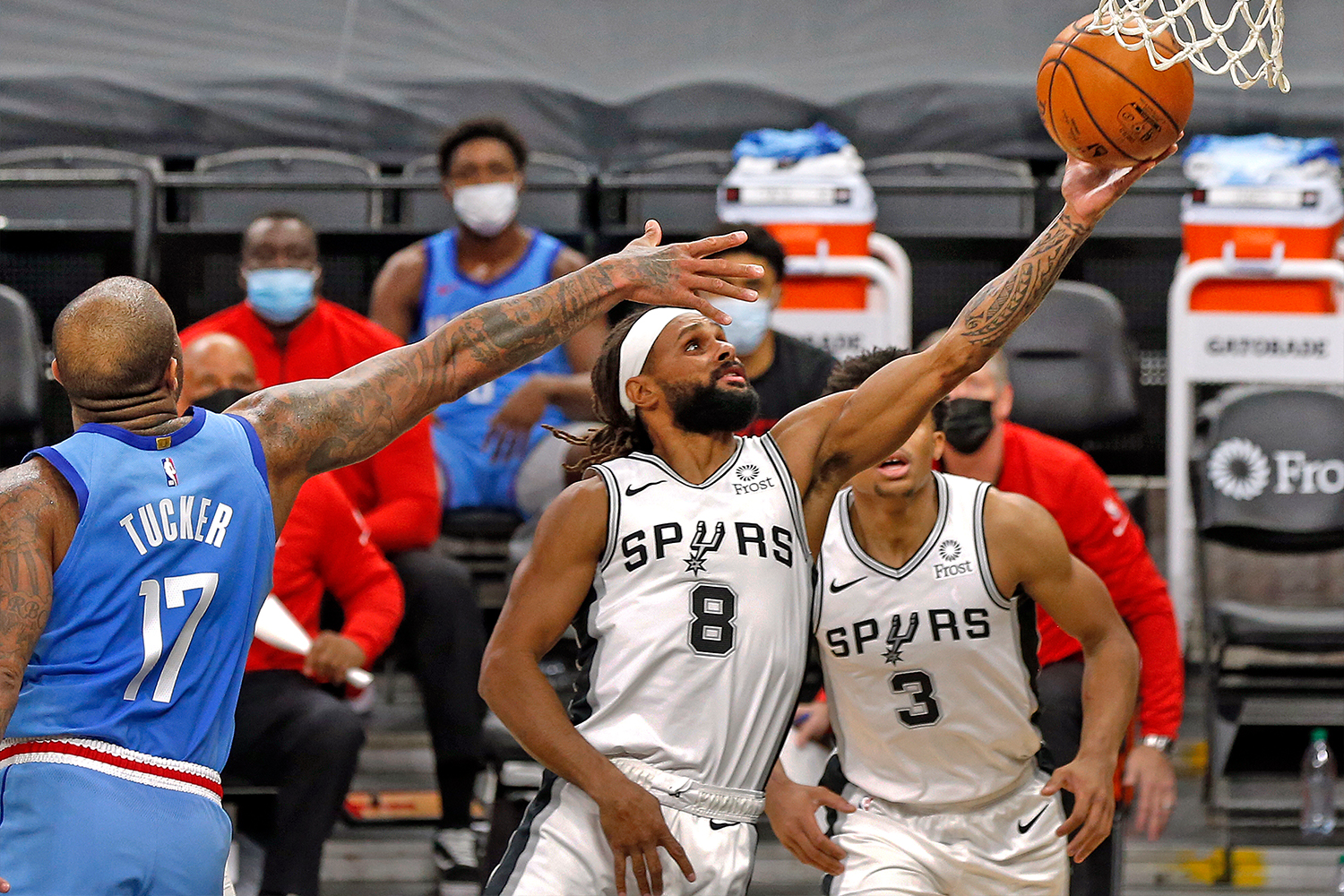
5. San Antonio Spurs (Association Uniform, 24 games)
Sometimes little things can pack a big visual wallop. Case in point: the spur standing in for the “U” in the Spurs’ chest lettering. So simple, so obvious, so perfect. Clever and classy in equal measure.
Frequency of other uniforms: City, 19; Icon, 17; Statement, 12
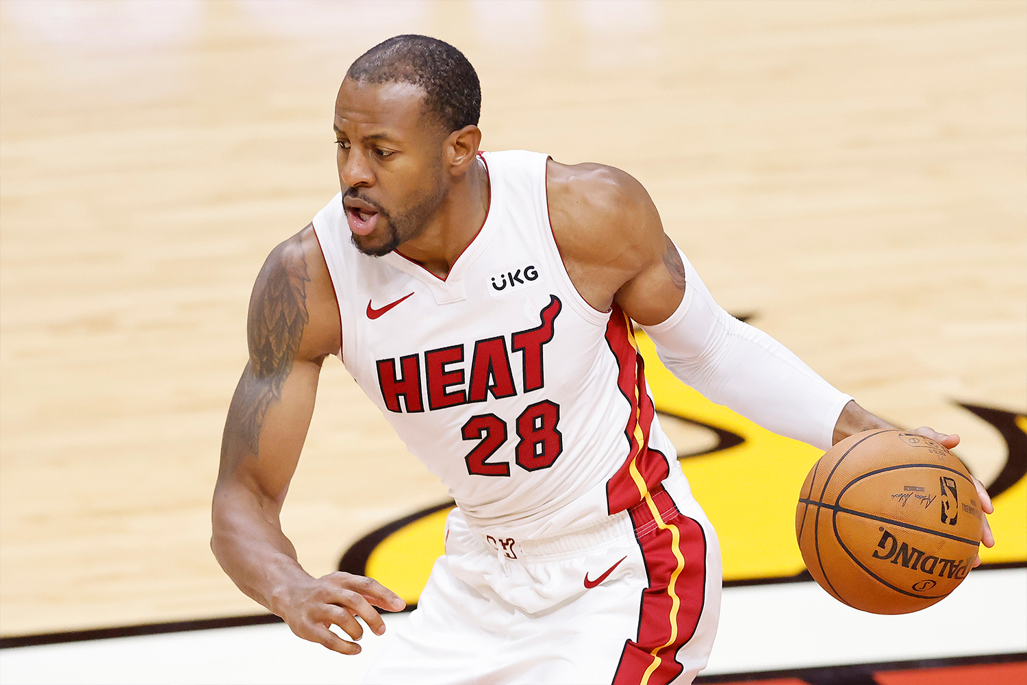
6. Miami Heat (Association Uniform, 22 games)
Speaking of little things that punch above their weight, that flame flaring off the end of the Heat’s chest wordmark probably seemed a bit oversimplistic or maybe even cheesy when the team debuted in 1988. More than three decades later, it now feels like a classic of contemporary sports design. Meanwhile, the red and yellow side piping on the team’s white uniform provides just enough, uh, heat to make this one of the league’s sharper designs.
Frequency of other uniforms: City, 19; Icon, 19; Statement, 9; Earned, 3
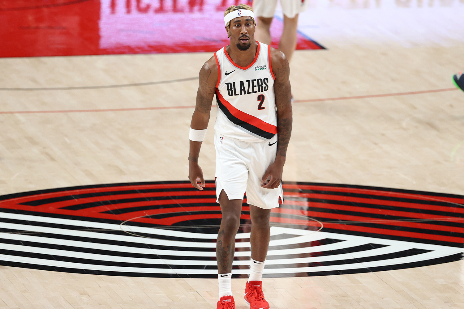
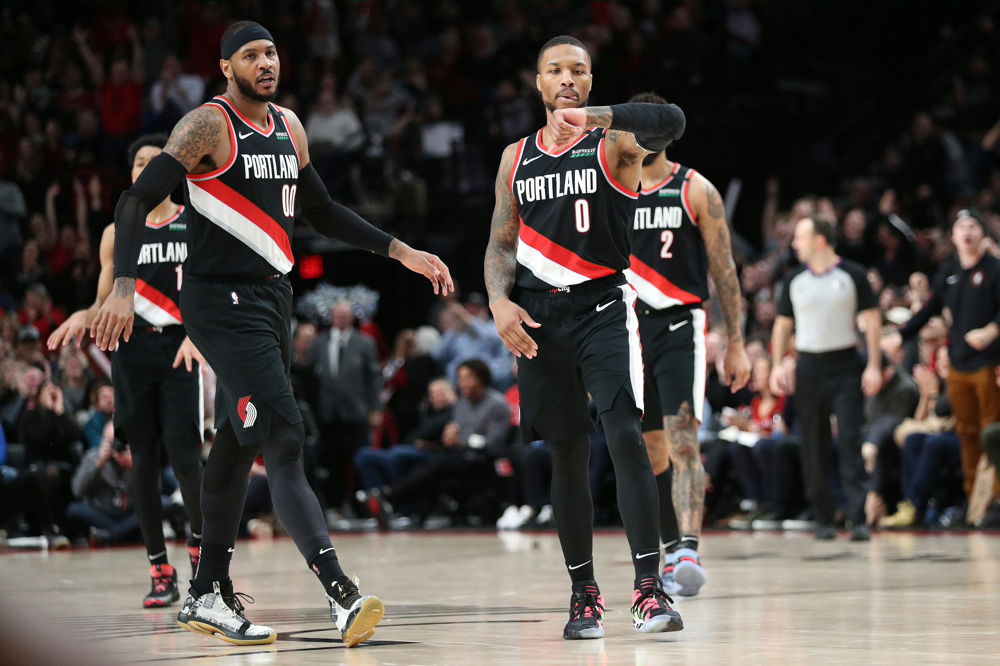
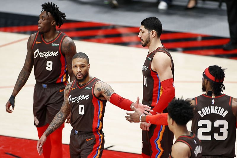
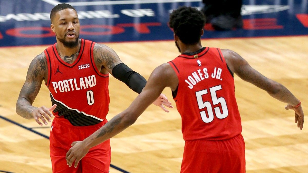
7. Portland Trail Blazers (Association Uniform, 23 games)
There aren’t many teams out there that use diagonal lines as part of their visual signature. But the Blazers have been doing it since 1977, so now those slanted lines are part of their DNA, providing a unique dynamism not found in most other NBA uni designs.
Frequency of other uniforms: Icon, 16; City, 13; Statement, 11; Earned, 9
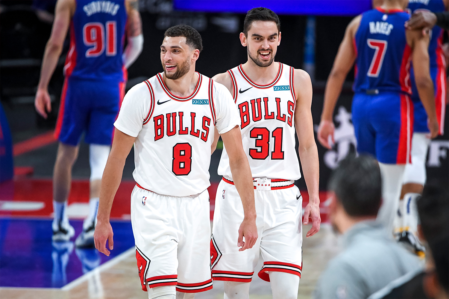
8. Chicago Bulls (Association Uniform, 24 games)
Be honest: Would this plain-Jane uniform signify so strongly for you if not for MJ, Scottie and all those championships? Maybe not, but sometimes the proof is in the pedigree, and that’s definitely the case with the Bulls’ uniforms — you can’t separate them from their history. Gotta like that deep vertical arching on the chest lettering, too. Docked a notch for the ad patch’s brutal color clash, though.
Frequency of other uniforms: Icon, 23; Statement, 15; City, 10
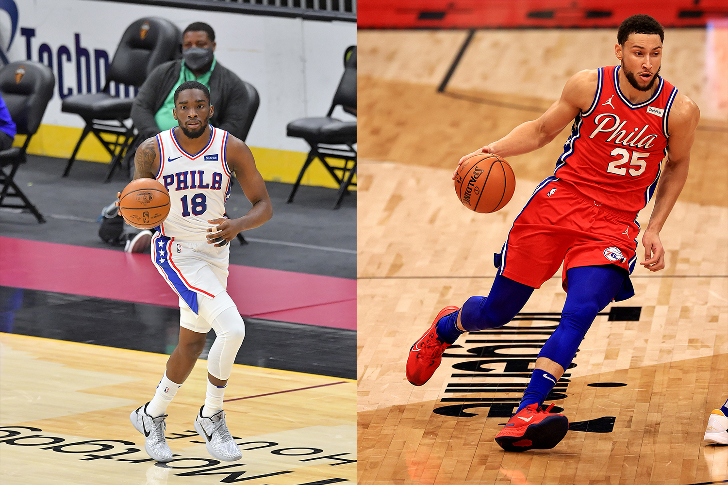
9. Philadelphia 76ers (Association and Statement Uniforms, 19 games each)
The Sixers have worn their whites and reds an equal number of times this season. Leaning heavily on the white design makes sense — it’s a great uniform with a star-spangled visual theme that doesn’t feel forced or costume-y. But the red uni is a bit loud — and besides, the British were the Redcoats back in 1776, so why should this team have a red uni to begin with?
Frequency of other uniforms: Icon, 13; City, 12; Earned, 9

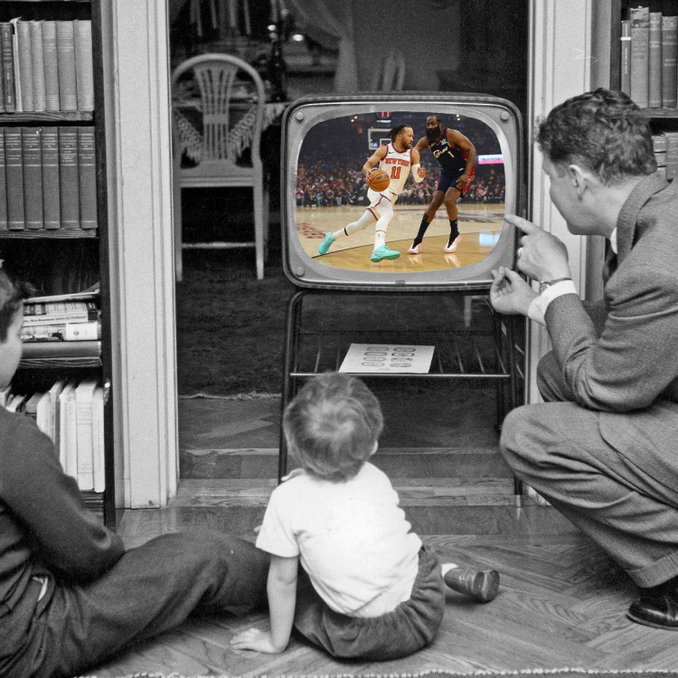
10. New York Knicks (Association Uniform, 33 games)
Here we have the uniform that led the entire league in appearances, as the Knicks wore it for 35 of their 72 games. It’s a good look, but it would rank five or six slots higher on this list if the Knicks went back to the more deeply arched “New York” chest lettering. The current, more gently arched version, introduced in 2012, has always felt unsatisfying, like a cheap knock-off of the genuine article.
Frequency of other uniforms: City, 15; Icon, 12; Statement, 12

11. Atlanta Hawks (Icon Uniform, 25 games)
After several years of being the league’s worst-dressed team, the Hawks made a welcome return to aesthetic respectability this season. Their new set, including the primary red design that turned out to be their most-worn uniform, is unspectacular but solid, and it gets a little extra juice from that bold double-striping down the sides.
Frequency of other uniforms: Association, 21; Statement, 16; City, 10

12. Indiana Pacers (Statement Uniform, 22 games)
The Pacers’ yellow Statement alternate, like the old FloJo design that inspired it, gets points for the asymmetry of having the white side panels on only one side of the uniform — an unusual approach that works.
Frequency of other uniforms: Icon, 16; Association, 15; City, 12; Earned, 7

13. Boston Celtics (City Uniform, 22 games)
It’s not like this is a bad uniform, but it’s definitely a step down from their primary white design. Why? Because the bold lettering, based on the Celtics’ championship banners, feels too billboard-y, especially when you see several players grouped together. That font makes sense if you’re hanging something from the rafters, where people will be viewing it from a distance. But on a jersey? It’s a bit too much.
Frequency of other uniforms: Icon, 14; Statement, 14; Association, 13; Earned, 7
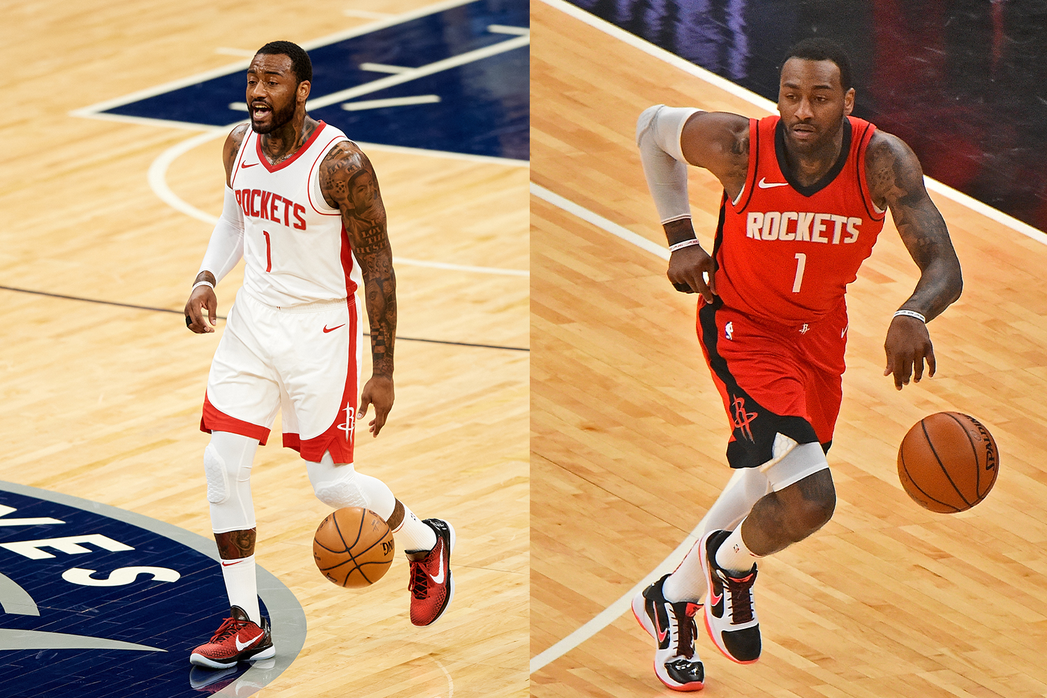
14. Houston Rockets (Association and Icon Uniforms, 18 games each)
There’s nothing wrong with having a simple, no-frills uniform design like this one — if you’re the Celtics, or the Knicks, or some other team with an aesthetic heritage built on old-school classicism. But for the Rockets — a team whose visual history has ranged from snappy to out there to way out there, the current look feels too sedate, like a renegade putting on airs. Bonus points for not having a corporate ad patch this season.
Frequency of other uniforms: City, 16; Statement, 16; Earned, 4

15. Detroit Pistons (Association Uniform, 24 games)
Another uniform that isn’t terrible but could be so much better. The big problem here is the Pistons’ current uniform font, which has always felt a bit rinky-dink. In 20 years of use, it has developed neither gravitas nor pizzazz, neither heft nor novelty. Motown deserves better.
Frequency of other uniforms: City, 20; Statement, 16; Icon, 12
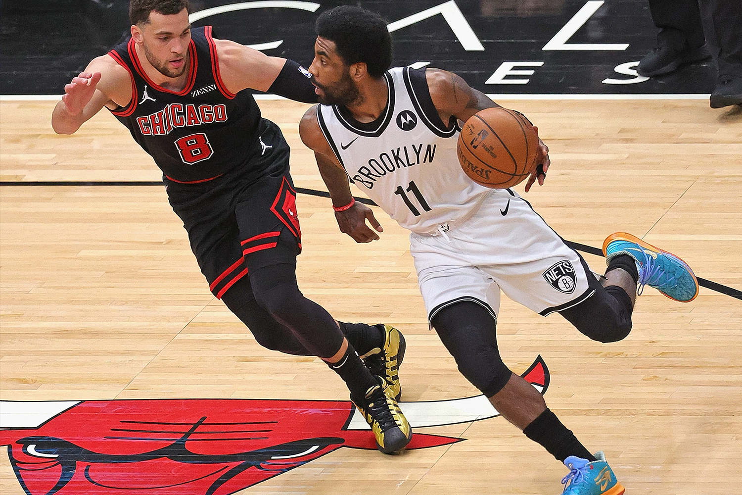
16. Brooklyn Nets (Association Uniform, 24 games)
There are certain uniforms that look significantly better if the player is wearing leggings under his shorts. The Nets’ white uni is one of those. By itself, it’s minimalist to a fault, but if you add some black leggings to the mix — well, it’s still minimalist to a fault, but at least now you’ve created a new layer of contrast that adds a bit of zip to the proceedings.
Frequency of other uniforms: City, 13; Icon, 12; Classic, 11; Statement, 7, Earned, 5
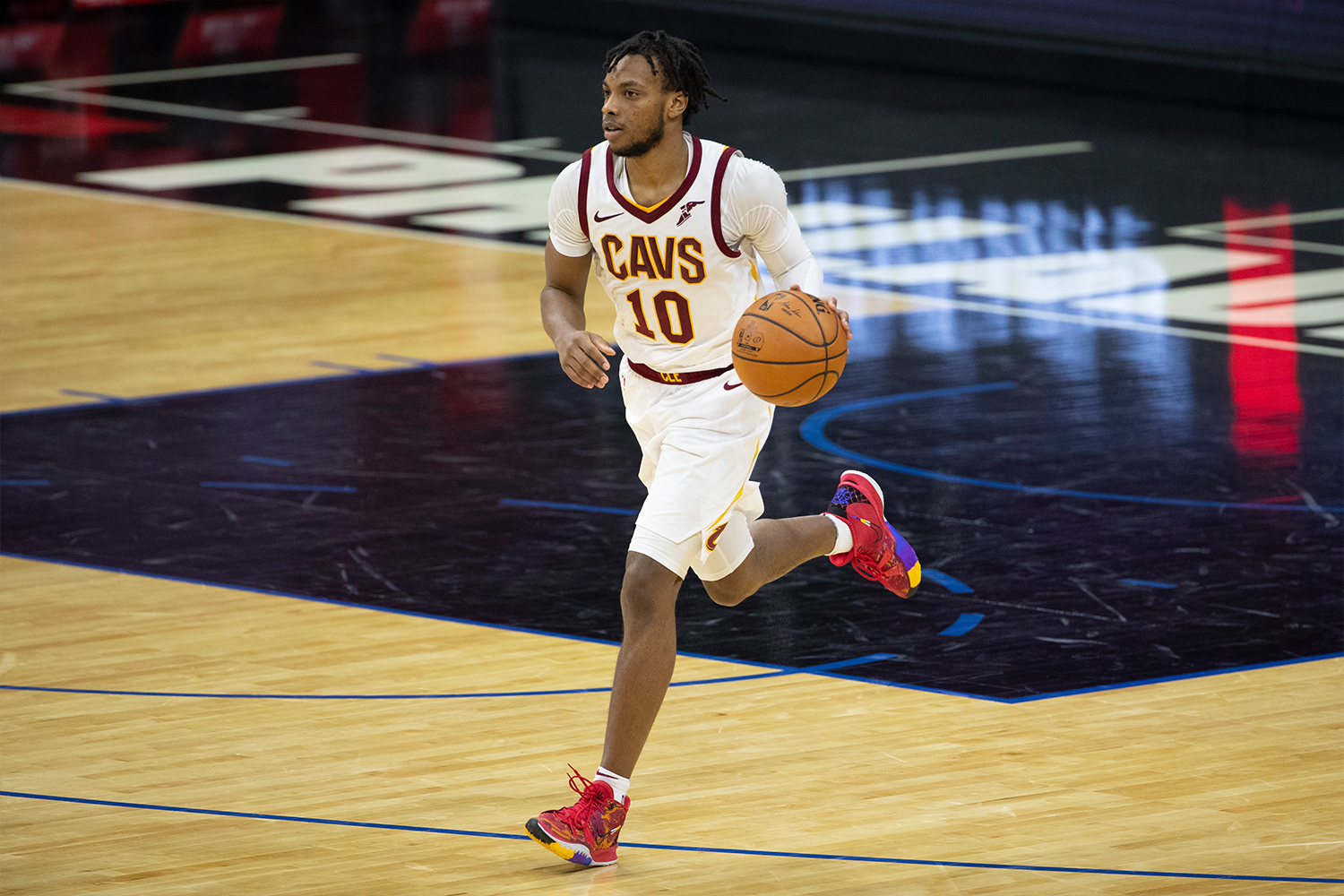
17. Cleveland Cavaliers (Association Uniform, 28 games)
Another uniform that falls into the vast middle ground of “meh.” Still a great color scheme, but they’ve never recaptured the visual zing that they had during LeBron’s early days. Would love to see them go back to that chest lettering.
Frequency of other uniforms: Icon, 17; Statement, 15; City, 12
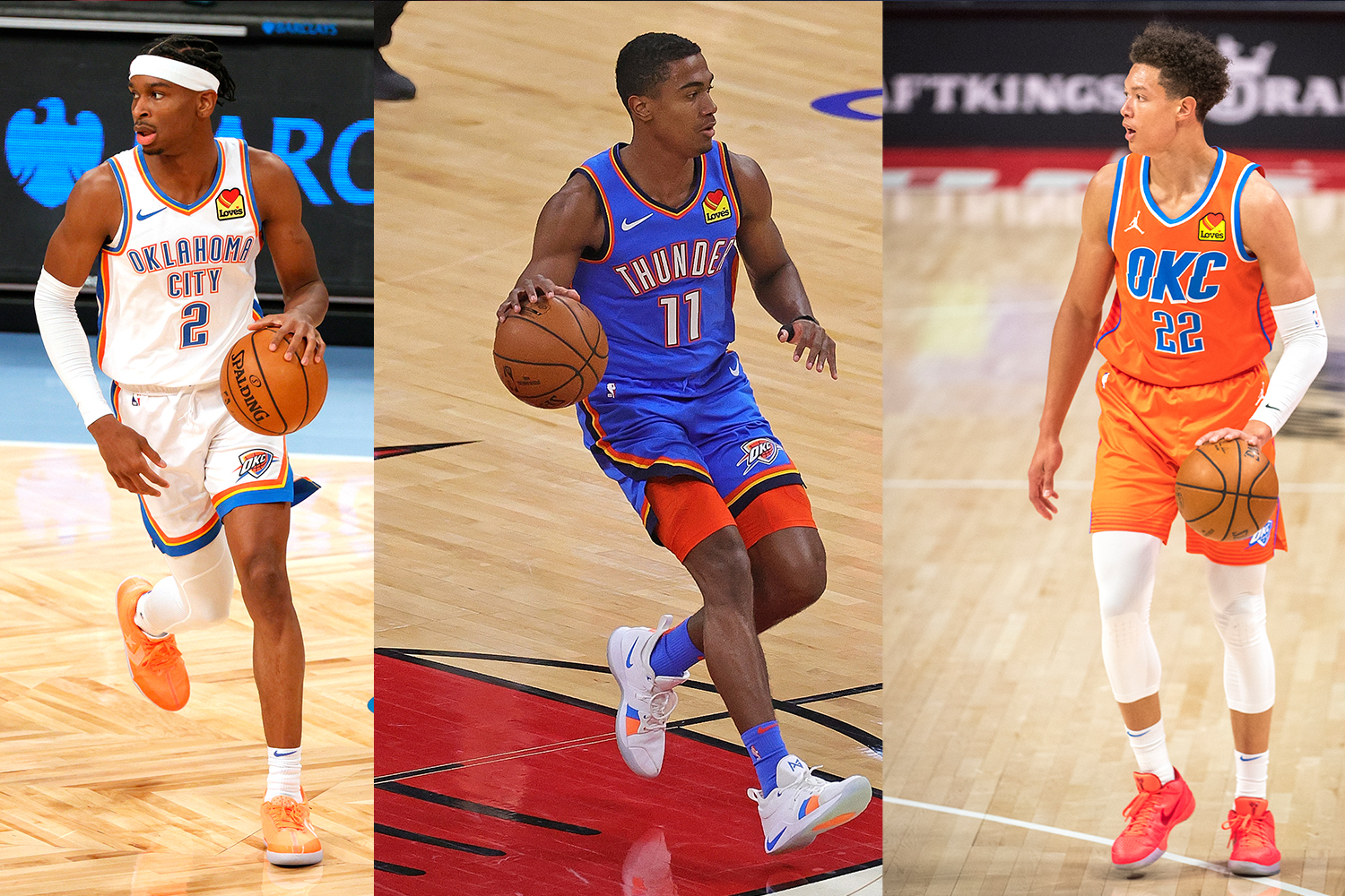
18. Oklahoma City Thunder (Association, Icon and Statement Uniforms, 19 games each)
It’s convenient that the Thunder had a three-way tie for their most-worn uniform this season, because the three designs provide a handy guide to how orange tends to function in the uni-verse. When used as an accent color, as in the Thunder’s white and blue designs, it works really well and helps make all the other elements pop. But when it functions as the main color, it often comes across as too loud, too aggressive, too much. Bonus points for the league’s most beautifully arched surname, but docked a notch for having the league’s most bumper sticker-y ad patch.
Frequency of other uniforms: City, 10; Earned, 5
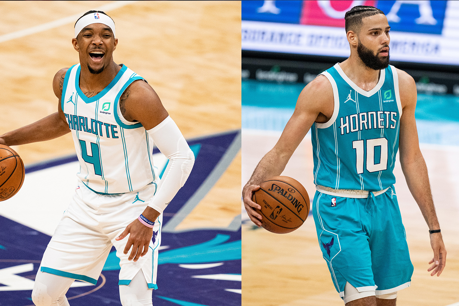
19. Charlotte Hornets (Association and Icon Uniforms, 19 games each)
Basketball players are tall, so there’s really no need for pinstripes on a hoops uniform. But if you’re going to have pinstripes, you can’t just put them on the jerseys and leave them off the shorts.
Frequency of other uniforms: City, 15; Statement, 15

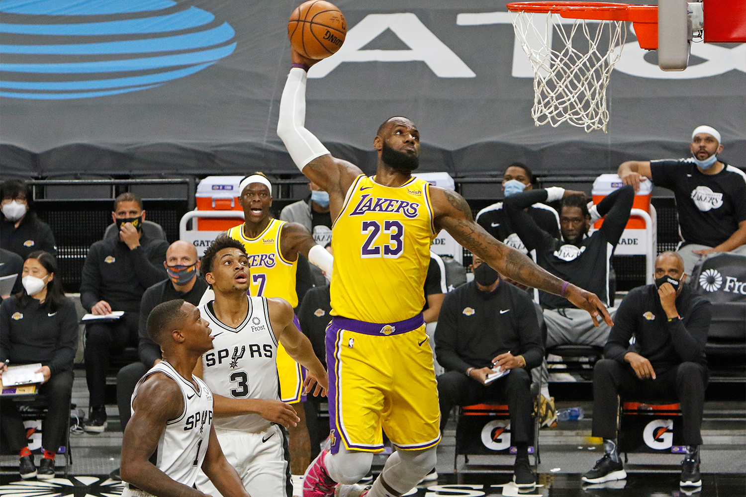
20. Los Angeles Clippers (Association Uniform, 28 games)
The Clippers’ current visual identity, which launched in 2015, has been a mess from the get-go. Lots of problems here, but the mismatched striping on the shorts — red on one side and blue on the other, with both colors wrapping around the back — is particularly problematic.
Frequency of other uniforms: City, 20; Icon, 14; Statement, 7; Earned, 3
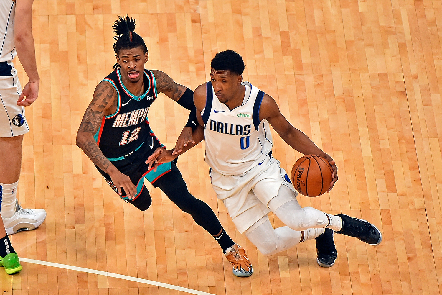
21. Dallas Mavericks (Association Uniform, 19 games)
From the typeface to the trim to the color scheme, the Mavs’ current set has no zip, no juice, no nothin’. It’s TGIUniform. Time for a serious makeover.
Frequency of other uniforms: Classic, 17; City, 13; Icon, 10; Statement, 9; Earned, 4

22. Denver Nuggets (Association Uniform, 21 games)
After a long stretch of wearing blue and gold, the Nuggets have been working a lot of red into their uniforms lately. They now have a red alternate uni, another alternate with predominantly red jersey graphics and red lettering on their primary white design. None of it feels right — after all those years of blue, red just doesn’t seem like a Nuggets color anymore.
Frequency of other uniforms: Icon, 17; City, 13; Statement, 13; Earned, 8

23. Minnesota Timberwolves (Association Uniform, 26 games)
From the old illegible typography and tree-line side panels to the current shoulder harness and neon green, this franchise has been one aesthetic disaster after another, although the white uni is probably the least objectionable of their current designs. Bonus points for not wearing an ad patch this season.
Frequency of other uniforms: Icon, 20; City, 16; Statement, 10
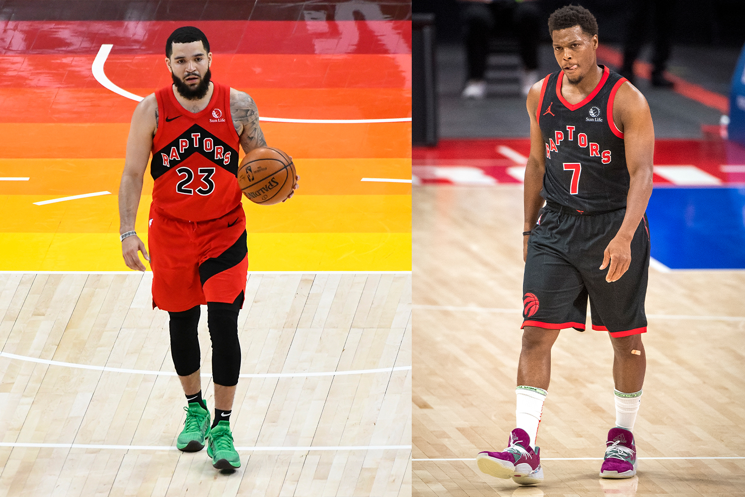
24. Toronto Raptors (Icon and Statement Uniforms, 21 games each)
Multiple-choice quiz: The Raptors’ chevron motif is (A) a “We the North” design cliché; (B) inaccurate, since the Timberwolves and Trail Blazers are actually located north of Toronto; (C) visually inconsistent, since some of the uniforms have the lettering on a contrast-colored banner while others just have the lettering on the base fabric; or (D) all of the above.
Frequency of other uniforms: Association, 17; Earned, 7; City, 6
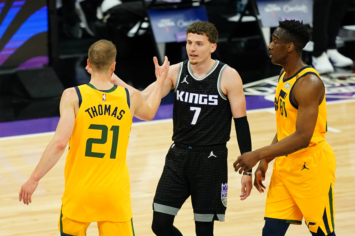
25. Sacramento Kings (Statement Uniform, 22 games)
The Kings would rank significantly higher on this list if their most-worn design had been their primary white uni, a classy look with just the right amount of purple (the color of royalty, perfect for a team called the Kings). The black alternate needs more purple, but the bigger issue is the sublimated pattern on the base fabric. You can’t see it from a distance, but it shows up clearly during TV close-ups, effectively crossing the fine line that separates a uniform from a costume. Bonus points for not having an ad patch this season.
Frequency of other uniforms: Association, 18; City, 18; Icon, 14
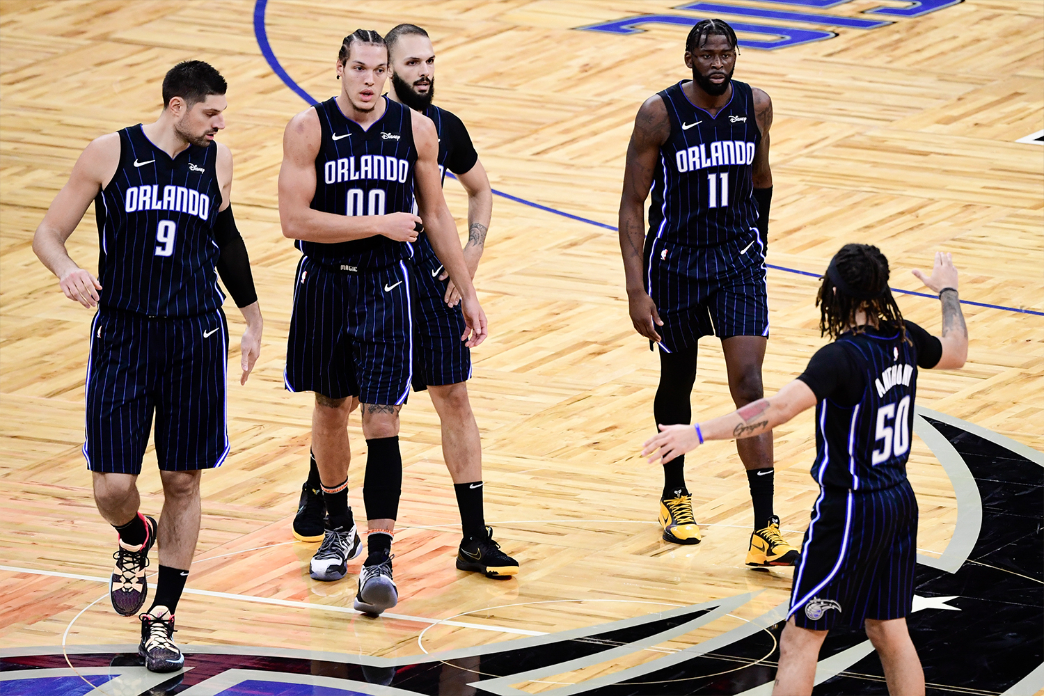
26. Orlando Magic (Icon Uniform, 22 games)
When you think of Orlando, you think sunshine, you think Disney World, you think … the color black?
Frequency of other uniforms: Association, 17; Statement, 16; City, 14; Earned, 3
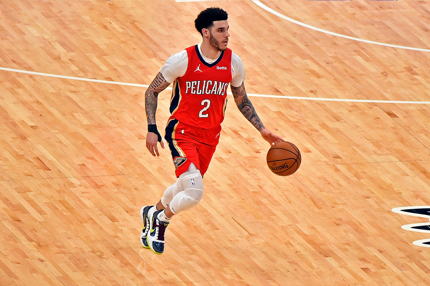
27. New Orleans Pelicans (Statement Uniform, 24 games)
The first problem here is that the red design is probably the weakest of the Pels’ four uniforms, so why make that your most-worn uni? But here’s the bigger issue: How is it possible that a team called the Pelicans doesn’t have a single jersey featuring a cartoon pelican? Come on, people, it’s a great mascot character waiting to happen!
Frequency of other uniforms: Association, 17; City, 16; Icon, 15
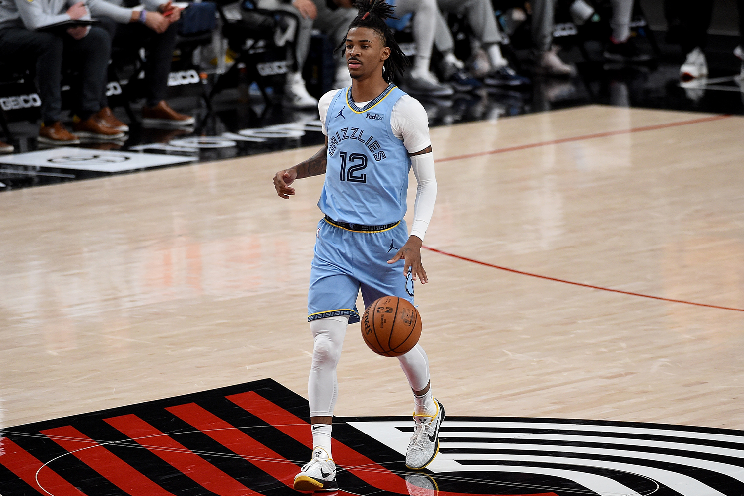
28. Memphis Grizzlies (Statement Uniform, 19 games)
Pretty ironic — and sad, too — that the same franchise that once had the NBA’s most gonzo look now sports the league’s blandest, most characterless uniforms. It’s not that the Grizzlies look bad; it’s more that they don’t look like much of anything. The yellow trim on the collar, waistband and shorts cuffs helps a bit, but it’s not enough to save this uniform from being a total snooze.
Frequency of other uniforms: City, 15, Classic, 14; Association, 13; Icon, 11

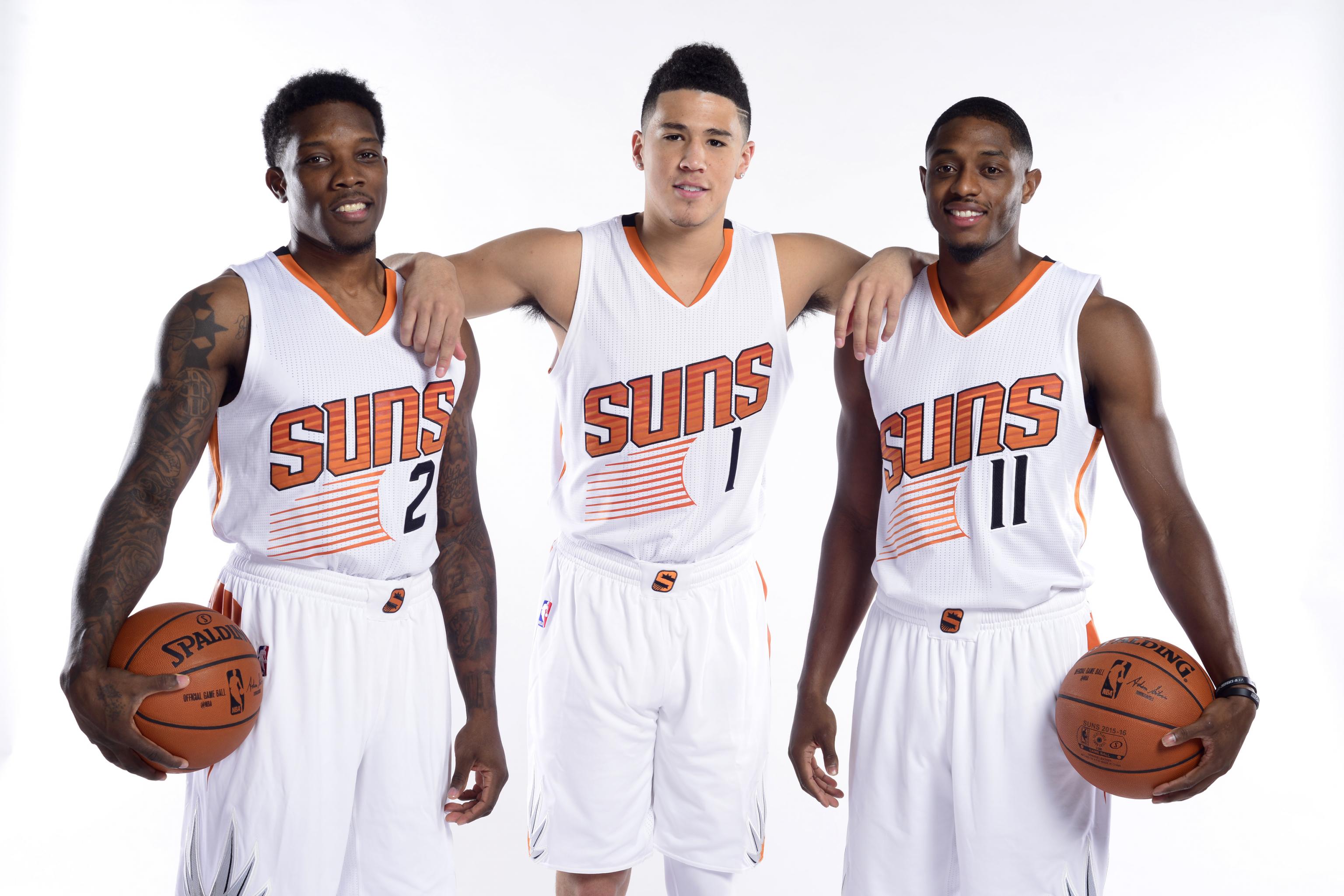
29. Phoenix Suns (Association Uniform, 32 games)
For a few blissful years — 2013 through 2017 — the Suns had one of the best and most interesting uniforms in the league. Then they inexplicably traded it in for a miserable uni set saddled with some of the worst clichés in the uni biz. Beveled lettering? Check! Silly number font with lots of extraneous little “thorns” and “talons”? Double-check! And while using one color for your lettering and a different one for your numbers isn’t necessarily a bad thing (indeed, it works well for several teams in the upper reaches of this list), it feels particularly jarring here. Bring back the mid-2010s design!
Frequency of other uniforms: City, 20; Icon, 10; Statement, 10
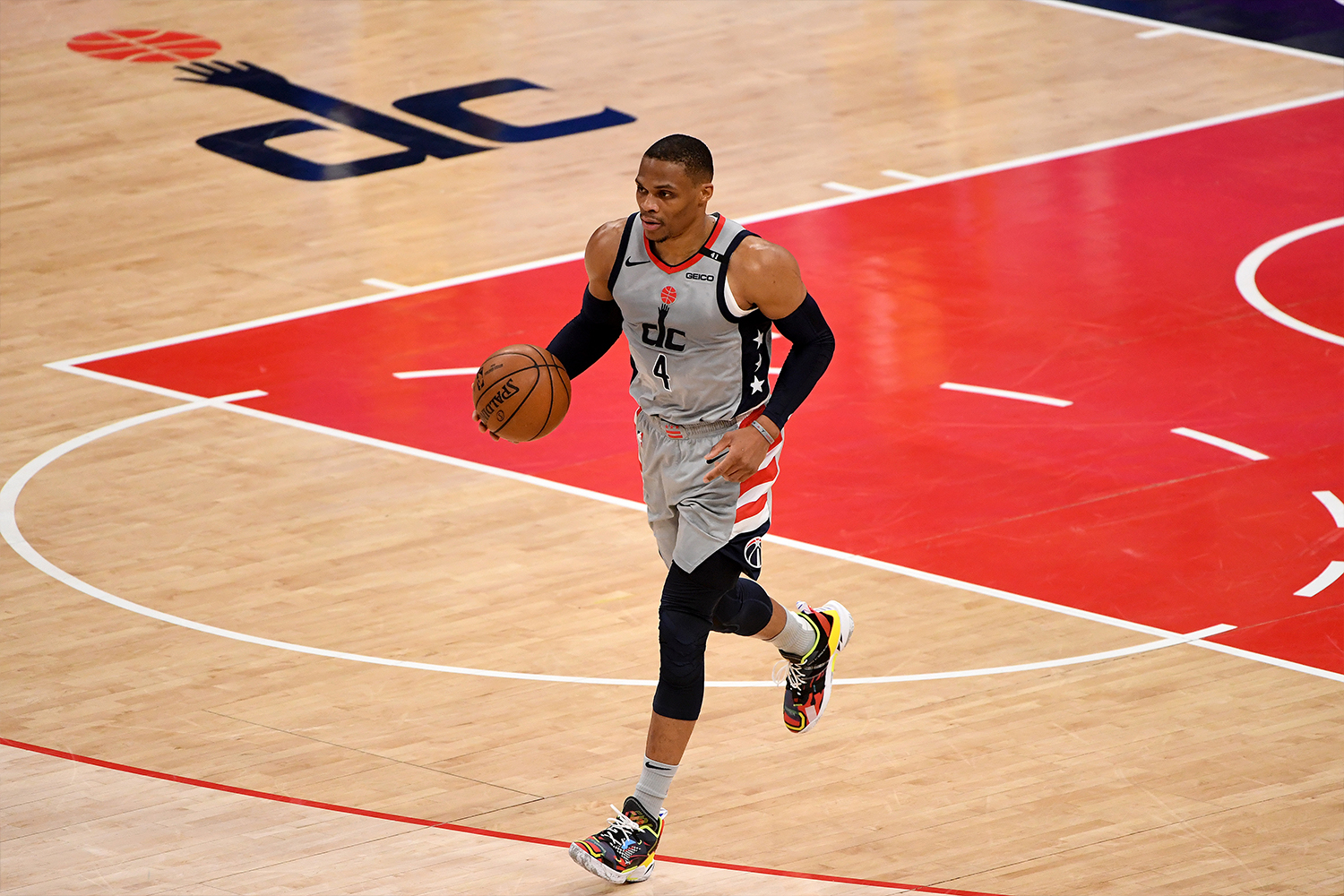
30. Washington Wizards (City Uniform, 29 games)
Ah yes, those stirring patriotic colors of red, white, blue … and drab gray. Seriously, who thought that was a good idea? And how did this uniform, out of all of the Wizards’ designs, end up as their most-worn uni of the season? Well, it’s nice to know that the universe (and the uni-verse) can still present us with such confounding mysteries to ponder.
Frequency of other uniforms: Icon, 19; Statement, 14; Association, 10
Paul Lukas has been writing about sports uniforms since 1999. If you like this article, you’ll probably like his Uni Watch Blog, plus you can follow him on Twitter and Facebook, check out his podcast, and sign up for his mailing list so you won’t miss any of his future InsideHook columns. Want to learn about his Uni Watch Membership Program, check out his Uni Watch merchandise, or just ask him a question? Contact him here.
Meet your guide
More Like This
The Charge will help you move better, think clearer and stay in the game longer. Subscribe to our wellness newsletter today.


/cloudfront-us-east-1.images.arcpublishing.com/wweek/VQ7TTCDP3NEXJASRUC6VJMCA2M.jpeg)