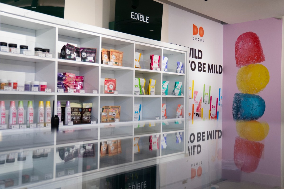
If you’ve spent any time in dispensaries — or even looking at photos of their wares — you might have noticed something about the way edibles are packaged there. Some edibles have sleek, informative packaging that’s pleasant to look at on an aesthetic level, and some edibles have packaging that is, shall we say, less likely to draw a buyer’s gaze. As this Weedmaps article by Datrianna Meeks points out, it’s also crucial (for both legal and consumer reasons) that this packaging contain information about what, exactly, is inside.
In a new article for The New Yorker, Alexandra Lange argues that this has led to some intriguing developments in graphic and product design. Lange is an expert when it comes to questions of design and interaction, and has plenty of insights into how they converge in this unlikely location.
Citing the example of the Camino line of edibles, Lange addresses some of the challenges facing companies. “The brand is distributed in ten states, so the company must negotiate a thicket of individual state regulations for the packaging and appearance of controlled substances,” she writes — adding that these regulations can literally shape both the edibles themselves and the containers in which they’re sold.
A Chat With an L.A. Cannabis Pioneer About America’s Best Weed City
Where to shop, what to buy and the problem with budtendersLange’s overview of the design of weed edibles covers a lot of ground, from the design legacy of Apple to the ways that architecture, Instagram and autobiography have influenced specific packages. At the end of the day — sometimes literally — great package design won’t cover up a substandard edible. But at its best, it can draw your eye and help you find your new favorite — or stand on its own as a notable object in its own right.
Every Thursday, our resident experts see to it that you’re up to date on the latest from the world of drinks. Trend reports, bottle reviews, cocktail recipes and more. Sign up for THE SPILL now.
