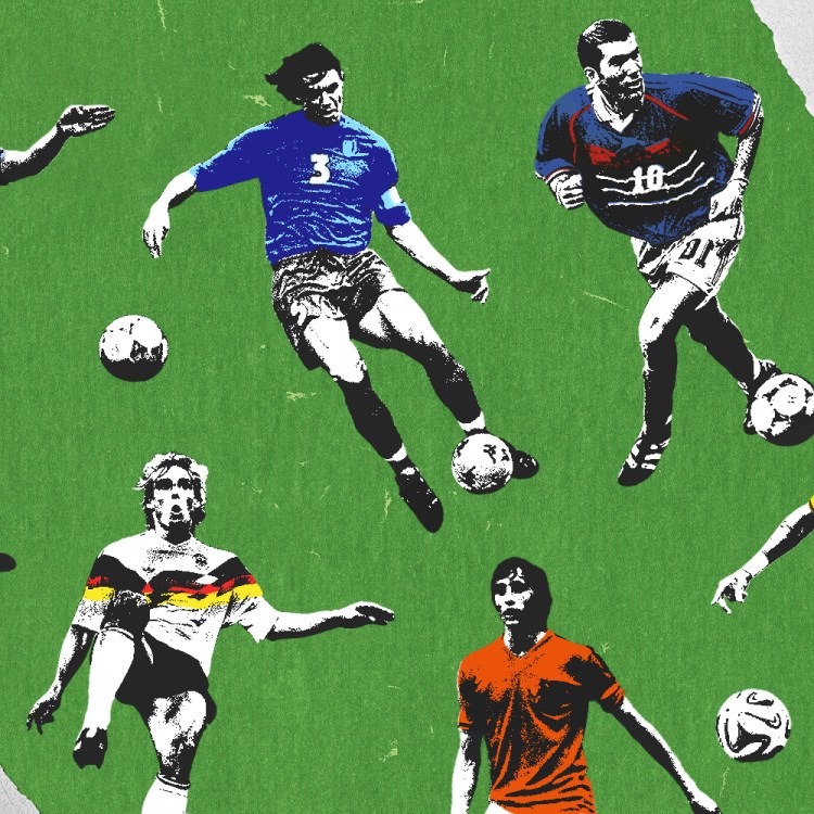
As we count down the waning days of 2020, there’s one thing on which we can all agree: This has been a bad year — a very, very bad year. So what better way for a uniform writer to cap things off than by looking at some bad uniforms?
But not just any bad uniforms. Just as Columbus sailed west to get east, some uniforms are so bad that they’re actually good. Those are the ones we’re going to look at, and celebrate, in this year-end piece.
Before we get started, it’s worth noting that “So bad it’s good” is an inherently nebulous phrase that means different things to different people. Let’s start with what it doesn’t mean, at least for the purposes of this article: I’ve tried to avoid self-evidently awful designs that have acquired a certain pat-on-the-head charm when viewed through the lens of kitschy nostalgia (like, say, the Tampa Bay Devil Rays’ original late-’90s uniforms, which were bad when they debuted and are still bad today, even if we can laugh about them now). I’ve also avoided designs that were supposed to be bad, like those minor league baseball theme uniforms. And I’ve also avoid cynical attempts to be outrageous just for outrage’s sake, like when a team trots out a neon-colored alternate uni.
So what does “So bad it’s good” mean? For me, it means a design that’s audacious, that loudly and proudly breaks some of the usual rules and standards, and that isn’t afraid to flirt with garishness, but is also trying — and on some level succeeding — to be a legitimately good uni design. That’s a tricky and nuanced needle to thread, but when it works, the results are memorable.
Of course, one person’s tricky and nuanced is another’s stupid and retina-searing, so your mileage may vary and all that. So with that proviso in mind, here’s one observer’s list of 20 uniforms that manage to hit the “So bad it’s good” sweet spot.
20. Oregon Ducks: The Diamondplate
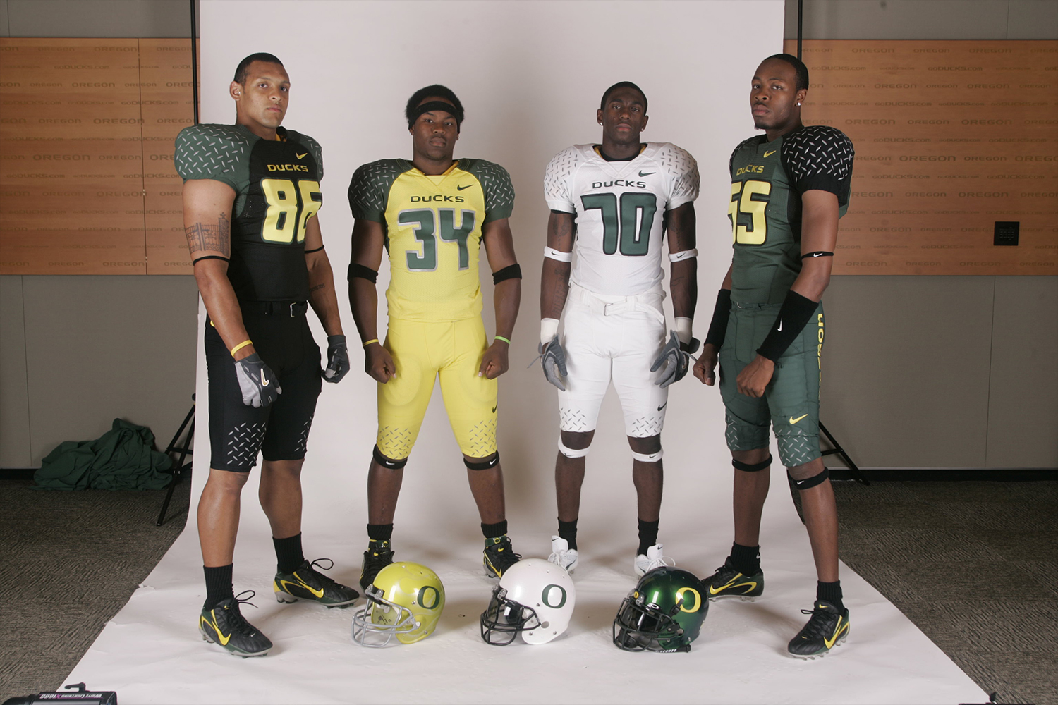
We can’t talk about “So bad it’s good” without including something from Oregon, who’ve spent the past two decades scrambling the uni-verse’s conceptions of what’s bad and what’s good. Any number of their uniforms might qualify for this list (in fact, we could do a separate list devoted exclusively to Oregon designs), but we’re going with their 2005 set, which featured the diamondplate pattern on the shoulders and knees, marking the moment when the program really transitioned from uniforms to costumes. It seemed laughable at the time, and still seems pretty silly today, but it also helped define an anything-goes approach to on-field design that has resulted in some notable successes along with the obvious failures. In the big picture, the uni-verse is better for it.
19. Sacramento Kings: Split Personality
The Kings’ old two-tone uniforms: awful or awesome? pic.twitter.com/Wply82qCmX
— Paul Lukas (@UniWatch) December 29, 2020
Can’t decide whether your uniform should be black or purple? No problem — go with both! That’s what the Kings did for a few seasons in the mid-1990s. Just like you have to break a few eggs to make an omelet, sometimes you have to break a few rules to achieve “So bad it’s good”-ness. Bonus points for the checkerboard trim.
18. New Orleans Hornets: Mardi Gras
In February of 2012, the Hornets (who would later become the Pelicans, with the Charlotte Bobcats taking the Hornets moniker) unveiled the first and still the best of their Mardi Gras-themed uniforms. It was purple on the front, green on the back, and adorned with lots of ornamentation meant to simulate beads and other festive gewgaws. Was it loud and gaudy? Yes, duh, of course it was loud and gaudy — that’s the whole point of Mardi Gras! Nicely done.
17. St. Louis Blues: The Diagonal Design
Sometimes it’s the back of the uniform that really tells the story. That was the case with the uni set that the Blues wore in the late 1990s, which featured a diagonal motif. The front view raised some eyebrows, but it’s the back view, with the diagonally slanted uni numbers, that really bugged people. Or at least some people — the feeling here at Uni Watch HQ is that the slant-based numerals are among the coolest design elements ever to appear on an NHL uniform.
16. Denver Broncos: Vertically Striped Socks
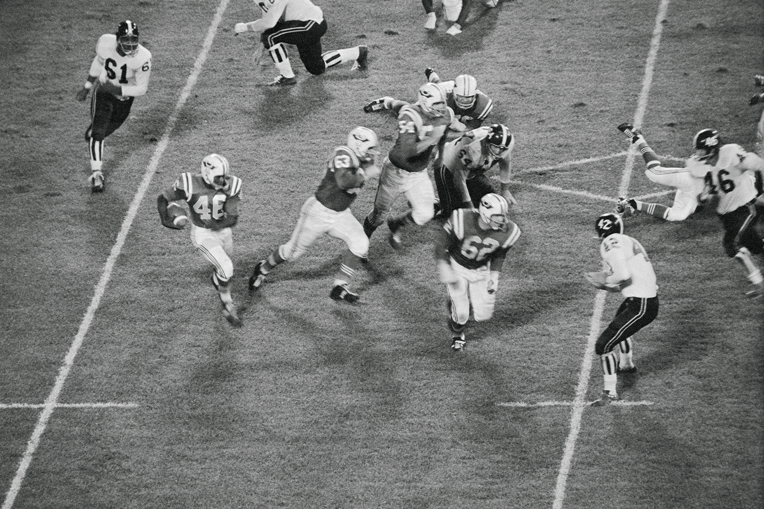
For most of the Broncos’ history, their colors have been orange and blue. But for their first two seasons — 1960 and ’61 — they wore second-hand uniforms (famously penny-pinching owner Bob Howsam got them from defunct college bowl game) featuring yellow and brown. Aside from the pee-and-poo color scheme, the uniforms also featured vertically striped socks, a design element that led to so much ridicule that the players torched the socks in a bonfire when the team eventually got new uniforms in 1962. But it says here that the vertically striped hose were actually awesome, providing brilliant lower-leg stylings that could have become iconic if the team had stuck with them. (Footnote: This uni, including the vertical stripes, was revived as a throwback in 2009. Time to bring it back for another go-round!)
15. Philadelphia Phillies: Saturday Night Special
Today in 1979 the #Phillies sported these new “Saturday Night Special” all burgundy uniforms. They lost 10-5 and never wore them again. pic.twitter.com/G8JPbycshR
— Dan Mallon (@MallonDan) May 19, 2017
On the night of Saturday, May 19, 1979, the Phillies took the field in a set of solid-burgundy alternate uniforms. Traditionalists were aghast, and it didn’t help that the Phils got thumped that night by the Expos, 10-5, so the uniforms were quietly mothballed, never to be worn again. Because of their legendary one-and-done status, they became known as the Saturday Night Specials. But here’s the thing: They didn’t look that bad. The Phils totally own that shade of burgundy, so why not flaunt it? If this design had become part of the team’s regular uni rotation instead of being abandoned after one game, fans probably would have gotten used to it and a whole new realm of solid-colored baseball attire might have opened up. We’ll never know for sure, but the Saturday Night Specials deserved a better fate than the dunce-capped corner of shame to which they’ve heretofore been consigned. (As an aside: A Uni Watch reader later ended up acquiring Mike Schmidt’s cap from this game!)
14. Iowa Hawkeyes: The Banana Peel
Can never have too much of that Iowa banana peel uni set! pic.twitter.com/w6aTel1wQm
— Paul Lukas (@UniWatch) December 24, 2020
In the mid-1990s, the Iowa football team wore an unusual uniform created by the now-defunct uniform brand Apex. It was officially known as the “winged” design, but that name quickly became supplanted by something more derisive: the banana peel uniform. That’s a funny name for an admittedly atypical uni design, so everyone quickly piled on and the uniform became a near-universal object of mockery. But if you can stop thinking about banana peels and just view the stripes as, you know, stripes, it’s a pretty cool look, and certainly better than Iowa’s current uniforms, which are just Pittsburgh Steelers knockoffs.
12. and 13. Milwaukee Bucks and Atlanta Hawks: The Menagerie
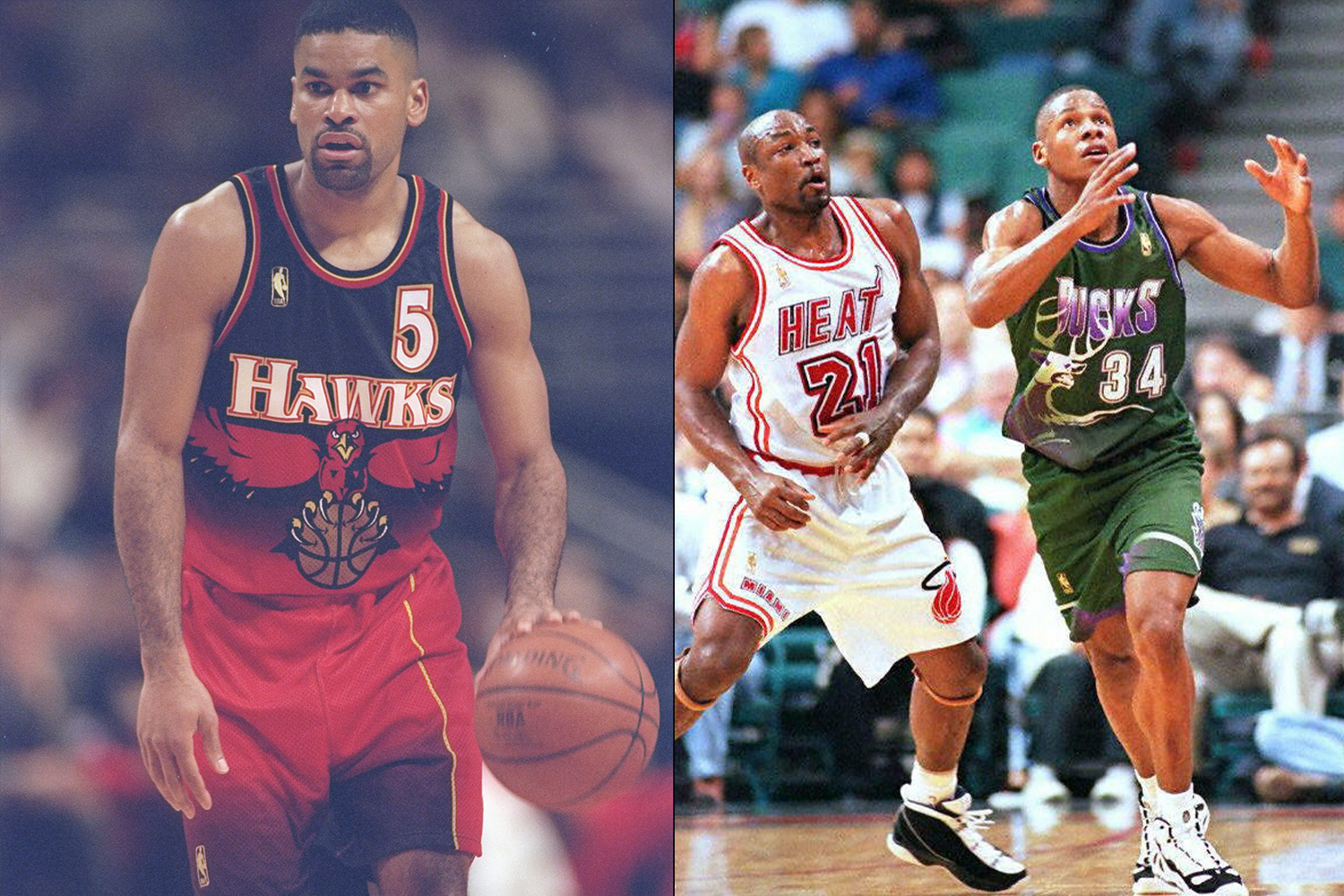
In the mid-1990s, the NBA’s creative services department took advantage of a new apparel technique called sublimation, which allowed uniform graphics to be printed directly onto the fabric instead of sewn on. This allowed for much more complex designs, many of which pushed the envelope far beyond the bounds of traditional basketball uniforms. Two teams that really embraced the new style were the Bucks and Hawks, both of which let their namesake animal mascots go free-range, so to speak, on their jerseys. Purists balked and squawked, but uniforms like these help set the stage for today’s freewheeling NBA uni scene.
11. Toronto Raptors: Barney
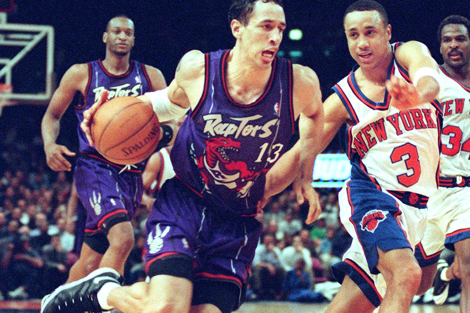
Sublimation wasn’t just handy for depicting real-world animals like deer and birds of prey — it was also ideal for showcasing a cartoon rendering of Raptors’ mascot. Although smirking observers quickly nicknamed the uni after the educational kids’ TV dinosaur Barney, it’s actually a pretty cool design. Sure, it’s silly, but in a self-aware, wink-wink way. Plus you’ve got to love a uniform that shows a dinosaur wearing a uniform! Too bad they just put an “R” on the dino’s chest instead of creating an infinite regression (i.e., a dinosaur wearing a jersey showing a dinosaur wearing a jersey showing a dinosaur, etc.) — a missed opport-uni-ty there.
9. and 10. Mighty Ducks of Anaheim and Los Angeles Kings: Wild Wing and Burger King
One month from today — Jan. 27, 2021 — will be the 25th anniversary of a seminal event in the uni-verse: the infamous Wild Wing vs. Burger King game.
— Paul Lukas (@UniWatch) December 27, 2020
The full game is available on YouTube: https://t.co/6oKHiebsJ6 pic.twitter.com/buSJ0PNOAf
The NHL hopped on the sublimation bandwagon, most notably (and notoriously) with the alternate uniforms that the Mighty Ducks and Kings briefly wore during the 1995-96 season. Anaheim’s design featured a hilariously low-grade cartoon of the team’s mascot, Wild Wing, bursting through the ice, while L.A.’s version featured a trippy stripe pattern and a fairly random-seeming head shot of a king (which quickly resulted in the uniform becoming known as the “Burger King” design). The Wild Wing uni is endearingly goofy and has long been a Uni Watch favorite (plus it’s another great example of a uniform featuring a mascot wearing a uniform). Burger King is admittedly harder to make a “So bad it’s good” case for — it’s just legitimately bad — but these two designs will forever be linked in history, largely because of the amazing Wing-vs.-King matchup that took place on Jan. 27, 1996, one of the most eye-popping games in the history of the uni-verse (you can watch the whole game on YouTube). What do we have to do to get these two teams play a Wing/King throwback game every year on the anniversary of that momentous occasion?
8. Chicago White Sox: Shorts
The White Sox’s 1976 uniform set was weird in all sorts of ways. There were the floppy disco collars, the jerseys designed to be worn untucked, the road uniforms rendered in dark navy instead of the usual gray, the old-timey “Chicago” chest-lettering font contrasting with the modern “Sox” font on the cap … and then there were the shorts. They were worn for only three games but their legend long ago eclipsed their on-field presence. While not completely unprecedented in pro ball (several minor league teams wore shorts in the 1950s), the shorts were a first for a big league team and perfectly captured the zany spirit of team owner Bill Veeck. Sure, you could say the whole thing was a misguided mistake, but wouldn’t you rather live in a world where this kind of mistake can be made? If the video footage embedded above isn’t enough for you, there’s a bit more Sox-in-shorts goodness available here. (Footnote: Let the record show that the Sox won two of their three shorts-clad games — and despite their exposed knees, went eight-for-eight in stolen base attempts!)
7. Caribous of Colorado: The Tasseled Fringe
@FootballKitCon
— William Kay (@williamkay62) January 21, 2020
Colorado Caribous 1978.
Worst shirt of all time?
Or a misunderstood classic? @scottishkits2 pic.twitter.com/wLKNWQp63y
The North American Soccer League was a pretty big deal in the 1970s, at least by American soccer standards, with Pelé, Franz Beckenbauer, and Carlos Alberto all playing for the league’s New York Cosmos franchise. But from a uniform standpoint, the NASL was most notable for the Caribous of Colorado (yes, that was the official name, just like the Mighty Ducks of Anaheim), a Denver-based team that existed only for the 1978 season. Despite their short history, the Caribous made an outsized mark in the world of athletics aesthetics thanks to their bizarre jerseys, which featured a wraparound row of tasseled leather fringe. The design routinely shows up in various “Worst Uniforms Ever” lists, but come on — it’s not ugly, it’s just seriously, gloriously weird. Someone really needs to revive it as a throwback.
6. Norway Olympic Curling Team: Loudmouth Pants
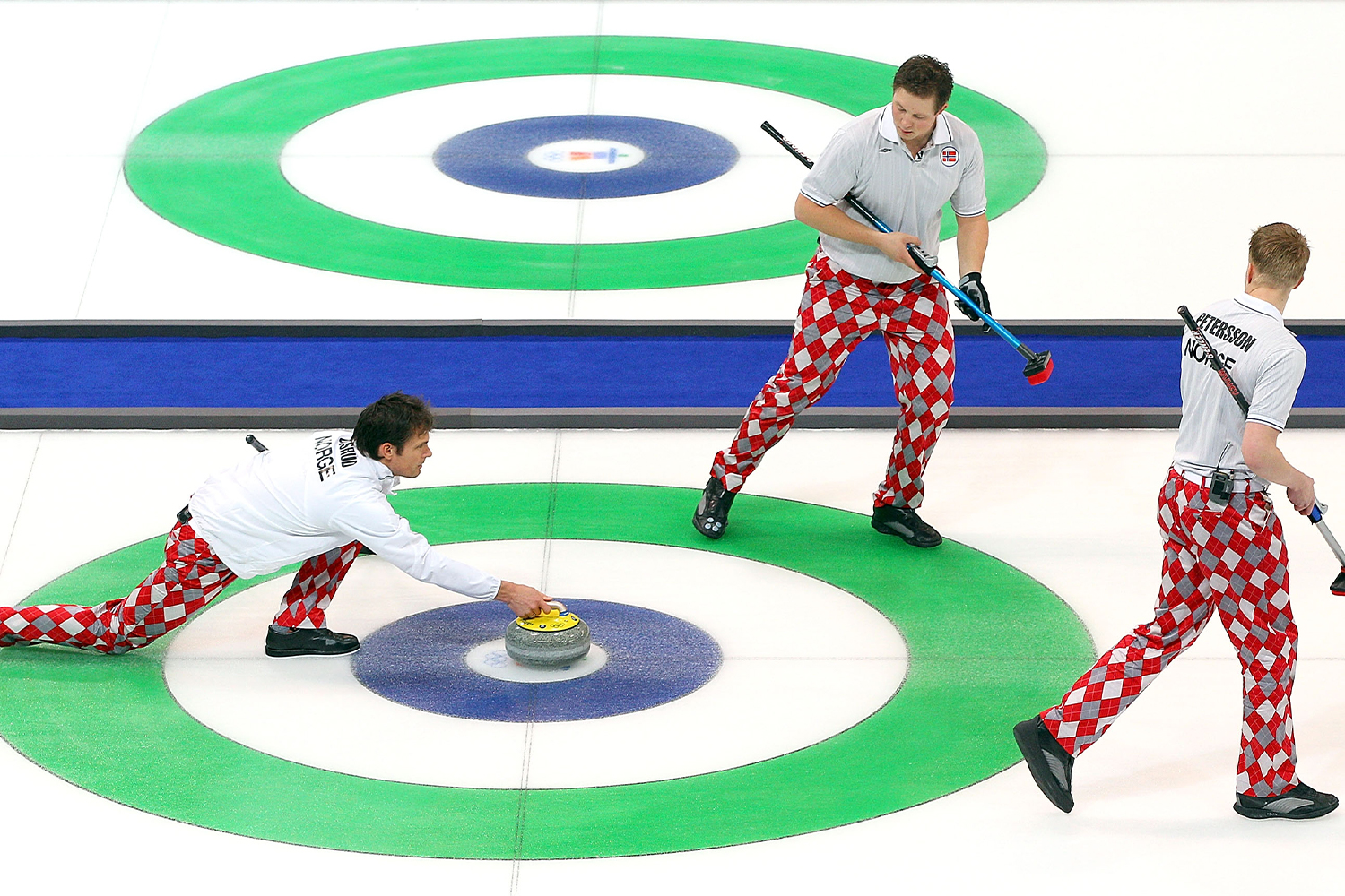
At the 2010 Winter Olympics in Vancouver, the Norwegian curling team caused a stir by appearing in gaudy harlequin-patterned pants made by Loudmouth Golf. Lots of people snickered, but many of those people had never paid any attention to curling before. By the time the Norwegians took home the silver medal at the close of the games, the pants had become their visual signature and curling had gained a bunch of new fans.
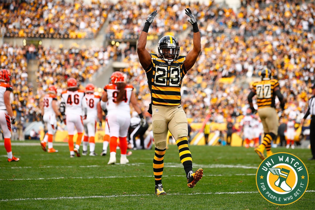
5. Pittsburgh Steelers: Bumblebee Throwbacks
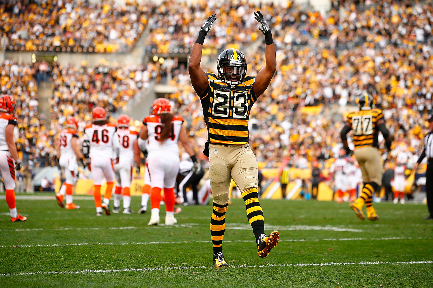
You know they drill: They look like bumblebees, they look like prison uniforms, yadda yadda yadda. But hey, we’re always hearing how all the Pittsburgh pro sports teams wear black and gold, and surely no uniform captures the duality of those two colors like this one. Like all throwbacks, it also functions as a de facto history lesson (hearkening back to the team’s 1933 inaugural uni set, don’tcha know). Would you want a modern-day team to wear this design as their primary uni? Nope. But as a change of pace once or twice a year, it’s the epitome of “So bad it’s good.”
4. Miami Heat: Vice Versa
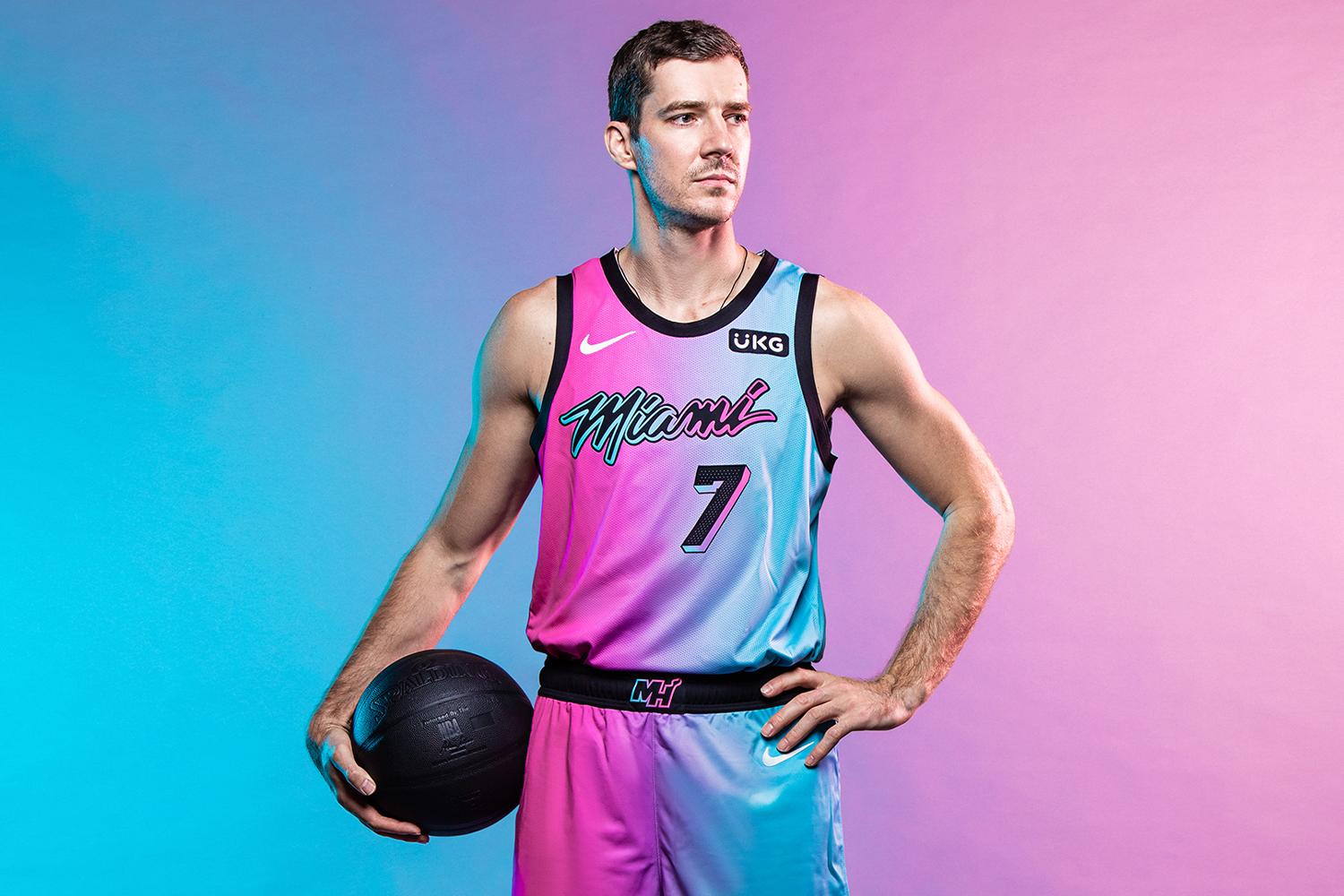
Most of the designs on this list are old (or at least old-ish), but this is a brand-new one, unveiled just a few weeks ago. Having previously worn Miami Vice-themed alternate uniforms rendered in white, black, blue, and pink — all of them pretty damn good — the Heat have basically combined all of those color combos in this fifth and supposedly final Vice-based design, which they’re calling “Vice Versa.” Treading a fine line between eyeful and and eyesore, it takes a fun concept to its logical extreme. Designers are fond of saying, “Less is more,” and they’re usually right. Occasionally, though, more is more, and this uniform is a great example of that.
3. New York Mets: Mercury Mets
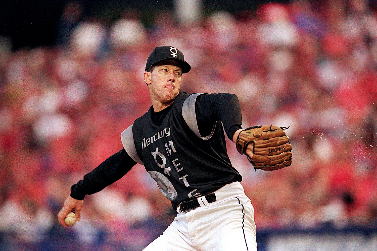
As part of a now-infamous 1999 promotion, 22 of the 30 MLB teams dressed up in “futuristic” uniforms for a game or two. Most of the teams simply wore jerseys with ridiculously oversized logos, which didn’t look futuristic — it just looked lazy and lame-o. But the Mets ran with the concept, billing themselves as the Mercury Mets, “making their only Earth appearance,” complete with a sci-fi uniform. Was it absurd, or even embarrassing? Definitely. But it was also the only design of the bunch that truly embraced the spirit of the promotion and showed even a smidgen of imagination. The lesson: If you’re going to do something — even something that’s really, really stupid — do it right.
2. Vancouver Canucks: The Flying “V”
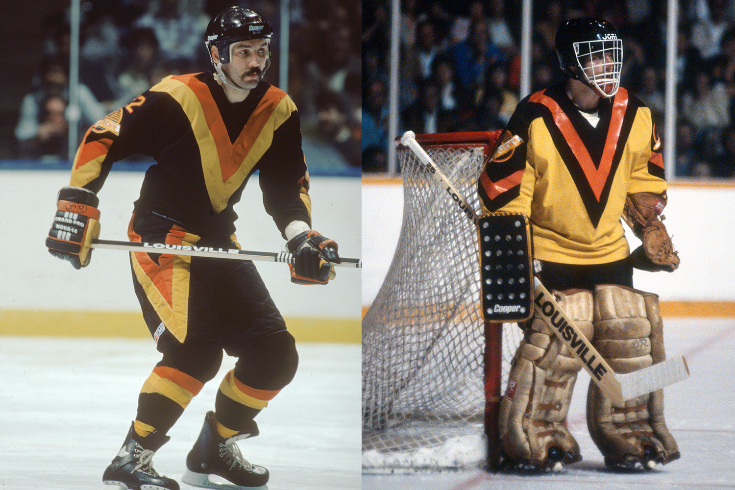
For generations, most hockey uniforms featured a crest — a fancy word for a logo — in the center of the jersey. But in 1978, the Canucks decided to use the entire jersey as a canvas for a giant “V”-shaped stripe pattern that looked something like a fluorescent safety vest. Roundly mocked at the time, it holds up as a bold design that expanded the possibilities of what a uniform could be.
1. Houston Astros: The Tequila Sunrise
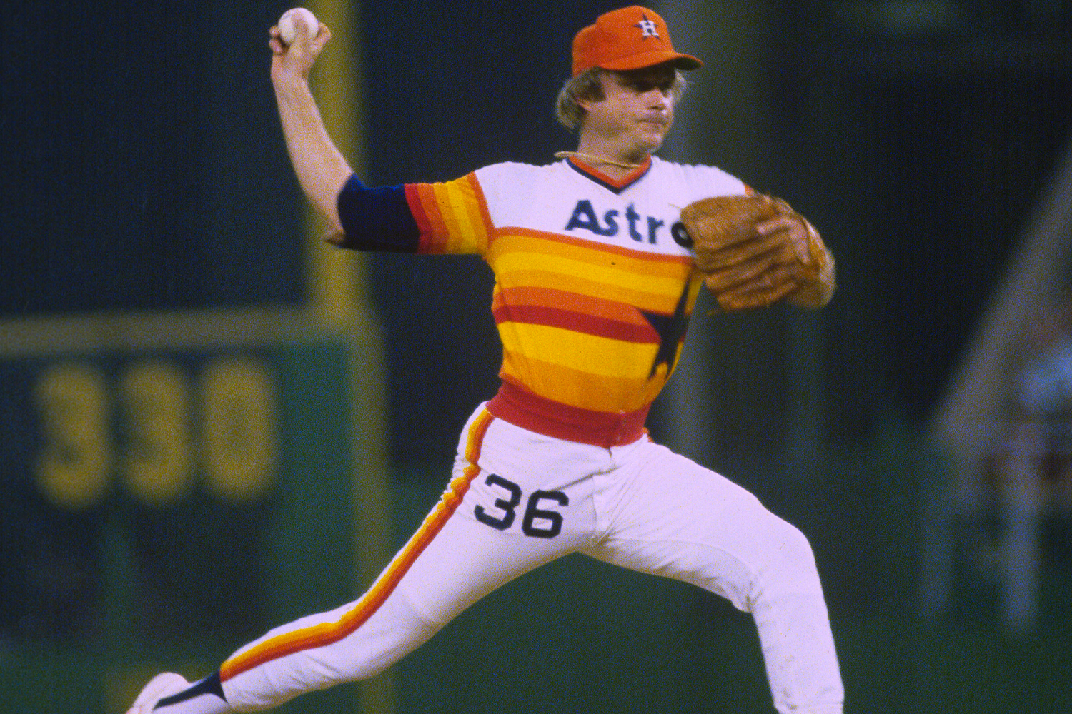
The ultimate “So bad it’s good” design, the Astros’ tequila sunrise uniform was widely ridiculed when it first hit the field in 1975. That’s understandable — nothing even remotely like it had ever been seen before on a baseball diamond (which, as the guys who designed it later explained, was precisely the idea). Nearly half a century later, it’s now acknowledged as a modern classic and has even become a design style unto itself, copied by countless high school, college, American Legion, and Little League teams (and also serving as the inspiration for a Uni Watch jersey). So bad it’s good? More like so bad it’s awesome.
And there you have it. Of course, there are countless uniforms that could qualify as honorable mentions — the New York Islanders’ fish sticks design, the Vancouver Grizzlies’ inaugural 1995 set, and many more — so please accept your friendly uniform columnist’s apologies if your favorite entry didn’t make the cut.
That’s a wrap for 2020, and not a moment too soon. Here’s hoping your favorite team’s uniforms in 2021 are 100% good and 0% bad, however you choose to define those terms.
Paul Lukas wishes everyone peace, health, and happiness in the new year. If you like this article, you’ll probably like his Uni Watch Blog, plus you can follow him on Twitter and Facebook, and sign up for his mailing list so you won’t miss any of his future InsideHook columns. Want to learn about his Uni Watch Membership Program, check out his Uni Watch merchandise, or just ask him a question? Contact him here.
Meet your guide
More Like This

The Charge will help you move better, think clearer and stay in the game longer. Subscribe to our wellness newsletter today.


