Nota bene: All products in this article are independently selected and vetted by InsideHook editors. If you buy something, we may earn an affiliate commission.
Fun fact: in terms of how it’s commonly applied today, the term “polo shirt” is a bit of a misnomer. The garment that came to England from India (where the sport was invented) in the late 19th century was actually a long-sleeved oxford featuring buttons to secure the collar and keep it from flapping in the breeze as one galloped around the field.
It was tennis pro René Lacoste who was responsible for creating the “polo” as we know it today, deciding in 1926 that the aforementioned oxfords were too cumbersome for play and developing his own version: a short-sleeve made from loosely-knit (see: breathable) piqué cotton with a flat, soft collar that could be worn up to protect one’s neck from the sun.
This was commonly referred to as a “tennis shirt” up until 1972, when Ralph Lauren introduced it as a staple of his Polo line, and stuck his now-iconic polo player logo on the left side of the chest in the fashion of Lacoste’s crocodile and Fred Perry’s laurel before him.
The shirt and brand took off like rockets, became synonymous, and here we are. The ensuing years solidified the polo as arguably the most ubiquitous sportswear item of all time, favored by Ivy League preps and hip-hop habitues alike and manufactured by scores of brands — most electing to place an embroidered logo of their own in the traditional left-breast location.
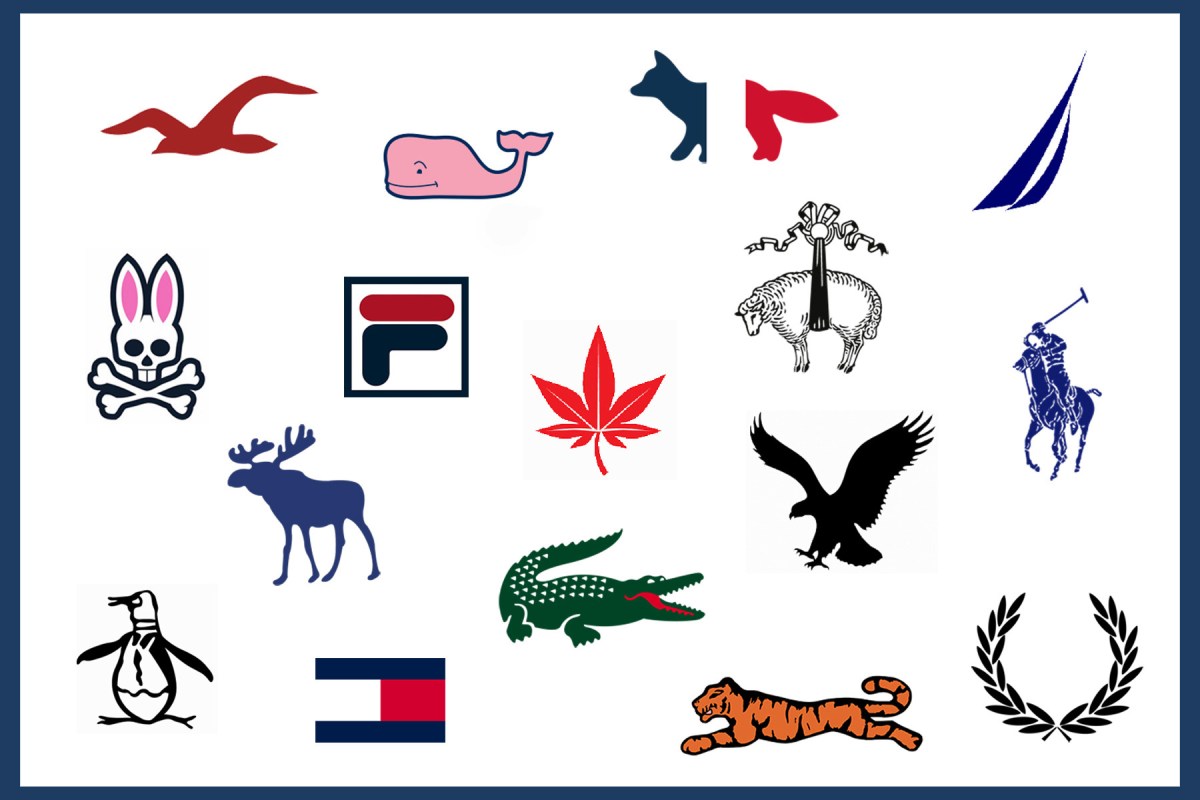
From tigers to crocs to penguins, boats to flags to whales, your correspondent and InsideHook’s editor-in-chief Walker Loetscher recently elected to debate and rank these logos from worst to best. As warm weather approaches, let our largely arbitrary and heavily biased opinions be your guide as to which graces your chest.
17. Vineyard Vines: Whale
D: It has zero gravitas. It looks like you’re wearing a shirt from a daycare center.
16. Hollister: Seagull
D: At least I think it’s a seagull? Could be a check mark. Unclear.
W: If Hollister is Abercrombie with a vaguely “Californian” twist, they could have at least gone with a condor. I bet the world’s most geriatric condor could still gobble up the beau idéal of seagulls entire.
15. Abercrombie & Fitch: Moose
D: Admittedly a moose is a pretty badass animal (they attack more people annually than bears do), but so many points deducted for the fact that A&F insisted on making these HUGE on their polos. No regard for established polo embroidery size norms.
W: I was kind of hoping the Abercrombie moose had some meaningful origin story — the company started out as a sporting goods outfitter, after all. But it seems it’s just some mid-’90s marketer’s idea of paying homage to a past the company has otherwise divorced itself from. Lame.
14. Tommy Hilfiger: Flag
D: I’m actually down for Tommy as a brand, I think they make more interesting stuff than they get credit for and despite the four-alarm dumpster fire that is our nation currently, I still dig their strong America vibes. But the flag is a snooze — while I get that it’s meant to be sailing-inspired, it’s too plain and geometric to have any true joie de vivre.
W: If Tommy Hilfiger were a country, I do not think I would voluntarily live there.
13. American Eagle: Eagle
D: I’m gonna cop to a strong bias here — I think this brand is wack and phony and it totally colors my opinion of the logo. Traditionally I’m very pro-eagle, I feel like if a brand I actually liked used this exact same thing I’d probably be into it.
W: Here’s the issue with most of these newfangled animal logos: they’re too self-serious. Look at the Lacoste croc (spoiler: it’s way higher up the list). That thing has some panache, some whimsy. You get the feeling it lets loose at the annual animal logo mixer. But these eagles and gulls and moose are just kind of … drab and boring. It defeats the purpose of putting an animal — rather than some genteel shit like a polo player or a hood ornament or an ascot — on there in the first place.
12. Nautica: Sailboat
W: Actual transcription of how this polo was invented: “What’s the whitest sport of all?” “Polo.” “It’s taken.” “How about sailing?” “Book it.”
D: Additionally, this “sailboat” falls into the same category as the Hollister seagull — is it a sailboat? Really? I’m all for abstraction, but this just seems downright lazy.
11. Fox: Fox
D: Not to be confused with today’s motocross apparel company, this Fox was apparently a J.C. Penney house brand in the ‘80’s meant to grab some market share/bucks from Lacoste and capitalize on the whole “save an alligator, shoot a preppy” bumper sticker campaign of the time. Not a bad design, but a terrible genesis and no lasting power (though you can find ‘em on secondhand sites).
W: I just had to plumb the depths of the internet to even find a photo of this thing. It’s an off-brand Le Tigre, no two ways around it.

10. Psycho Bunny: Bunny + Crossbones
D: Not super into their name, but this might be the only “new” logo on this list that I actually ride for — walks the preppy/punk tightrope pretty deftly, is simple and clean without being boring, and most importantly doesn’t take itself too seriously. The polo logo club is a tough one to break into, but I believe Psycho Bunny has done it.
W: Hard disagree. If I had a long-distance MySpace girlfriend who shopped at Hot Topic and for some inexplicable reason she took up golf, I picture her wearing this.
9. Brooks Brothers: “Golden Fleece” Sheep
D: This one gets points for sheer convolution: so it’s actually Brooks Brothers who popularized the original oxford version of the polo shirt with the button-down collar in the late 1800s, after early company president John Brooks spotted one at a polo match in England. The Brooks Brothers logo, however, dates all the way back to Philip the Good, the Duke of Burgundy who chose it for his Order of the Golden Fleece in 1430. So, Brooks Brothers co-opts logo of ancient Roman Catholic order of chivalry, goes on to co-opt and popularize an Indian sporting garment (the oxford polo) via Britain, has the name of that garment co-opted by a rival American clothier (Ralph Lauren) for a different garment (the piqué polo) he himself had co-opted from a French tennis player (Lacoste), then Brooks Brothers winds up putting their aforementioned co-opted ancient logo on said garment now named for rival American clothier. Got it.
W: I just want to point out that this one was recommended by executive editor Mike Conklin, who thought it was a dead sheep being raised to the heavens. Danny says it’s merely being prepped for shearing. Guess we’ll never know.
8. Maison Kitsuné: French Flag Fox
D: Even if it is a bit of a bite on the old Fox logo, that brand has been lost to the sartorial sands of time and Kitsuné’s tricolor treatment appeals to my inner Francophile. Plus they have excellent mixtapes.
W: I don’t even like France and I like this logo.

7. Original Penguin: Penguin
D: Now we’re getting somewhere. Whimsical but still stately and with a very solid origin story: in 1955, traveling salesman Abbot Pederson is delayed in New York, gets drunk, and stumbles into a taxidermist, where he elects to purchase a stuffed Penguin. Naming it “Pete,” he brings it on his flight, has a few more drinks, and proceeds to accidentally knock Pete’s head off. A flight attendant uses Pederson’s tie to reattach it, remarking, “He’s cute, I bet he’d look good on a shirt.” Even if this is total bullshit I still love it.
W: This is the kind of playful animal the polo logo was built for. Remember that while polo shirts are seen as relatively formal these days, when they were invented, they were literally the most casual thing a white-collar gent would ever wear in public — the 1950s equivalent of a graphic workout tee, if you will. So it was probably a right old GAS when your friend Edward showed up to the weekly bridge game with a penguin in a dinner jacket on his shirt. Oh, Eddie, you absolute CARD!
6. Boast: Japanese Maple Leaf
D: According to Boast, in the 1970s the company’s founders wanted an “irreverent” and “subtly subversive” answer to European tennis brands, and thus the Japanese maple leaf logo was born. Because weed. Sold.
W: Donald Young wore Boast at the US Open a few years ago and managed to whip a bunch of stodgy, fun-hating tennis fans into a frothing rage. Any company that can do that is OK by me.
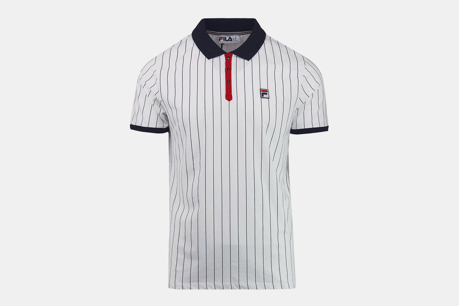
5. Fila: Capital F
W: You’ll notice that Fila is the only pure “athletic” brand on this list (we excluded Nike and Adidas, e.g.). The difference is that those brands were never “polo” brands. They might have made them (and still do, especially sport-specific ones for golf and tennis), but their polos never transcended sport to become fashion iconography. Bjorn Borg, Fila’s most famous constituent, is also the most stylish tennis player to ever walk this earth by some distance, and the striped Fila polos he favored are about as timeless a garment as you’ll find. How many other athletes can say they’ve inspired a Wes Anderson character?
D: Yeah, what Walker said.
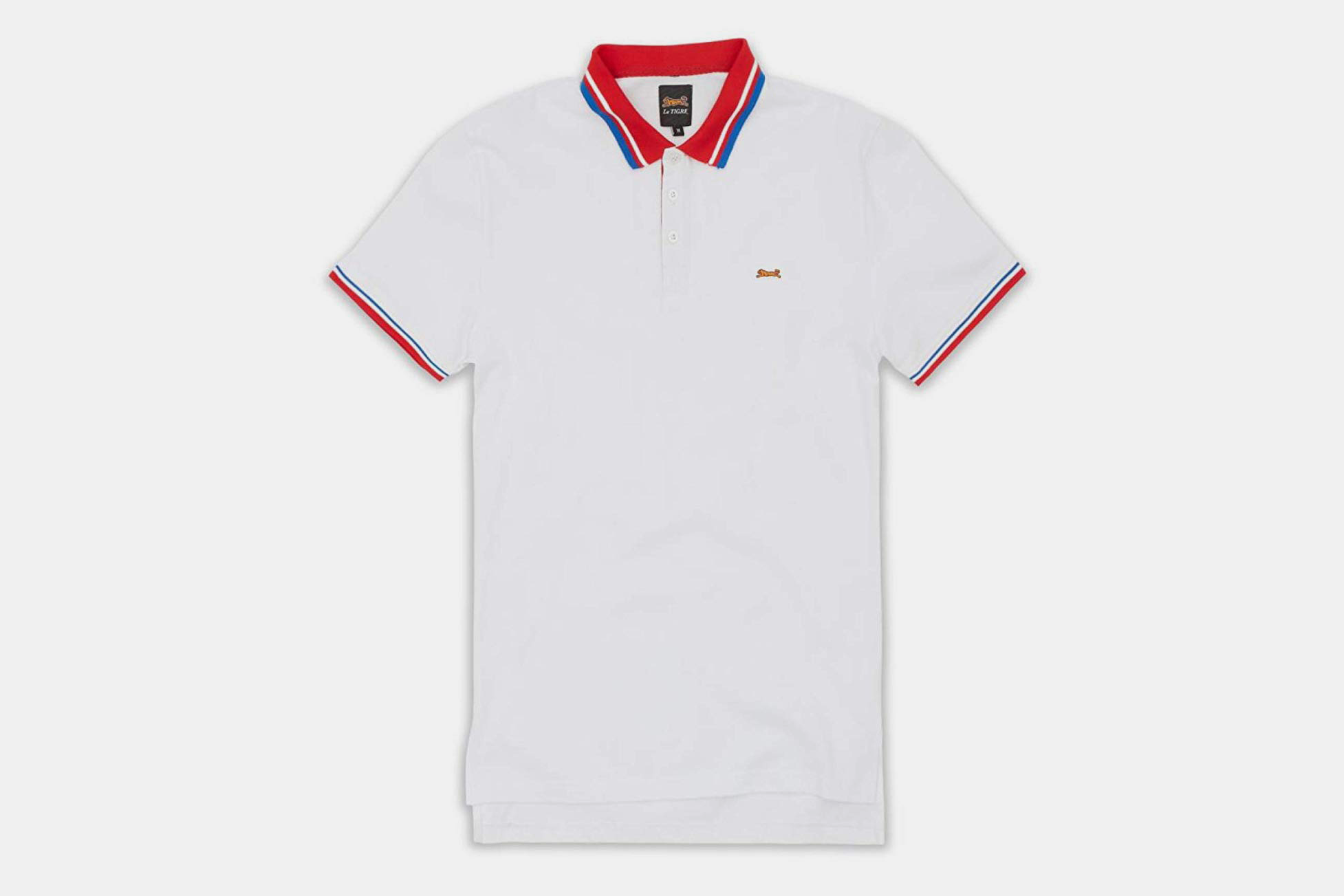
4. Le Tigre: Tiger
D: “I’m sewing tigers on my shirt. And alligators.” Any logo shouted out by the Notorious B.I.G. has achieved true icon status. Also bears noting that Le Tigre just relaunched and is doing some pretty killer stuff.
W: The next two animal entries on the list wrote the script for all the inferior animal logos listed above, and they remain the standard bearers. Notice the attention to detail: the various colors of thread, the white outline, the facial features. They are cartoonish without feeling childish, and in that there’s a timelessness that none of their imitators have quite been able to achieve.
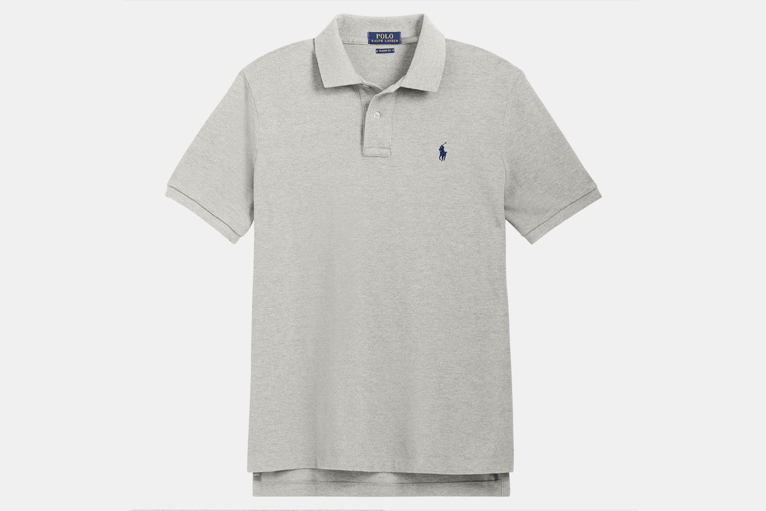
3. Polo: Polo Player
D: Despite the fact that Ralph Lauren (né Lifshitz) was approximately a half-century late to the bandwagon, credit must be given for making his polo player logo so inextricably tied to this style of shirt that it became cultural shorthand for the form (and also wound up coming full circle to actually be worn by polo players). In terms of America’s longstanding history of cultural appropriation, this has to rank right up there with pizza and yoga.
W: Lacoste shirts always fit me better, so I never got into Polo polos. But dammit, I respect them. The little man on the horse has transcended every scene, demographic, border and archetype. Bookmark this amazing history lesson from High Snobiety on the brand — that jaunty, mallet-swinging logo is an icon.
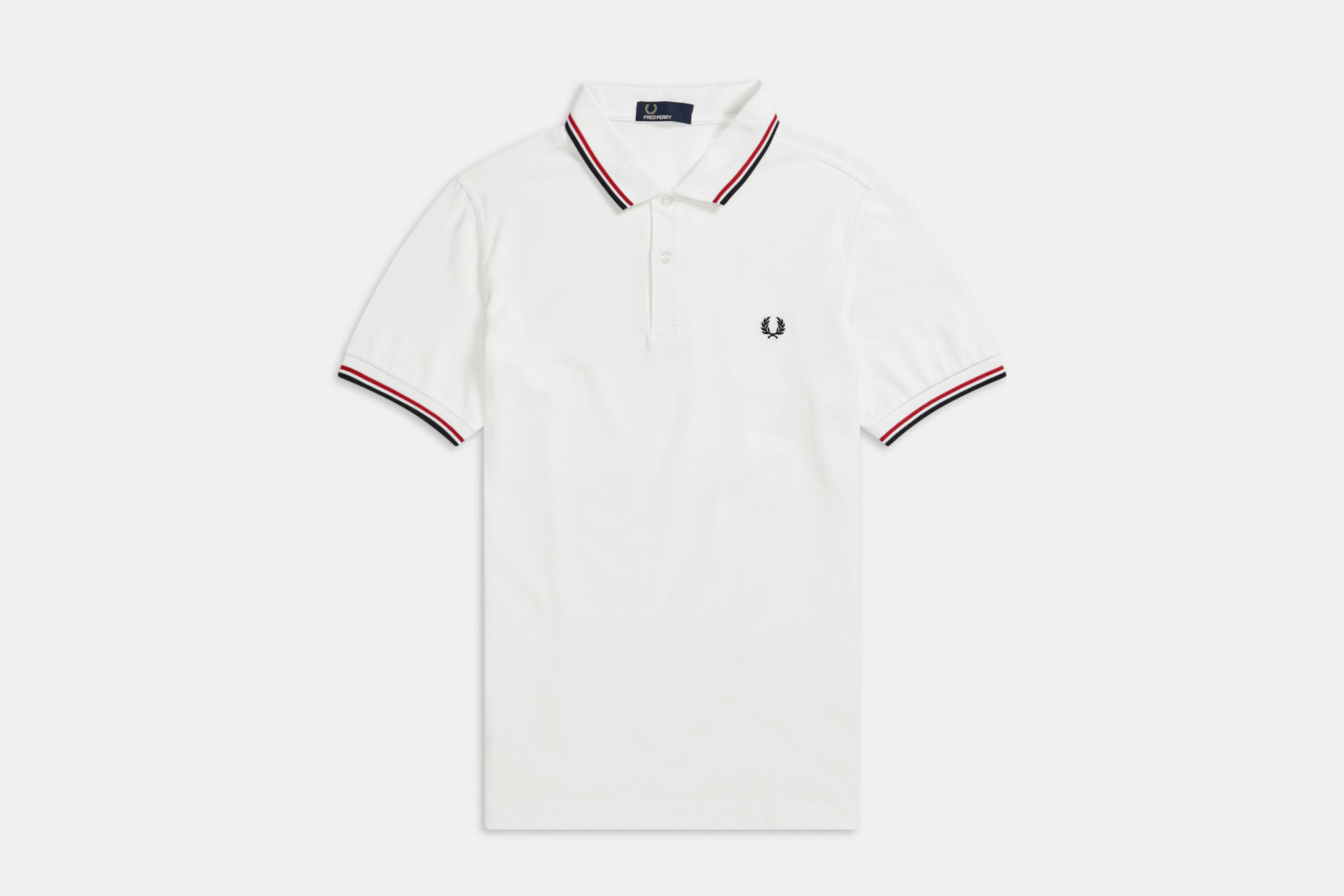
2. Fred Perry: Laurel
D: I think what makes Perry’s laurel so interesting is the sense of contrasting cultures it has become imbued with: designed as an homage to Wimbledon’s original logo, the Perry laurel originally connoted a sense of cultural exclusivity and aristocratic privilege. In the 1960s, however, Perry shirts were co-opted by mod culture, functioning as a subversive dig at English elitism on the part of young, working class Brits. The problematic fact that it was ultimately further co-opted by skinhead culture borne of the mod movement notwithstanding, the Perry laurel still carries a high/low vibe that I find very appealing. It’s classy, but tough.
W: It’s also far less ubiquitous than Lacoste, Polo et al. (at least on this side of the pond), so you get that bit of fringe-y hipster cool to boot.
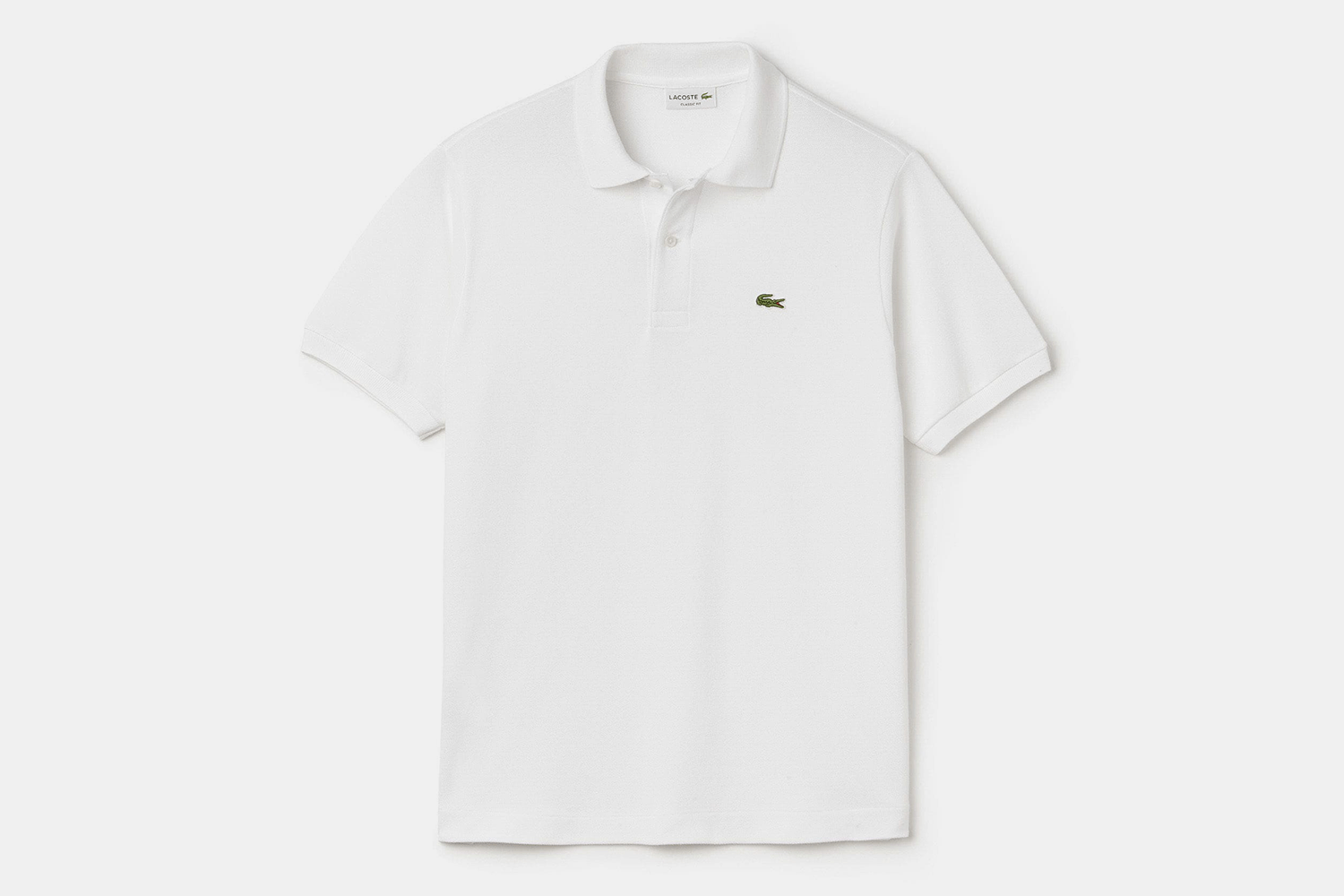
1. Lacoste: Crocodile
D: My point above re: Le Tigre is obviously applicable here as well, despite the fact that Biggie had his reptiles mixed up — the company’s logo is a nod to Lacoste’s nickname “The Crocodile,” bestowed for his tenacity on the court. Great nickname, great logo. Also doesn’t hurt that they, you know, invented the f*cking thing.
W: Look, it was invented by a tennis player, for tennis players, in the country where tennis was invented. The croc is the ur-polo logo, the proto-polo logo, the Cro-Magnon of polo logos. Everything that comes after — even the little guy on the horse to which the shirt owes its name — is and forever will be playing catch-up.
Meet your guide
More Like This


This article appeared in an InsideHook newsletter. Sign up for free to get more on travel, wellness, style, drinking, and culture..