In March, it was reported that the number of subscriptions to online video streaming services around the world reached 1.1 billion in 2020 — a 26 percent increase from 2019. The surge was an obvious product of the coronavirus pandemic, which kept viewers locked in their homes with not much to do besides binge watch TV.
Since the start of 2020, eight streaming services have launched, including AMC+, Paramount+ and Peacock. Big players like HBO Max and Disney Plus have enticed subscribers with exclusive content, like day-and-date film releases and a filmed stage adaptation of Hamilton, respectively.
The streaming wars are very much on. But the biggest battle the platforms are fighting is not with their competitors — it’s with their own terrible interfaces.
Assuming you’re among the billion-plus people who subscribe to at least one streaming service, there’s a very good chance you have your own gripes and frustrations with usability on even your preferred platforms. And you’re certainly not alone.
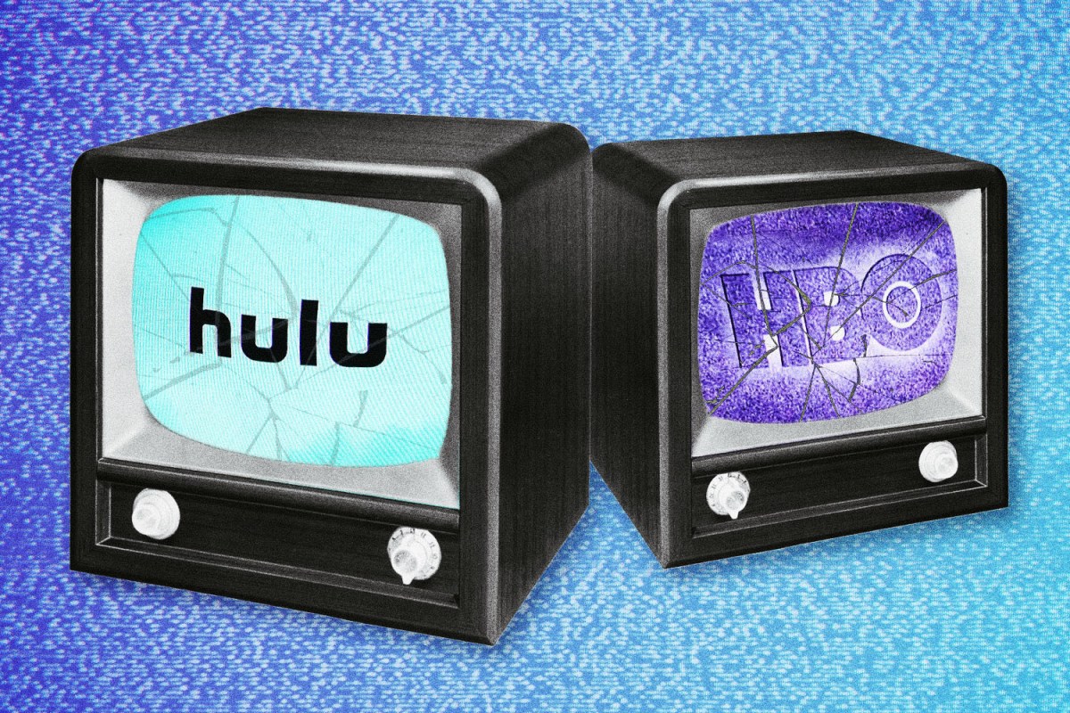
People’s inability to navigate HBO Max’s glitchy app, for example, is so commonplace that it’s become a meme. “The hbo max app is designed like they’re mad at you for using it,” tweeted user @JackWilliamRtF in early August. The tweet garnered nearly 318,000 likes and 29,000 retweets, with 700 replies from others users sharing their own bad experiences.
This past summer, users accessing HBO Max through Apple TV and Roku were met with a surfeit of problems and malfunctions. Besides issues with playback control and scrubbing, users have experienced freezes and repeated crashes when trying to play content, according to Vulture, who reported last month on HBO Max’s efforts to fix its buggy app. To HBO parent company WarnerMedia’s credit, they were aware their app was severely broken, and they scrambled to fix it. The problem, though, isn’t unique to them. Infuriating user functionality plagues nearly every popular streaming service.
Last month for Paste, writer Jim Vorel detailed his frustrations with Amazon Prime, writing that the streaming service’s video library has become “genuinely impossible to browse” and adding, “Personally, I have my own grievances with Hulu, a platform that, for whatever reason, refuses to pick up from where I left off and will, instead, restart the episode from the beginning or skip to the next episode even without me finishing the previous one.
For Mia Eltiste, a user experience (UX) researcher based in Austin, Texas, streaming platforms and their horrible interfaces have helped earn her a sizable following on TikTok. On her account, @heymiadotco, Eltiste roasts everything from shopping websites to dating apps for their bad user interfaces (UI) and UX design, but she has a significant amount of content about streaming services.
“The most frustrating thing is when companies don’t consider accessibility at all,” she tells InsideHook. “Without question, their UI needs to pass color-contrast ratios, [and] captions and audio descriptions need to be available and easily accessed.”
With the majority of problems Eltiste finds on streaming services, there’s a useful design functionality at play, but the context a user might be in when viewing content isn’t considered. “For example, letting users skip the intro but having the button disappear after three seconds doesn’t consider the fact that users might have to search for their remote or still want to skip the intro halfway through,” she says.
“System status” also plays a crucial role. This has to do with a system letting its user know where they are and communicating to them about what’s going on.
“A good example of this is on my Peacock roast, where you can’t see where you’re rewinding to. This affects the sense of control a user has, which can obviously affect the experience they’re having — humans like to have control, and when you take that away you increase the chance of a bad user experience.”
There are countless examples of seemingly small issues like these, and we could certainly keep going, but then we wouldn’t have time to ask the important question:
Why does bad UI/UX happen to good content?
“It seems like a cop-out to blame the technology, but we’re in a race. We’re in a technological race,” says Dominira Saul, the President, Principal and Co-Founder of strategic research and design firm DFFRNT and the former Director of the UX team for You.i TV. “When we are dealing with a hundred million people trying to all download the same content at the same time, and these websites are calling to servers and the servers are downloading content, that’s where a lot of the glitches arise.”
User experience is dependent on how viewers are accessing a streaming service as well. The main issues with HBO Max, as mentioned above, involved the software and smart TVs that were hosting the streaming application.
“If you’re HBO, Hulu or whoever, you have to deliver your platform to so many different devices and variations of those devices. And they all have proprietary technology,” Dan Rayburn, a streaming media expert, tells InsideHook. “Apple, Microsoft, Google, Sony, Roku, Amazon, Tevo don’t share the same technology.” Therefore, streaming services have to develop applications that work on each platform, along with software development kits (SDK), Rayburn explains, which is essentially the thing that makes a streaming service operate on a Roku or Amazon device. The moment the SDK changes or a platform like Apple TV rolls out a new update, it can break the technology HBO or Hulu created for that platform.
“Now they have to go back and debug it. They’ve got to look at what everyone’s complaining about and roll out an update,” says Rayburn. “It’s not always a problem with the [streaming service]. Sometimes these platforms make changes and it breaks things,” says Rayburn.
Okay, so technological difficulties happen, but what about the mind-boggling user interface functions? Why doesn’t Hulu mark an episode as complete even though there are only ten seconds of credits left, credits I will obviously not be finishing?
“Time and money are the biggest reasons,” says Eltiste. “To discover these issues, you have to do research and then redesigns, then test those, and then develop them — all before you can implement them. Also, you’re testing in a different environment, so you’re not going to notice everything that someone actually goes through.”
It’s not that issues with navigation, for example, are difficult for product design teams to tackle, says Viktor Golias, a Product UX/UI Designer, it just isn’t on the table to fix them because they might not be playing a significant part of business value. “I think product teams that have ideas for improving the UI have tiny budgets or those projects got deprioritized in comparison with initiatives that directly correlates with business growth, such as securing the best content,” he says.
“The biggest problem we have in the industry internally and externally is a lack of experts in consumer behavior involved in these projects,” adds Rayburn, who explains that the vast majority of streaming services are solely hiring data analysts instead of consumer behavior specialists.
“The biggest thing missing in the [streaming] industry, is the predictability because you can predict how somebody is going to behave depending on how you put information in front of them, and yet almost none of these services are hiring those people.” Save for Netflix.
Netflix: The Gold Standard
All of the experts I spoke with agreed that when it comes to streaming, Netflix does it best.
“Love it or hate it, Netflix is probably the best example out there of a streaming service user interface,” says Saul.
“Now, you have to understand how Netflix got to be where they are,” he adds. “They have a real heavy focus on usability. They have a heavy focus on research, on design, on testing. They’re constantly doing automated A/B testing. They’re constantly doing usability testing and constantly tweaking little bits and pieces of the interface to make it better.”
It’s why competitive services may seem substandard next to Netflix. You can’t simply recreate Netflix’s simple design, you need their depth of research.
“It’s easy to see Netflix as a whole and say, ‘Well, I’m just going to reproduce that. I’m going to make some swim lanes and carousels. We’re going to have a play button,’” says Saul. “But to remove that top layer and look at the mechanisms underneath that got them there, that’s not being reproduced in a lot of these streaming services. They’re trying to do the visuals. But they’re not doing the research. They’re not doing the design iteration underneath the covers that got Netflix to where they are. They’re just trying to copy what they see.”
Still, the storied streaming service is not without its own issues.
“Netflix is definitely the front runner, but there are still plenty of things to be improved,” says Eltiste who notes that the ability to filter search by which shows/movies have audio descriptions (AD) available would be an extremely helpful asset to those visually impaired. “Netflix is better than most in that they at least label a series with ‘AD’ if it’s available, but that’s still more work than it should be.”
Netflix also doesn’t trigger ads or offer live content, features many other streaming services have, which shields them from potential technological blunders. HBO Max’s launch of a new $10 ad-supported tier in June as part of the reason it bugged out, according to Vulture.
It’s why (as much as we like to) comparing streaming services is like comparing apples to oranges. “People will say, ‘Oh, Peacock, hasn’t been that good. There are all these issues with ad triggering. Netflix doesn’t have that issue.’ Well, Netflix isn’t triggering ads. Netflix isn’t doing live sports.”
So what should streaming services companies be doing about all these criticisms?
Well, the obvious answer is to listen to their consumers.
“It’s painful to listen when people are actually denigrating or criticizing the work that you do. I’ve seen some of these design teams in some of these organizations. They’re dedicated. They’re talented. They know what they’re doing. A lot of the time it’s not necessarily even the design team, it’s often the organizational structure that’s the hindrance,” explains Saul. “But the number one thing is listening to that criticism and taking it to heart because they’re the end-users. That’s your customer base.” Especially because glitches and frustrating UI/UX design can have an impact on subscriptions.
“I stopped using HBO Max completely because it was too heavy and kept crashing,” notes Eltiste.
In a market as saturated as streaming, consumers are overwhelmed with choices. While content is still king, usability and user experience is going to have a real impact on a company’s success.
“People have ample amounts of streaming services to choose from, they don’t have to put up with poor service,” adds Eltiste. Companies that want to succeed in the streaming market need to prioritize user experience.”
Meet your guide

More Like This


This article appeared in an InsideHook newsletter. Sign up for free to get more on travel, wellness, style, drinking, and culture..