It feels like just yesterday that I was writing a note very similar to this one, explaining why, at a moment’s notice, our old website had disappeared and given way to a better, smarter, handsomer one. (OK, it wasn’t yesterday — it was actually April 12, 2019.)
The truth is that like the men for whom we claim to be writing, InsideHook is a work in progress. We prize self-awareness and self-evaluation, and when there is room for improvement, we embrace the process of making it.
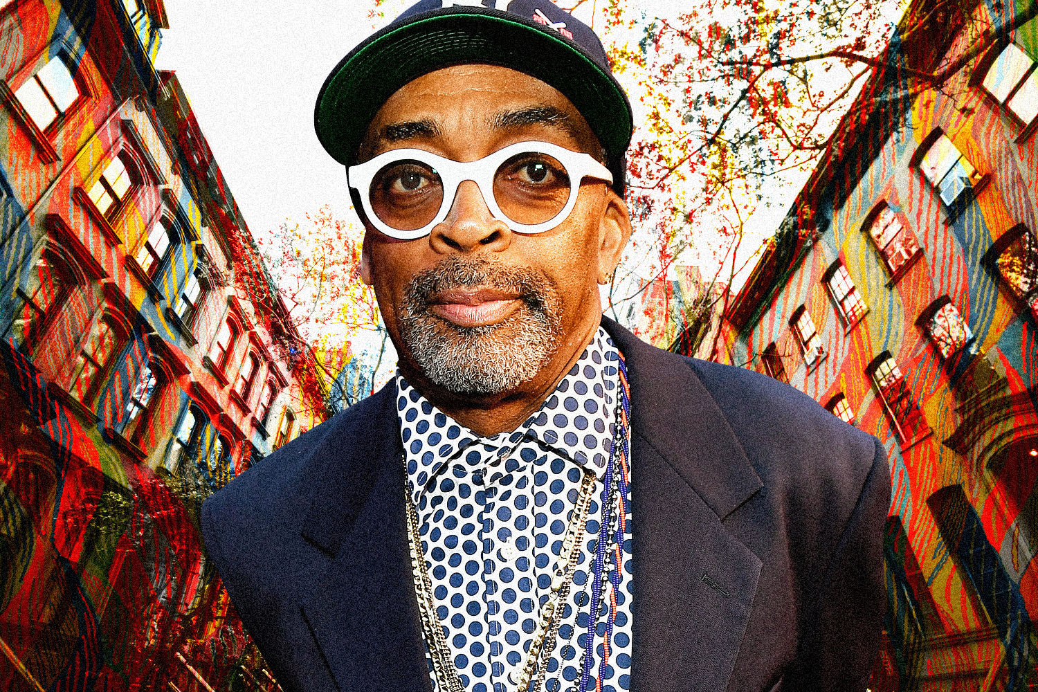
One such improvement arrived late last year, when we had the opportunity to re-hire our beloved former art director, Mike Falco. We had been without his services for more than a year, and it showed. We had a new website and new email templates that functioned better and provided a more seamless user experience, and we were recruiting superlative new writers like Charles Bramesco and Elyssa Goodman and Elon Green and Nadja Sayej. Still, something was missing: a strong, cohesive visual identity.
And so Mike assessed the situation, said, “Yeah, this could use some work,” and set about re-designing our website. It’s been a long process with its share of debates around arduous topics like serifs and font widths and how gray is too gray?, but as of today, it’s a successful one.
What, exactly, were we hoping to achieve? I’ll let the architect explain that.
Says Mike:
“We’ve always been a publication dedicated to showing men how to live their best life. But when we started taking on the brand refresh, I had to step back and really ask, ‘What does it mean to be a man in 2020? And what does it mean to live your best life?’
Masculine identity, values of self worth and satisfaction — these constructs evolve. So the strategy was to create a system that could deliver our content in a way that could adapt with the discussion of masculine fulfillment while being impartial, direct and fun.
We have an amazing staff of writers and artists who work tirelessly to bring you great content every day, and I wanted them to be at the forefront. From a visual standpoint, it was important for the content to dictate the experience, not some flashy branding. The typography is timeless and easily legible, and the color palette is overtly neutral, with color used sparingly to direct the reader’s attention.”
In other words, we wanted to get out of our own way and let the work do the talking.
It’s a lesson we think every man could stand to learn from. Remember: work in progress.
Walker Loetscher
Editor in Chief, InsideHook
P.S. Thoughts? Comments? Want to challenge me to a duel? You can find me at talktowalker@insidehook.com.
Meet your guide

More Like This
This article appeared in an InsideHook newsletter. Sign up for free to get more on travel, wellness, style, drinking, and culture..