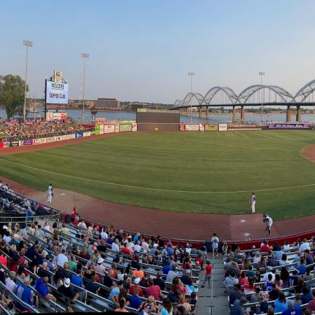
Minor League Baseball is typically more fun than Major League Baseball. The games are extremely affordable, the promotions are over-the-top, and the beer is drastically cheaper. Rather than shell out 100 bucks or so for somewhat decent tickets and a couple beers at a Cubs or White Sox game, why not take a short trip to a nearby Minor League park?
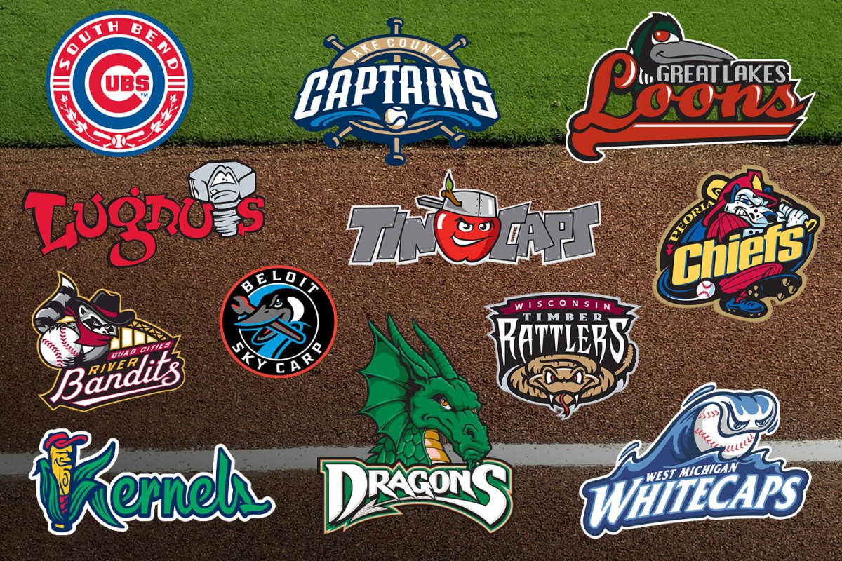
We’ve ranked the 12 teams in the Midwest League by three criteria: team name, logo and hat. You may want to just see the Minor League affiliate of the team you root for, but where’s the fun in that? This is about dumb names and dumber hats. Play ball!
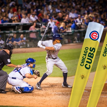
12. South Bend Cubs (Cubs affiliate)
I love the Cubs. I’m a big Cubs fan. But the name is boring, and the logo and hat are just good takes on pre-existing alternate logos and pre-existing Cubs gear. If you’re going to get one Cubs affiliate hat, go with the Tennessee Smokies.
11. Peoria Chiefs (Cardinals affiliate)
Eh. It’s a fire dog because they’re fire chiefs, not racist chiefs like the NFL team, so that’s good. But it’s still boring. It doesn’t help that they’re a St. Louis Cardinals affiliate.
10. Dayton Dragons (Reds affiliate)
Seems like a made-up team used in an early Nintendo game. Anyone else want to play some Baseball Stars?
9. Wisconsin Timber Rattlers (Brewers affiliate)
Great name, lackluster hat, just bad logo.
8. Great Lake Loons (Dodgers affiliate)
Eh. The name is better than the logo. The hat and all their gear looks like Division II college football merchandise.
7. West Michigan Whitecaps (Tigers affiliate)
Oh, interesting. What’s a whitecap? I don’t think of big surf when I think of Grand Rapids. But their alternate persona (which is something minor league teams can do?), The Beer City Bung Hammers, is a way better name for way obvious reasons. Grand Rapids was named “Beer City USA,” and the Whitecaps changed their name and logo to the Beer City Bung Hammers for one game on August 4, 2018. Now they do it every season. They’ll be the Bung Hammers this year on Friday, August 18, 2023. So on Friday, August 18, 2023, they’ll jump from the seventh best to the best.
6. Beloit Sky Carp (Marlins affiliate)
Yes. This is confusing. I am a fan. I want to know more about this carp. Bonus points for the team sticking to their big league affiliate color scheme (Miami Marlins). Bonus points for the team realizing they intentionally chose a confounding name. There’s an explainer page on their site. This is the best line: “A slang term for a goose that does not migrate in the winter, instead preferring to stay in its home city, the Sky Carp name represents the city of Beloit — a flourishing, innovative town so vibrant and strong that no one wants to leave.” Isn’t that great! The Beloit tourism board couldn’t have written better copy.
“Simple Sabotage” — The CIA’s Guide for “Rascally Spies”
America’s WWII advice for citizen saboteurs included telegram tampering and giving bad directions.5. Lansing Lugnuts (A’s affiliate)
Easily one of the best team names. But the logo is lacking. It looks like it was designed for a children’s television program about tools that play baseball, which is fine, but not memorable. The hat is blech. It’s not surprising that an Oakland A’s affiliate does one thing right and the rest very wrong.
4. Lake County Captains (Guardians affiliate)
Now this is a Minor League logo! It’s a dude’s face! A dude that has lived a life, like a Lake County captain! Why isn’t the alternate hat the main hat! Make it the main hat! The current main hat is not good. No one cares about a lighthouse and a big C — it looks like the Wizards logo mashed up with the old Cleveland Indians hat. Just make the players wear the dude on their head!
3. Quad City River Bandits (Royals affiliate)
This name and logo combo is great — it’s just not as good as its alternate logo. The bandit in a bandana mask and cowboy hat is good. The alternate hat with a paw gripping a baseball is even better.
2. Fort Wayne TinCaps (Padres affiliate)
This is how you do it! What exactly is a tincap? Why is it a team name? Why is the logo an apple wearing a tin pot as a hat? Why does the tin pot have a branch growing out of its side? This is exactly the kind of confusion that is perfect.
1. Cedar Rapids Kernels (Twins affiliate)
This is how you do it even better! We all know what a kernel is, and we all know where kernels come from (corn, corn grown in Iowa). It’s the ideal marriage of location, name and logo. And the hat — the hat may be the best hat in baseball. It’s navy blue. The logo is corn with an evil grin. But it’s not a corn — it’s a baseball bat, and for some reason the bat was grown the same way corn grows? The corn/bat husks that have peeled off make a K. And the bat is wearing a red hat. Perfect. It’s hat-on-hat, it’s a mascot reminding you the team name starts with the letter K. It’s the Brewers classic logo meets Minor League absurdity.
Meet your guide
More Like This
The Charge will help you move better, think clearer and stay in the game longer. Subscribe to our wellness newsletter today.