For the past two decades, Paul Lukas been writing about sports uniforms, logos and field designs via Uni Watch, a column that has appeared on ESPN.com and Sports Illustrated as well as its own dedicated daily blog. Now he’s bringing his obsession — the aesthetics of athletics — to InsideHook.
Just about everyone agrees that the Tampa Bay Buccaneers need new uniforms — and fast. The problem is figuring out how to fix them.
The Bucs present an unusual challenge. Unlike most teams, which at least stick with the same basic color scheme even if they tinker with other aspects of their uniforms, the Bucs have had two radically different uniform eras. From 1976 through 1996, they wore orange and white (a combo that led to their uniforms becoming known as the “Creamsicles”) and had Bucco Bruce (an Errol Flynn-like swashbuckler mascot) plastered on their helmets. Those uniforms were almost universally derided back in the day — in part because no NFL team had worn that color combo before, in part because many fans thought Bucco Bruce “looked gay,” and in part because the Bucs were a perennially awful team. Most fans today, though, agree that Bruce and the Creamsicles look better when viewed through the lens of nostalgic hindsight. (For a while, the old uniforms were periodically revived as throwbacks, but the NFL’s current helmet rules have made that impossible since 2013.)
In 1997, the Bucs shifted gears and scrapped the Creamsicles. Orange and white were out, replaced by red and a dark, metallic tone called pewter that had never been seen before in the sports world. Bucco Bruce was sent packing as well, supplanted by a variation on the Jolly Roger flag.
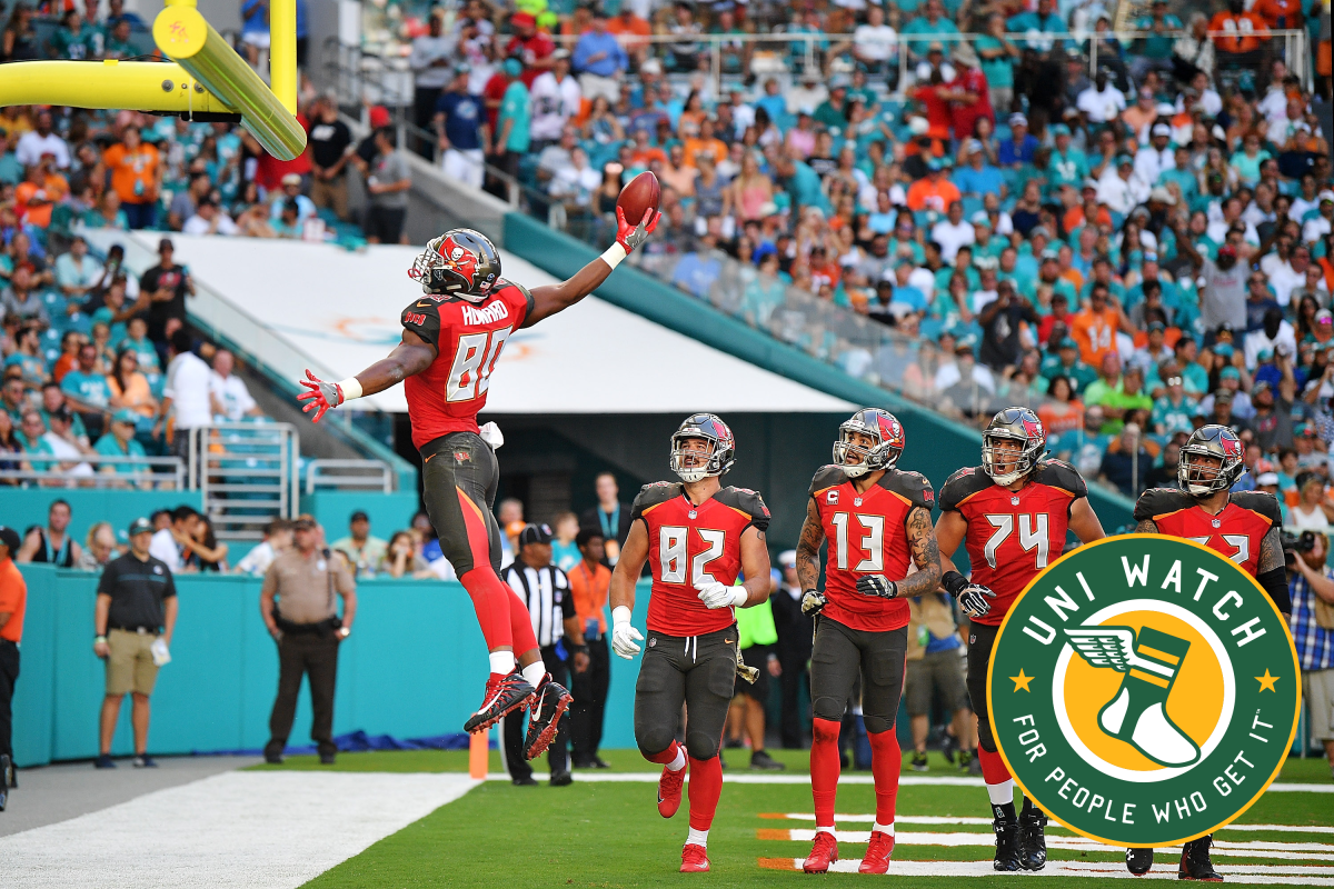
All of which was fine until 2014, when the Bucs and Nike conspired to create the team’s current aesthetic trainwreck. The digital-alarm-clock numerals, the oversized helmet logo, the pewter shoulder yoke, the partial pants striping, the wordmark on the sleeve … it’s a disaster.
But if we’re going to redesign the Bucs, what’s the best way to go about it? Should we bring back the Creamsicle color palette, or stick with red and pewter, or even find a way to merge them? Similarly, should we exhume Bucco Bruce, maintain the Jolly Roger, merge them into a hybrid or just blow everything up and start over?
We posed those questions to Uni Watch readers a few weeks ago, challenging them to redesign the Bucs. They came up with lots of intriguing solutions. Below, you’ll find the best and most interesting design concepts they submitted (click on all of the designs to see larger versions).
Best Overall Design: Dan Bodurtha
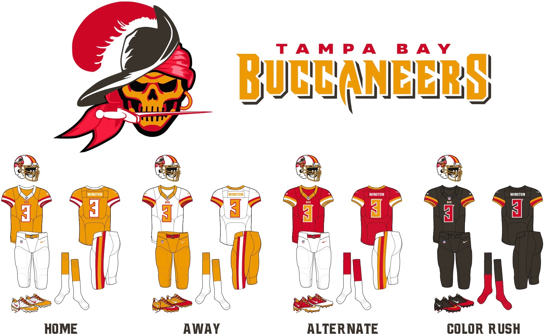
Dan Bodurtha did the best job of combining elements from the Bucs’ two primary uniform eras, beginning with his logo: a skull version of Bucco Bruce (an idea, it should be noted, that was also used by many other contest entrants). His white helmet with orange and red trim should work well with his home (orange), road (white) and alternate (red) jerseys, all of which look sharp. His solid-pewter Color Rush design would look ridiculous on the field, but the same goes for most of Color Rush uniforms in real life, so it’s mostly a wash. All in all: Very nicely done! (If you want a closer look at Bodurtha’s individual uniform designs, look here.)
Best Updated Creamsicles: Angus O’Keefe
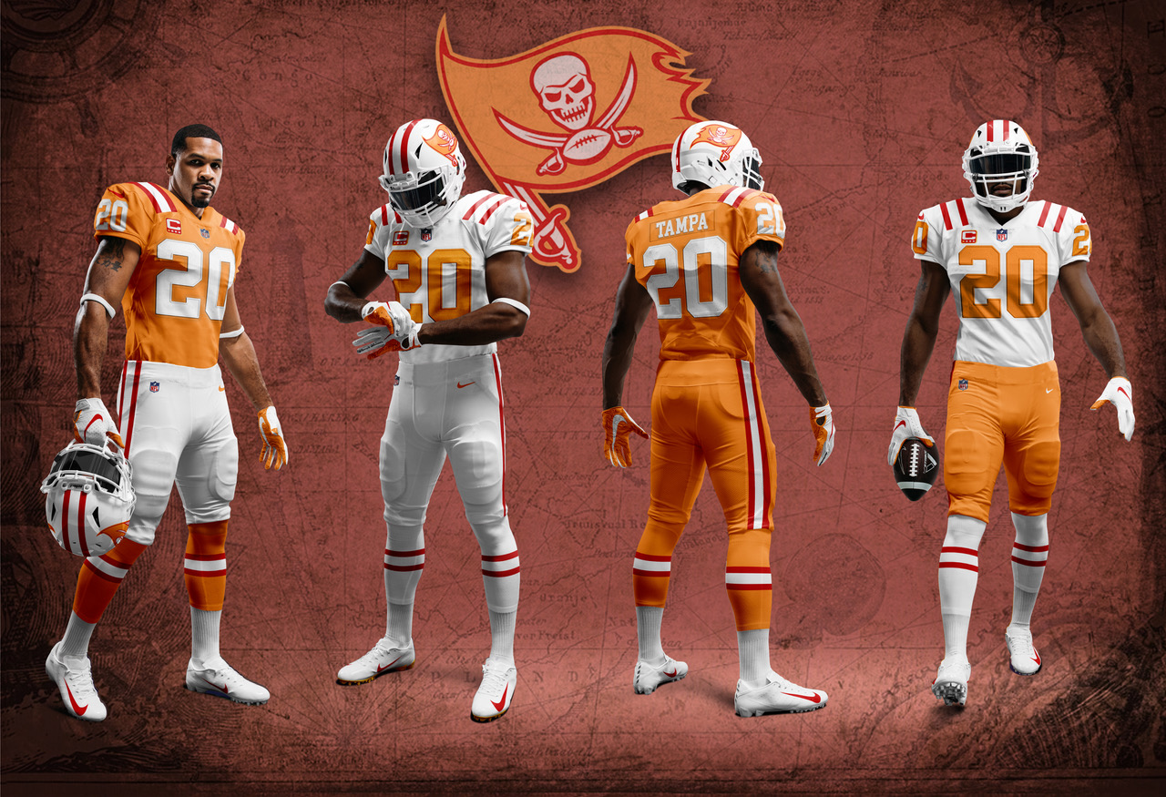
When we announced this contest, lots of people responded on social media by posting photos of the old Creamsicle uniforms and saying, “There — done.” And sure, just bringing back the old look would be an easy fix. But Angus O’Keefe took a more nuanced approach by keeping Bruce mothballed and instead creating an orange version of the team’s current pirate flag helmet logo. Not bad!
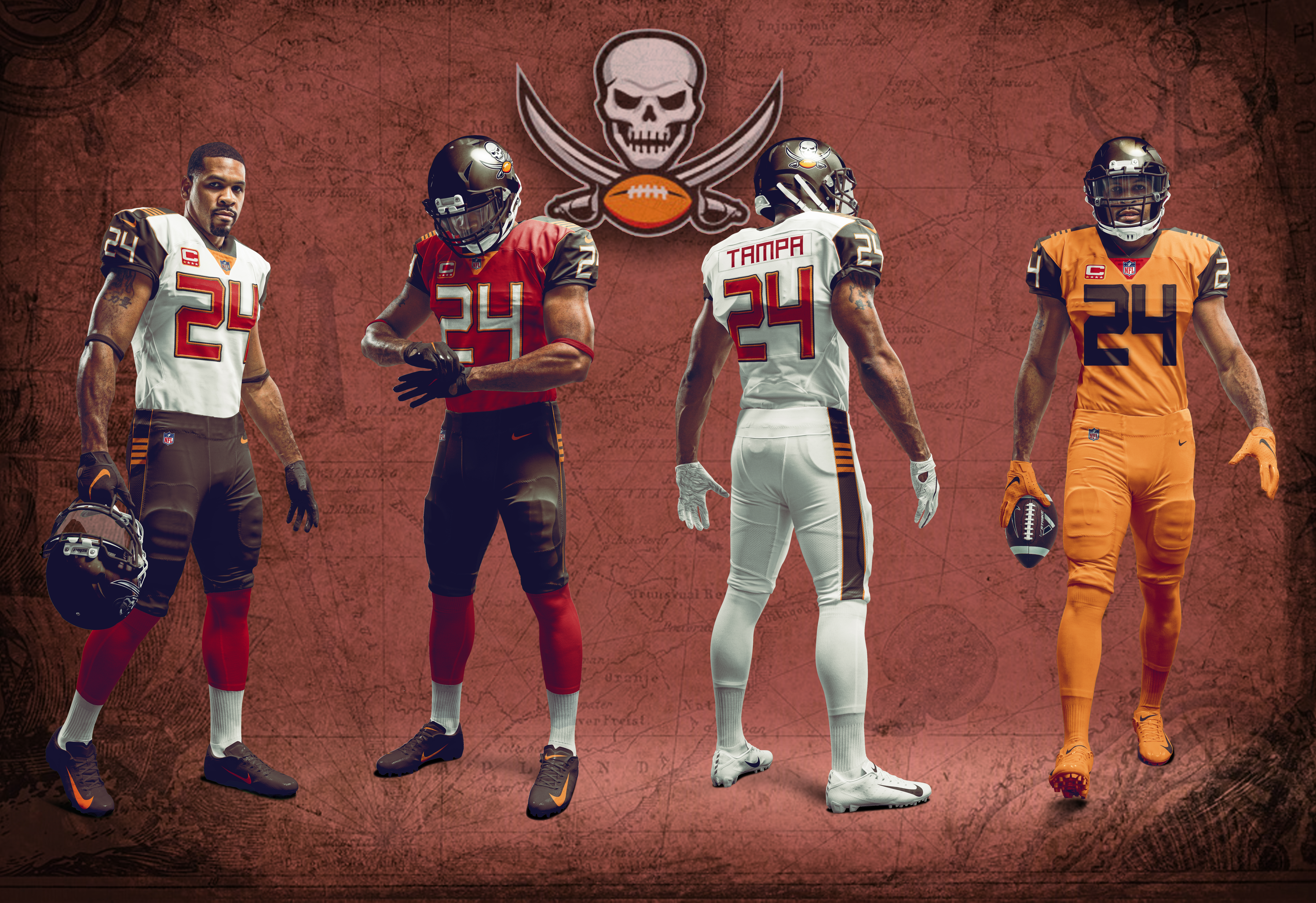
While we’re at it, O’Keefe also came up with a very serviceable reimagining of the team’s current look. If the Bucs are determined to stick with pewter and red, they could do a lot worse than this.
Best Use of Red: Matt Skipper
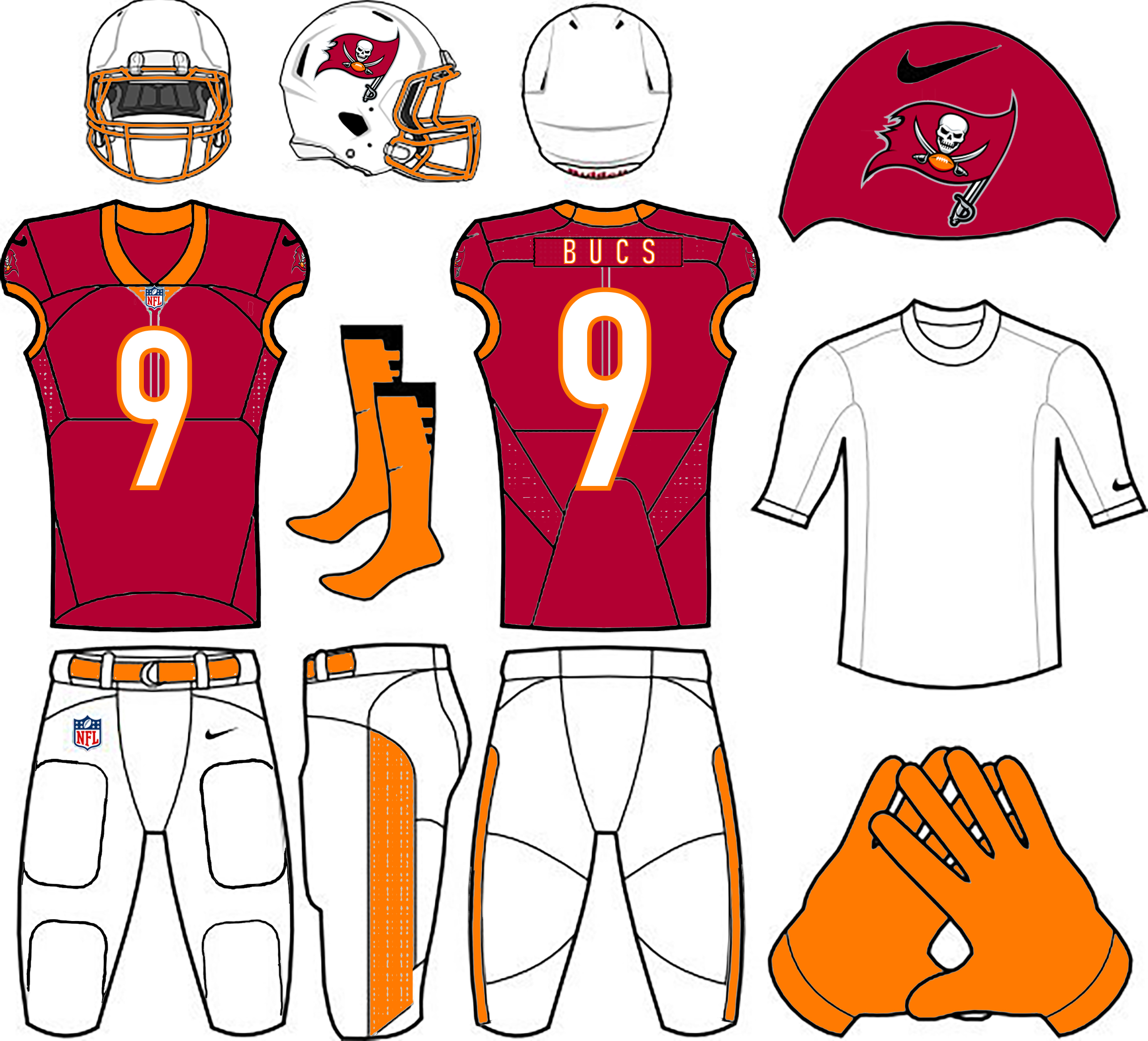
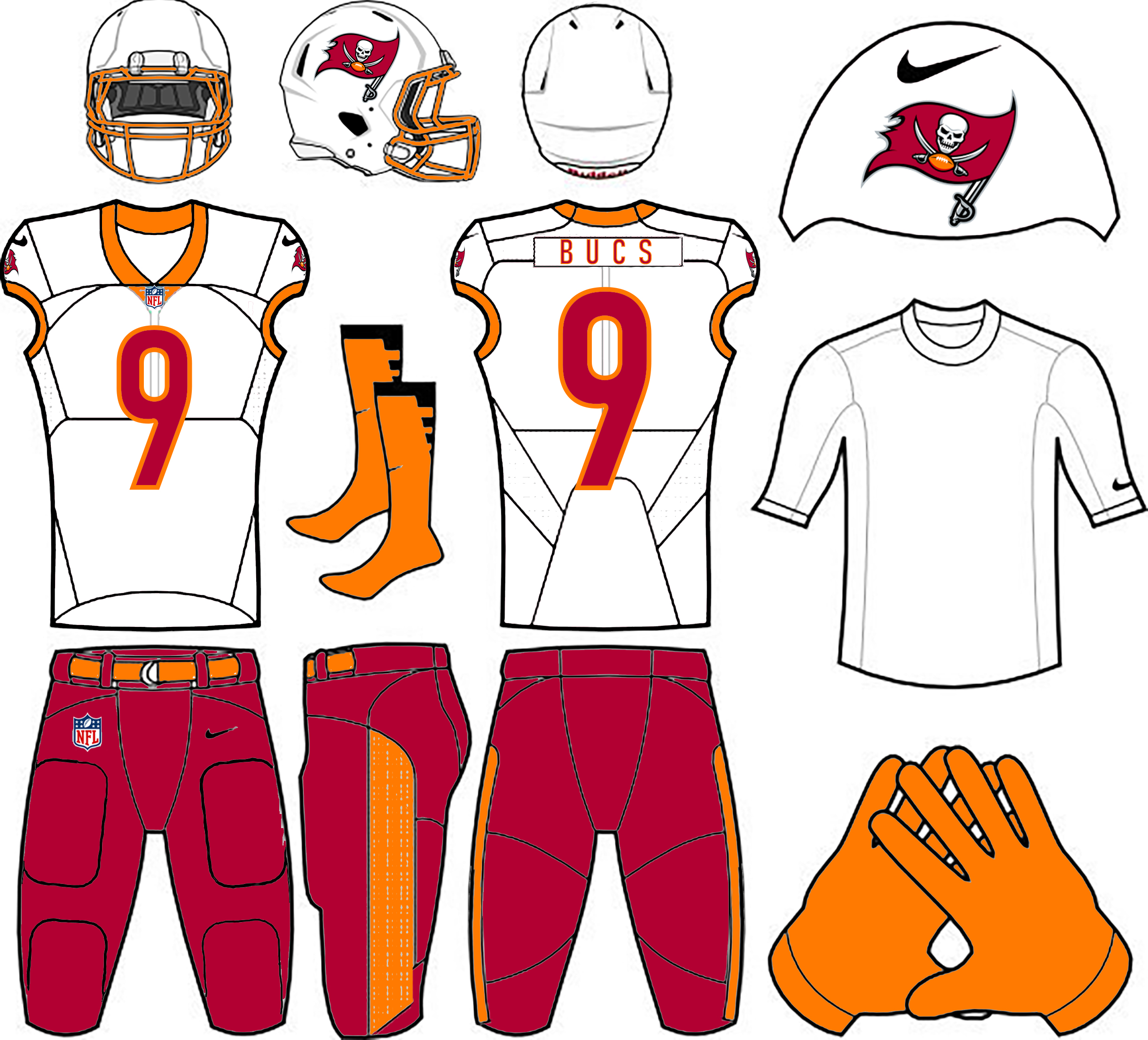
The original Bucs wore orange with red trim. Then they wore red with pewter trim. Ah, but what if they wore red with orange trim? Matt Skipper has given us a peek at what that might look like, and the results aren’t bad at all. The Uni Watch contest judging panel especially likes the red road pants.
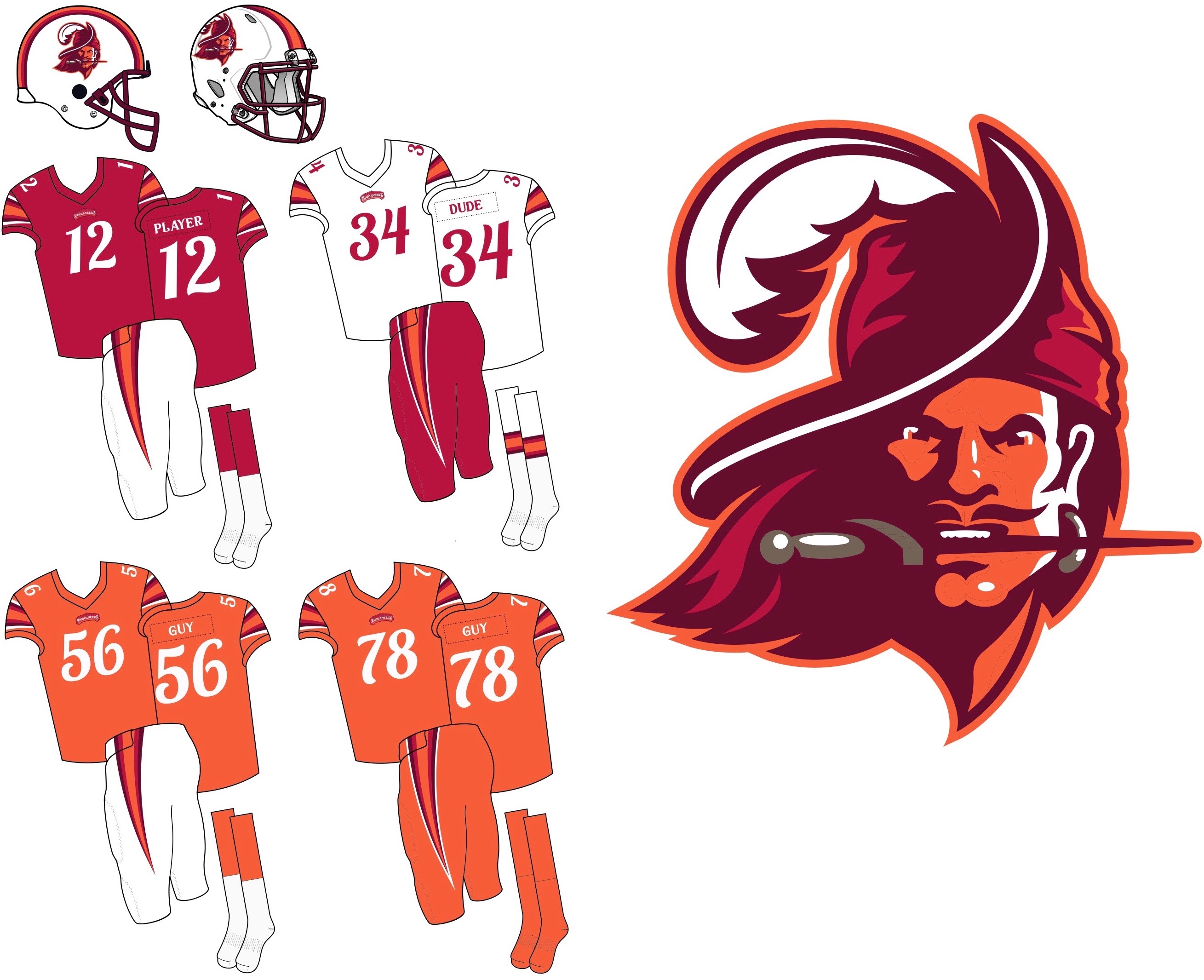
Honorable mention in this category goes to Sean McCarthy, who came up with a similar red/orange approach and added a much ruddier version of Bucco Bruce (plus he gets bonus points for putting “Player,” “Dude” and “Guy” on the nameplates of his jersey mock-ups):
Best Use of Black: Mark Morgan
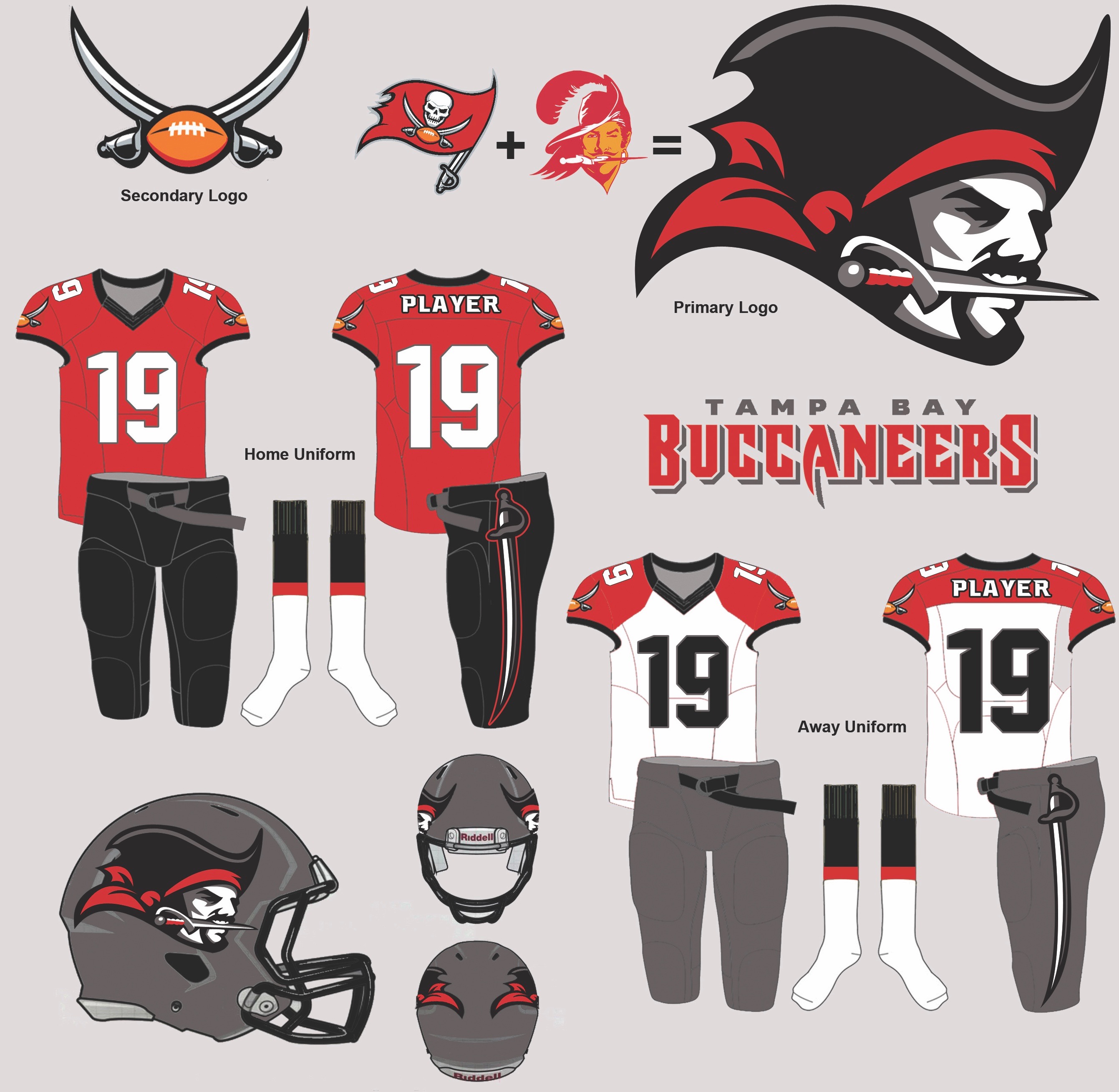
Black is such a tired cliché in sports design. The Bucs have never used it except for socks and minor trim, but Mark Morgan’s designs show that it could work surprisingly well with the team’s pewter look. His buccaneer logo character feels more original than most of the Bucco Bruce retreads that were submitted, too. The sword down the side of the pants is the kind of thing that probably looks better on a computer monitor than it would in real life, but it’s an interesting idea. Good work.
Best Mascot: Tom Bierbaum

Whenever we run one of these contests, reader Tom Bierbaum submits hand-drawn renderings and always includes an old-school goofy mascot character. He’s really outdone himself this time, as his “Bucco Bird” — basically a football-playing combination of Bucco Bruce and a pirate’s parrot — is a winner.
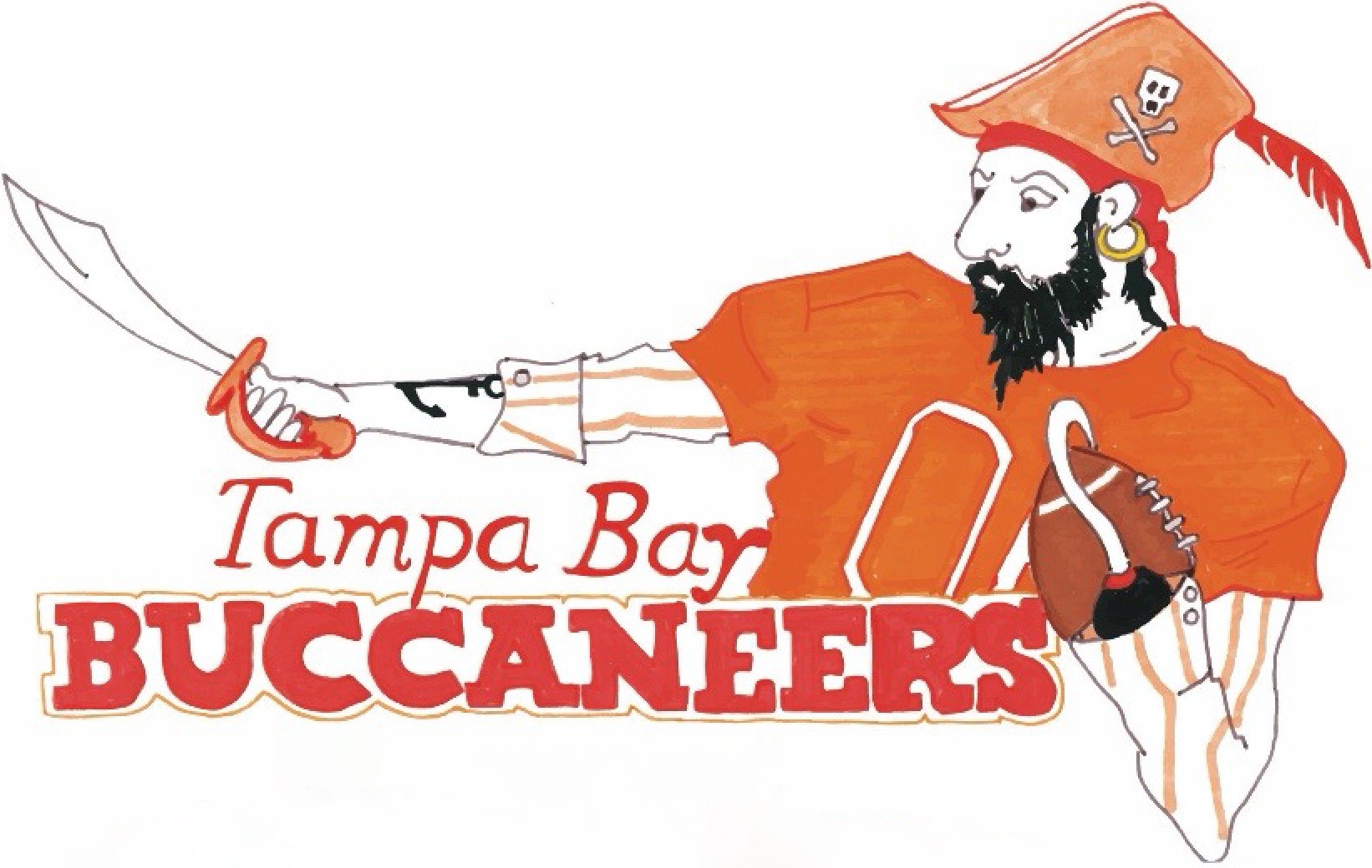
Honorable mention goes to Tyler Cohen, who came up with a football-playing Captain Hook-like mascot — complete with a hook to cradle the ball:
Best Presentation: Tim Fesmire
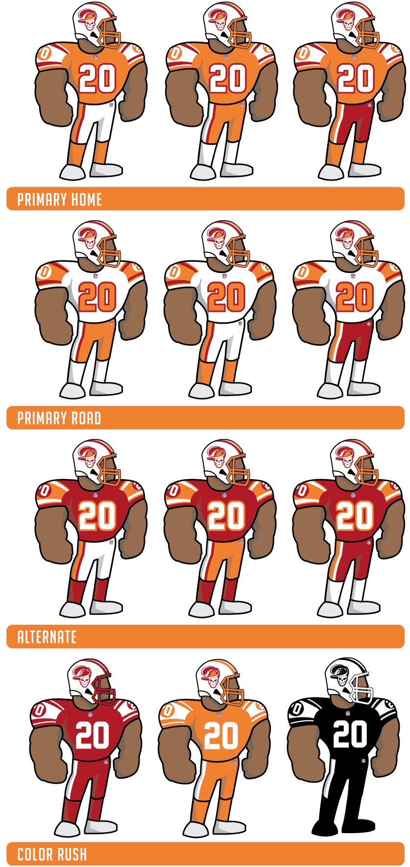
When you’re staring at hundreds of designs, many of them created with the same templates over and over again, it can feel like a relief when you come across one that feels fresh and playful. So I hereby raise a pirate’s cup of grog to Tim Fesmire, whose uniform designs, which aren’t bad on their own, are definitely enhanced by his cartoonish little player mannequins. Remember, kids, presentation counts!
Those were the most notable entries. Want to see more? You can view all of the design submissions we received here.
Paul Lukas has been writing about uniforms for over 20 years. If you like this article, you’ll probably like his Uni Watch Blog, plus you can follow him on Twitter and Facebook. Want to learn about his Uni Watch Membership Program, check out his Uni Watch merchandise, or just ask him a question? Contact him here.
Related: The Uni Watch 2019 NBA Season Preview
The Charge will help you move better, think clearer and stay in the game longer. Subscribe to our wellness newsletter today.
