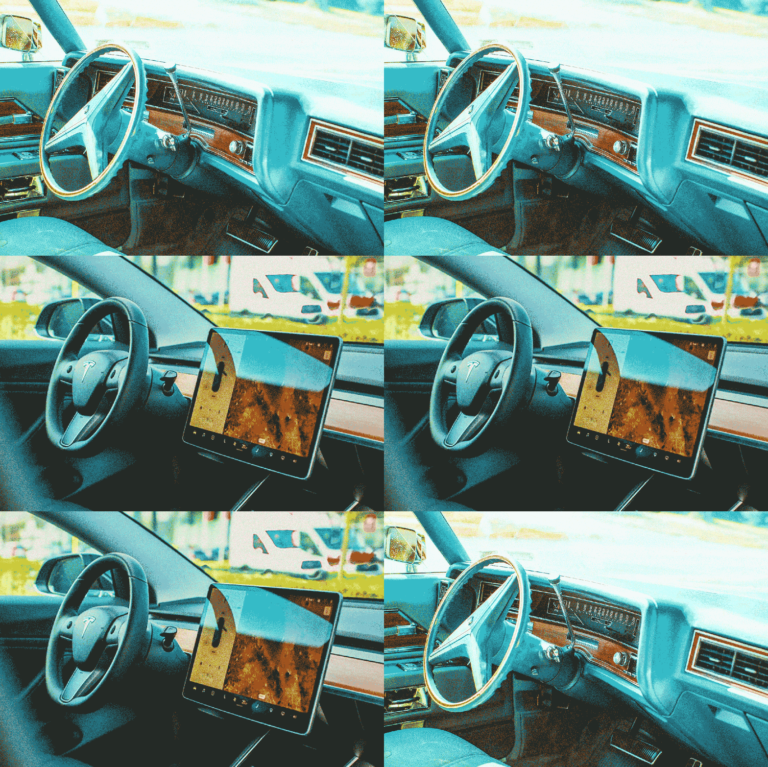
The automotive touchscreen has become a ubiquitous aspect of the modern driving experience, with only a handful of low-buck entry-level models able to escape that glowing rectangular eye on the center stack.
It wasn’t always so, of course. For decades in-car entertainment was accessed exclusively via buttons and knobs, with climate controls relegated to dials and sliders of their own perched helpfully nearby. Navigation was unheard of, and making a call from the road meant holding a heavy brick of plastic to the side of your head, corded to an even bulkier hunk of metal precariously balanced on the transmission tunnel or the seat beside you.
Is it any surprise that designers dreamed of a way to smooth out dashboards and simplify control sets? And does it come as a shock that there were only a few automakers out there willing to pioneer a (very expensive) path towards the future using technology that was barely in its infancy, or in some cases, had yet to actually be invented?
Welcome to the clunky world of early touchscreens and controls, which did their best to corral electrons and transmit driver commands through the ether to be processed by what passed for cutting-edge computing back in the late 1970s and early ’80s. While they may not have made a major dent in the market at the time, these proto-touch displays and keypads shifted the minds of product planners and marketers in a new direction, ultimately paving the path for the Tesla-type tablets and Porsche full-dash displays that represent the current state of the art.
Reach, Meet Grasp
Aston Martin was a small company with limited resources when it launched the eye-catching Lagonda sedan in 1976, but that didn’t stop designer Robert Town from stuffing it with equipment and features that far exceeded existing engineering capabilities. Leaving aside the complexities of its exceedingly finicky drivetrain, the Lagonda earned a spot in history by daring to be the first car with both touch technology and LED/CRT displays inside the cabin.
The former took the shape of surfaces that would be familiar to anyone who grew up as part of the Speak ‘n Spell generation: small and flat “membrane” switches that relied on touch pressure to be activated. Nearly a full 40 of these were scattered throughout the car, many of them arrayed on a shelf behind the steering wheel in the form of difficult-to-distinguish white circles framing lowercase text describing their function.
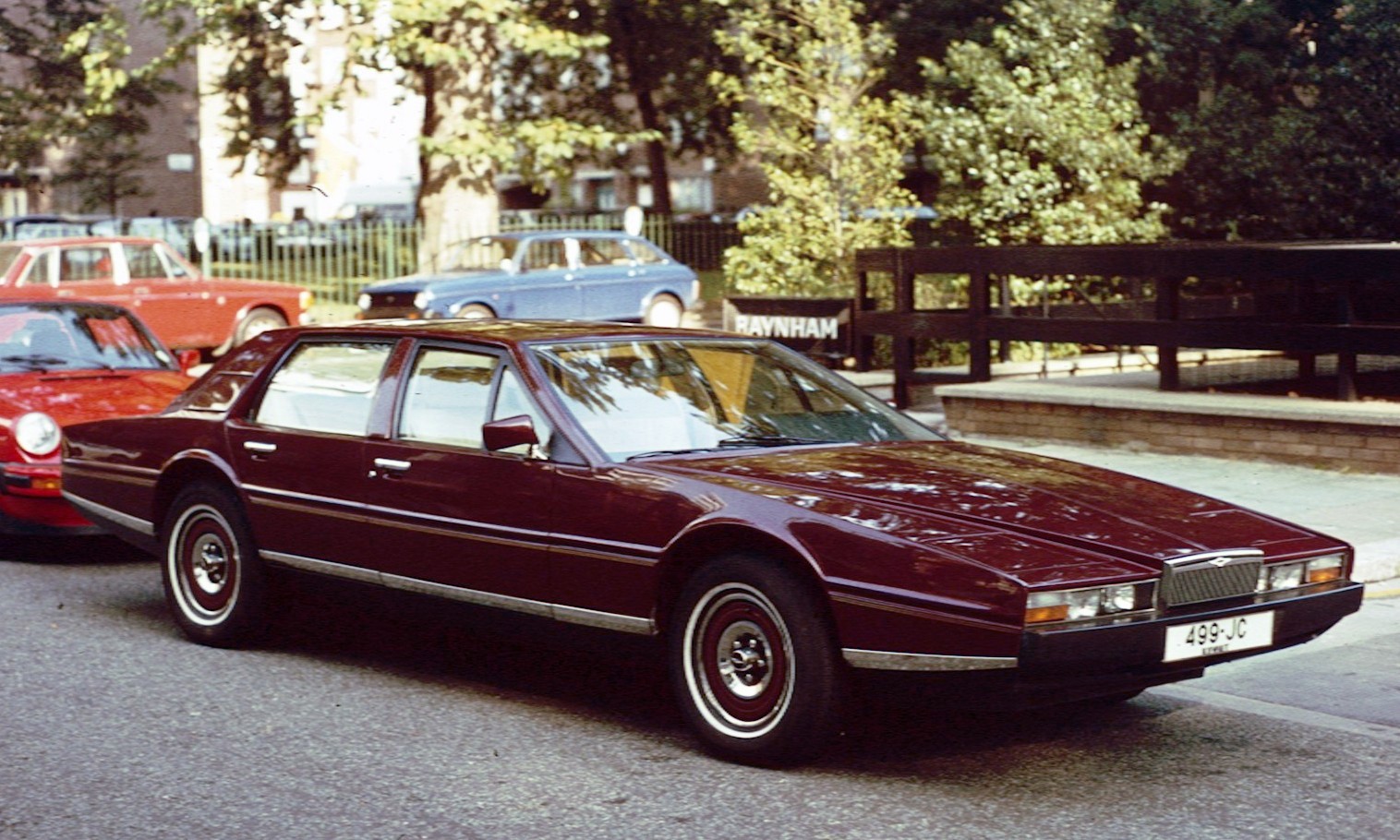
Perched just above the switchboard was an even stranger (to the eyes of 1970s luxury buyers) sight to behold. Behind a plastic screen sat a tilted black panel featuring the smallest of red-lettered LED readouts that kept track of the time, the vehicle’s speed and of course info like fuel level and engine temp.
If you’ve ever dug your childhood toys out of storage and attempted to power them back to life, then you already have some idea of how well the Lagonda’s touch-sensitive controls functioned. So unwilling to operate were the early Lagonda’s various vehicle features that Aston Martin would be forced to eliminate them completely from the equipment list and go back to regular buttons and dials.
A similar issue would raise its head with the early LED display. Initially, the British company had reached out to the Cranfield Institute of Technology to have its students design the computer system that would support its computerized readouts, but after that proved disastrous (with a prototype threatening to immolate on the display stand), Texas-based Javalina would step in.
The new development team would tear out nearly 200 lbs. of computer gear from the Lagonda and replace it with a Z80 CPU (similar to that found in a slew of video-game cabinets), which greatly reduced the amount of heat and complexity involved in the system. Still, Aston Martin would struggle with both reliability and cost of the LED panels, and in the true spirit of adventure, ultimately decided to replace them with another entirely untested automotive technology: CRT screens.
Out went the LEDs and in went not one, but three cathode ray displays sourced from the same supplier used by the U.S. Air Force to outfit the F-15 fighter jet. These mini-TVs provided a visual upgrade over the red-hued dash of old, and were wrapped in the finest of wood accents, giving the dash of the Lagonda a look not unlike that of an arcade machine. Paired with a limited digital speech synthesizer, the setup would wow Aston Martin drivers (when it was working) until 1987, when they were replaced by a more common vacuum fluorescent setup similar to what was seen on VCRs and microwaves of the era.
The General Steps In
Biding its time until the tech had a chance to mature was General Motors. The automotive giant took note of where Aston Martin had stumbled and elected to restrict its touch-control efforts to a single, less failure-prone point of contact, creating the world’s first vehicular touchscreen.
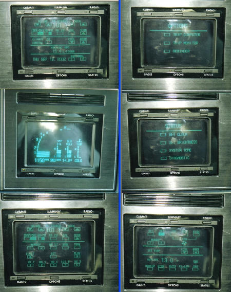
Surprisingly this high-end offering came not in a Cadillac package, but in the new-for-’86 Buick Riviera, which at the time was still enjoying its last gasp as a legitimate luxury coupe contender. Hoping to draw in younger, gadget-savvy buyers, Buick would make the nine-inch touchscreen Graphic Control Center the focal point of the car’s dashboard. All manner of systems were accessible via a simple finger-press, including radio functions, fuel economy info and of course the traditional litany of “your door is ajar” reminders.
Unlike Aston, Buick got it right. The system, although expensive, was remarkably robust in comparison to the boutique brand’s effort, largely due to extensive testing prior to putting it in showrooms. It would also remain in the brand’s portfolio for an extended period of time, adding features and spreading into other models over the course of the next four years.
And Then, Nothing
If the Graphic Control Center was such a technical success, why didn’t it spill over into other General Motors models? More to the point, aside from a few low-production, Japanese market examples, why didn’t any other car company in the 1990s decide to follow Buick’s example and compete in America with a touchscreen of its own?
The answer to that question is very similar to the growing criticism leveled against the current reliance on touch controls. Yes, the Buick GCC functioned well, but aside from its wow factor, no one thought to ask customers if this was something they were looking for in a car. GM’s engineers crowed that the touchscreen replaced dozens upon dozens of buttons and sliders, yet owners complained — much as they do now — about having to take their eyes off the road to figure out how to change the radio station or turn off the defroster using its menu system.
Simply put, despite looking cool, the GCC’s touchscreen didn’t improve the ownership experience in any measurable way. That near-20 year gap before touchscreens started to become commonplace? That’s the length of time it took for these displays to gain the kind of app features (navigation, Bluetooth connectivity) required to justify their additional complexity, and then trickle down from the luxury segment to more affordable automobiles.
Neo-futuristic glamor might look good in the brochure, but if it gets between the driver and the driving, even the most eye-popping technology is unlikely to find adherents willing to pay for it. As the current generation of touchscreens begin to take over almost ever conceivable vehicle function, it’s a safe bet that automakers are bracing for a second wave of pushback from owners who want to drive their cars without having to scroll through an endless torrent of apps, menus and screens on the way to work in the morning.
This article appeared in an InsideHook newsletter. Sign up for free to get more on travel, wellness, style, drinking, and culture.
