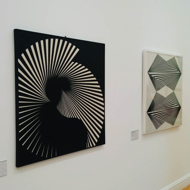
It’s easy to get lost in the designs of Franco Grignani. Geometric forms bend in unexpected ways; text and images dance around each other in ways that are both ecstatic and orderly. Grignani’s most-seen design is probably his Woolmark logo. But you may have also seen his work on everything from science fiction paperback covers to the walls of art museums.
At AIGA Eye on Design, writer Sara Schifano took a deep dive into Grignani’s biography and body of work, in advance of a new retrospective of Grignani’s designs at Switzerland’s m.a.x. Museo.
Schifano neatly summarizes the ways in which Grignani’s work brings together seemingly disparate elements, as well as his talent at making that work extend into unexpected places:
He approached graphic design as yet another experimental laboratory to observe and control optical phenomena that he then translated into numerous advertising campaigns for prestigious clients.
Attempting to pin down Grignani’s work or style is nearly impossible: his was a career that included both fine art and commercial design, and showed just how porous the boundaries between disciplines could be. And while Grignani died in 1999, his expansive career seems decidedly modern in retrospect — a harbinger of the way that many of today’s artists dabble in both high culture and more overtly commercial pursuits.
As Schiafano notes in her article, Grignani’s aesthetic continues to influence designers and artists today — and likely will for years to come.
Editor’s Note: RealClearLife, a news and lifestyle publisher, is now a part of InsideHook. Together, we’ll be covering current events, pop culture, sports, travel, health and the world. Subscribe here for our free daily newsletter.
Meet your guide