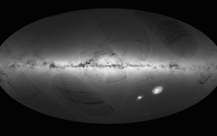
The European Space Agency’s satellite Gaia has just given us the most detailed look at the universe yet. After spending more than 1,000 days orbiting our planet, Gaia captured the image above, which contains 1.1142 billion stars (that’s twice as precise and shows 20 times more stars than the most detailed predecessor).
The stunning survey is part of ESA’s efforts to create a 3-D map of our galaxy (the Milky Way), so naturally the first step was to observe the celestial body within the greater context of the universe. The image took Gaia an entire year to produce, scanning the sky for about 14 months before finishing in September 2015. “Gaia is at the forefront of astrometry, charting the sky at precisions that have never been achieved before,” says Alvaro Giménez, ESA’s director of science.
As awe-inspiring as the image is, it’s not exactly clear what you’re seeing when you look at the map, but it shows the density of stars observed by Gaia in each portion of the sky. Brighter areas of the map correspond with denser concentrations of stars, while the darker parts have less stars. The bright area in the map’s center is where most of the galaxy’s stars converge, including the Milky Way Galaxy.
To help you better understand the map, ESA release an annotated version (see below). That horizontal disc called the “Galactic Plane” is extremely dense since it measures about 100,000 light-years wide and about 1,000 light-years deep. Dark splotches within the Galactic Plan are dense clouds of interstellar gas and dust, which appear that way because the clouds absorb starlight.
In addition to the Galactic Plane, stars form other groups (held together by mutual gravity) known as globular and open clusters. Mainly found in the Milky Way’s halo, globular clusters can contain stars numbering in the millions. Much smaller, open clusters hold hundreds of thousands.

In the right corner, the two bright spots are two dwarf galaxies, named the Large and Small Messianic Clouds, that orbit the Milky Way. In the lower left, you’ll find our largest neighbor, the Andromeda Galaxy.
The erratic patches and lines on the map are not how the universe actually looks: That’s simply a facet of Gaia’s sky-scanning process. The map’s spherical nature is also caused by the way the satellite produces the image. Speaking of which, if you’d like to view a full-size version of the map, so you scan it yourself, you can click here for the original map or click here for the annotated version.
This article appeared in an InsideHook newsletter. Sign up for free to get more on travel, wellness, style, drinking, and culture..


