The NHL’s annual Stanley Cup playoffs begin this week, which makes this a good time to do a ranking of how the teams look on the ice. From first to worst, we have the full listings for you.
Assessing NHL uniforms is always a hoot, because hockey has the sports world’s most interesting uniforms. Consider:
- Hockey is the only major sport whose jerseys are designed to be worn untucked, which provides a larger design canvas.
- It’s also the only sport that combines short pants with full-length stockings.
- Unlike football and basketball, hockey doesn’t require teams to put a number on the front of the jersey, which further expands the design possibilities.
- Except for the face, every part of a hockey player’s body is covered. Again, this serves to expand the design canvas.
It’s also worth mentioning that the NHL is a pretty good-looking league at the moment. There are only a couple of flat-out unattractive teams, and relatively few unattractive individual uniforms. But that could all go down the crapper if the league adds advertising patches to its jerseys in 2022, which is apparently a strong possibility. So let’s enjoy the league’s current aesthetic bull market while we can.
These rankings are based primarily on the teams’ standard home and road uniforms, with alternate and Reverse Retro (ЯR) designs considered mainly for bonus points and tiebreakers. Ready? Here we go.
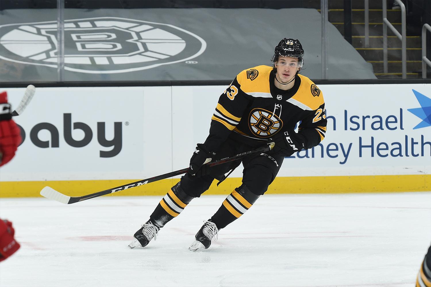
1. Boston Bruins
If you looked up “hockey uniform” in the dictionary, this is pretty much what you’d find. The iconic crest, the contrasting shoulder yoke, the matching sleeve and sock stripes — first rate! The road whites are just as strong as the home design, and even the alternates and ЯRs look sharp. No matter which uni this team is suiting up in, you know they’re going to look good out there. Uni Watch’s highest rating.
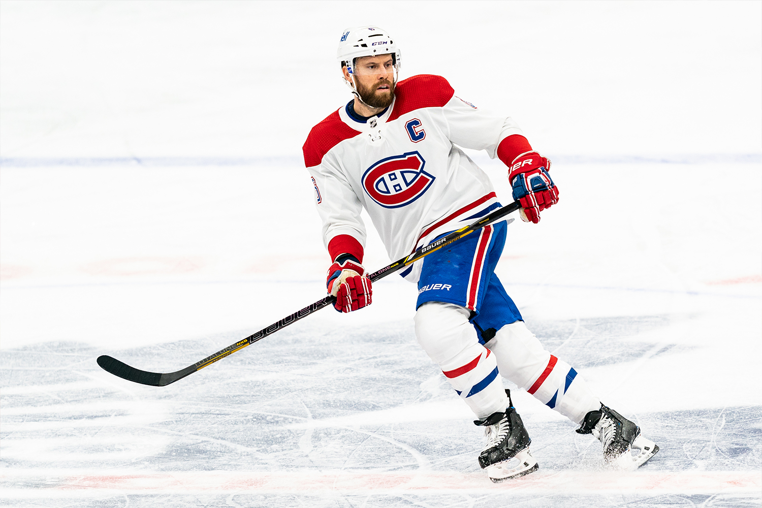
2. Montreal Canadiens
Pro sports is loaded with waaaaay too many teams that wear some combination of red and blue. But few squads wear those colors as well as the Canadiens. And is there anything sweeter than that big, bold jersey crest? Plus you’ve gotta love the wraparound striping on the home reds, and even the ЯRs look surprisingly good. Vive les Habs!
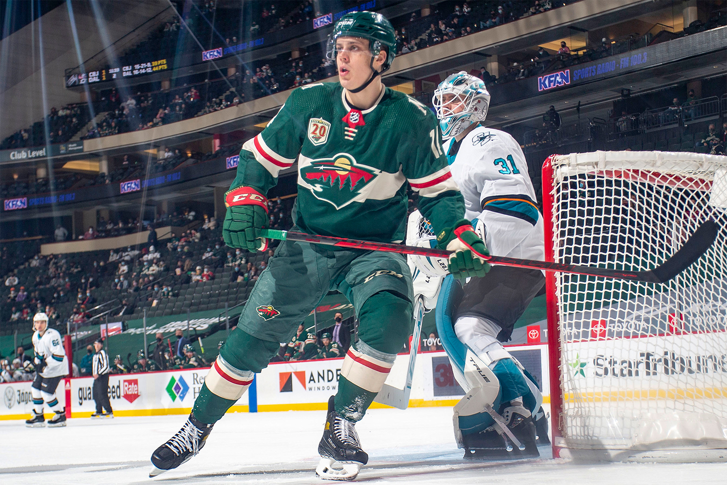
3. Minnesota Wild
Green is criminally underrepresented in pro sports in general and the NHL in particular. Fortunately, the Wild have been repping the green to spectacular effect for 20 years now. The tan and red accents work perfectly, and the road whites are arguably even better than the home greens. Bonus points for the magnificent North Stars-inspired ЯR design, which puts the biscuit in the basket and then some.
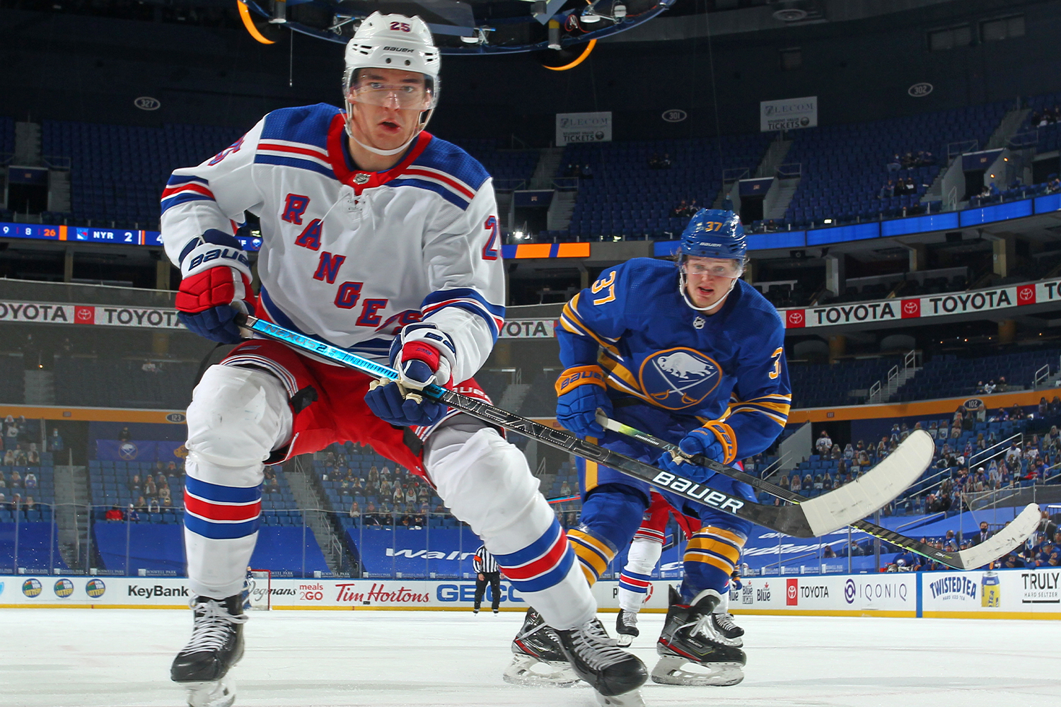
4. New York Rangers
In 2003, after more than three decades of having home teams wear white, the NHL shifted to a “color at home, white on the road” format. No team’s fan base has suffered more from this policy than that of the Rangers, whose spectacular white uniform is the class of the league. The red and blue trim really pops against the white background, no? The team’s blue uni is no slouch either, but it can’t compete with its brilliant white counterpart. Please, NHL: Let home teams wear white again!
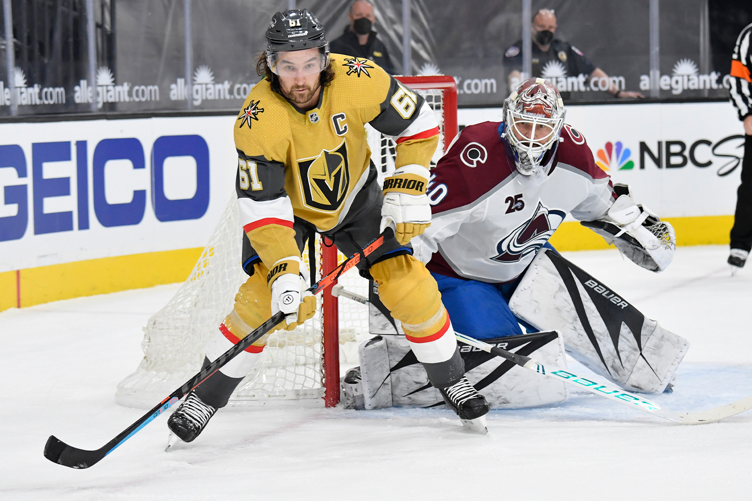
5. Vegas Golden Knights
Alright, so we said this list would be based primarily on the teams’ standard home and road uniforms, but an exception has to be made for the Golden Knights’ gold alternate design, which was introduced this season. Aside from being a obvious match for the team’s name (why didn’t they have a gold uni when the franchise launched in 2017?), it’s also a killer uniform that feels like an instant classic, with the red and white accents playing perfectly off the muted shade of gold. The team’s home and road designs are also winners (the home uni is the rare gray/charcoal uniform that actually works), but it’s the gold alternate that vaults Vegas into the No. 5 slot on this list. Here’s hoping they redesignate it as the home uni soon.
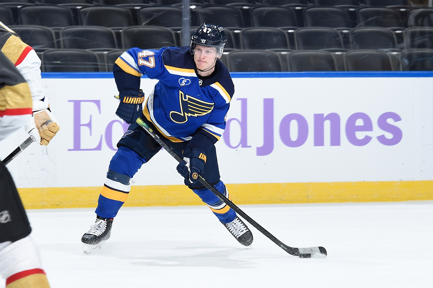
6. St. Louis Blues
The Blues live up to their team name by mixing two shades of blue — royal and navy. That’s usually a uni no-no, but it works here because of the contrast provided by the white and yellow. Meanwhile, the road whites look sharp and the throwback alternate is a nice blast from the baby-blue past. Granted, the ЯR design is a stinker, but they wisely opted to wear it for only two games this season, so not much harm done there.
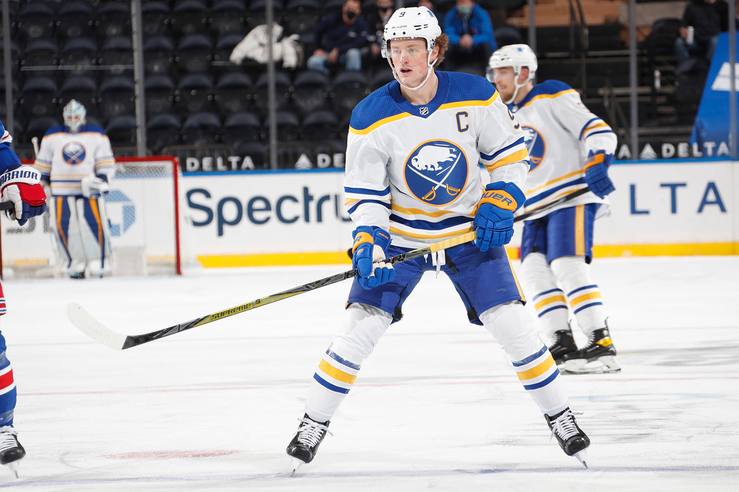
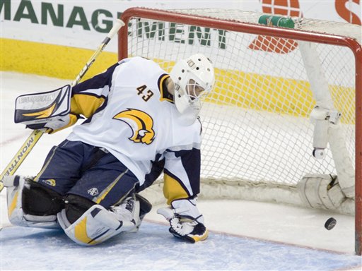
7. Buffalo Sabres
Another team that looks better in white, although the home blues are nothing to complain about. Either way, after all the years of visually painful nonsense — the red design, the bison’s head, the front numbers and apron strings, and of course the buffaslug — it’s great to see the Sabres getting back to basics and reclaiming their position in the league’s top 10.
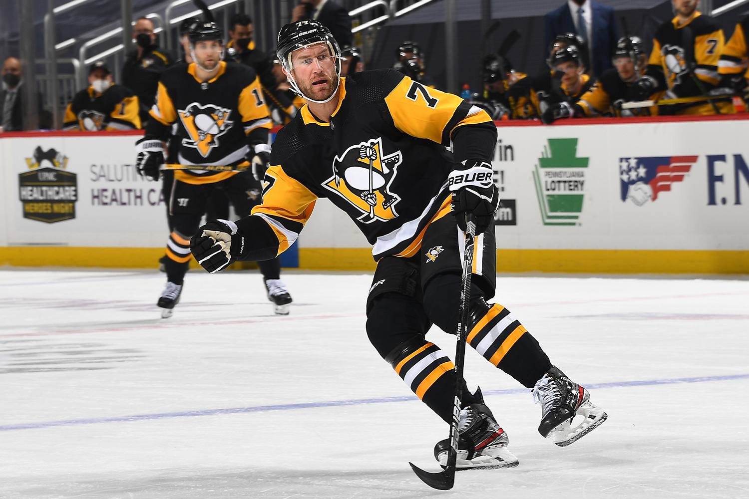
8. Pittsburgh Penguins
Who doesn’t love a skating cartoon penguin? Answer: Nobody — nobody doesn’t love a skating cartoon penguin. Glad we cleared that up for you.
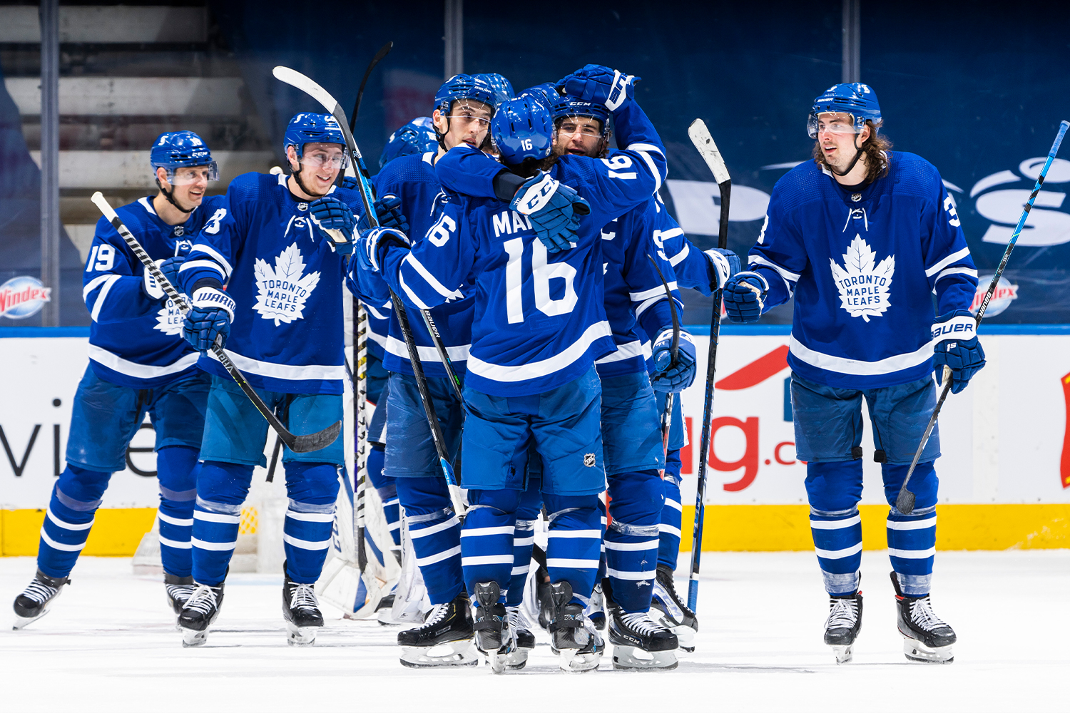
9. Toronto Maple Leafs
A classic uniform, obviously. And the current iteration of the jersey crest is certainly better than its clunky predecessor.
But when a team has only one color plus white, the visual effect feels a bit underwhelming. That goes double for the Leafs’ home uniform, which becomes a largely undifferentiated monochromatic blur. Which leads us to…
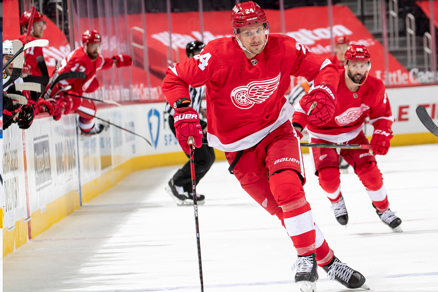
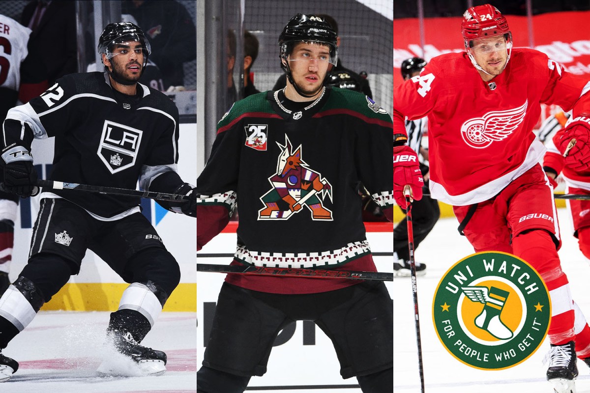
10. Detroit Red Wings
Much like the Maple Leafs, the Red Wings are an Original Six franchise with a classic uniform that’s held back by the “one color plus white” factor. This uniform is so firmly etched in the NHL’s visual firmament that you can’t just add another color to it — but that means the team will always come up a bit short on this list (despite the bonus points for the vertically arched player names). A very good uniform set? Yes. A great one? Not quite.
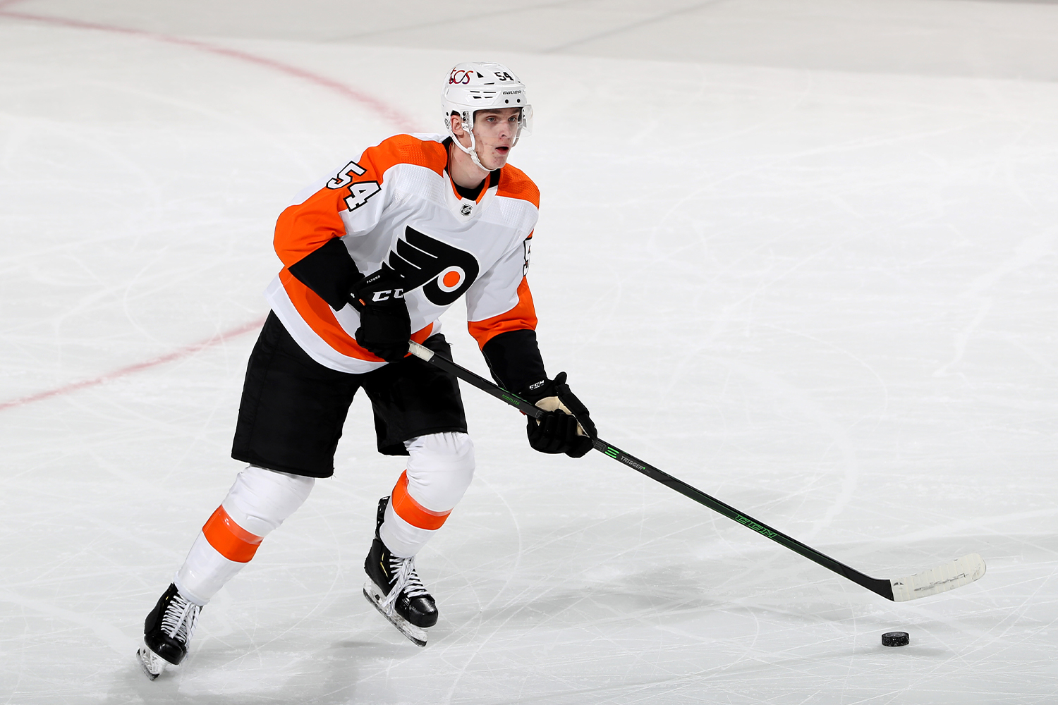
11. Philadelphia Flyers
Another team that looks better in its white uniform, although the orange/black color scheme makes for a solid home design as well. The jersey crest, essentially unchanged after more than half a century, still feels fresh, and the contrast-colored nameplates have become a fun visual signature. Solid-looking team.
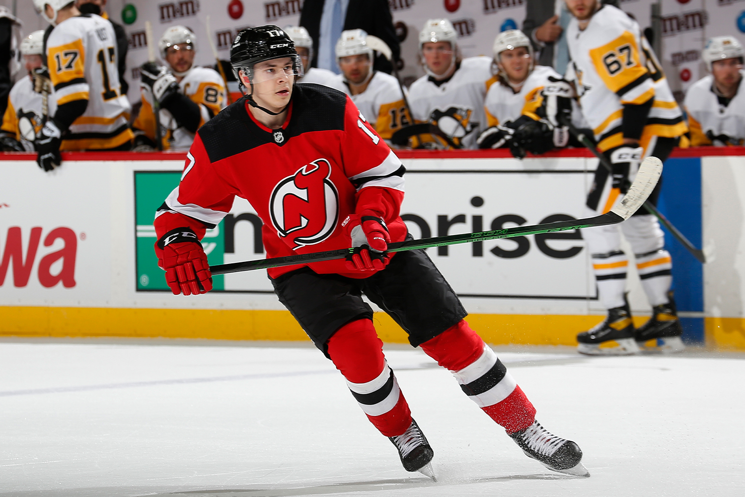
12. New Jersey Devils
After four decades of use, the Devils’ jersey crest deserves some credit as one of the NHL’s strongest logo designs. In fact, it doesn’t matter whether we’re talking about the home reds, the road whites, the green-accented heritage uni or the more heavily green-centric ЯR design — what comes through each time is that bold, devil-horned “NJ.” It’s almost as though it doesn’t matter which colors or design details you put around it — the logo still dominates.
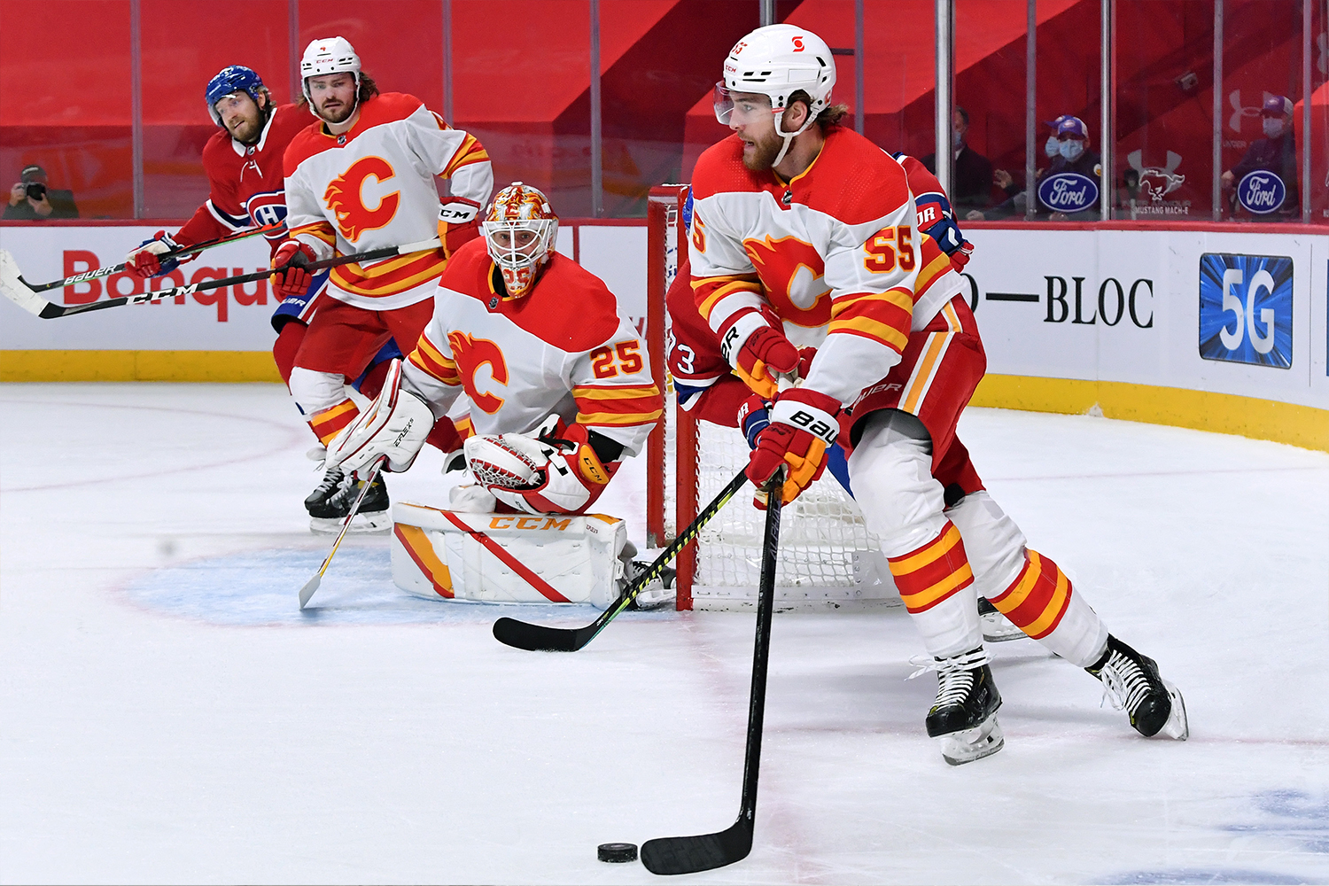
13. Calgary Flames
Yet another team that looks better in white, and with good reason: The “new” uniform that the Flames began wearing this season is essentially a return to what the team wore in the early 1980s, when NHL teams still repped white at home. Too bad about the black-themed alternates (guys, you’re the Flames, not the Charred Ashes) and the laughably bad ЯR design, but the standard home and road sets are A-OK.
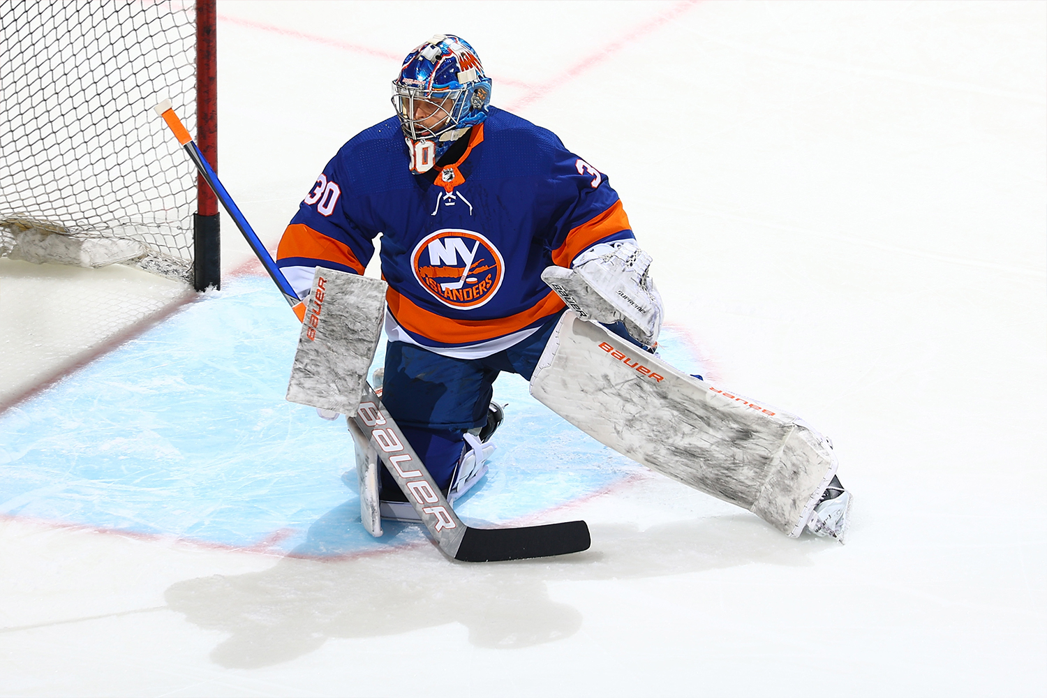
14. New York Islanders
The Isles have been so bad for so long (only nine playoff appearances in the past 25 years, six of which saw them exiting in the first round) that it’s easy to overlook the fact that their uniforms are generally solid. They’ve made some missteps over the years with alternates, and of course there was the whole fish sticks fiasco, but their basic home and road looks are fine. Not outstanding, not upper-echelon, not elite — but fine.
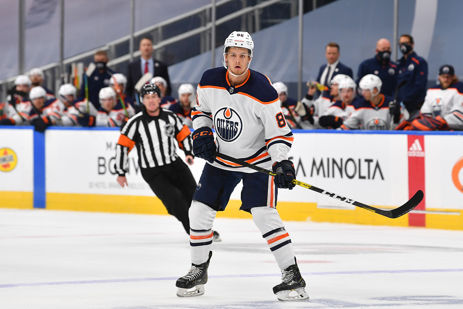
15. Edmonton Oilers
Another team that looks bett— well, you get the idea by now. Not only do the Oilers look good in their white/navy road uni, but their white/orange ЯR design is arguably another step up. That said, the home uni feels a bit blah, the alternate design is saddled with vibrating colors and the longstanding jersey crest is starting to feel more dated than iconic.
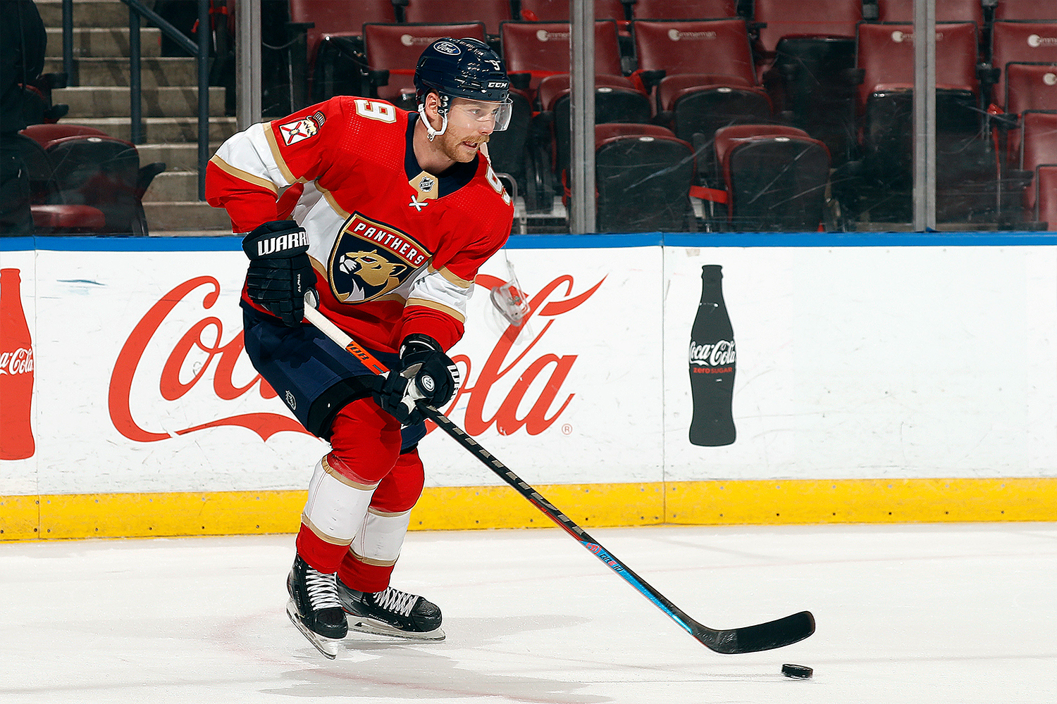
16. Florida Panthers
Few NHL uniform sets have been so vexing here at Uni Watch HQ as Florida’s. On the one hand, the color scheme is excellent and the overall composition of elements works really well. On the other hand, that jersey crest just doesn’t feel like a hockey logo. Soccer? Sure. Rugby? Maybe. But hockey? Not feelin’ it. The net result is a maddeningly unsatisfying uniform that doesn’t reach its full aesthetic potential.
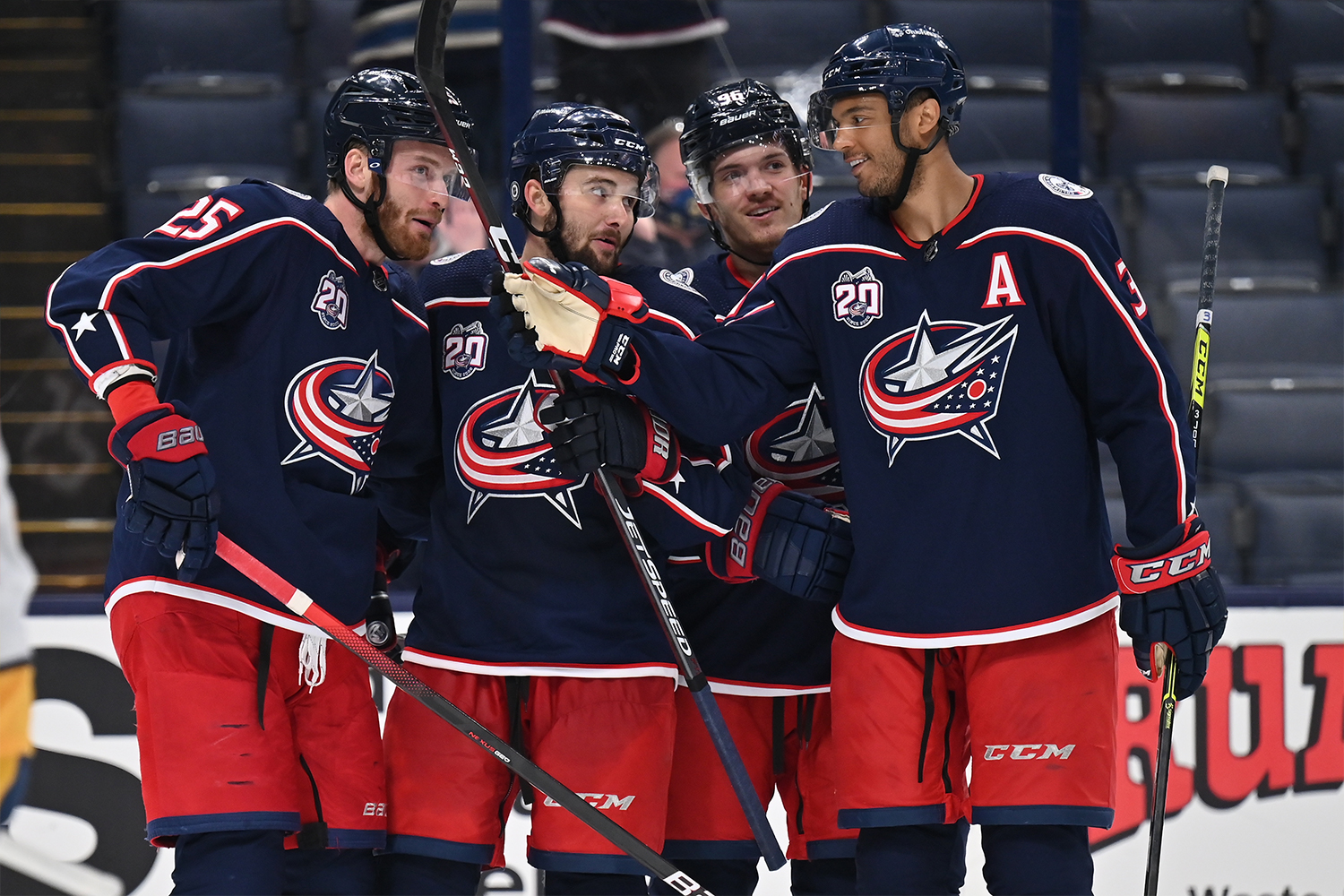
17. Columbus Blue Jackets
The Blue Jackets have a different uniform template than most other NHL teams. The lower jersey striping is right at the hemline instead of across the belly area, and the shoulder yoke striping extends all the way down the sleeves — which looks particularly good on, you guessed it, the white road jersey (are you sensing a pattern here?). That’s all to the good, and it’s cool that they’ve based their crest on the Ohio flag (America’s only non-rectangular state flag, don’tcha know), but the flag is too heavily stylized, plus it seems counterintuitive to have it facing to the left. Meanwhile, the rear uni numbers feel clunky, the alternate uni feels generic and the ЯR design is a stinker. Overall: Meh.
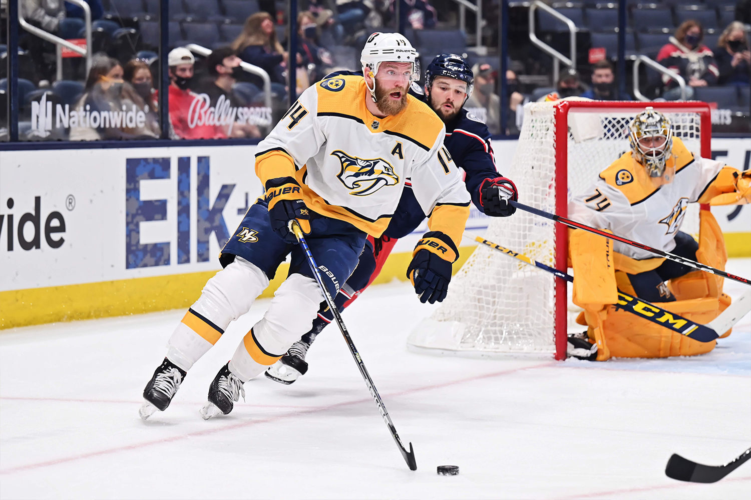
18. Nashville Predators
Another team that looks so much better in white. In fact, the road whites are among the better designs in the league. But the home design is burdened by way too much yellow. A navy shoulder yoke and/or navy helmet would help, as the very similar ЯR design makes clear.
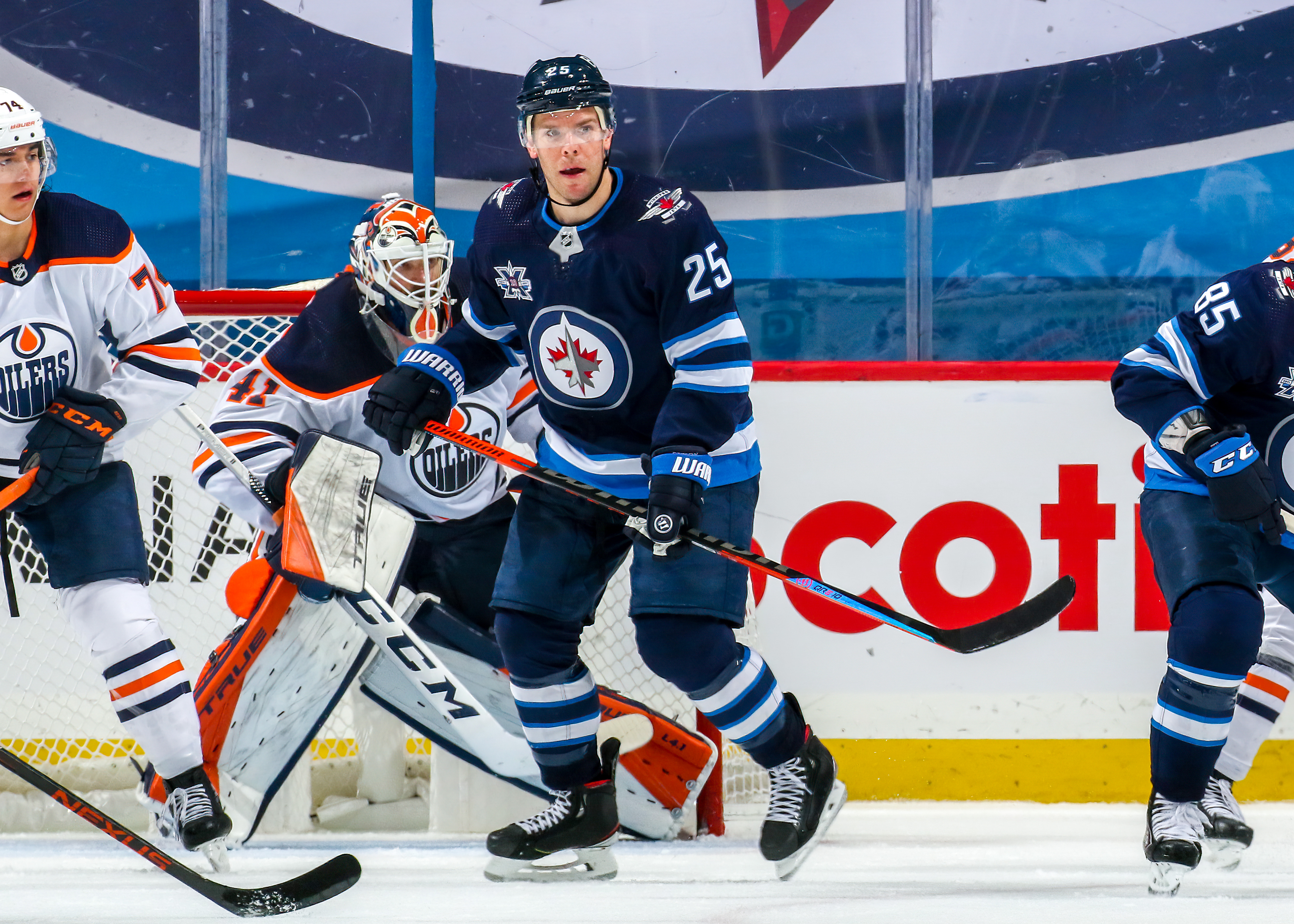
19. Winnipeg Jets
The Jets get a lot of aesthetic mileage out of those double-striped sleeves and socks, plus the road whites hold their own quite nicely and the retro alternates are a hoot. So why aren’t they higher on this list? Because of the jersey crest. It’s nice that it’s based on the Canadian Air Force insignia (because the team is called the Jets, get it?), but it feels sooooo lackluster compared to what was worn by the NHL’s previous incarnation of the Jets (who then moved to Arizona and became the Coyotes). It’s fun that they’ve revived that old design for their ЯR uni, but they’ve done it a disservice by rendering it in charcoal and wearing it only twice this season.
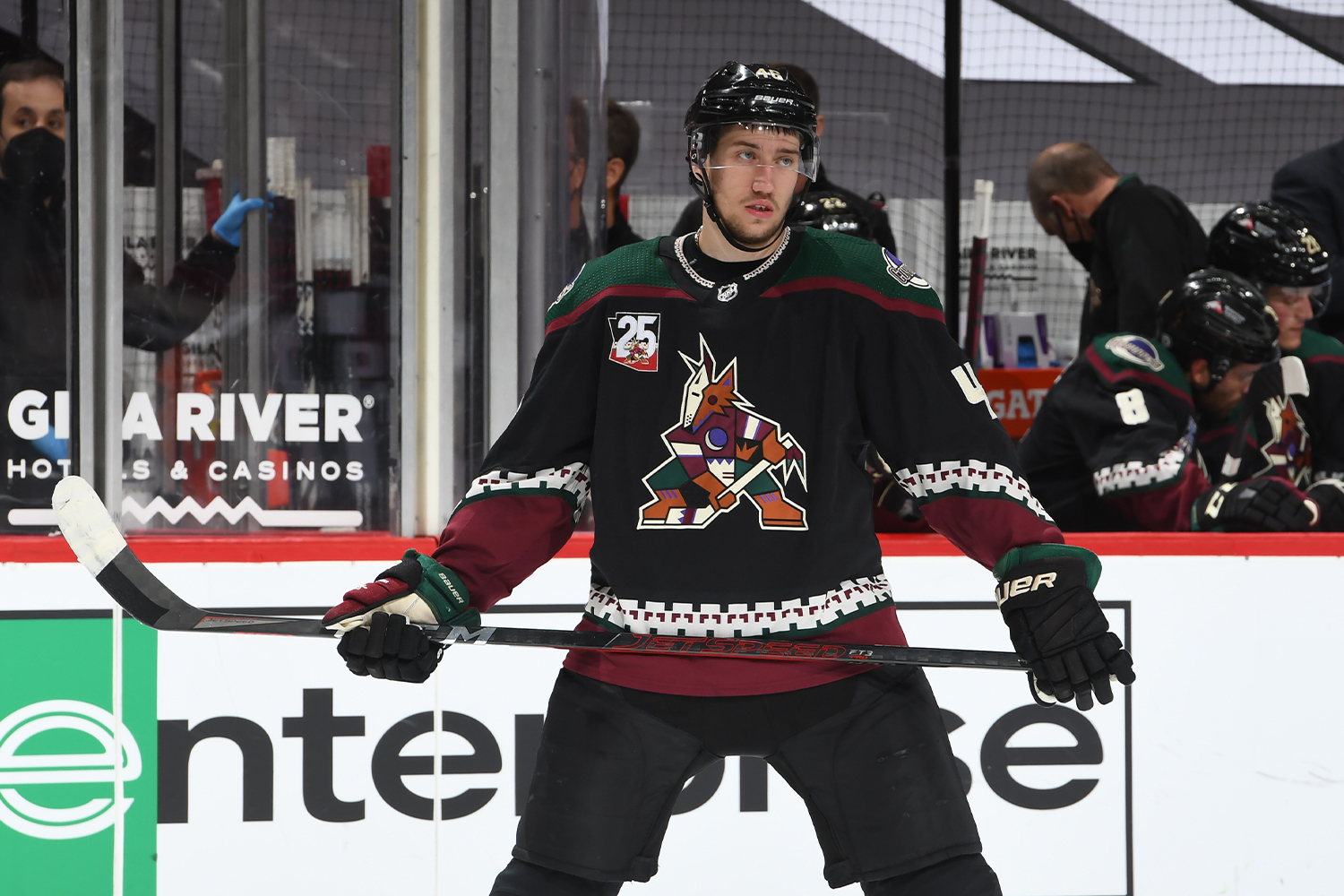
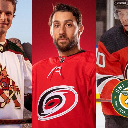
20. Arizona Coyotes
Lots of people, this columnist included, treated the Coyotes’ “Kachina” design as a joke when it debuted in 1990s. A quarter-century later, it’s time to admit that this uniform has aged surprisingly well and now feels like the definitive look for a team that has gone through multiple design cycles, so it’s great that they’ve brought it back as their primary home look this season. Unfortunately, the road uni is a total snooze, the alternate uni is the same snooze in a different colorway and the ЯR uni is an eyesore.
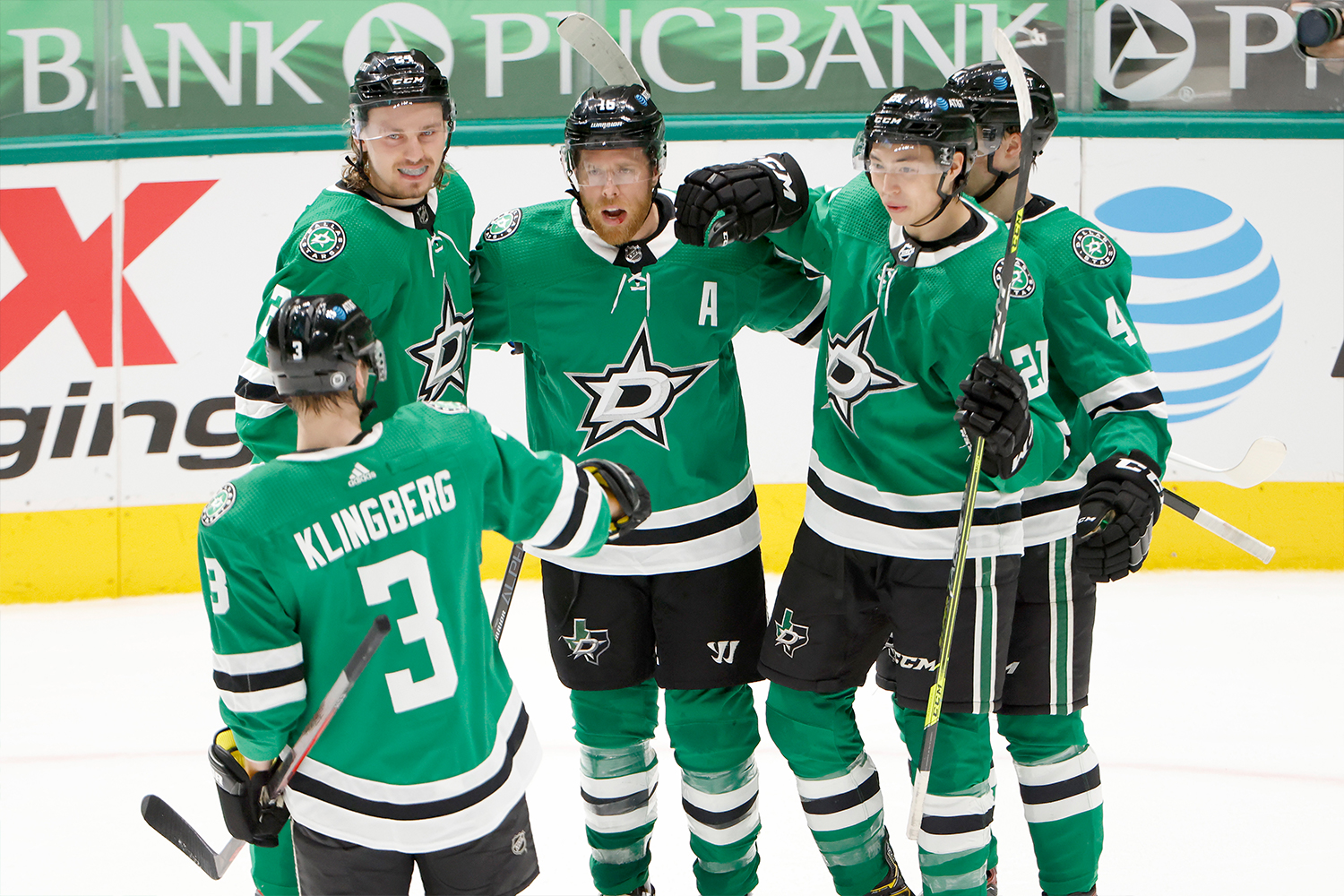
21. Dallas Stars
It’s always good to see a team wearing green. But the chest logo looks like something you’d see at Old Navy, the road uni would be better off with green pants instead of black, the neon-themed alternates are embarrassing and the ЯRs are illegible. The world’s greatest color deserves better.
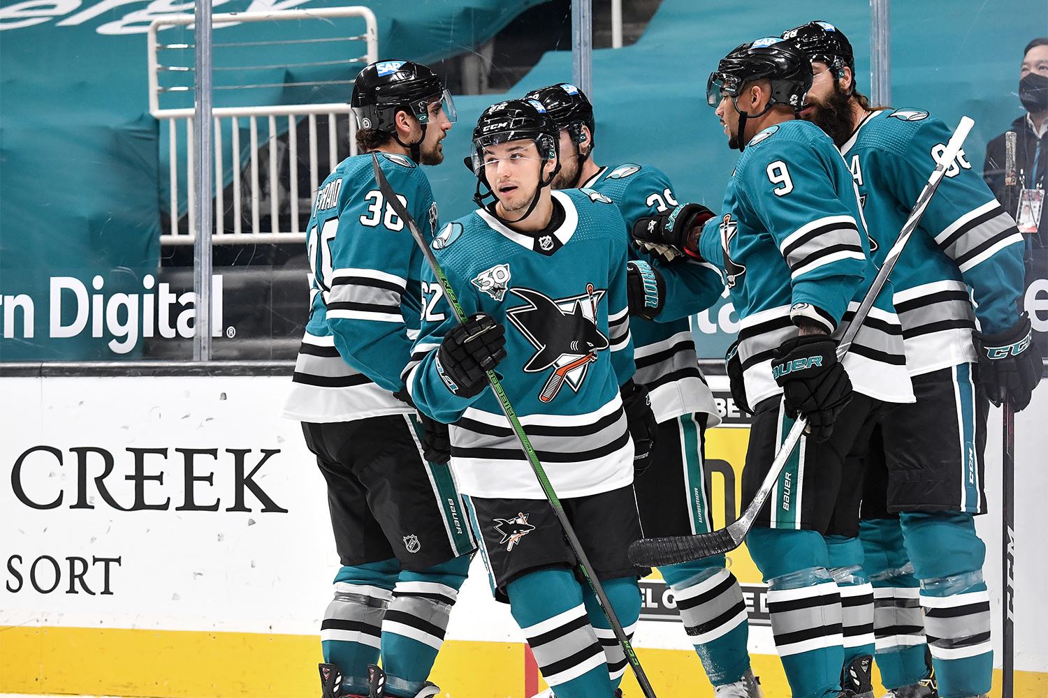
22. San Jose Sharks
The jersey crest, largely unchanged during the franchise’s 30-year history, is still a winner. Wish we could say the same for the color scheme, which now feels badly dated — few things scream 1990s like teal and black. The gray trim doesn’t help, but the Sharks would rank several slots higher if they brought back their old orange trim, a small but powerful design element that added some much-needed brightness to the proceedings.
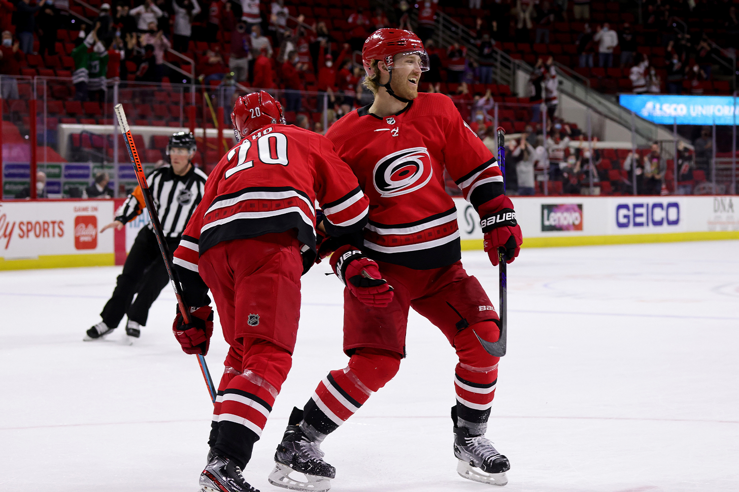
23. Carolina Hurricanes
The Hurricanes are in the odd and possibly unprecedented position of having four uniforms with four different jersey crests — not exactly the best way to build a coherent visual identity. The home reds and black alternates are solid enough, but the road design is cringe-worthy (memo to all other NHL teams: Leave the diagonal lettering to the Rangers), the ЯR Whalers throwback would look so much better in green or white instead of drab gray (plus it’s basically trolling the fans up in Hartford), and the overall inconsistency throughout the team’s uni program feels jarring.
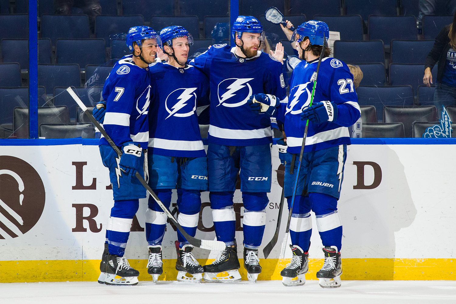
24. Tampa Bay Lightning
Much like the Maple Leafs and Red Wings, the Lightning are in the “one color plus white” bucket (no coincidence, since they adopted this uni design when former Wings great Steve Yzerman became their GM). But unlike the Leafs and Wings, the Lightning don’t have a century-long heritage to fall back on. There’s nothing terrible about their uniform set, but it feels rather rote and uninspired, especially for a young franchise. And it’s hard to get past how the jersey crest makes all the players look like the Flash.
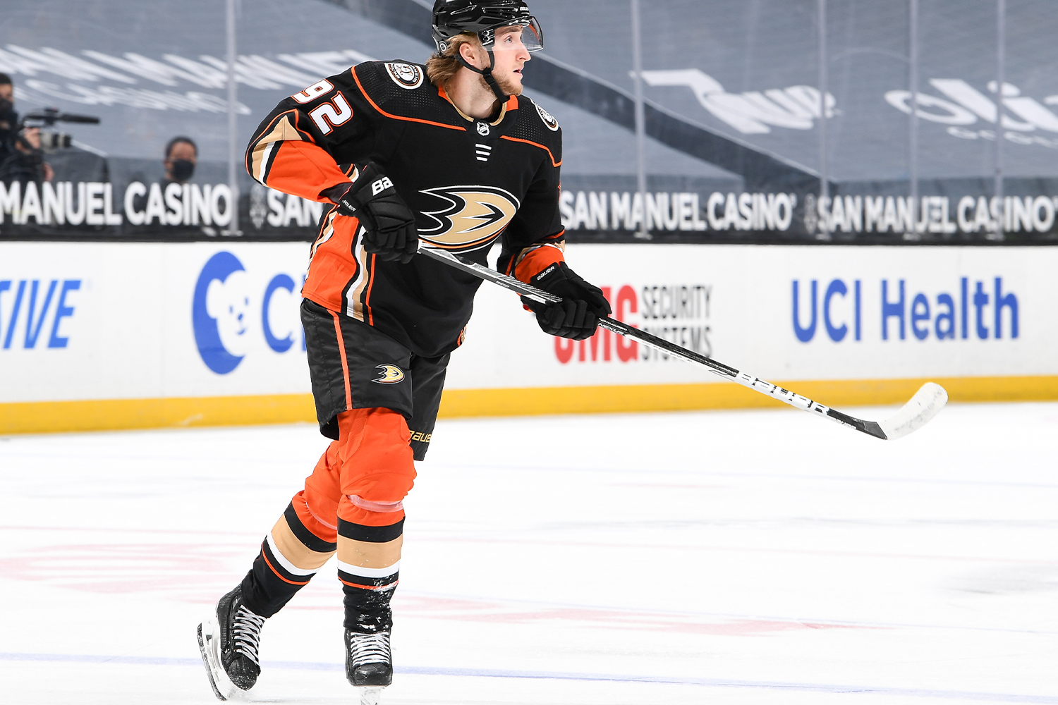
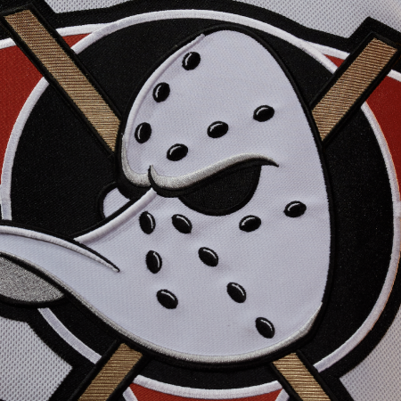
25. Anaheim Ducks
Orange as an accent color is a wonderful thing. But the Ducks’ use of orange — especially the very bold, saturated shade that they use — goes beyond accenting and becomes garish. The sleeves, the socks, those godawful side panels — it’s too much. And speaking of garish, maybe it’s time to rethink that webfoot jersey crest.
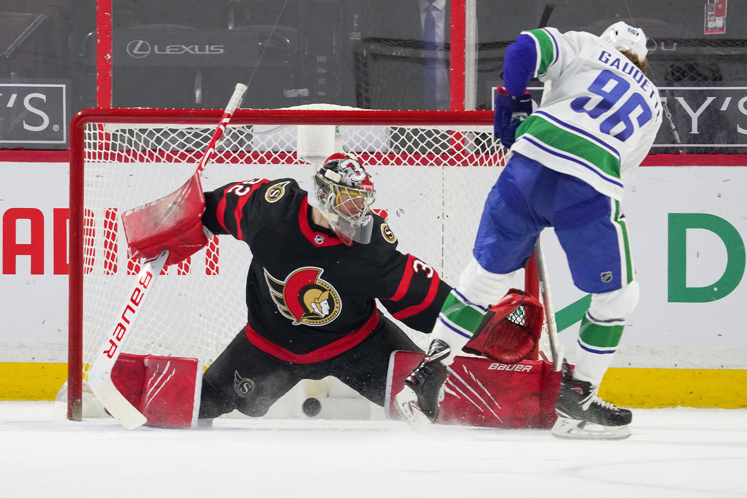
26. Ottawa Senators
Something about this team’s visual identity has always seemed a bit misbegotten. They don’t look terrible, but they never look special either. The problem is that Roman centurion crest mascot, which has always seemed like an odd fit for a Canadian hockey team (or any other hockey team, for that matter).
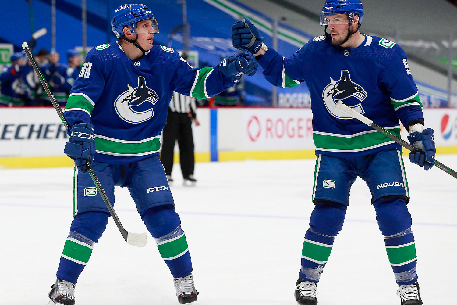
27. Vancouver Canucks
When it comes to the Canucks’ logo, there isn’t much middle ground: Either you really like the orca breaking through the “C” or you think it’s ridiculous. Here at Uni Watch HQ, we fall into the latter category. It’s long past time, people: Put Johnny Canuck on the jersey!

28. Washington Capitals
The patriotic color scheme is fine, and so is the chest lettering. So what’s the problem? Ugh, those white stripes running down the sleeves and the navy side panels (and their counterparts on the road jersey) — getting rid of those would be a textbook case of addition by subtraction. Also, doesn’t it seem a bit cheesy that the Caps apply the jersey lettering and graphics as one giant patch, instead of sewing the letters on individually? Shouldn’t that be reserved for cheapo replica jerseys?
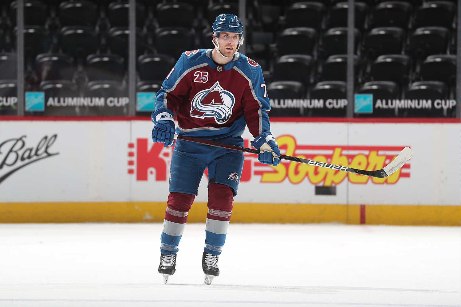
29. Colorado Avalanche
The Avs made some aesthetic headway this season by changing their pants, helmets and gloves from black to blue. But that’s too little, too late for a team that badly needs to go back to the drawing board. From the logo to the colors, the whole thing feels way too 1990s — time for a reboot. (A few bonus points for the vertically arched nameplate lettering, however.)
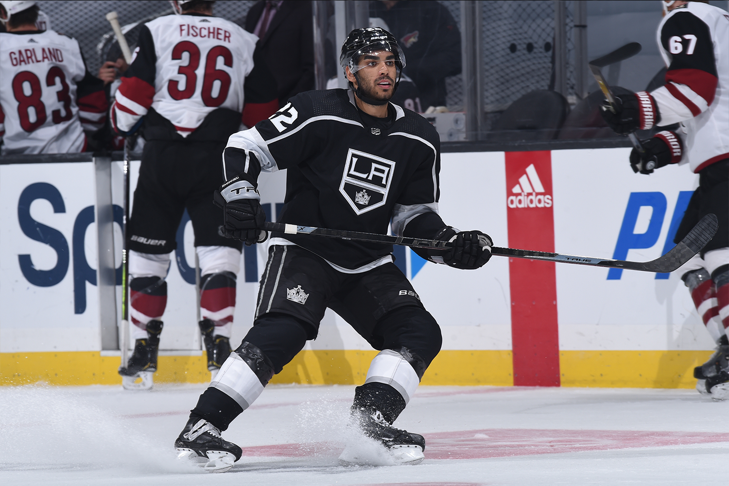
30. Los Angeles Kings
As many of you may be aware, your friendly uniform columnist dislikes — nay, loathes — the color purple. It’s the diva of colors, the Celine Dion of colors: loud, tacky, overbearing. So listen up, because you may never see these words emanating from Uni Watch HQ again: The Kings should go back to wearing purple. Why? Because for all of purple’s annoyances, it’s also the color of royalty, so it made sense when the Kings wore it back in the 1970s and ’80s. Silver and black? That’s cool if you’re playing in the NFL for the Raiders and a lame-o cliché for anyone else. The Kings took a step in the right direction with this season’s purple ЯR design, but they wore it only four times. Meanwhile, their primary crest looks like a bargain-basement knockoff design and their number font looks choppy and bloated. An overhaul — with or without purple — is long overdue.
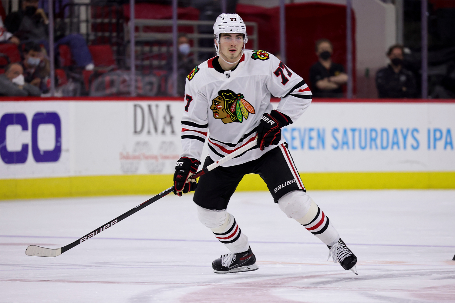
31. Chicago Blackhawks
Countless sports teams across North America, from top-level professional clubs to high schools, are stopping their use of Indigenous-based team names, logos and iconography. It’s time for the Blackhawks to join them. Until that happens, they’ll rank at the bottom of this list.
Incomplete Data: Seattle Kraken
Come this fall, the NHL will have a 32nd team, as the Seattle Kraken are set to make their debut in the 2021-22 season. Aside from a few Photoshop mock-ups, there are still no images of the full uniforms, so it’s not yet clear where the Kraken will slot into our rankings. But you can learn more about the team’s visual program here and here, with a full Uni Watch assessment here.
Paul Lukas will have uni rankings for NBA teams when their postseason starts later this month. If you like this article, you’ll probably like his Uni Watch Blog, plus you can follow him on Twitter and Facebook, check out his podcast, and sign up for his mailing list so you won’t miss any of his future InsideHook columns. Want to learn about his Uni Watch Membership Program, check out his Uni Watch merchandise, or just ask him a question? Contact him here.
Meet your guide
More Like This
The Charge will help you move better, think clearer and stay in the game longer. Subscribe to our wellness newsletter today.


