
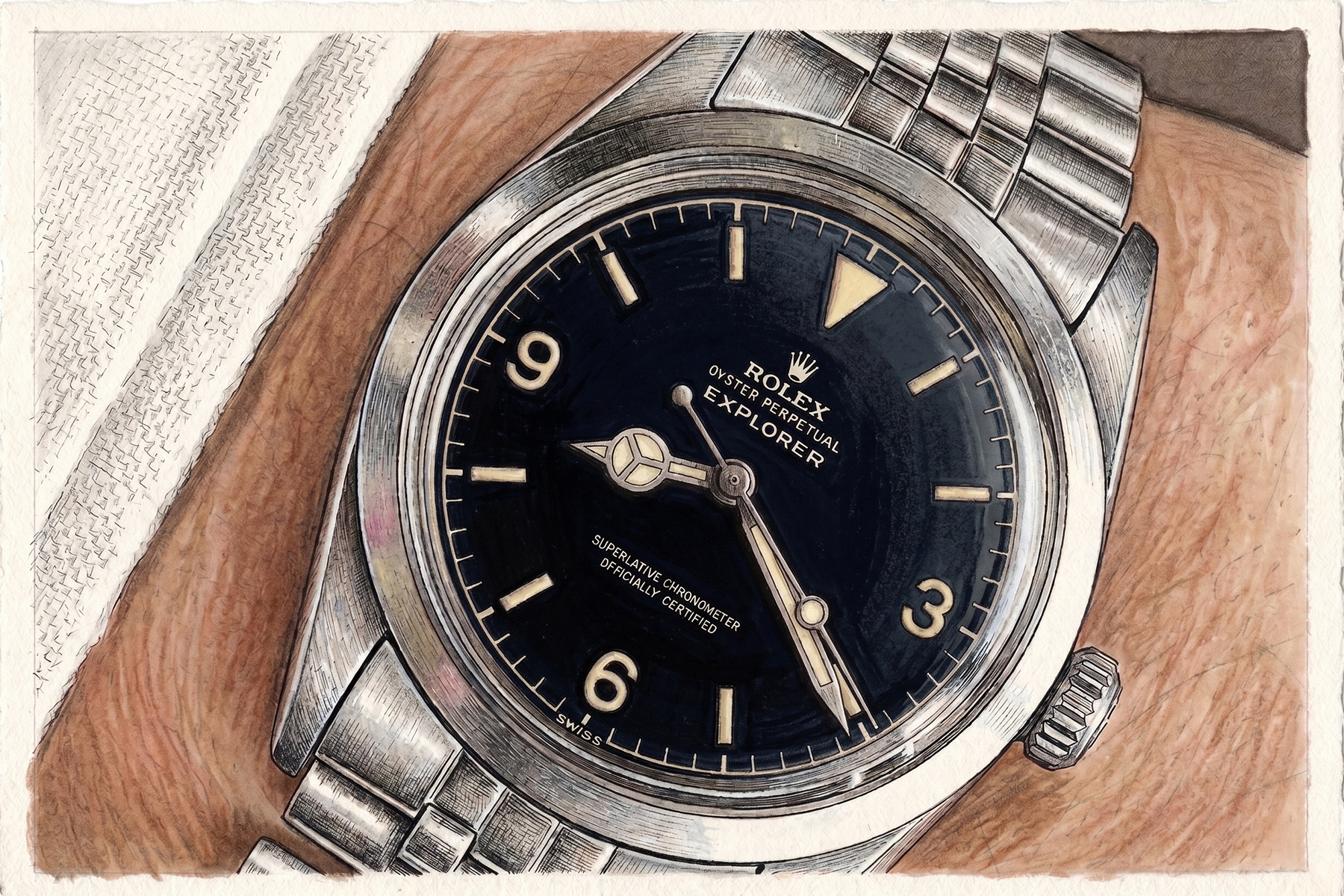
Welcome to Watchword, a series in which we break down key terminology to help you better understand the lay of the horological land. In this piece, we examine the gilt dial — one of the most coveted (and misunderstood) features in vintage watch collecting.
What Is a Gilt Dial?
Few features of vintage watches elicit more confusion than the “gilt” dial, and with good reason. After all, these dials aren’t really gilt at all, but merely appear so. At first glance, a gilt dial seems simple enough: gold-colored text and markers set against a glossy black surface. But that description — while technically accurate — misses the point. A true gilt dial is defined not by what’s added to the dial, but by what’s left behind.
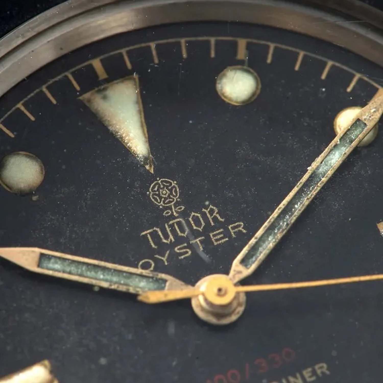
Rather than printing text atop a finished surface, midcentury manufacturers began with a brass dial blank, plating it before applying a black lacquer over the top. The text, minute track, and logos were then created by masking or etching away that lacquer, allowing the underlying metal to shine through in warm, golden relief. The effect is subtly magical: a mirror-like, glossy black surface paired with typography that seems to glow from within the dial itself, producing a sense of depth that modern printing struggles to replicate. In other words, a gilt dial isn’t printed — it’s revealed.

Rolex and the Gilt-Dial Era
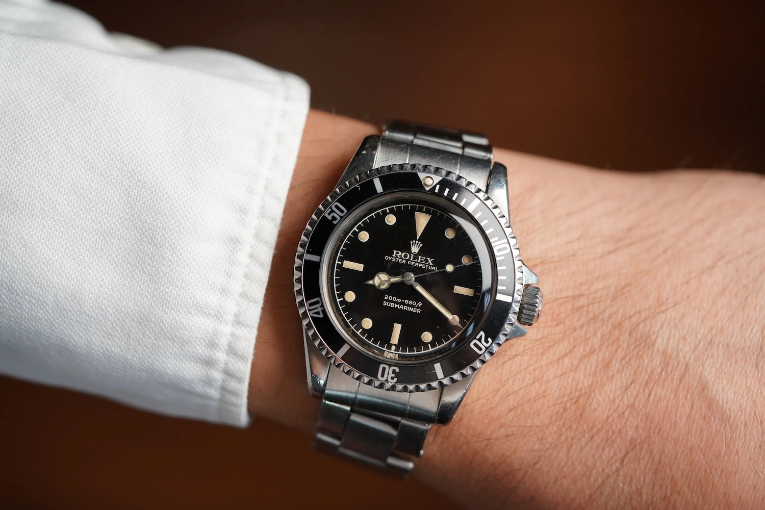
No brand is more closely associated with gilt dials than Rolex. From the early 1950s through roughly 1966 or ’67, gilt dials were the standard across Rolex’s professional lineup. These were not niche curiosities, but the default aesthetic for what are now some of the most iconic watches ever produced, including the Submariner, GMT-Master and Explorer. In these references, gilt dials paired utilitarian intent with a surprising degree of visual richness: radium or tritium lume plots aged to creamy tones over time, while the exposed gilt text developed a warm, almost honeyed character that softened the stark contrast of black and gold.
This period represents the first chapter of modern Rolex dial production, preceding the matte dials that would come to define the late 1960s and ’70s. As production methods evolved, many original gilt dials were replaced during routine servicing, often swapped for later matte variants, making surviving examples increasingly scarce. Among collectors, the hierarchy is therefore well established: all else equal, gilt beats matte — not simply for its rarity, but for the unmistakable visual depth and warmth that defines the era. Collectors are taking note, and noted dealers such as Eric Wind of Wind Vintage are working overtime to keep up: “Over the last few years, gilt dial Rolex sports models — the GMT-Master, Submariner, and Explorer — have become some of the most in-demand vintage watches, and we cannot find enough great examples to satisfy demand,” he says.
Beyond Rolex: A Wider Swiss Phenomenon
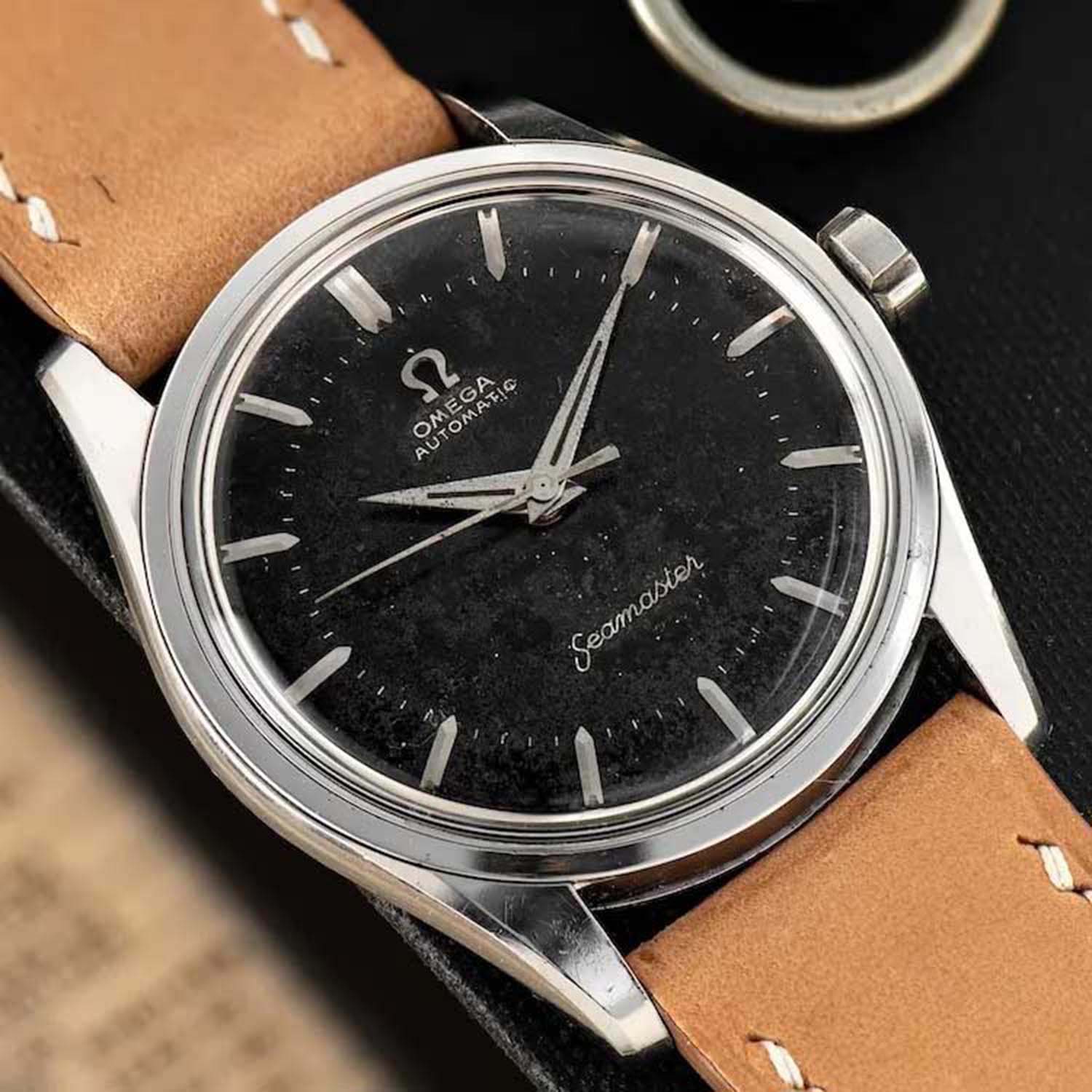
Though Rolex dominates the conversation, gilt dials were hardly exclusive to the Crown: Throughout the 1940s, ’50s, and into the ’60s, the technique appeared across the Swiss industry, with brands such as Omega, Tudor, Universal Genève and Longines all producing variations on the theme. Early Omega Seamaster references, in particular, often featured glossy black dials with gilt printing that offered a slightly dressier counterpoint to the brand’s later, more overtly utilitarian matte executions.

Across these manufacturers, the appeal was consistent: a dial that felt less like a flat, printed surface and more like a layered object, one capable of interacting dynamically with light in a way that gave even simple time-only watches an added sense of richness and complexity. Wind is bullish on these non-Rolex timepieces as well: “Other general black gilt-dial watches (typically with yellow gold printing and yellow gold hands) from brands such as OMEGA, Heuer, Longines, IWC and Universal Geneve have also remained popular with vintage watch enthusiasts,” says Wind. “I find them to be some of the most mesmerizing vintage watches.”
Why the Technique Disappeared
If gilt dials are so compelling, their disappearance might seem puzzling at first glance. The reality, however, is grounded in practicality. The galvanic and lacquer-based production process was both labor-intensive and difficult to execute consistently, with a relatively high margin for error. As the watch industry moved into a more industrialized phase in the late 1960s, brands began shifting toward matte dials with printed text — a method that was faster, more cost-effective and, importantly, more legible under a wider range of conditions.
This transition aligned neatly with the broader evolution of the tool watch, which increasingly (albeit momentarily) prioritized clarity and functionality over decorative flourish. In that context, the glossy, reflective surfaces of gilt dials began to feel like a vestige of an earlier era. The technique didn’t disappear because it failed, but because it proved too complex to scale in a rapidly modernizing industry.
Patina, Aging, and the Collector’s Eye
Part of the gilt dial’s enduring appeal lies in how it ages. Over decades, the glossy lacquer surface can develop fine cracks — often referred to as “crazing” — or fade into rich brown tones, producing the so-called “tropical” effect so prized among collectors. In some cases, the black lacquer takes on a softer, almost smoky translucence, subtly altering the dial’s character while leaving the exposed metal beneath intact. That underlying gilt text retains its warmth, creating a visual interplay that feels organic rather than manufactured.
The result is that no two gilt dials age in precisely the same way. In a collecting landscape increasingly defined by uniformity and predictability, this individuality has become a significant part of the appeal. Each example tells its own story, shaped as much by time and environment as by the original manufacturing process.
Modern Gilt-Dial Watches
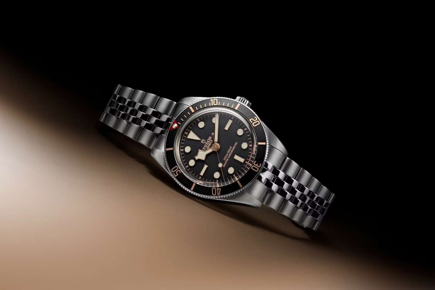
Today, gilt dials have returned, at least in appearance. Brands ranging from Tudor to a host of smaller independents regularly produce so-called “gilt-style” dials characterized by glossy or semi-gloss black surfaces paired with gold-colored text and markers, often rendered in vintage-inspired fonts. At a glance, these watches capture much of the aesthetic charm of their midcentury predecessors.
Look more closely, however, and a key distinction emerges. Modern gilt-style dials are typically produced using pad printing, a process in which gold-toned ink is applied directly onto the surface of the dial. While visually effective, this technique lacks the defining structural quality of true gilt dials, where the text is not added but exposed from beneath the surface. The difference is subtle but meaningful: vintage gilt is integral to the dial’s construction, while modern gilt is, in essence, decorative.
This is not necessarily a shortcoming. Contemporary production methods are more consistent, more durable, and far easier to control at scale. Still, the older technique, with all its quirks and idiosyncrasies, produced a level of depth and variation that modern precision has yet to fully replicate.
Parting Thoughts
Like so many elements of midcentury watchmaking, the gilt dial occupies a space where craft, material and process converge in a way that feels difficult to reproduce today. It is both a technical artifact and an aesthetic signature — one that, in the case of Rolex, marks the beginning of the brand’s modern design language.
As collectors continue to gravitate toward smaller cases, glossy finishes and the broader codes of midcentury design, the gilt dial remains a touchstone for what makes vintage watches so compelling in the first place. Not everything that glitters is gilt — but the real thing, as ever, has a way of standing apart.
More Like This




The world of men’s style, from the streets of NYC to the showrooms of Milan, run down weekly by writer and photographer Christopher Fenimore.