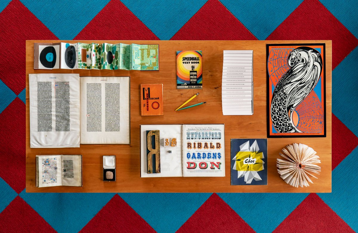
If you go, right now, to Letterform Archive’s Instagram page, you’ll likely see all your coolest, best-dressed friends in the list of accounts in the “Followed By” section. For four decades, Letterform founder Rob Saunders has collected exceptional examples of the letter arts from around the world. The 75,000+ pieces in the collection range from “type ephemera” from 1930s Germany to a broadside of typefaces from a 1780s print shop to an equally old book from Indonesia containing a majestic illustration of a buraq, a winged, horse-like creature. For artists, designers, and all-purpose dreamers, it’s a wonderland. The online archive makes much of these easily accessible.
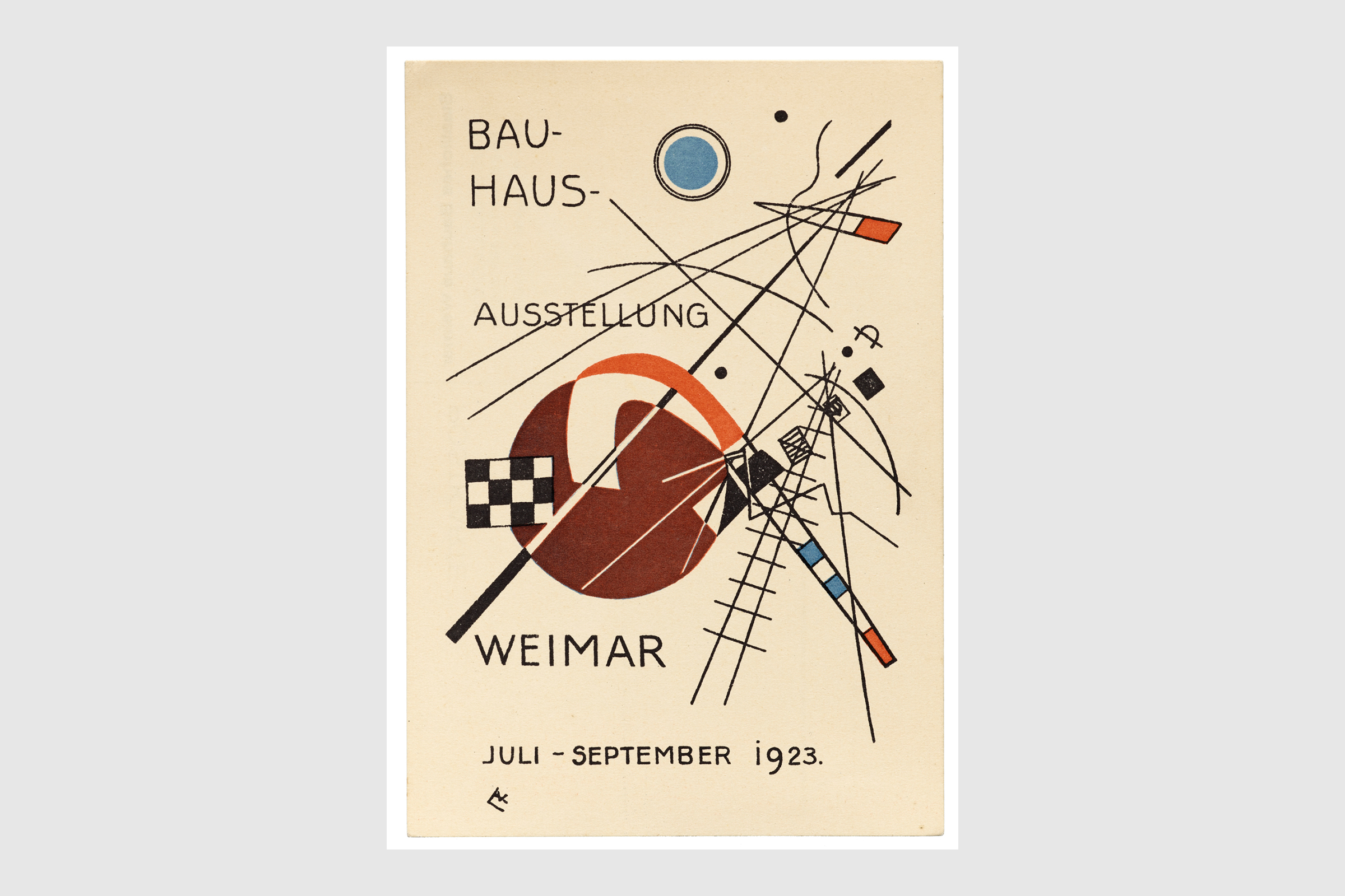
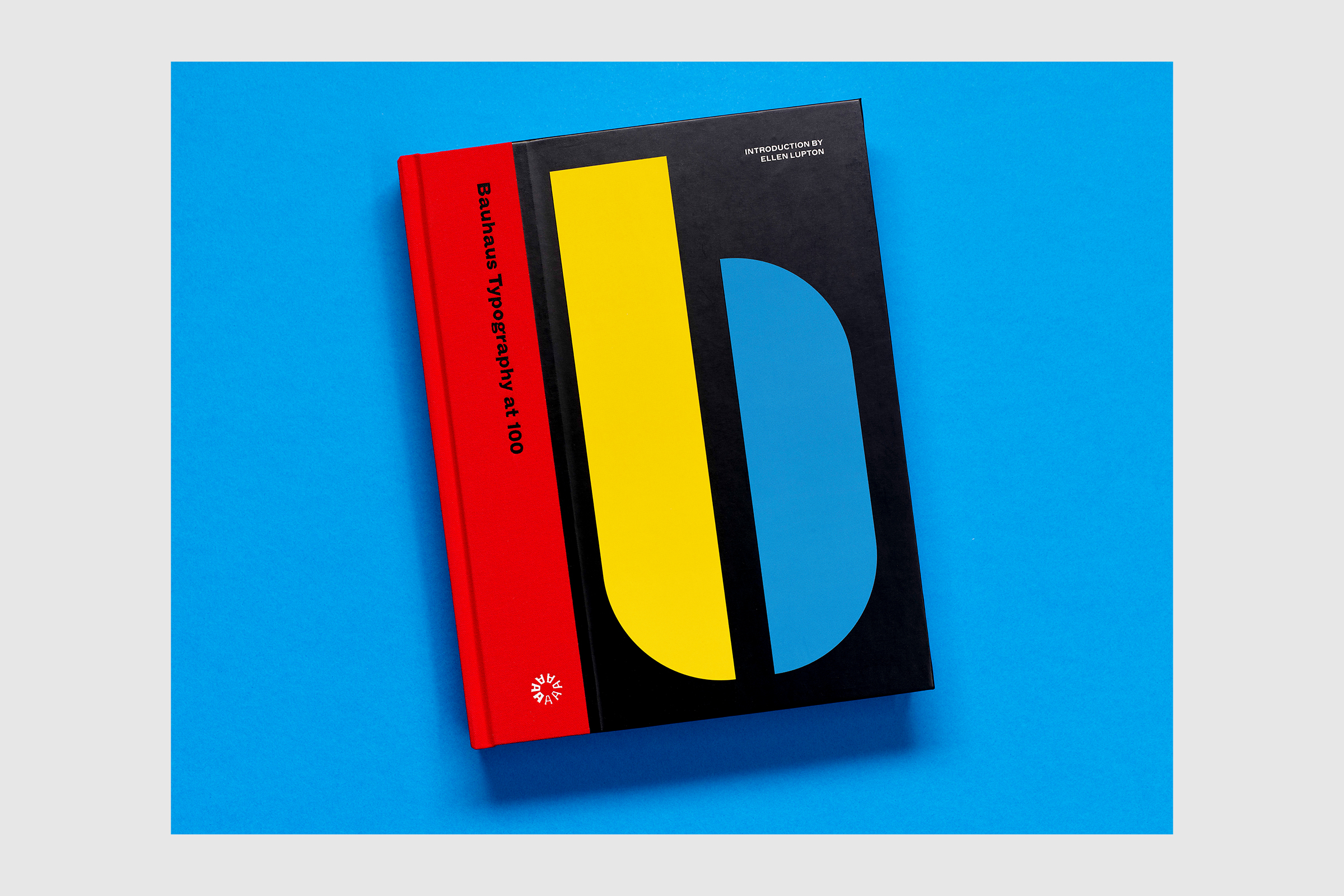
Letterform Archive has been open to visitors since 2015 — welcoming, by their math, “10,000 visitors from 30 countries, including students, practitioners, and letterform admirers from every creative background.” While COVID put a temporary halt to that, Saunders and his team were busy planning the debut of this new space in Dogpatch. The first exhibition will focus on the typography of the hugely influential Bauhaus school, founded by Walter Gropius in Weimar, Germany, in 1919. “We’re either showing things that we have, or thing we want,” Saunders says. This show represents the former; an upcoming exhibition on graffiti arts will focus on the latter.
Here, we talk to Saunders about the archive, its future, whether S.F. has a semi-official font, and the typeface he thinks in best.
InsideHook: Why is now the right time to open a gallery?
Rob Saunders: We’ve always wanted a gallery. Our old location — which is only about six or eight blocks away from where we are now — consisted of three live-work lofts that happened to be on the same hall, but were terribly inefficient. We were running up and down stairs and in and out of locked doors with books all the time. We knew we had to go — in the end, our landlord kind of forced us out . Gallery space was one of the criteria we had for a new space.
It’s quite small, but it’s a beautiful space in an old industrial building. It’s was just an ambition that we’ve had for a while — to have a gallery and to be able to share the collection with the public in that way.
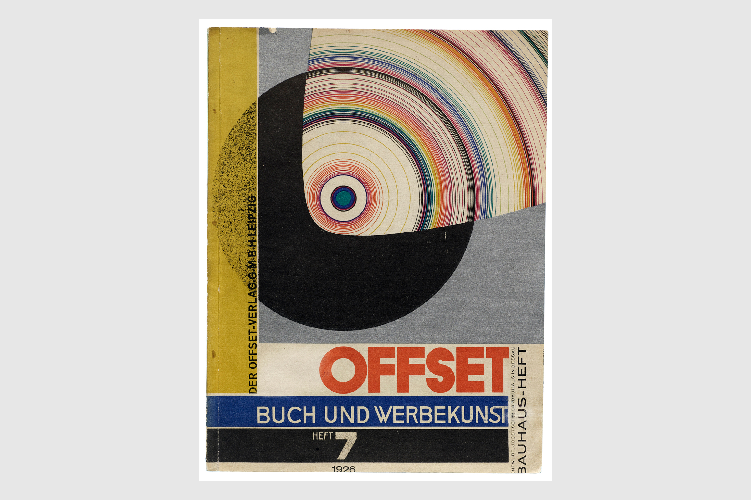
Why start with Bauhaus typography?
Well, we’re in the centenary of the school, which ran from 1919 to 1933, though the typography workshop wasn’t established until 1925. There were a lot of anniversary [events] that happened around 2019, but we wanted to take a deeper dive and also address a slightly wider timespan.
This also happens to be a strength of the collection, something I’ve collected for a very long time.
I’m sure you could have done anything you wanted in the art or design world. Why letter arts?
it started, you know, like a lot of passions: I was very young. Calligraphy was the gateway drug. I started doing it at 18, and I went pretty deeply down that rabbit hole, which led to typography and graphic design. Then I studied that and was an educator for a while, out of college. [Saunders taught at The School of the Museum of Fine Arts Boston and Tufts University.]
Were you practicing calligraphy at 18? I don’t know a lot of 18-year-olds who make that choice.
I had a tutor who was learning it at Northwestern and turned me on to it, and I was just fascinated by it. I got an Osmiroid pen set, which is a fountain pen with edged tips, and started playing around. It was a pretty deep rabbit hole. I probably did my 10,000 hours of calligraphy within about two or three years.
Do you remember the first piece you bought for the collection?
I can’t even remember the beginning — I was just a student buying books. It’s not like, flip a switch and all of a sudden you’re a crazy collector. A lot of the books were quite normal — just regular new books. It was a while before I got into collecting the antiquarian market. I can tell you, because I coded my books.— I did so religiously at the beginning, when I started collecting — which means that I can look in a book and see when I bought it, and for how much. There are things in the Bauhaus show that I acquired in 1981.
Do you recall the last time you saw something that made you stop in your tracks?
It happens almost every day here. I’m surprised by shit all the time. The collection has exploded so much that I see things I’ve never seen before every day.
Anything in particular? Something super special?
I can think of a couple of things — some new arrivals and some that I’ve discovered in the collection. Just yesterday I was looking through four or five albums of matchbox covers from the late 19th century and early 20th century, from Sweden, Japan, and Belgium, all from the same factory, which exported them all over the world. But I don’t know! I might have looked the other way and said Russian constructivism.
Do you find it to be as rich, creatively speaking, as it’s ever been?
That’s a complicated question. I’m optimistic about Dogpatch, the arts district here, because it’s more affordable. But everything is racing beyond creatives, and freelancers, especially. It’s a systemic problem.
I am optimistic. When we opened, we didn’t anticipate the interest that we got in volume — neither in the demographic; it’s way younger than we’d thought. It’s actually concentrated on folks who, for example, trained in graphic design entirely on computers, and they crave [print].
As you know, San Francisco has a very rich design history. It turns out to have been, I think, an ideal place to open the Archive, because New York is kind of crowded as a market. San Francisco is surprisingly deep in design, and the young generation is amazing.
What do you hope the archive will be doing in a year or two that it’s not doing now?
Honestly, nothing — we’re doing enough for a year! We have plans to expand some programs. The biggest thing we’ll face in the next year is the transition from sort of a [Covid-induced] hibernation state to [the archive] being back open to the public fully. Everybody will be masked, and [collection access] isn’t as risky as, for example, a class or introductory visit with 20 people around a table talking to folks. So those services will open next year. But we’ve been really busy — we’ve been getting books ready, we’ve been doing a lot of digitization and cataloging for the online archive, and planning for the openings.
Do you think San Francisco has a signature font, the way Helvetica is associated with New York?
Some cities have commissioned fonts — Minneapolis comes to mind, and lots of cities in Europe. I don’t believe New York or San Francisco had commissioned a font, and I don’t think either one really over overwhelmingly suggests one, by proliferation of use cases, right? They’re both pretty typographically diverse, and rich, environments.
Is there a typeface that you find yourself returning to — that helps you think better?
Syntax. It’s been a favorite for almost 40 years, and I’ve used it off and on for various things.
Actually — I don’t know. I had to blurt out something. That’s an impossible question.
Meet your guide
This article was featured in the InsideHook SF newsletter. Sign up now for more from the Bay Area.


