
The Best Kit From Every World Cup of the Modern Era
The tournament doesn’t just mint global champions, it’s responsible for some of the best uniforms of all time
The World Cup isn’t just a tournament, it’s arguably the world’s greatest drama. A never-ending circus of victory and defeat, the contest is a minting machine for decades-long feuds, global superstars and unforgettable moments of ecstasy and heartbreak, all presented to a rabid audience of billions.
Naturally, a production this grand demands costumes. Hundreds of jerseys, representing dozens of international teams, have been worn since the first World Cup took place in Uruguay in 1930. Most are forgettable. Many are outright terrible. But a handful of transcendent designs have become synonymous with the magic of the tournament.
These kits have come to represent not just title-winning teams, but the pivotal moments and stories that make the World Cup singular. They’re an integral part of football mythology, a tangible reminder of the dazzle and delirium well after the games have concluded.
Ahead of the 2026 World Cup, which begins June 11 with a newly expanded roster of 48 teams playing across the United States, Canada and Mexico, we’re taking a look back at the best kits from every World Cup in the modern era of kit manufacturing. (This designation is up for debate, but I am defining this period as beginning with the 1966 edition held in England. The early kits were often under-designed and produced in-house.)
Some of these jerseys notched a spot for what they achieved, others for what they represented; a few made it in on the strength of the design alone. Given the sheer breadth of uniforms, I’ve chosen one kit per tournament, and for the sake of fairness, I’ve implemented a one-kit-per-team policy. In theory, this diversifies the winners, ensures that each kit is the pinnacle of the respective country’s design and avoids dynastic runs.
Below, the best kit from every World Cup of the last 60 years.
1966: England (Umbro)
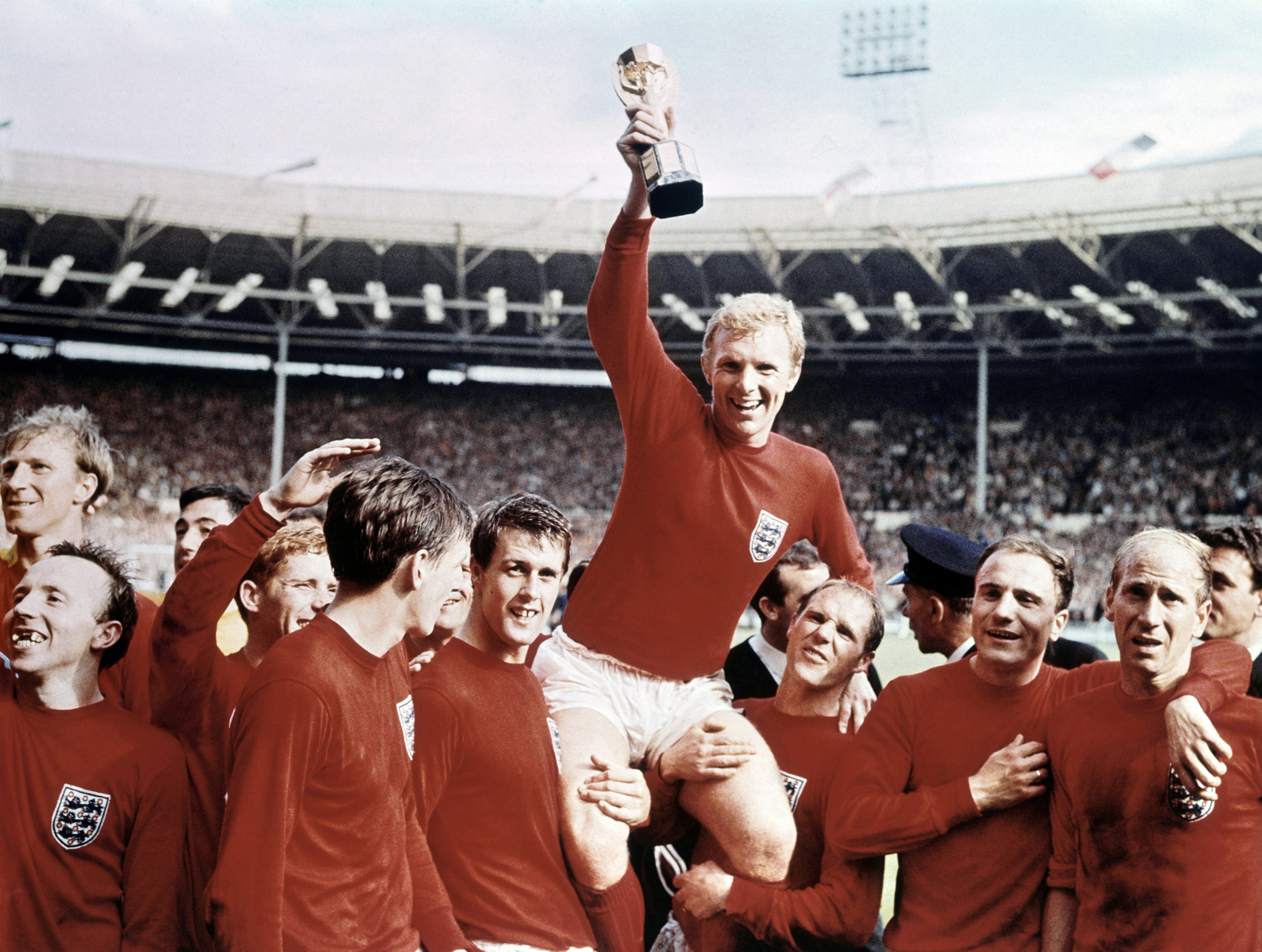
Even casual fans probably recognize the phrase “It’s coming home,” a perennial battle cry of the English that alludes to the nation’s sole World Cup victory over West Germany on home soil in 1966. The team’s Umbro-designed kit, in unmissable St. George’s red, might as well be a burlap sack compared to the clothing technology available now, but there’s real beauty in its simplicity. And it doesn’t get more British than a mock neck, long sleeves and a three lions crest.
More than anything, though, the shirt serves as a reminder of a proud footballing legacy — of Bobby Moore, a Geoff Hurst hat trick and a jubilant Wembley.
1970: Brazil (Athleta)
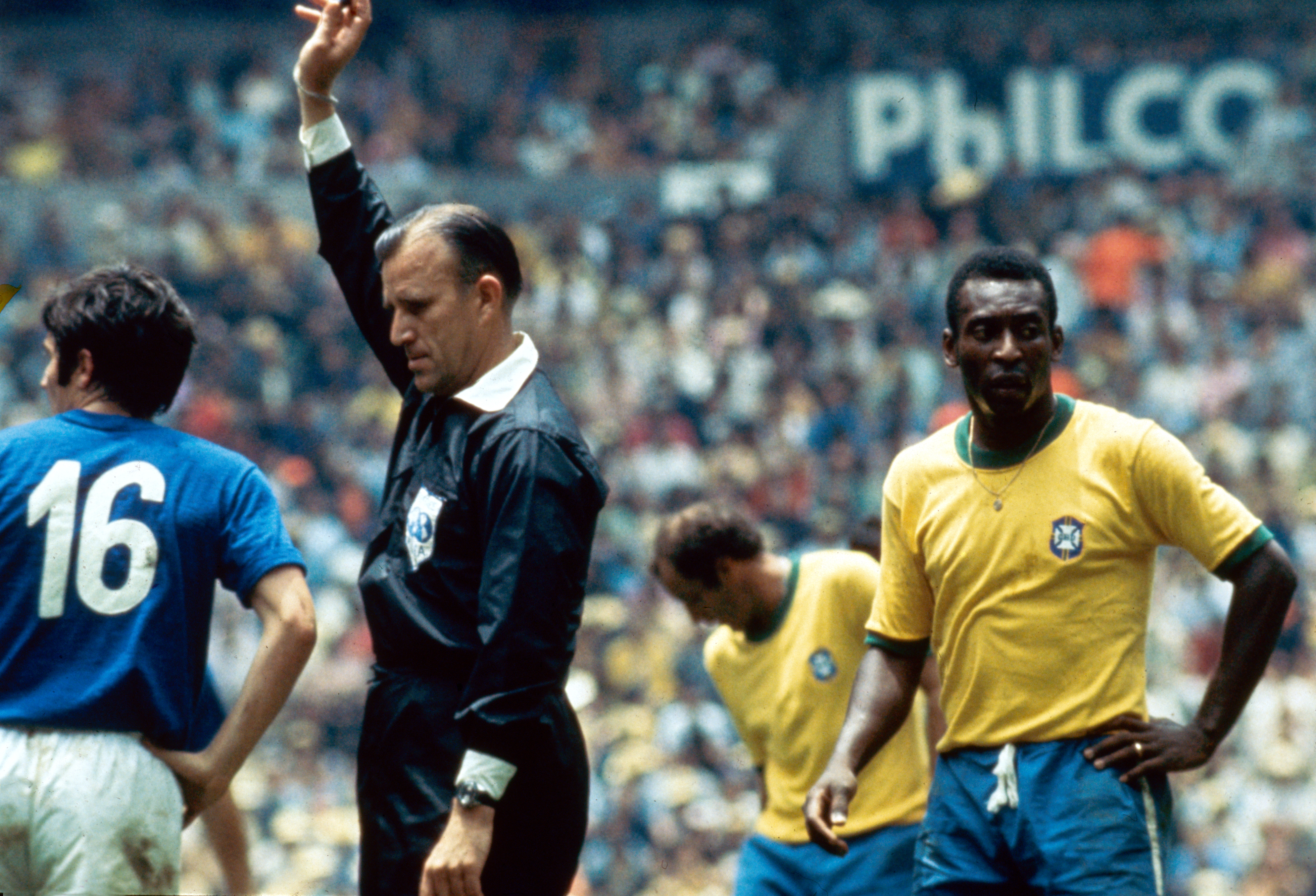
Some kits are synonymous with specific moments. Brazil’s kit is synonymous with football. A Seleção’s canary yellow is one of the most recognizable jersey colors of all time, not just in soccer but in sport at large, a heritage largely established during Mexico 1970, the first World Cup to be broadcast globally in color.
Worn by a roster of talent that included a prime Pelé, the uniform — a vibrant yellow shirt with green trim, paired with shock-blue shorts — served as a physical manifestation of joga bonito, and will go down in football folklore as a calling card for one of the greatest World Cup teams to ever grace the pitch.
1974: Netherlands (Adidas)
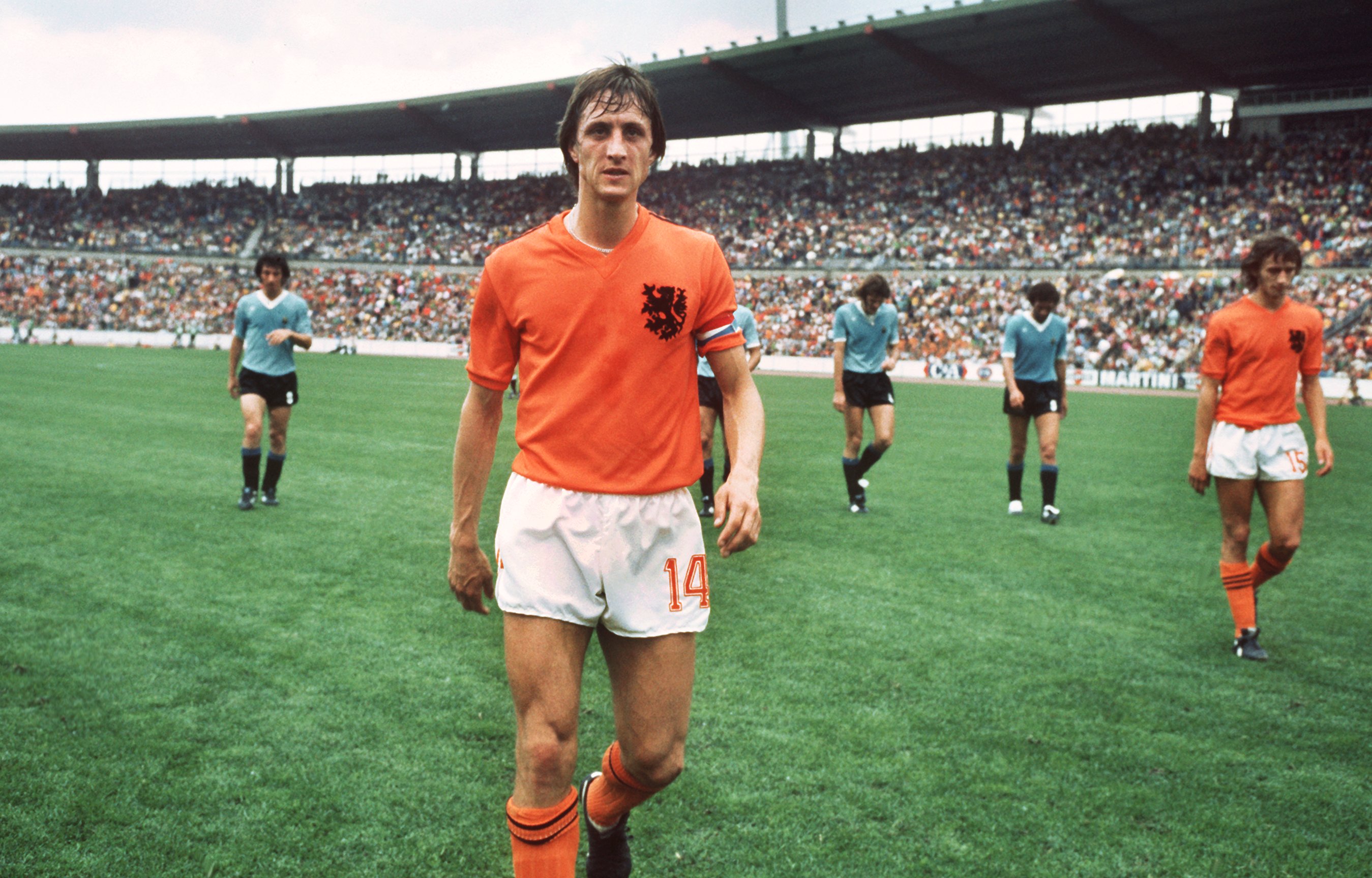
Worn by Johan Cruyff — arguably the best, and certainly the coolest player you’ve never heard of — and incepted before the wild prints and graphics the late ’70s had fully taken over, the Netherlands 1974 kit is among the most timeless uniforms ever produced. It’s simple, but effective. Adorned with an oversized Dutch lion badge and not much else, the blaze orange color does much of the heavy lifting.
1978: Mexico (Levi’s)
The 1978 World Cup is remembered for intense battles between the titans of the era: Brazil, Argentina and the Netherlands, mostly. This is a travesty, if only because it means that Mexico’s kit has gone unappreciated. Inexplicably produced by denim giant Levi’s, the V-neck style combined sleeve piping, exaggerated cuffs and the classic El Tri verde to devastating effect.
1982: Belgium (Admiral)
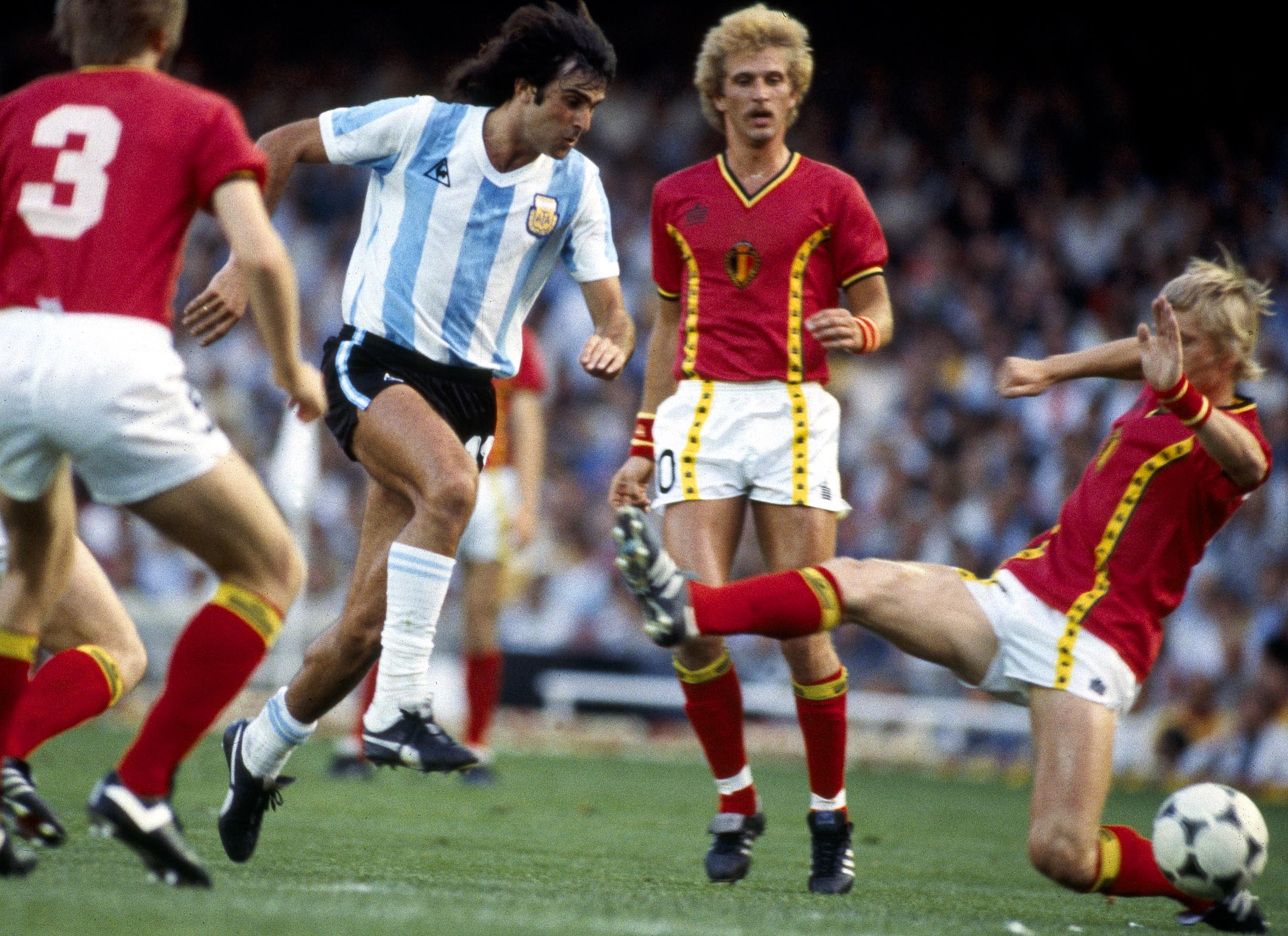
Despite a promising campaign gone awry, Belgium’s kits for World Cup 1982 were visionary — designed by sportswear brand Admiral, the jersey’s classic red-and-white scheme was subverted with vertical yellow graphic trim, extended to the accompanying shorts. In combination with the V-neck design, central badge and yellow-black piping around the collar and arms, it’s an aesthetic that feels almost retro-futurist, like something a modern retailer might attempt to channel vintage footy styles.
1986: Argentina (Le Coq Sportif)
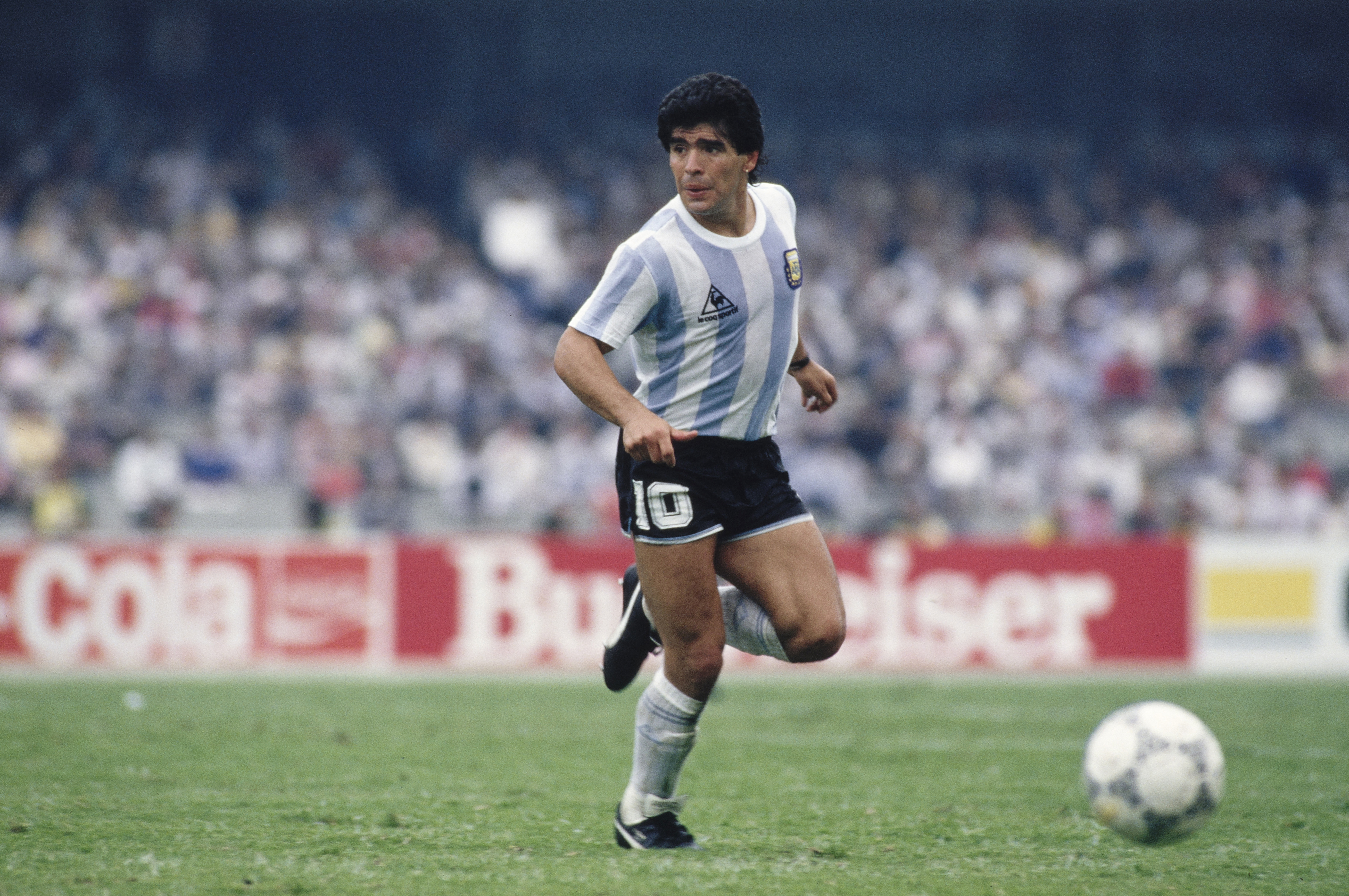
Brazilian soccer legend Zico once said, “I saw Maradona do things that God himself would doubt were possible.” Many of those things were done in Argentina’s 1986 kit, a zippy rendition of the sky blue and white of La Albiceleste, produced by Le Coq Sportif. Decked out in the chunky stripes, Maradona put on what is widely considered the single best World Cup campaign of all time; though two all-time highlights — “The Goal of the Century” and “The Hand of God,” both during a legendary 2-1 win over England — were notched while wearing a makeshift away jersey.
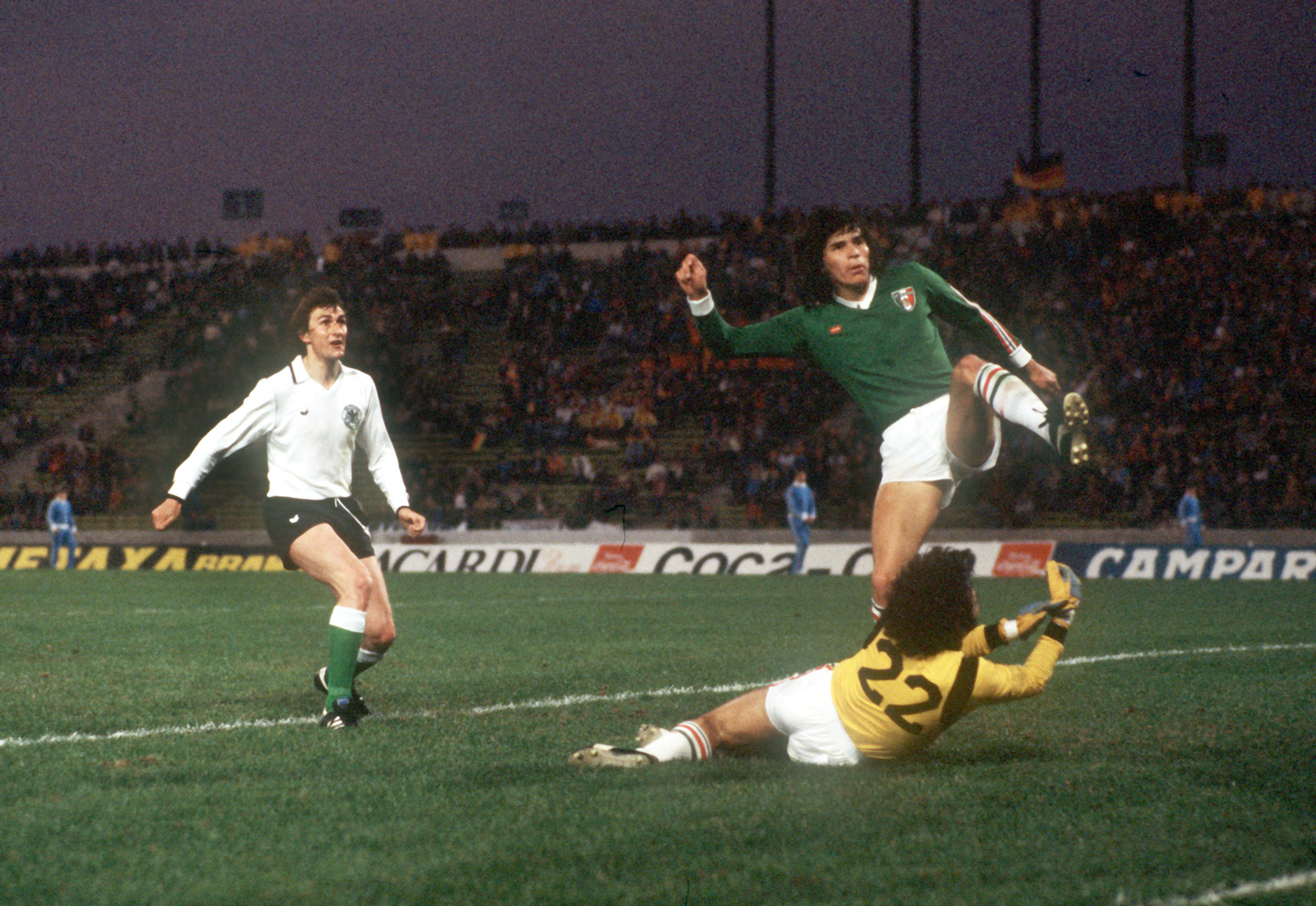
1990: West Germany (Adidas)
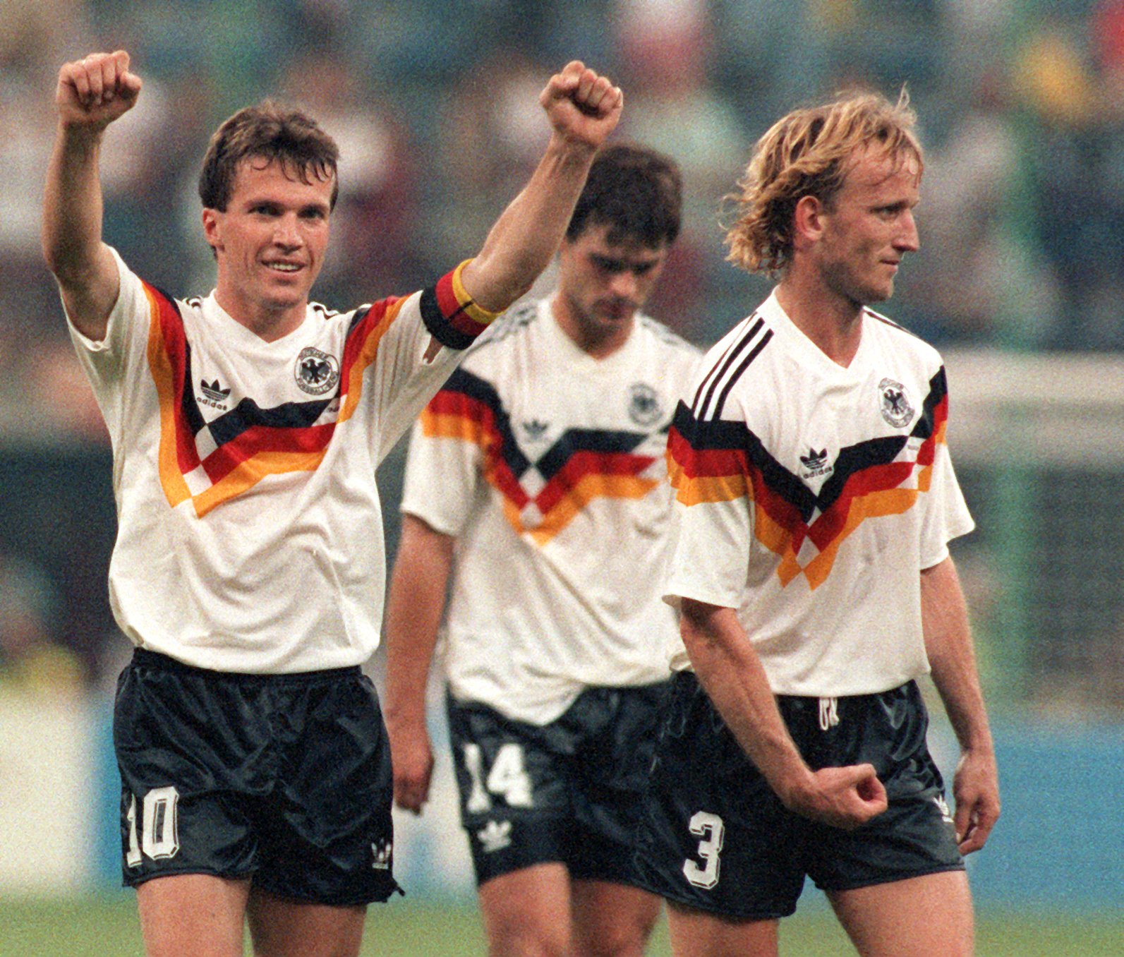
West Germany’s 1990 kit is often cited as the best international kit of all time. It’s easy to see why — Adidas struck gold with the iconic chest pattern, a tryptic chevron stripe in the black, red and gold of the German flag, kicking off a golden generation of ’90s-era kits in the process. Every detail, from the blended shoulder stripes to the placement of the Adidas logo, feels exactly right. No notes.
1994: USA (Adidas)
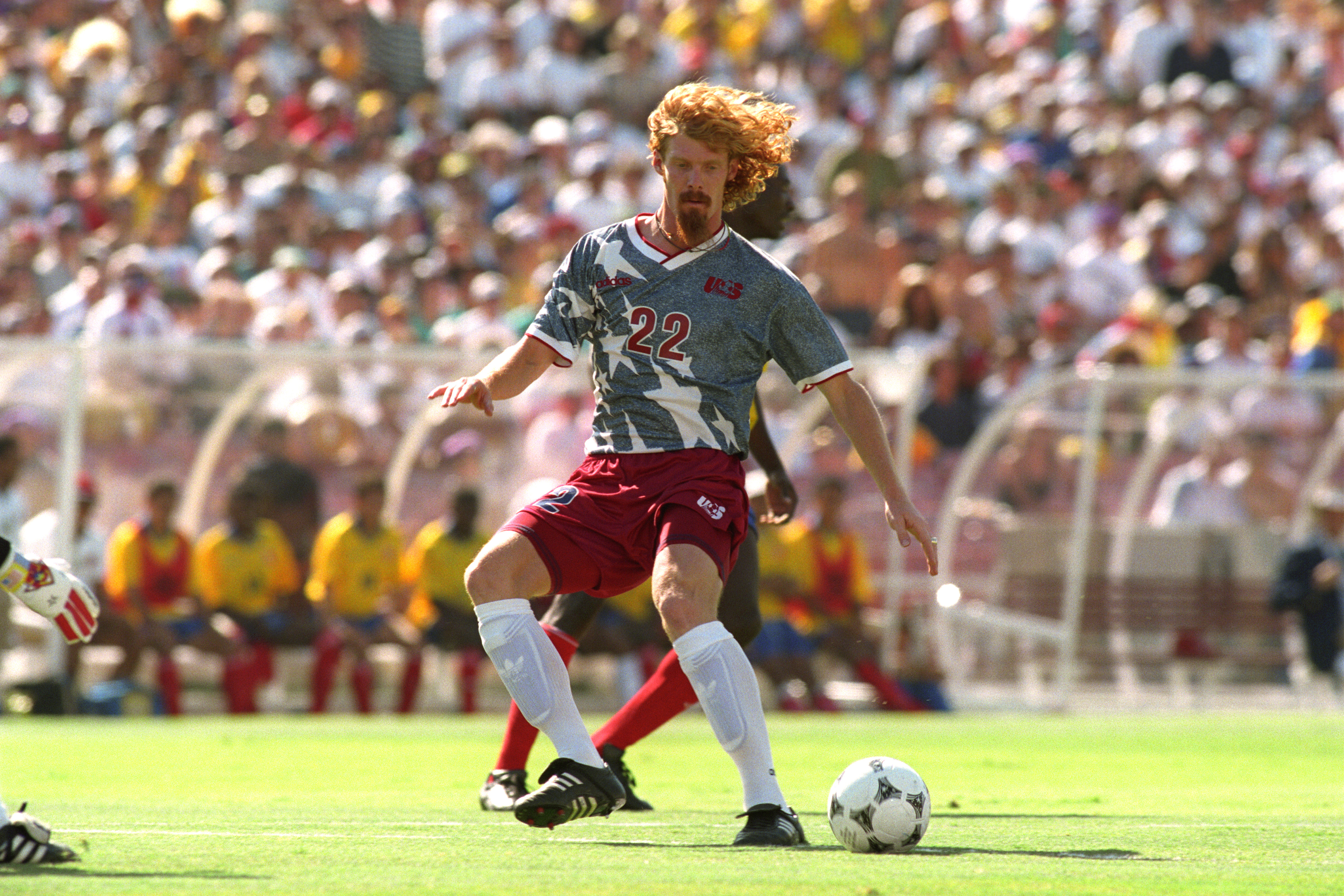
Stars? A pedigree? Who needs ’em. The USMNT has always been a small fish in a big pond, but that hasn’t stopped the Americans from wearing some truly incredible (outrageous?) kits, including the star-spangled uniforms concocted by Adidas for World Cup 1994. The denim-blue color, the oversized graphics, the OG logo — that’s patriotism at its finest.
1998: France (Adidas)
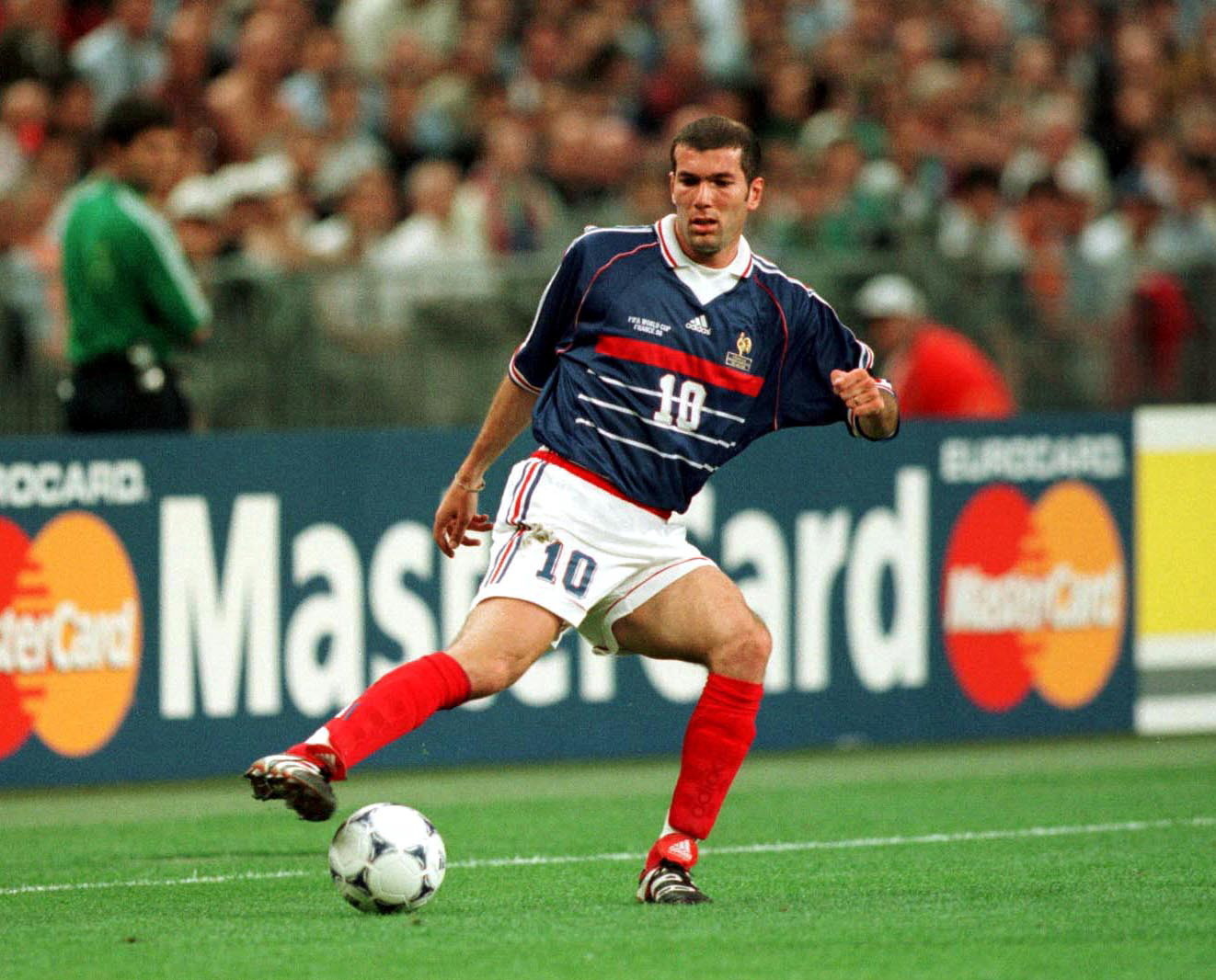
World Cup 1998 was littered with mind-boggling kits — Mexico, Croatia, Japan, the list goes on — but none more spectacular than that of the home team, and eventual champions, Les Bleus. Even amongst a canon of elite designs, the ’98 kit remains the pinnacle of elegance. Produced by Adidas and modeled after the country’s flag, the royal-blue jersey’s bold red chest band, shoulder striping and white collar combined for the quintessential French jersey.
2002: Italy (Kappa)
Typically, it’s a color, print or pattern that earns a kit cult status. For Italy’s 2002 World Cup shirts, it was the silhouette. Created by Kappa, the jersey’s skintight-bordering-on-spandexy stretch — reportedly fabricated so that referees could see when the shirt was being pulled — was a total novelty. And with a high, tight collar and extended sleeves, it introduced a completely new look for Gli Azzurri, somewhere between gladiator and scuba suit.
2006: Portugal (Nike)
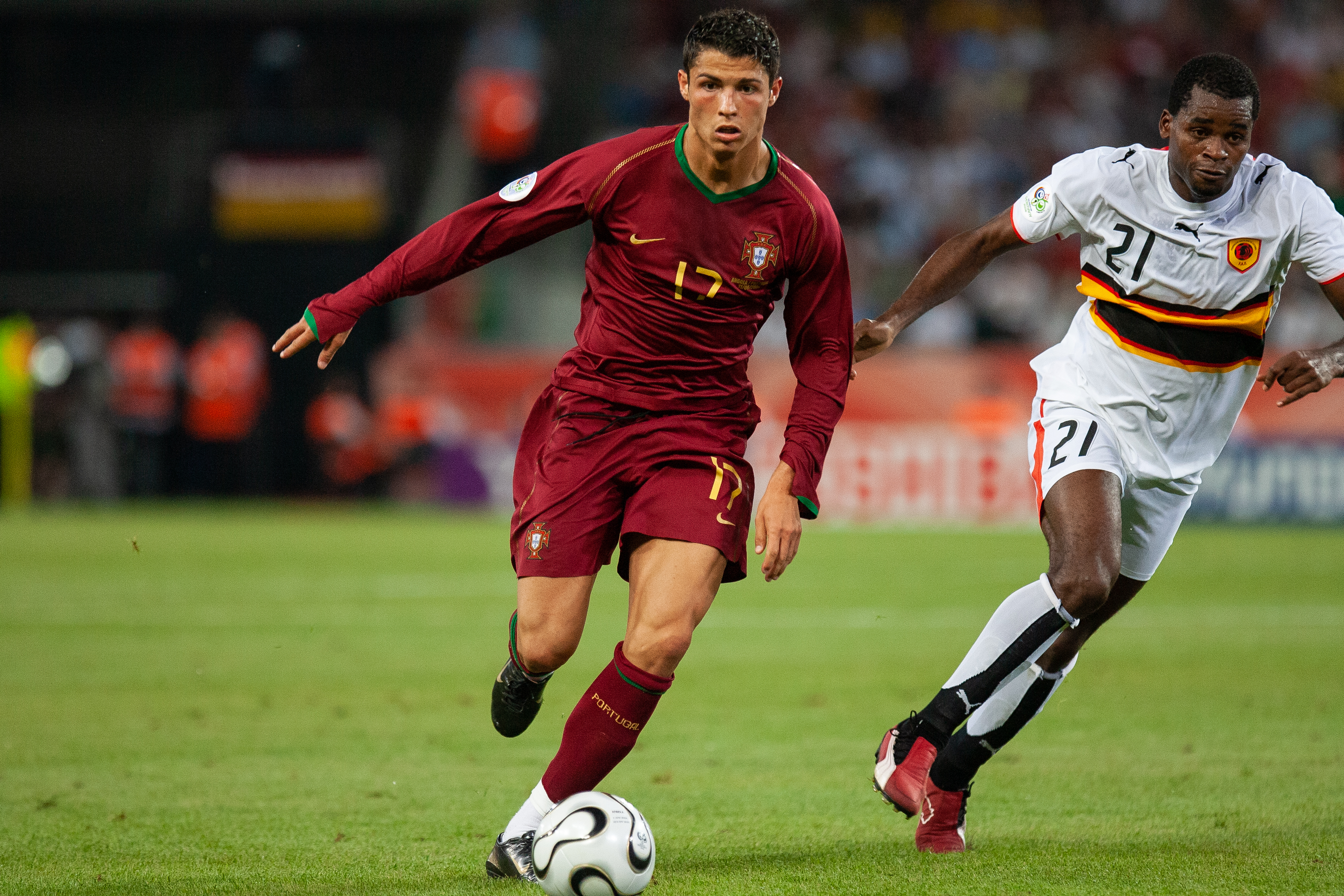
Today, Cristiano Ronaldo is the biggest athlete on the planet. In 2006, he was a tenacious, showboating starlet making his first World Cup appearance. His debut kit was an instant classic for Portugal — a beautiful, almost regal jersey with a boxy collar, green trim and gold appliqué on the crests and numbers.
2010: Spain (Adidas)
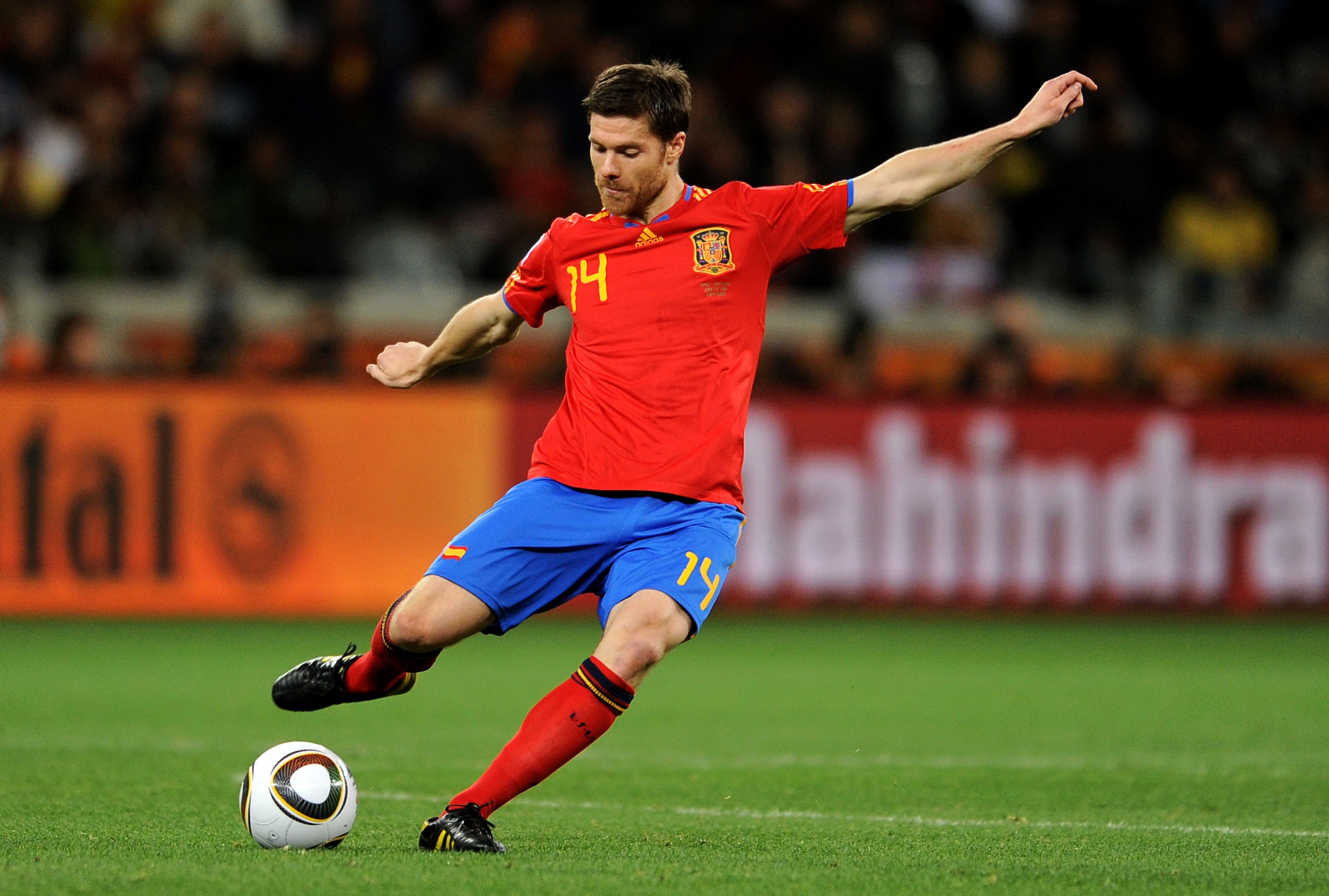
There is probably some irony in the fact that Spain’s golden generation — the only national team to ever win three international tournaments in a row (2008 European Championship, 2010 World Cup, 2012 Euro again) and perhaps the most technically proficient cohort of footballers the world has ever seen — dominated the planet wearing kits that, and I say this with love in my heart, looked like they were designed by a child. With a palette best referred to as aggressively primary school, the jerseys of La Roja were even more roja (and azul, and amarillo) than usual for the duration of the 2010 World Cup. Still, it somehow worked with the South Africa vibes. The tiki-taka probably didn’t hurt.
2014: Colombia (Adidas)

Colombia proved to be the dark horse of the 2014 World Cup in more ways than one. Alongside a deep run (and the best goal I’ve ever seen, a James Rodriguez volley against Uruguay), their Adidas kits — a handsome, banana-esque yellow base with a thin diagonal pattern across much of the body and a navy sash running from badge to shoulder — were the sleeper pick of the tournament, especially combined with the tribal-print “Battle Pack” cleats of the day. Lightning in a bottle.
2018: Nigeria (Nike)
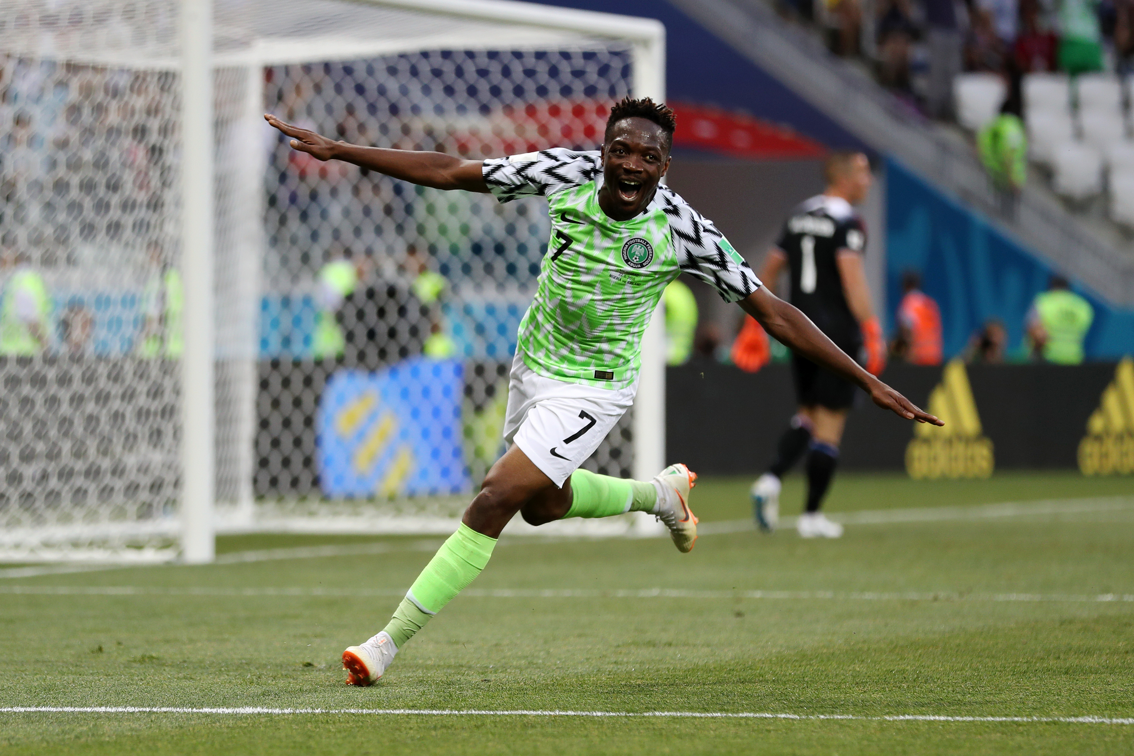
There’s visually idiosyncratic, and then there’s Nigeria’s 2018 kit. Created by prolific designer Matthew Wolff and produced by Nike, the contemporary jersey married a volt-green and white zig-zag body with feathered black and white sleeves meant to evoke wings (Nigeria’s team is nicknamed the Super Eagles). This might sound like too much on paper, but the reception proves out the risk — more than three million fans tried to preorder the shirt, and it remains a grail for many serious collectors.
2022: Japan (Adidas)
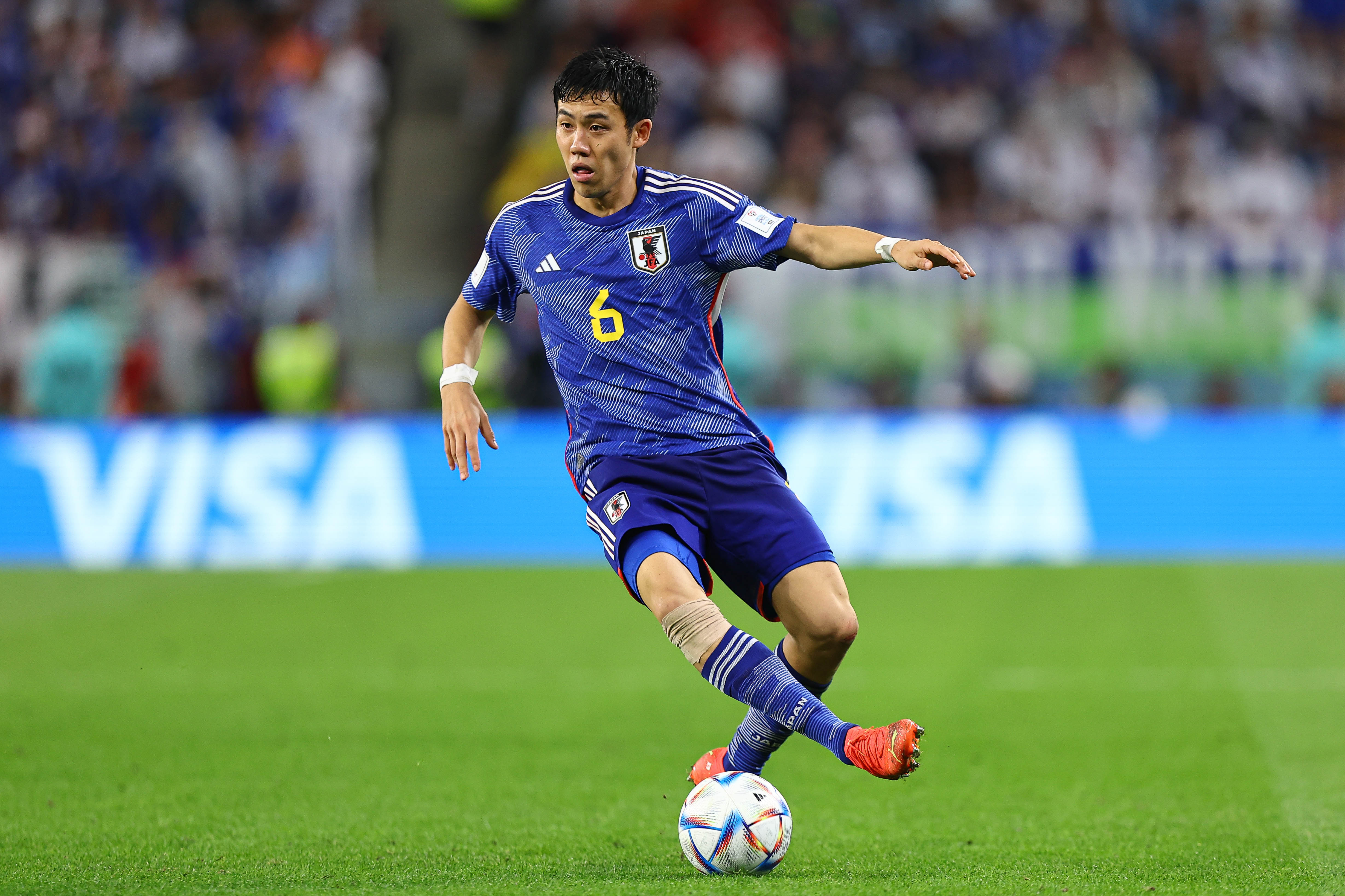
Even amongst Japan’s storied run of kits — this year’s additions are both excellent — the Samurai Blue’s last jersey, for the 2022 World Cup in Qatar, stands out. Nothing is out of place on the Adidas make: the distinctive origami pattern is an appropriate amount of eccentric, and retro yellow detailing (a throwback to the coveted ’93 kit) really stands out against the various tonal blues. The red contrast stitching, a nod to the Yatagarasu crest, is particularly tasteful. Less is more, until more is more.
2026: Ivory Coast (Puma)
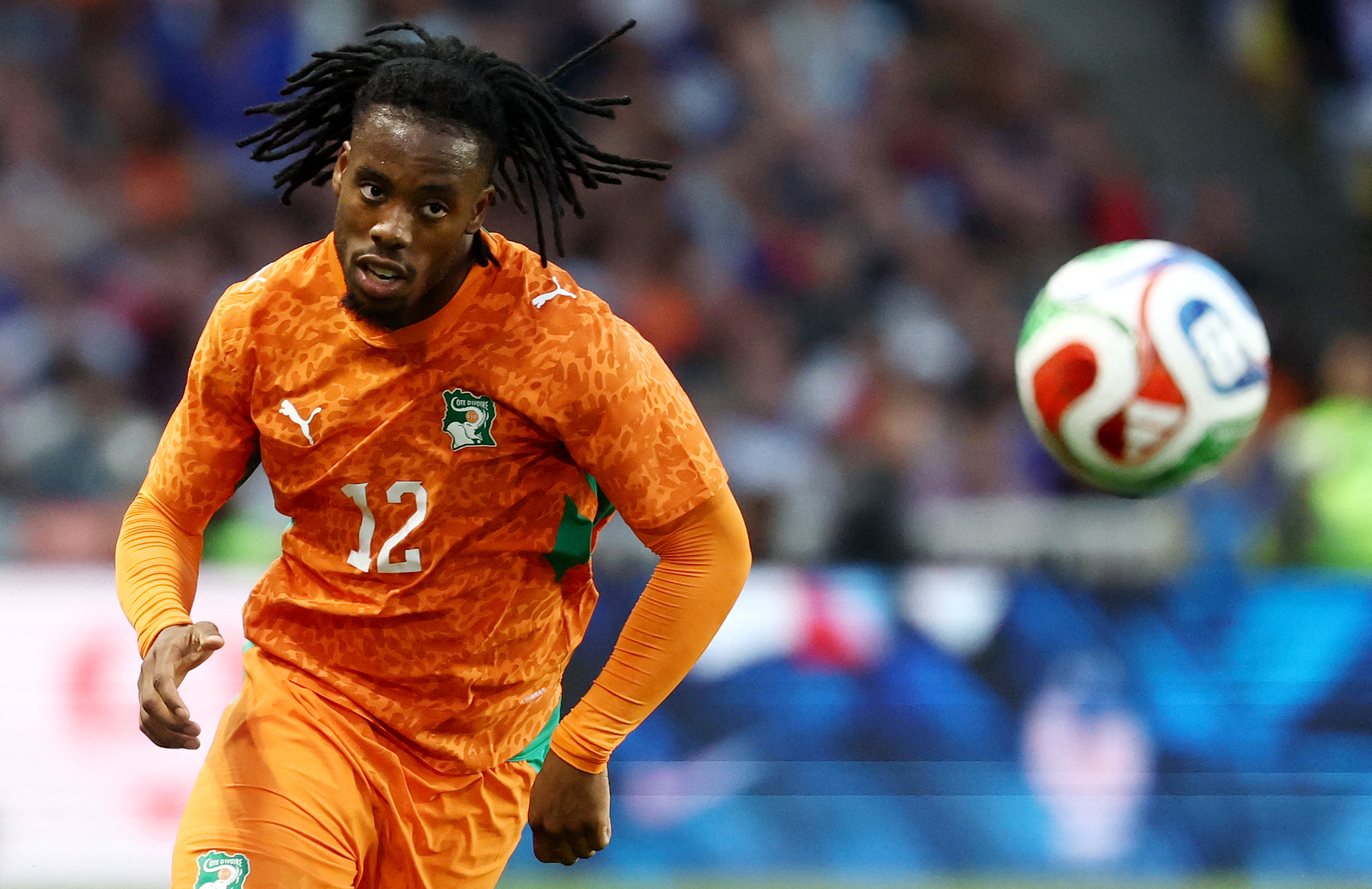
Is it too early to call a winner for the 2026 World Cup? Probably. That won’t stop me from crowning Ivory Coast. The new kits from Les Éléphants— part of a handful of stunning African designs, all by Puma — incorporate an all-over animal print into the team’s signature sunset orange. With green contrast paneling and white detailing, it’s exceptionally vivid and appropriately out there — everything you’d want for a once-every-four-years knockout tourney.
Meet your guide

More Like This
The Charge will help you move better, think clearer and stay in the game longer. Subscribe to our wellness newsletter today.