
For the past two decades, Paul Lukas been writing about sports uniforms, logos and field designs via Uni Watch, a column that has appeared on ESPN.com and Sports Illustrated as well as its own dedicated daily blog. Now he’s bringing his obsession — the aesthetics of athletics — to InsideHook.
In the beginning, there was Bucco Bruce, the swashbuckling pirate who was the symbol of the Tampa Bay Buccaneers’ famous “creamsicle” uniforms. He was ridiculed at the time but is fondly remembered today.
Then, in 1997, Bruce and the creamsicles were gone, replaced by pewter, a color that had never appeared on a sports uniform before — and a color that the Bucs rode all the way to victory in Super Bowl XXXVII. Another distinctive look for this franchise.
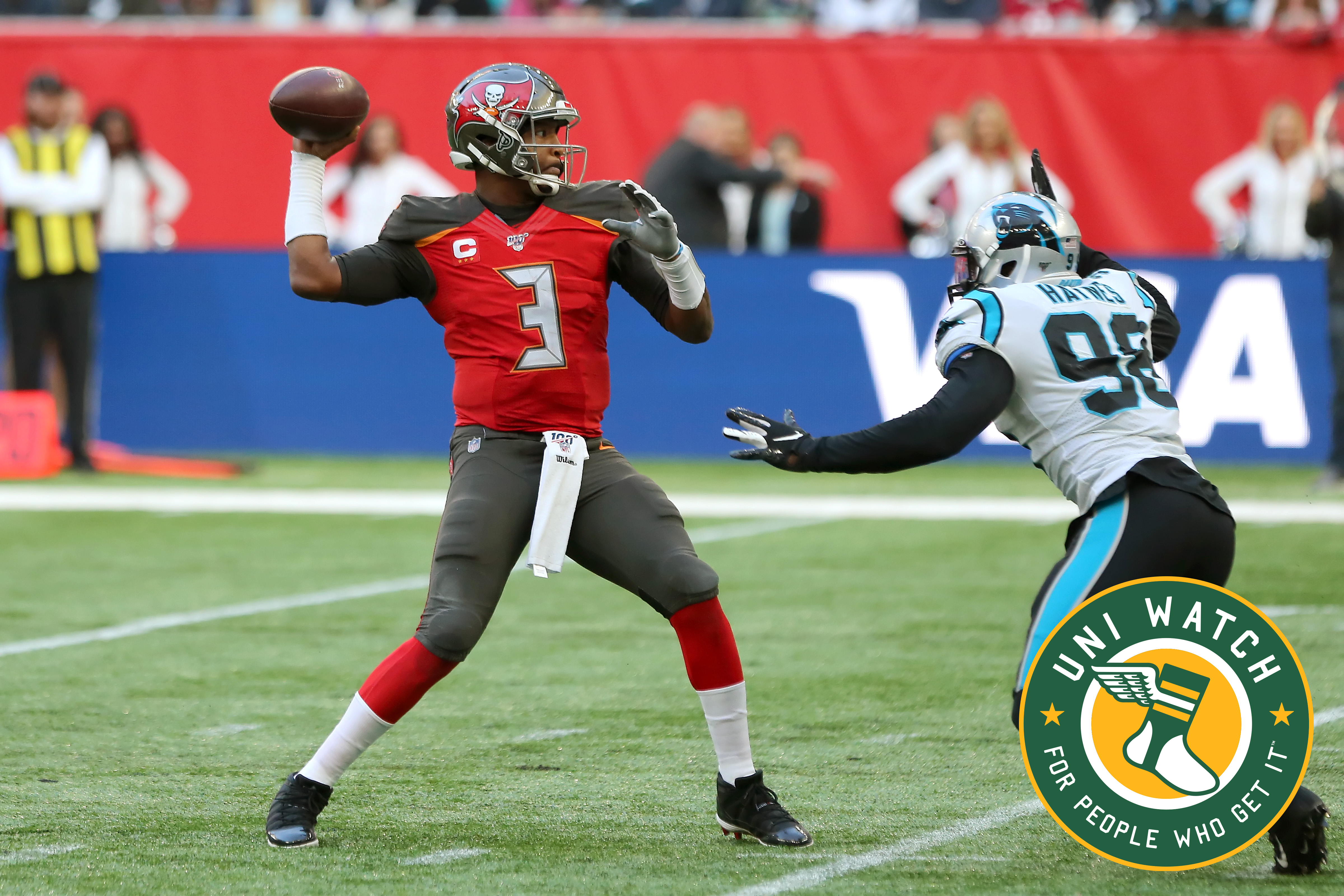
Then came the digital-alarm-clock look:
Ugh, what a mess. The uni numbers, the oversized helmet logos — it’s a disaster. The Bucs clearly need to go back to the drawing board.
So here’s our latest Uni Watch design contest: Redesign the Buccaneers!
Here are the guidelines:
- Your entry must include a primary logo, full home and road uniforms (helmet, jersey, pants, socks) and up to two alternate, Color Rush or throwback uniforms. If you like, you can also include secondary logos and a field design, but those aren’t required.
- You can maintain some of the team’s current elements (the helmet design, say, or the color scheme), draw upon the team’s visual history, or start from scratch and change everything. Up to you.
- Your designs can be created in any digital or analog medium (Illustrator, Photoshop, crayon, whatever) and can be submitted in any standard digital format (JPG, PDF, TIFF, etc.). You can also create a video presentation, upload it to YouTube and submit the YouTube link as your entry.
- The files you submit should be named after yourself (JohnDoe.jpg, for example). If you’re submitting multiple files, please either number them (JohnDoe1.jpg, JohnDoe2.jpg, etc.) or use some other designation (JohnDoe-HomeUni.jpg, JohnDoe-logo.jpg, etc.). Files that don’t follow this format will not be considered.
- In keeping with longstanding Uni Watch chromatic policy, entries with even a hint of purple will not be considered.
- Email your entry to Uni Watch HQ. If you have more than one concept, feel free to enter as many times as you like.
- Deadline: Submit all entries by Friday, Nov. 15. We’ll showcase the best entries here on InsideHook shortly thereafter. Good luck!
Paul Lukas has been writing about uniforms for more than 20 years. If you like this column, you’ll probably like his Uni Watch Blog. You can also follow him on Twitter and Facebook, and sign up for his mailing list so you’ll always know when a new column has been posted. Want to learn about his Uni Watch Membership Program, check out his Uni Watch merchandise or just ask him a question? Contact him here.
The Charge will help you move better, think clearer and stay in the game longer. Subscribe to our wellness newsletter today.