
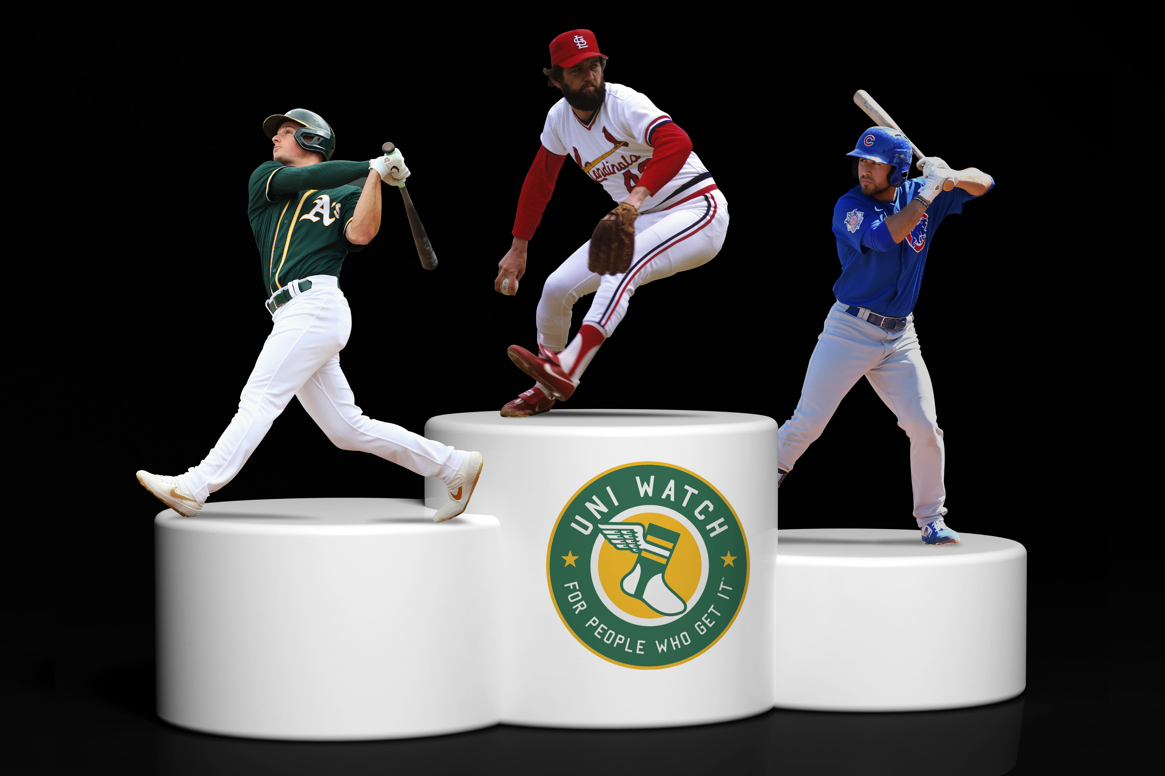
With sportswriters cooped up in their homes and no live events to report on, you may have noticed an increasing number of them choosing to fill the pandemic-induced void by turning to uniform rankings: the five best uniforms in Detroit sports history, or the all-time worst uniforms in Colorado sports history, or whatever. And really, who can blame them? Uniforms and rankings are like two great tastes that taste great together — they’re made for each other.
With that in mind, and with many people’s internal rhythms still telling them that it’s baseball o’clock, we hereby present the Uni Watch MLB Power Rankings, a definitive team-by-team ranking of current big league on-field attire.
Before we get started, a few notes:
- All judging has been done by the Uni Watch Power Rankings Executive Committee, which has a membership of one and freely admits its biases. The committee is rather fond of striped socks and the color green, for example, but is less enthusiastic about the color purple and design “innovations” that just feel like gimmicks. If you don’t share the committee’s preferences,
then you’re totally hopeless and it’s a wonder you can even dress yourself in the morningthat’s fine — the whole point of a project like this one is that it’s fun to argue and disagree. - Each team has been ranked primarily on the basis of its current home and road uniforms, with alternate uniforms taken into account if they’re part of the team’s regular uni rotation (and given extra weight if they’re worn a disproportionate amount of the time). One-off designs, special holiday promotions and so on have not been considered.
- The rankings take into account all of the new uniforms that have been released for 2020 (which, in case you missed them, were broken down in fairly granular detail in our recent Uni Watch MLB Season Preview). Factoring in these new designs was, by necessity, somewhat speculative, because we haven’t yet seen them on the field.
- Baseball is a pretty good-looking sport these days, so don’t be too upset if your favorite team didn’t make the top 10. Although there are 30 MLB teams, the inflection point from “Not Bad” to “Meh” on our list takes place at about No. 21 — well past the halfway point.
Okay, enough preliminaries. Ready, set, argue!
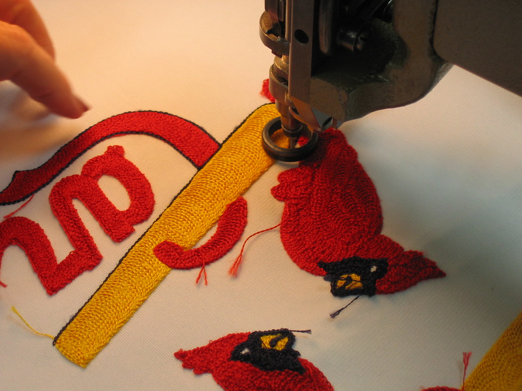
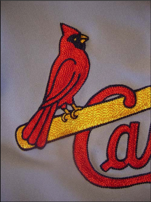
1. St. Louis Cardinals

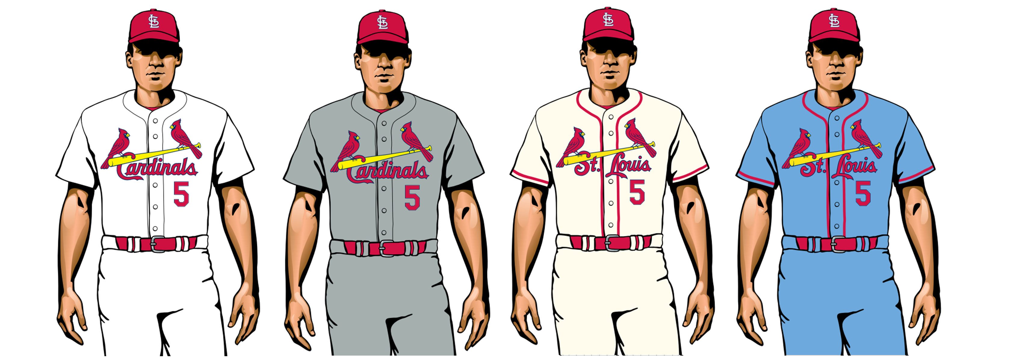
When people ask me about my favorite uniform — not just for baseball, but for sports overall — this is the one I cite. The bat-perched birds on the Cardinals’ jersey are every bit as iconic as the Yankees’ pinstripes or any other visual signature in sports, plus they’re rendered in chain-stitching — an old-school embroidery technique that really makes them pop. Once baseball finally starts up again, this uniform set will be the single most welcome sight, at least here at Uni Watch HQ.
2. Oakland A’s

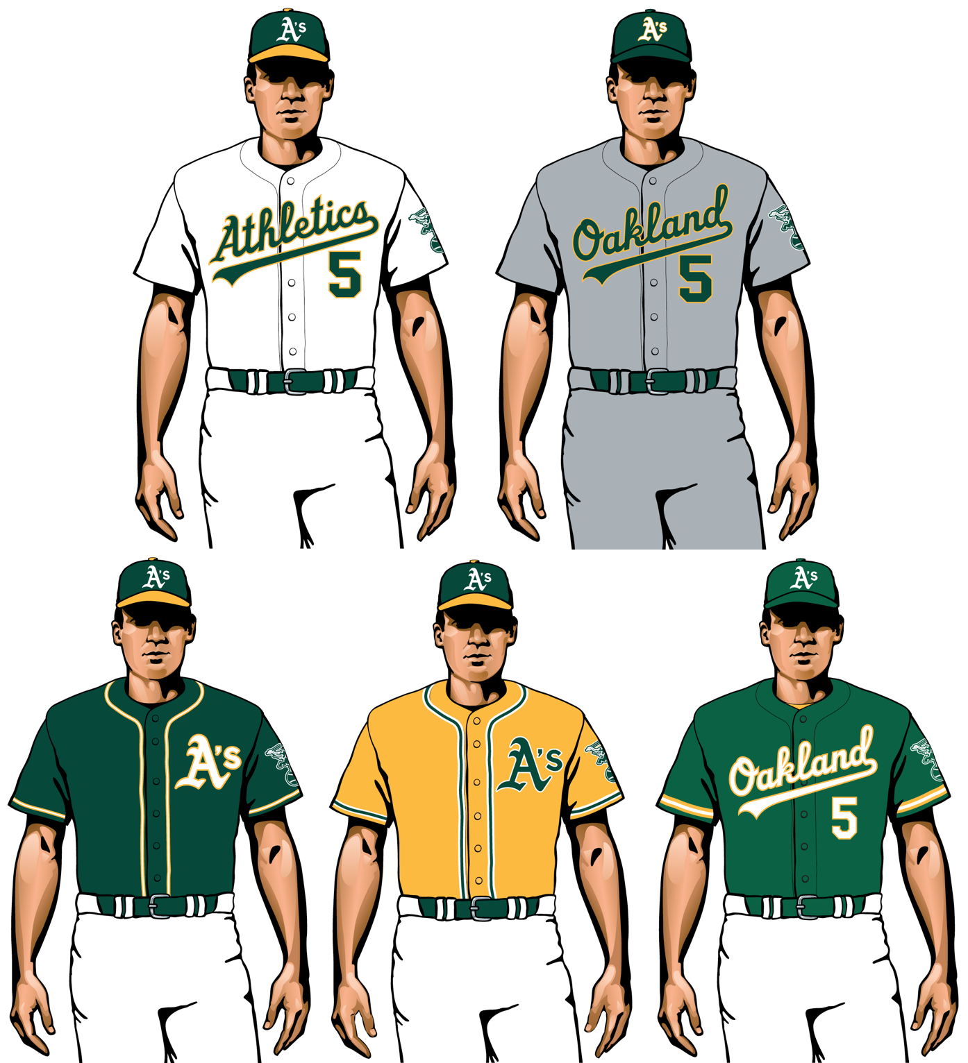
You might say, “No team needs five different uniforms,” and you’d be right. But I’d respond, “You can’t have too much of a good thing,” and I’d be even righter. Every one of Oakland’s uni combos looks sharp, thanks in part to the unbeatable color scheme of green and gold. That was considered revolutionary, maybe even scandalous, when A’s owner Charles Finley introduced it in the 1960s. Half a century later, it just looks classic.
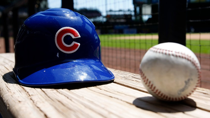
3. Chicago Cubs

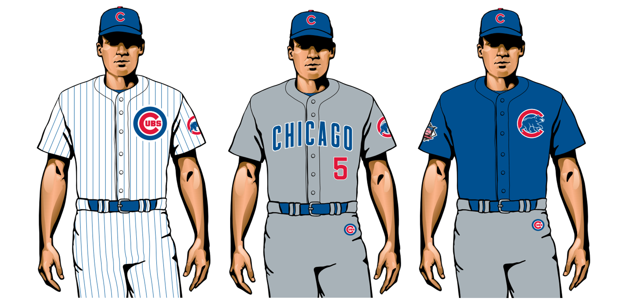
Here’s how it’s done: The home whites and road grays are nearly perfect, and even the blue softball top isn’t bad, because who doesn’t love the walking cubbie logo on the chest? Bonus points for the endearingly odd quirks of being the only MLB team to have a team logo on the upper pant thigh and an embroidered batting helmet logo patch.
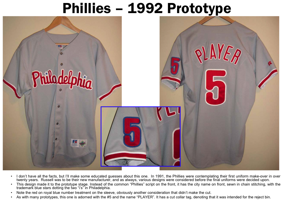
4. Philadelphia Phillies

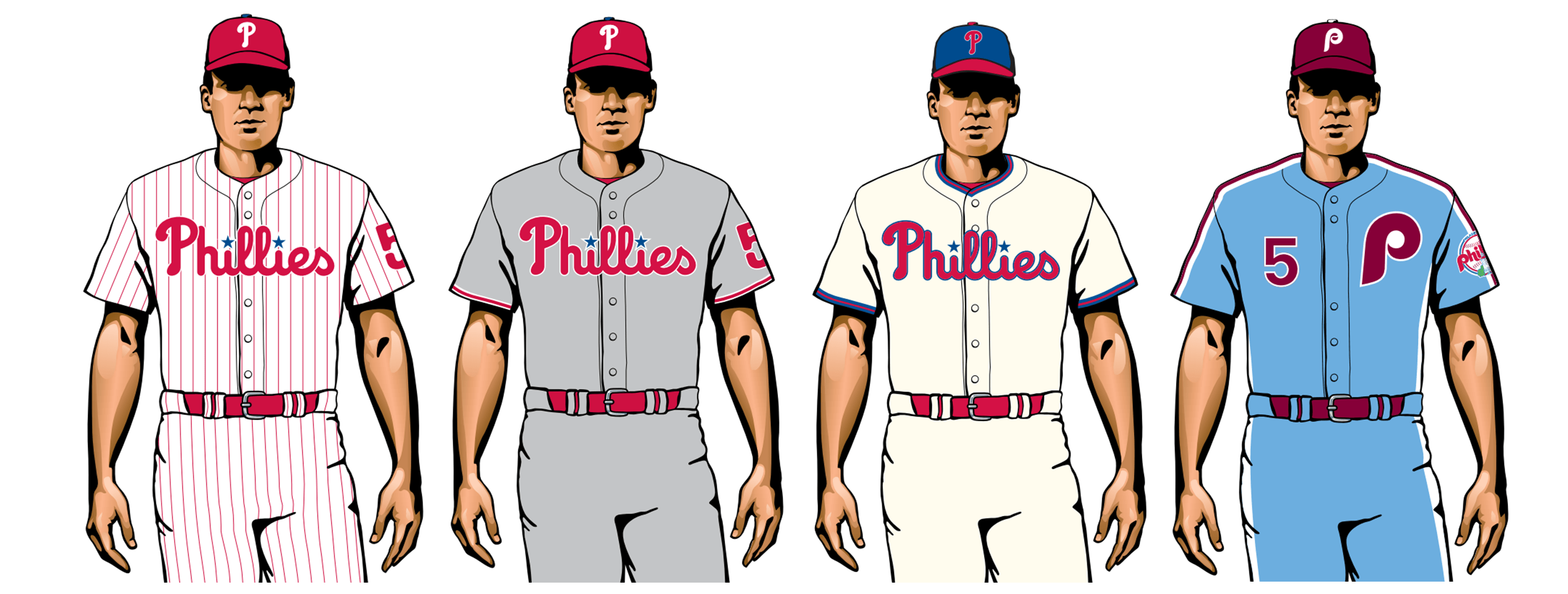
Here at Uni Watch HQ, we usually frown on teams that don’t wear their city name on any of their jerseys. But we can cut some slack for the Phillies, because omitting the city name is actually part of their uniform heritage: Over the team’s 137-year history, they have never worn the word “Philadelphia” across their chests (although they have worn the abbreviation “Phila.” and at one point did consider using the full city name). That issue notwithstanding, the Phils are a case study in how to build a first-rate baseball uniform set: Start with classic home and road designs, add a cream-colored alternate and top it off with a powder-blue throwback. Not a stinker in the bunch!
5. Los Angeles Dodgers

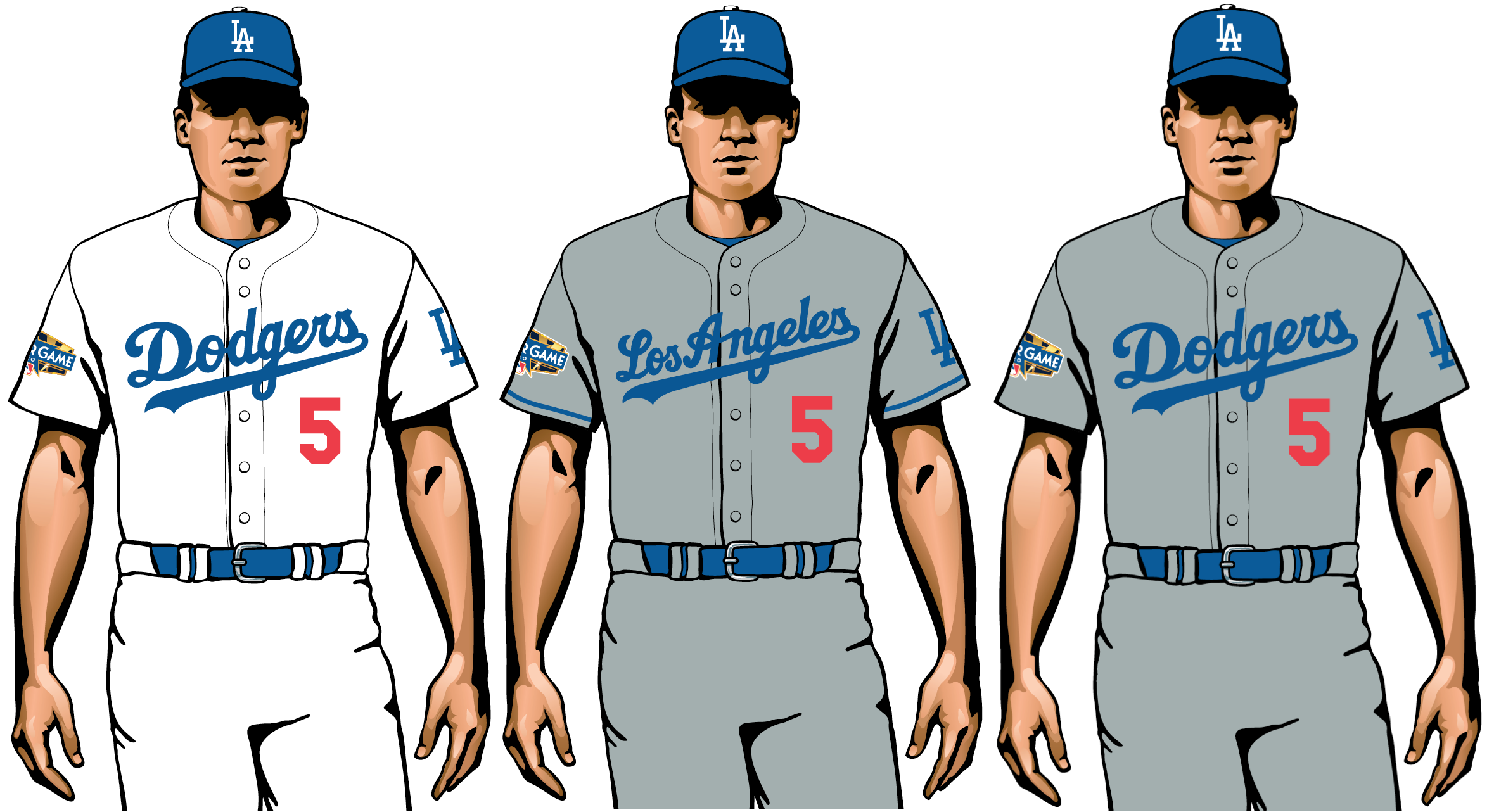
Is an alternate still an alternate if it’s worn more often than the primary? That’s a legitimate question for the Dodgers, who wore their alternate “Dodgers” road jersey 59 times last season, compared to only 21 times for the “Los Angeles” primary. That’s a bit of a downer (a team should rep its city on the road whenever possible, am I right?), but aside from that, the Dodgers’ uni program is a textbook case of, “If it ain’t broke, don’t fix it.”
6. Detroit Tigers

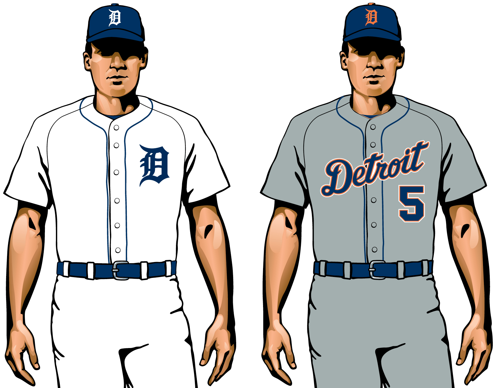
One of only two MLB teams without an alternate uniform — just home and road. But when the home and road designs are this good, it’s hard to complain. They’d rank even higher on this list if they’d just go back to the old version of their jersey logo, which they tweaked in 2018.
7. New York Yankees

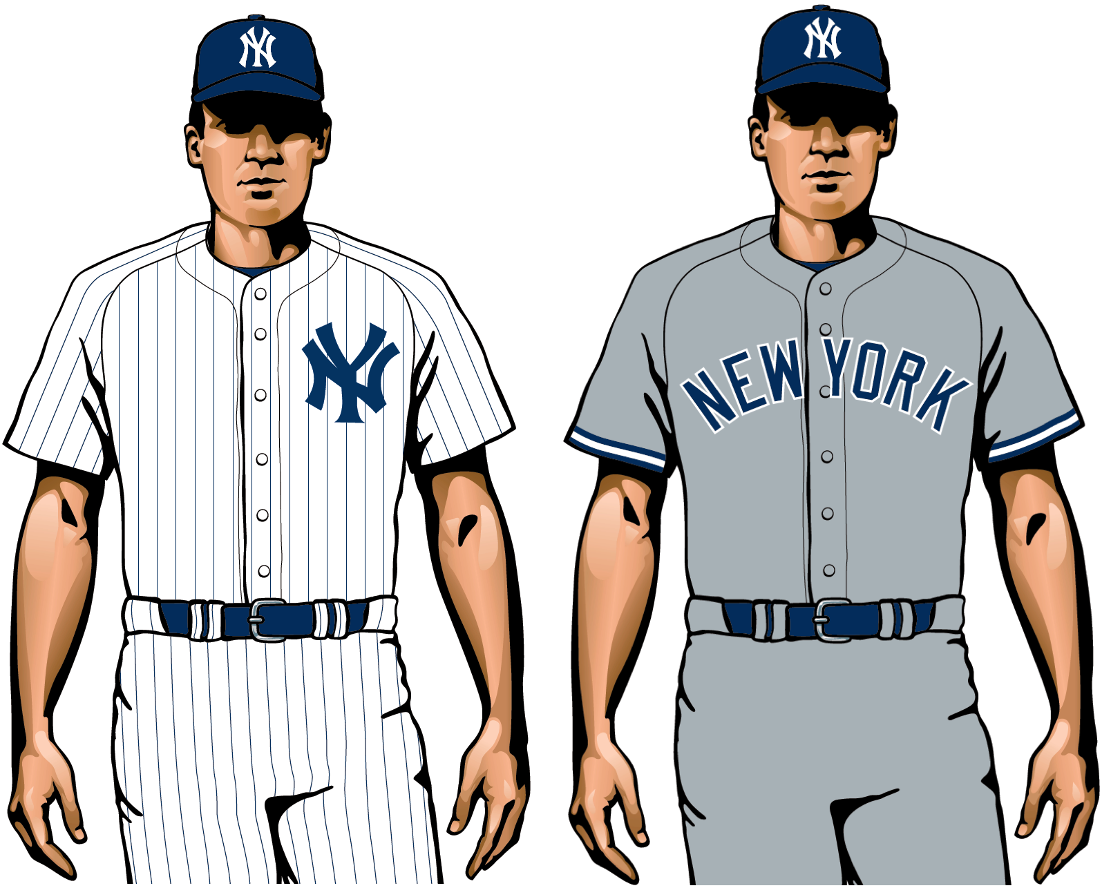
Here’s the other MLB team without an alternate uni, as well as the only team in all of top-level North American pro sports that doesn’t put its players’ names on any of its jerseys. It’s hard to argue with the classic home pinstripes or the simplicity of the road uniform. Still, if you compare the Yanks with the Tigers, Detroit’s road uni, with its script insignia and splash of colored trim, seems more appealing, no? That’s not to say that the Yankees should change anything — change isn’t really in their DNA — but it’s no great heresy to acknowledge that “iconic” is not the same thing as “dynamic.”
8. New York Mets

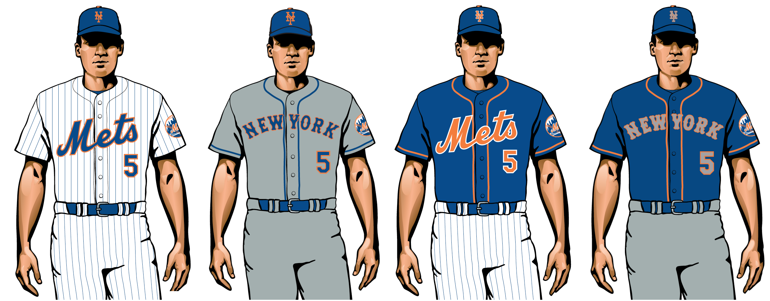
Let’s face it: Nobody — nobody — needs two separate blue alternate jerseys. Still, the Amazins’ standard home pinstripes and road grays can compete with any other uni set in the game.
9. Baltimore Orioles

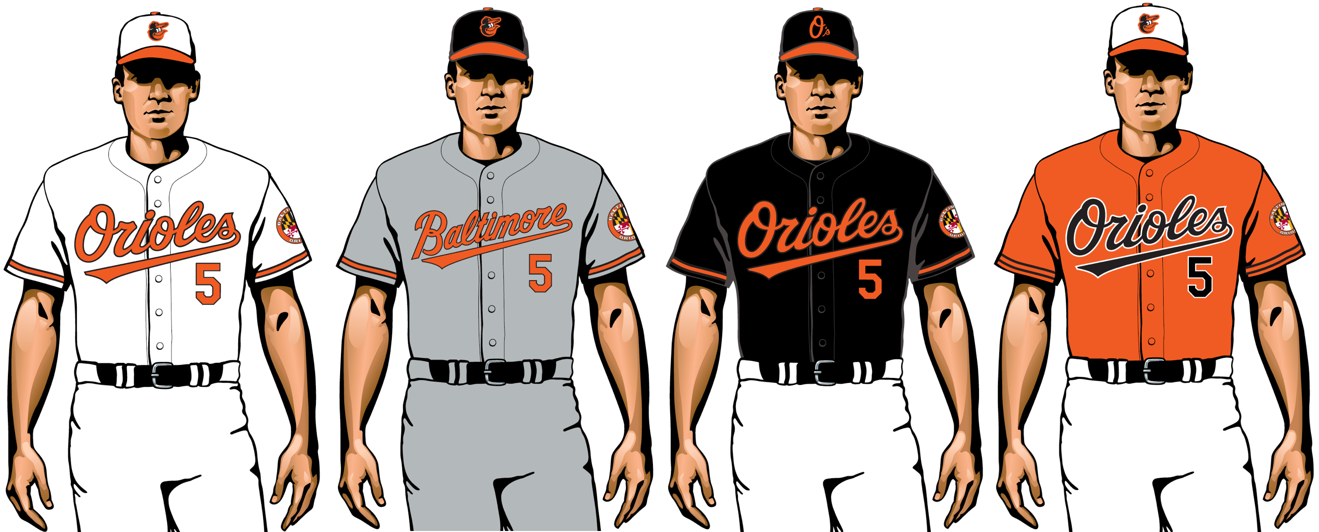
The O’s were epically awful in 2019, going 54-108, but at least they had no major problems regarding their uniforms. The color scheme, the jersey script, the cartoon bird logo on the cap — it all works. Think of it this way: If fate has decreed that you’re going to have a historically bad year, you may as well look good while you’re doing it.
10. Toronto Blue Jays

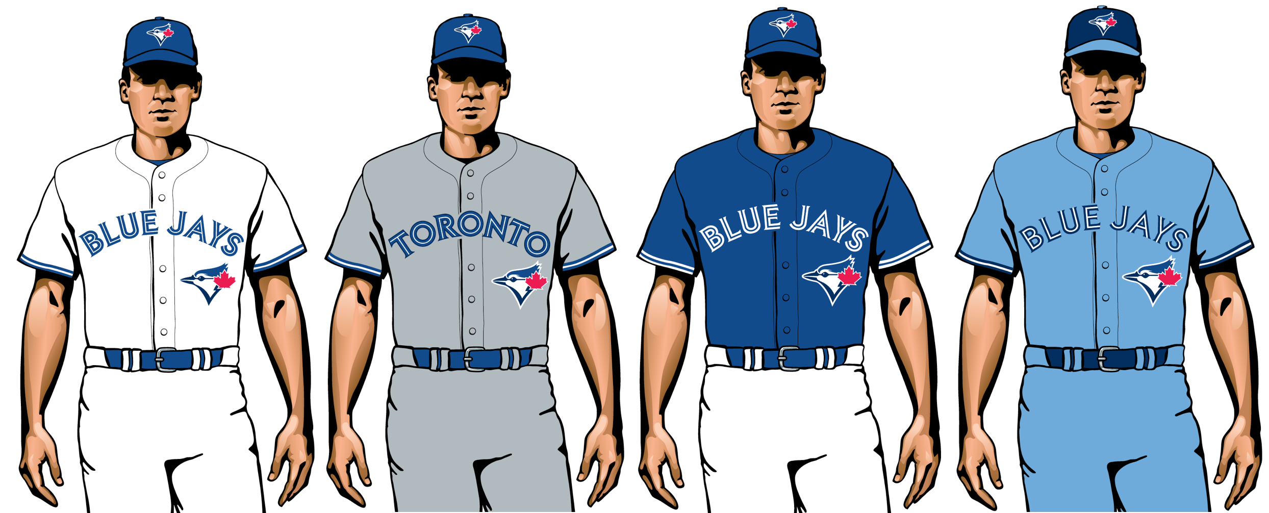
The Jays’ current set, introduced in 2012, is a case study in how to properly update an old design. It’s based on their original 1970s-1990s uniforms, but with snappier typography and a subtly tweaked logo. The new powder-blue alternate, just added this season, is the cherry on top.
11. Boston Red Sox

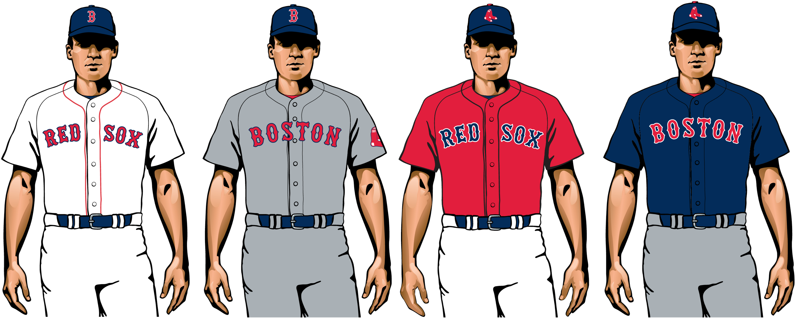
Why do the Red Sox — a team with an old-school heritage, playing in baseball’s premier old-school ballpark — bother to have solid-colored alternate jerseys? You can sort of understand the navy road alternate, but that bright red home alternate is an affront to the spirit of Fenway Park. Getting rid of it would be the very definition of addition by subtraction.
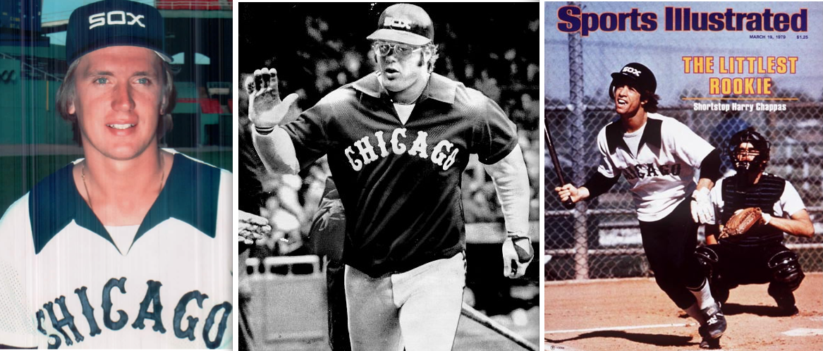
12. Chicago White Sox


From the 1930s through the 1980s, the Sox changed uniforms, logos and colors more than any other MLB team, often veering into bizarre design territory (remember the leisure suits and the shorts and the numbers on the pants?). But in 1991 they hit upon a fairly traditional look, and they’ve stuck with it now for nearly three decades, thereby transforming themselves from MLB’s most visually unpredictable franchise into a bastion of uniform stability. The thinking here is that their freewheeling days were more fun, but it’s hard to argue with their current look.
13. San Francisco Giants

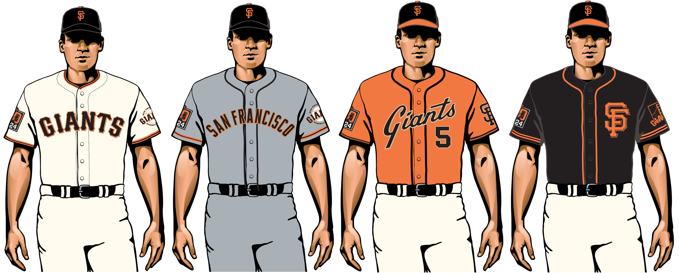
The Giants scrapped one of their road jerseys this season, and it’s hard not to think they kept the wrong one. Why keep that overcrowded “San Francisco” lettering when you could go with the handsome “SF” logo instead? Aside from that, the Giants remain a very solid-looking team.
14. Milwaukee Brewers
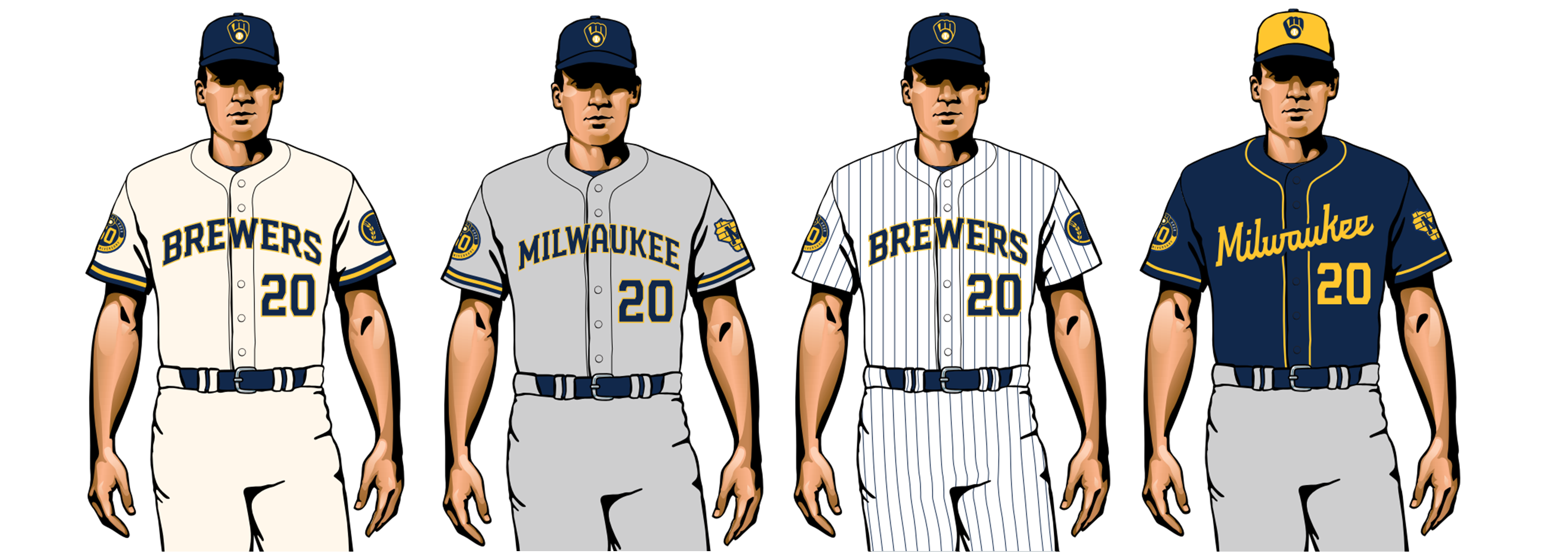
The Brewers are celebrating their 50th anniversary this year with a new uniform set anchored by their old “ball-in-glove” logo, something fans have long been clamoring for. It’s not perfect — your friendly uniform columnist doesn’t love the beer barrel-themed font, and the road alternate looks disturbingly like a Cub Scouts uniform — but it’s a huge upgrade over the bland set they were wearing for the past 20 years.
15. San Diego Padres

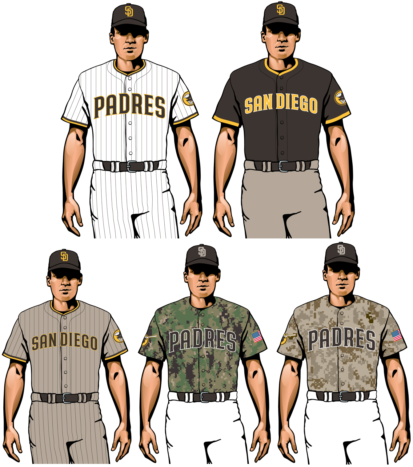
Another team that has finally given the fans what they’ve been asking for, which in this case means a return of the old brown/yellow color scheme. It’s a long-overdue move, and a huge upgrade over the characterless set they’d previously been wearing, although the return to brown would have been a nice opportunity to scrap the camouflage alternates, which feel badly played out by this point.
16. Los Angeles Angels

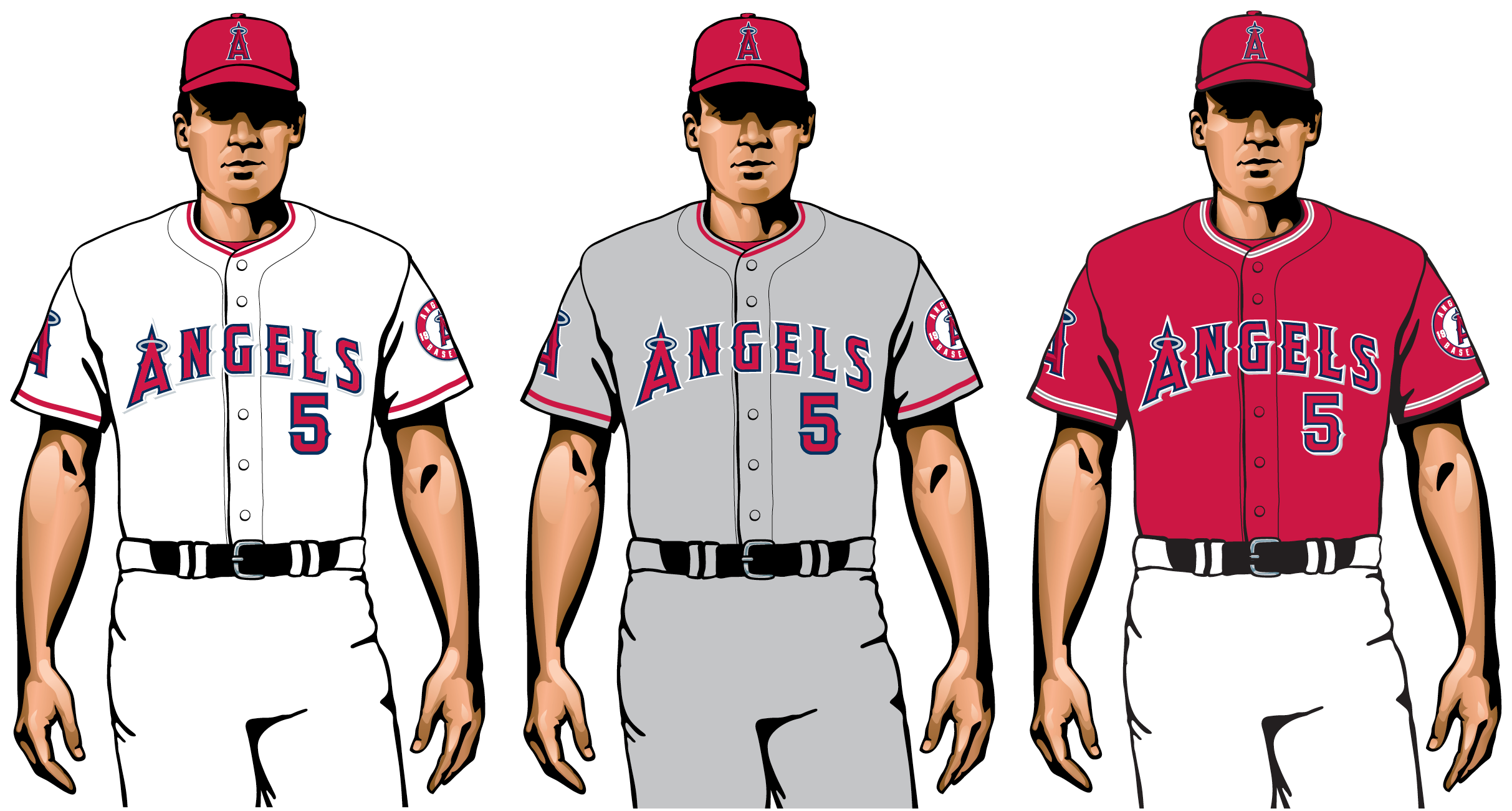
Generally speaking, the Angels look fine. But they could move up several places on this list by making three simple fixes: First, use a different chest insignia on at least one of the jerseys; second, change the red lettering on the red jersey to a different color, to boost legibility; and third, dial back the use of the halo-A logo, which appears on both sleeves, plus the chest mark, plus the cap. Enough already!
17. Seattle Mariners

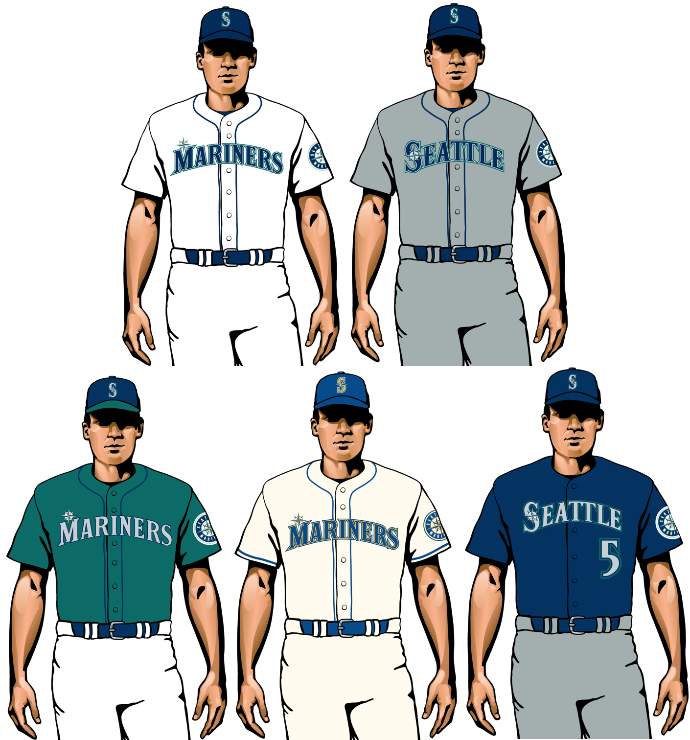
Does it bug anyone else that the “M” in “Mariners” is the same size as all the other letters on the jersey, but the “Seattle” insignia gets an oversized “S”? This is one of several things about the Mariners’ uni set that feels just a teeny bit off. Not a bad-looking team, by any means, but not quite a great-looking one either.
18. Kansas City Royals

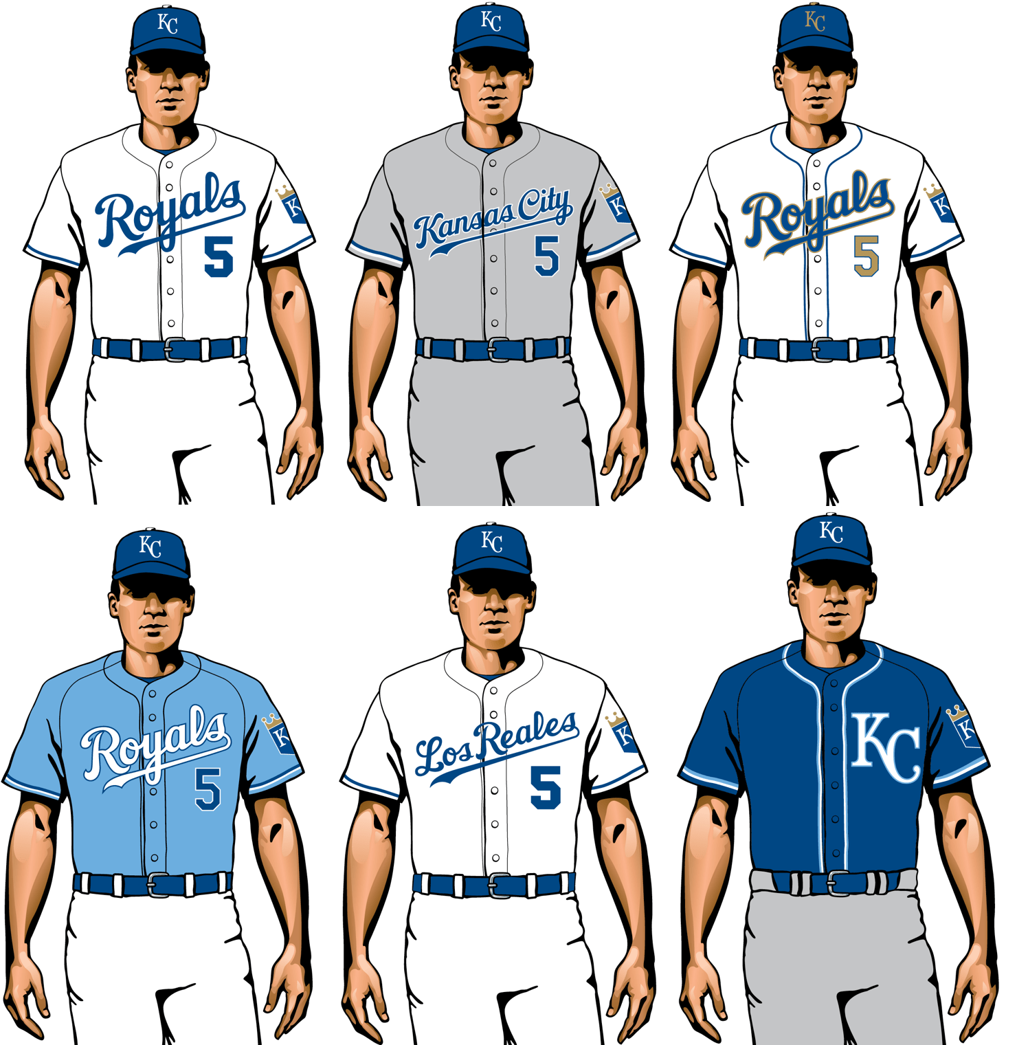
At their best, the Royals’ uniforms have always essentially been Dodgers Lite, which isn’t necessarily a bad thing. But come on — six uniforms? That’s way too many. And if they want to do the powder-blue thing, they should go all the way and add blue pants.
19. Pittsburgh Pirates

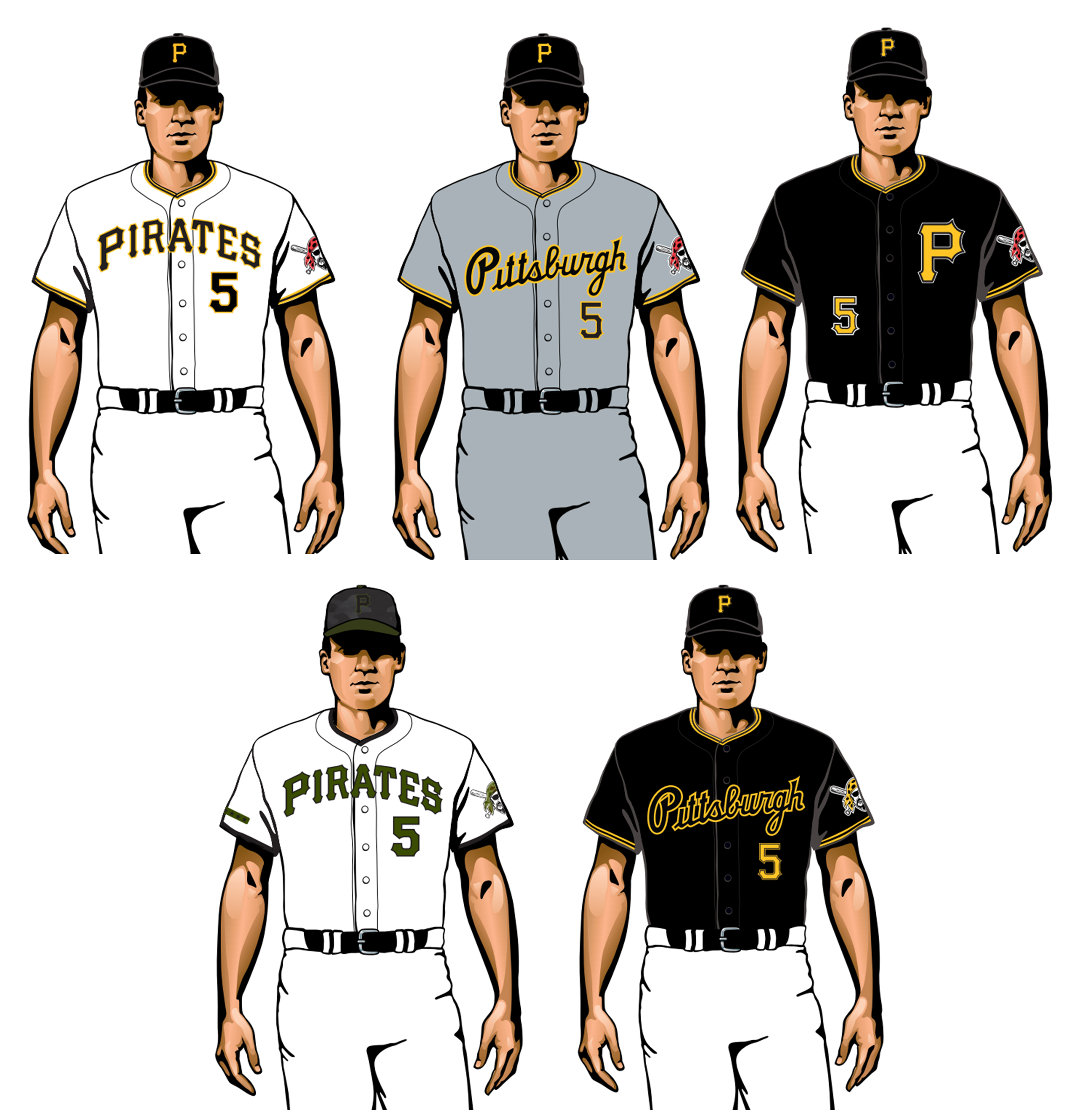
The Pirates’ uniform set is a matter of diminishing returns. The home whites are classic and perfect; the road greys, with their newly added script insignia, are fine (although it’s sort of irksome that the “i” is not dotted); the two black alternates are one too many; and the military-tribute alternate, with its olive lettering and camouflage cap, is a stinker. Meanwhile, they’ve ditched the throwbacks — too bad.
20. Tampa Bay Rays

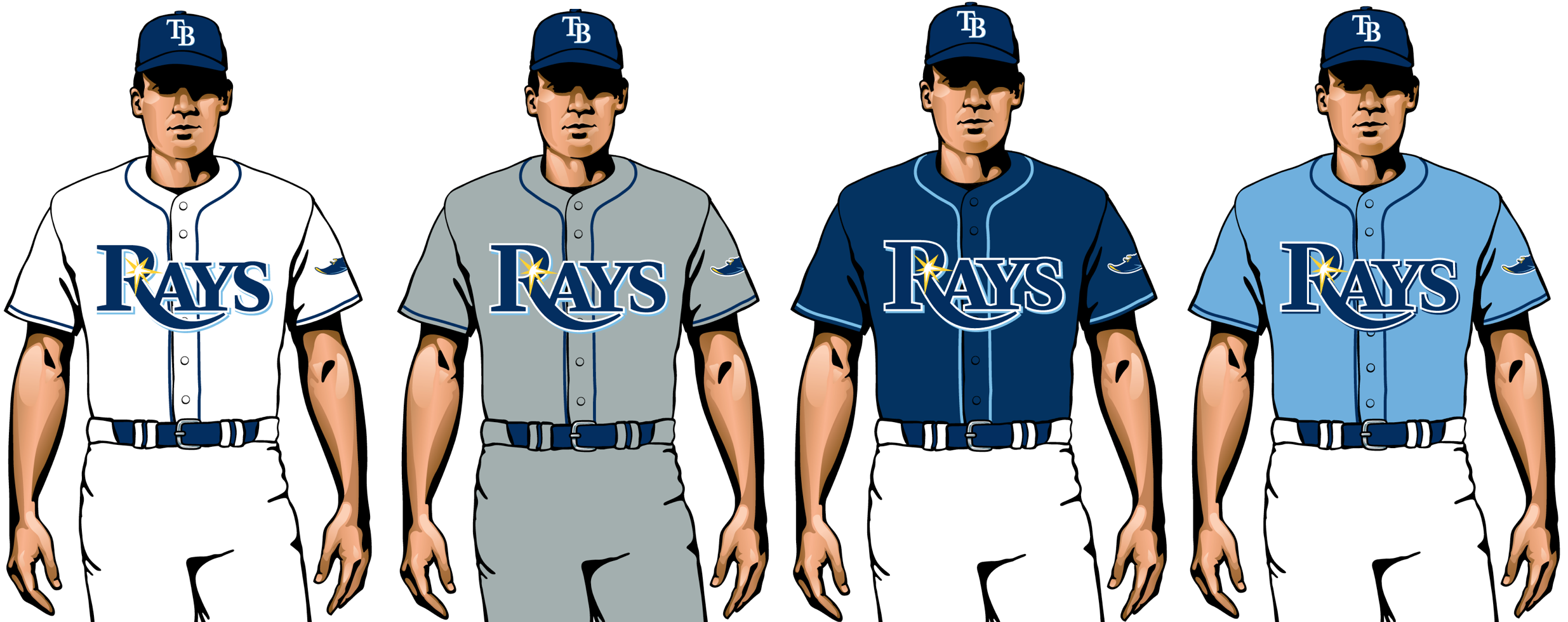
Did you ever meet someone at a party, talk to them for a bit, and come away feeling like they were pleasant enough but not particularly interesting? That’s what the Rays’ uniforms are like. There’s nothing here to be upset about, but nothing to get excited about either. And would it kill them to have just one jersey that didn’t feature the same chest insignia?
21. Houston Astros

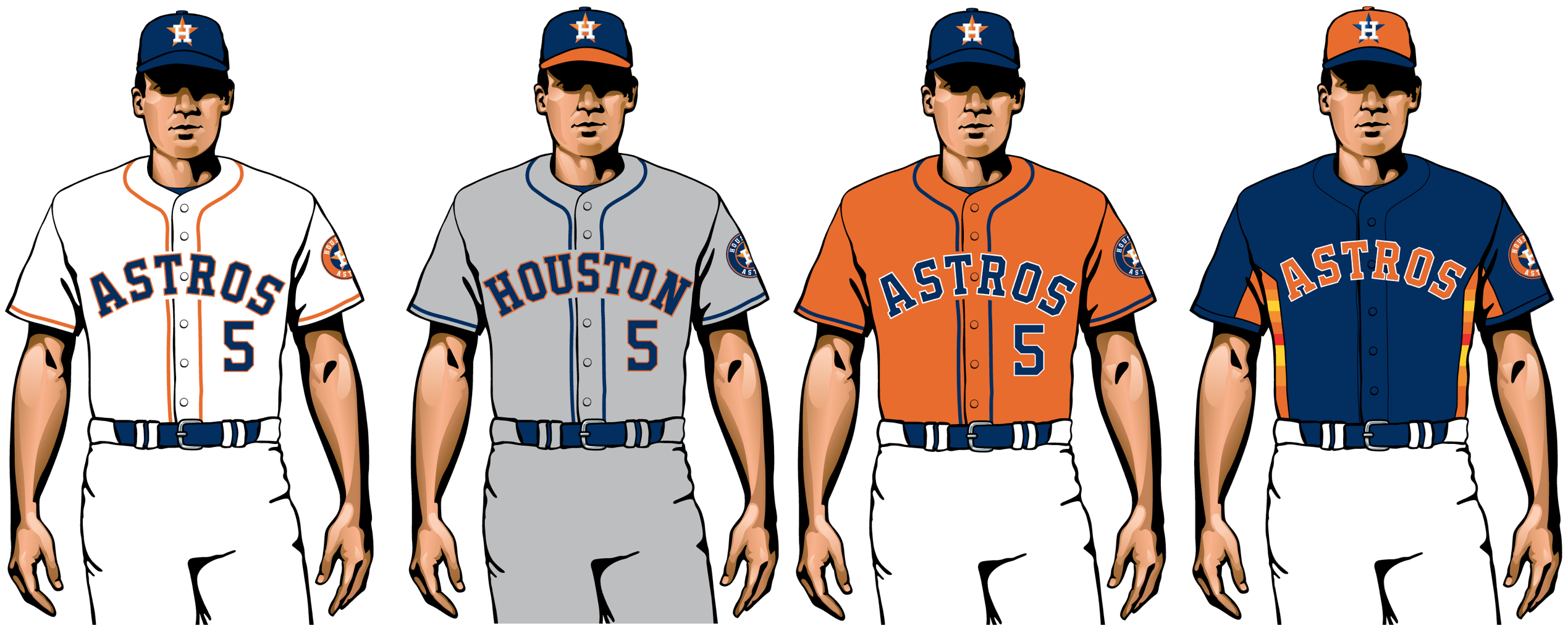
You know how designers (and, um, uniform critics) often like to say, “Less is more”? Sometimes less is less, especially for a team with such a freewheeling visual history as this one. Come on, guys: Why so plain? Your heritage includes orange rainbow stripes and the awesome shooting star jerseys, so let’s see some razzle-dazzle! And it doesn’t help that the home jersey’s chest lettering is badly lopsided.
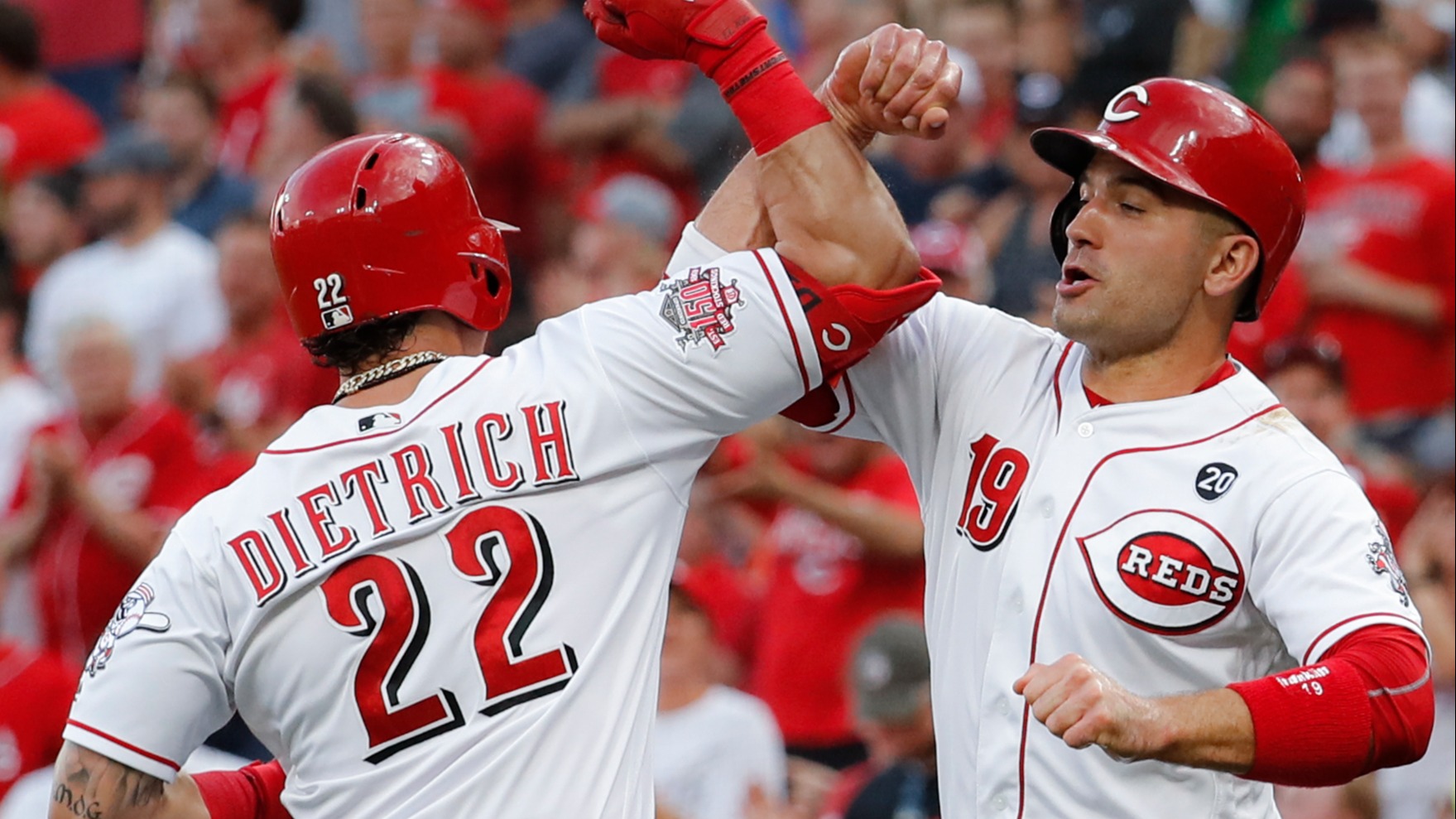
22. Cincinnati Reds

The simple fixes for the Reds’ uniform program have been obvious for years: Ditch the black drop-shadows, use a more straightforward typeface for the numbers and player names (certain letters, like the E and C, are particularly brutal), and boom, you suddenly have a classic look. So close, yet so far.
23. Washington Nationals
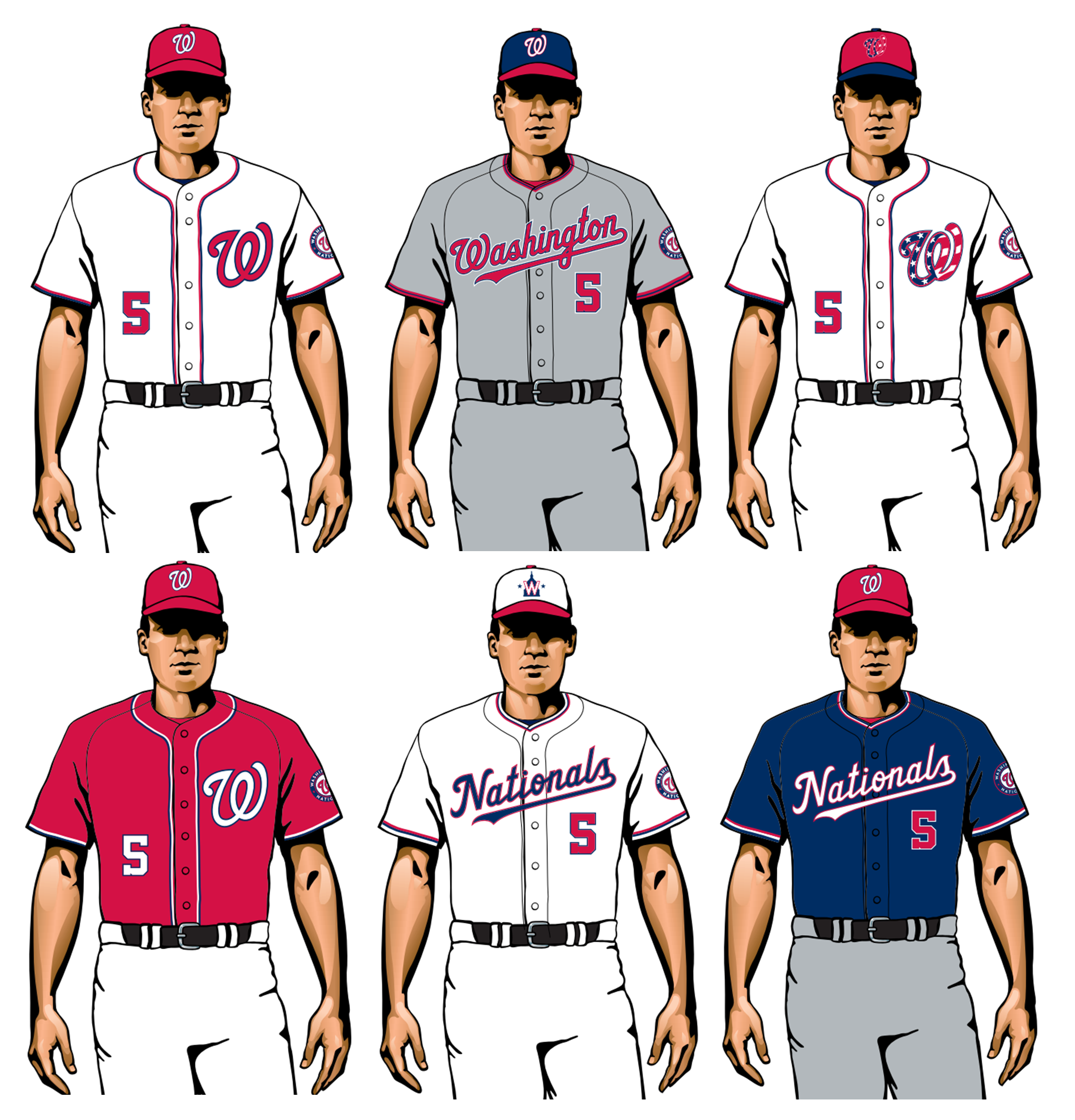
The reigning World Series champs have lots of good uniform elements — so many that it creates a visual identity crisis. Are they a “script across the jersey” team or a “letter on the upper-left chest” team? A red team or a blue team? An old-school team or a forward-looking team? With two new alternate caps and a new alternate jersey being added to the mix this season, things will only get more muddled. They need to dial it back and come up with a more coherent approach.
24. Minnesota Twins

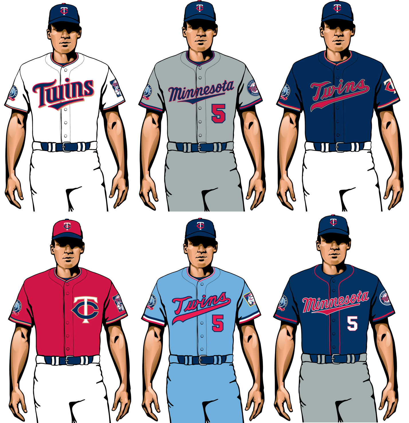
The Twins have been trying to have it both ways for years now, pairing their legacy “TC” logo with their more contemporary “Twins” jersey lettering. It’s never been a good fit, and now they’ve reached the point where they have too many different mix-and-match options for their own good. Not a terrible-looking team, but they’d benefit from some serious visual housecleaning.
25. Arizona Diamondbacks

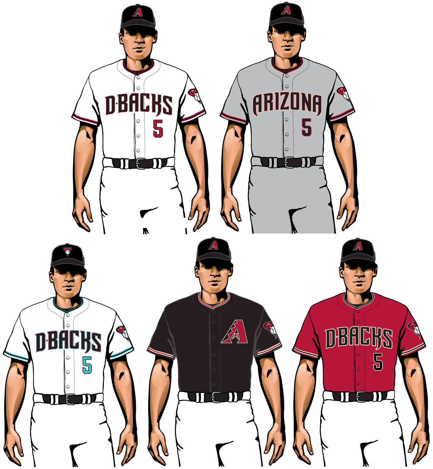
Ahead of the 2016 season, the D-backs unveiled a completely disastrous uniform set that put them at the bottom of the MLB uni heap. In the subsequent years, they’ve slowly eliminated most of the worst elements from that set — no more “bloody socks” pants, no more sublimated snakeskin pattern on the jerseys, no more charcoal road uniforms — so now they’ve at least climbed back to some semblance of aesthetic respectability. But no further than that.
26. Colorado Rockies

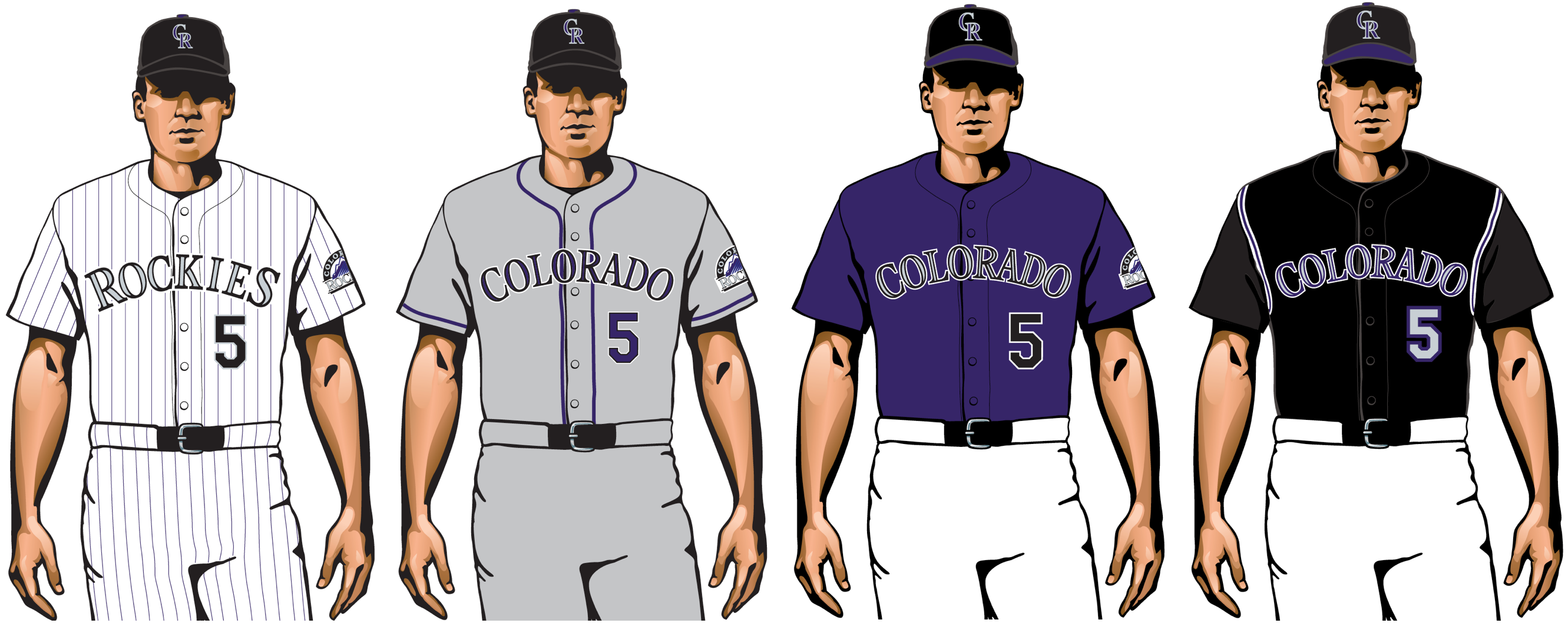
As a lifelong purple-phobe, your friendly uniform columnist cannot countenance the Rockies’ color scheme. But let’s give them credit for sticking with the same basic look for more than a quarter-century now. While most expansion teams keep reinventing their identities (hello, D-backs, Marlins and Devil Rays), the Rockies have stayed the course and basically created a legacy look for themselves. Good for them.
27. Texas Rangers


Ay yi yi. On the plus side, they’ve finally put the team name on some of their jerseys, so people won’t call them the Texas Texases anymore. But the new script on the home whites feels amateurish, the new powder-blue alternates feel like trend-hopping, and they still can’t decide whether they’re a blue team with red trim or the other way around.
28. Atlanta Braves

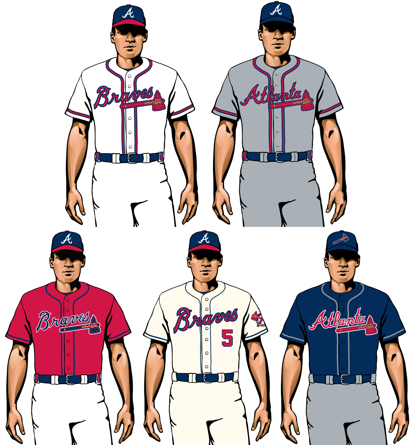
The Braves’ use of Native American iconography is way past its sell-by date. It’s time to scrap the tomahawk and rechristen the team. One idea: Shift to the Bravest, which would allow them to keep the essence of their familiar script insignia and also let them change the tomahawks to fire axes — a win-win-win!
29. Cleveland Indians

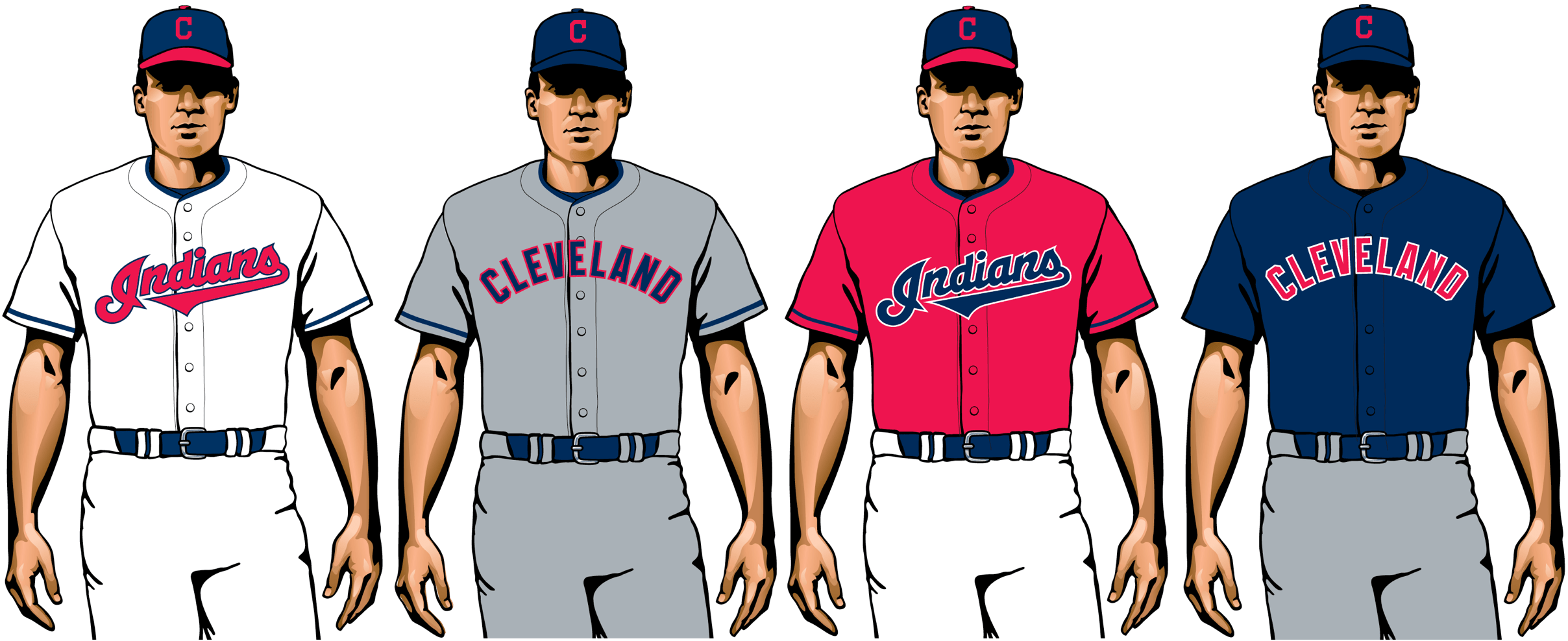
Retiring the Chief Wahoo logo last season was a long-overdue start. Now Cleveland should make a clean break from Native American cultural appropriation by changing the team name. While they’re at it, they can come up with a better logo than that plain block-C (their fans, having given up Wahoo, deserve better) and add some pizzazz to their road uniforms.
30. Miami Marlins

/cdn.vox-cdn.com/uploads/chorus_image/image/63195608/1031783042.jpg.0.jpg)
:format(jpeg)/cdn.vox-cdn.com/uploads/chorus_image/image/54507471/usa_today_10030016.0.jpg)
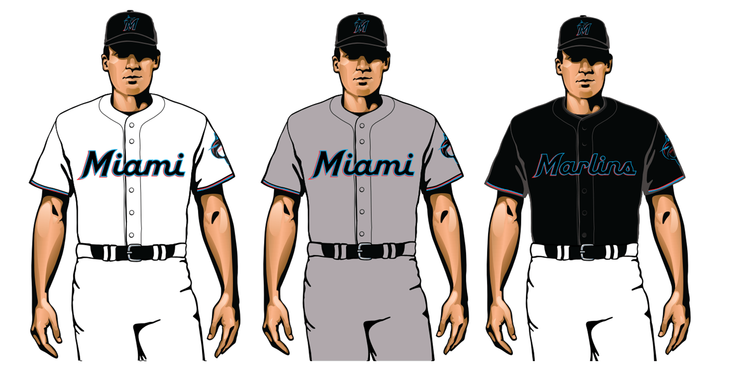
When your team name doesn’t appear on either your home and road jerseys and the black-on-black typography on your caps and alternate jersey is basically illegible, it’s time to go back to the drawing board (yet again). Blow it all up and start over.
***
And there we have it. Did you agree with this entire list? Of course you didn’t. Let the bickering commence!
(Special thanks to Mike Boyce, Jay Palmer and Ben Warrick for research assistance.)
Paul Lukas will present his Uni Watch NFL Power Rankings in about a month. If you like this article, you’ll probably like his Uni Watch Blog, plus you can follow him on Twitter and Facebook and sign up for his mailing list so you won’t miss any of his future InsideHook columns. Want to learn about his Uni Watch Membership Program, check out his Uni Watch merchandise, or just ask him a question? Contact him here.
Whether you’re looking to get into shape, or just get out of a funk, The Charge has got you covered. Sign up for our new wellness newsletter today.