
The uni-verse can be a contentious place. But if there’s one thing most fans can agree upon, it’s that they all like throwbacks.
There’s something fun about seeing the past brought back to life. That’s especially true in this pandemic-stricken year, as we all fantasize about reclaiming the throwback versions of our lives. Almost by definition, earlier times were happier times.
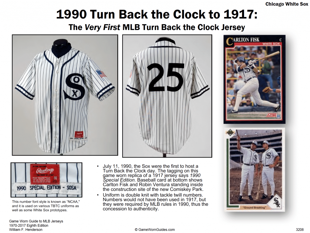
Throwback uniforms were pioneered by MLB’s Chicago White Sox in 1990. The idea quickly caught on with other leagues, and the ensuing three decades have seen teams dressing up in hundreds upon hundreds of throwback uniforms. Hell, the Cincinnati Reds wore 15 different throwbacks just last season!
But despite all of that turning back the clock, there are still lots of worthy uniform designs that have never gotten the throwback treatment. With that in mind, your friendly uniform columnist recently sat down to compile a list of 20 defunct uniforms that should be revived as throwbacks. The only rule was that uniforms that had previously received a throwback showcase would be ineligible (so Bucco Bruce and Pat Patriot, to cite two popular retro designs, do not appear on the list).
The resulting list includes some of the best uniforms in sports history, and also some of the worst. Even a bad uniform can be enjoyable as a throwback, because time and nostalgia have a way of softening the sharp edges, so that something once deemed heinous can seem, with the benefit of hindsight, endearingly misguided. That’s the thing about throwbacks: They serve as history lessons, even if the lesson is that we should learn to laugh at our own mistakes.
Okay, enough preliminaries — here’s our list of throwbacks that need to happen, like, yesterday.
1. Chicago White Sox, 1976 Shorts

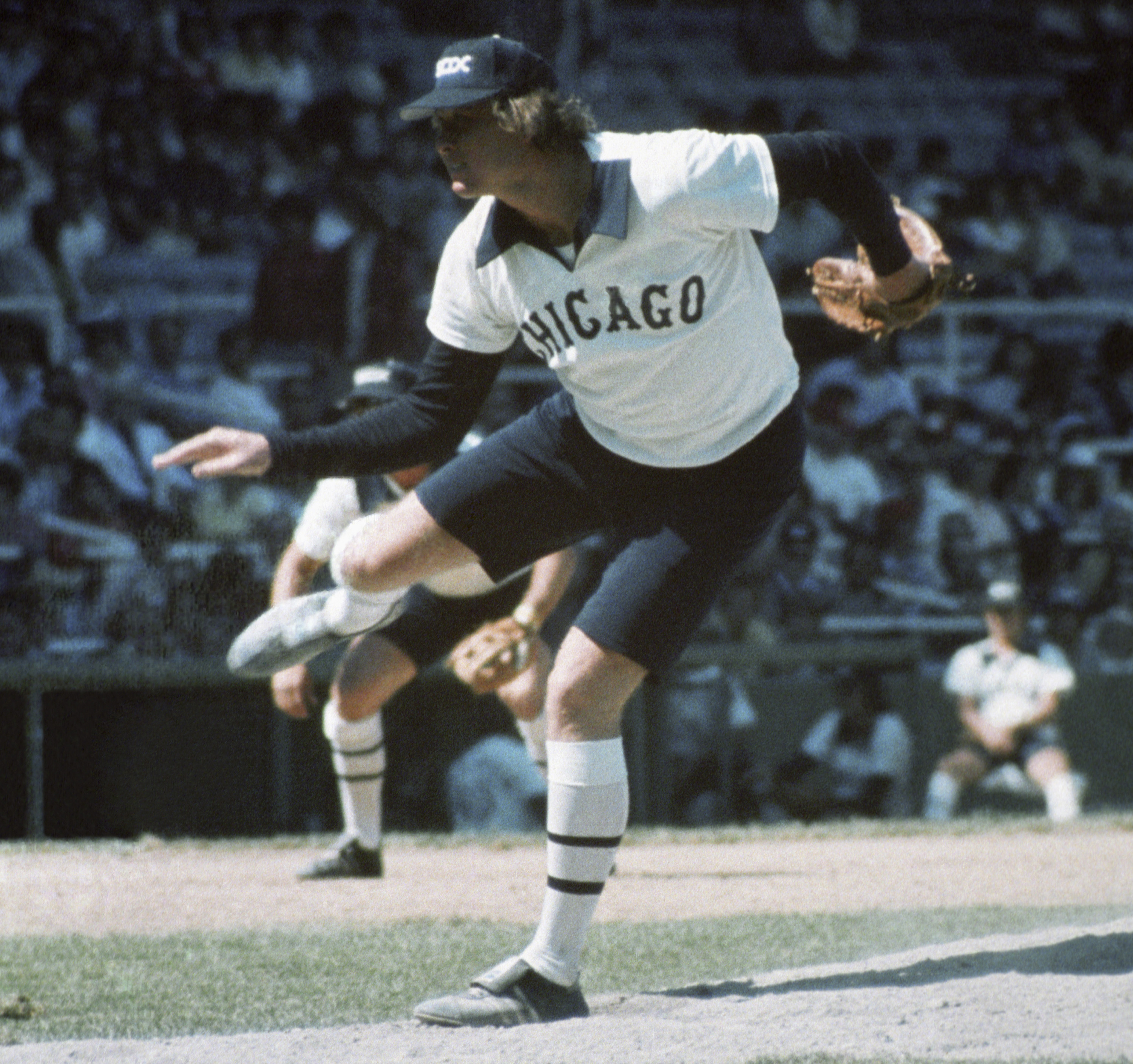
In 1976, White Sox owner Bill Veeck unveiled a bizarre new uniform set for his team. The jerseys had big, floppy disco collars and were designed to be worn untucked. Instead of traditional road grays, the road uniforms featured dark navy jerseys and pants. Oh, and the team had the option of wearing shorts. The shorts stayed in the closet until August and were ultimately worn only three times (you can see some good video footage here), but their legend has grown over the years. The White Sox have brought back the disco-collared jerseys as throwbacks (that’s the jersey that Chisox pitcher Chris Sale famously destroyed with a pair of scissors because he thought it looks so ridiculous), but they’ve never revived the short pants. Here’s hoping the team’s ownership revives the spirit of Bill Veeck and finally makes it happen: We want to see Sox in shorts!
2. Philadelphia Flyers, 1981-1983 Cooperalls

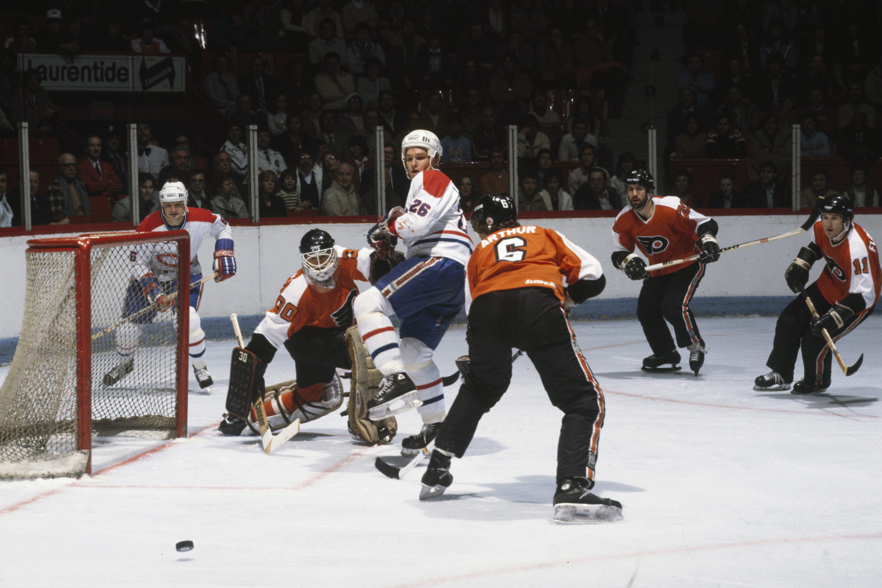
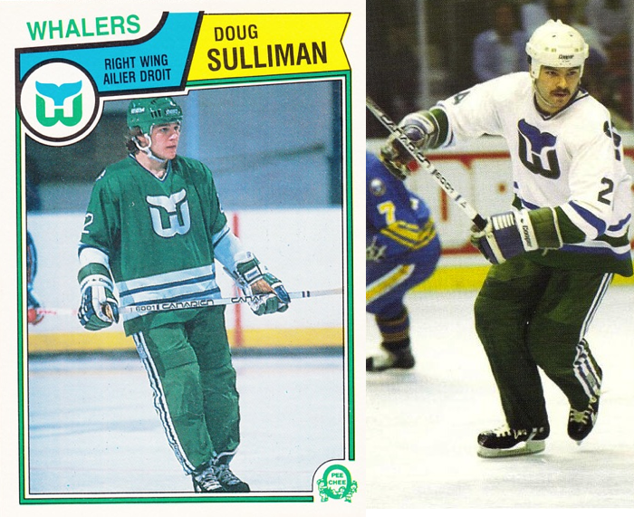
Five years after the White Sox wore pants that were too short for their sport, the NHL’s Philadelphia Flyers wore pants that were too long for their sport. The slacks were called Cooperalls (named after the manufacturer, Cooper), and nothing like them had ever been seen on the ice. Some observers hailed them as the future of hockey uniforms, but the Flyers wore them for only two seasons, only one other NHL team tried them (the Hartford Whalers) and the NHL eventually banned them because the fabric was so slick that players slid too fast and hard into the boards after they fell, creating a safety hazard. But nearly four decades later, surely a more appropriate fabric should be available, right? It’s way past time: Bring back the Cooperalls!
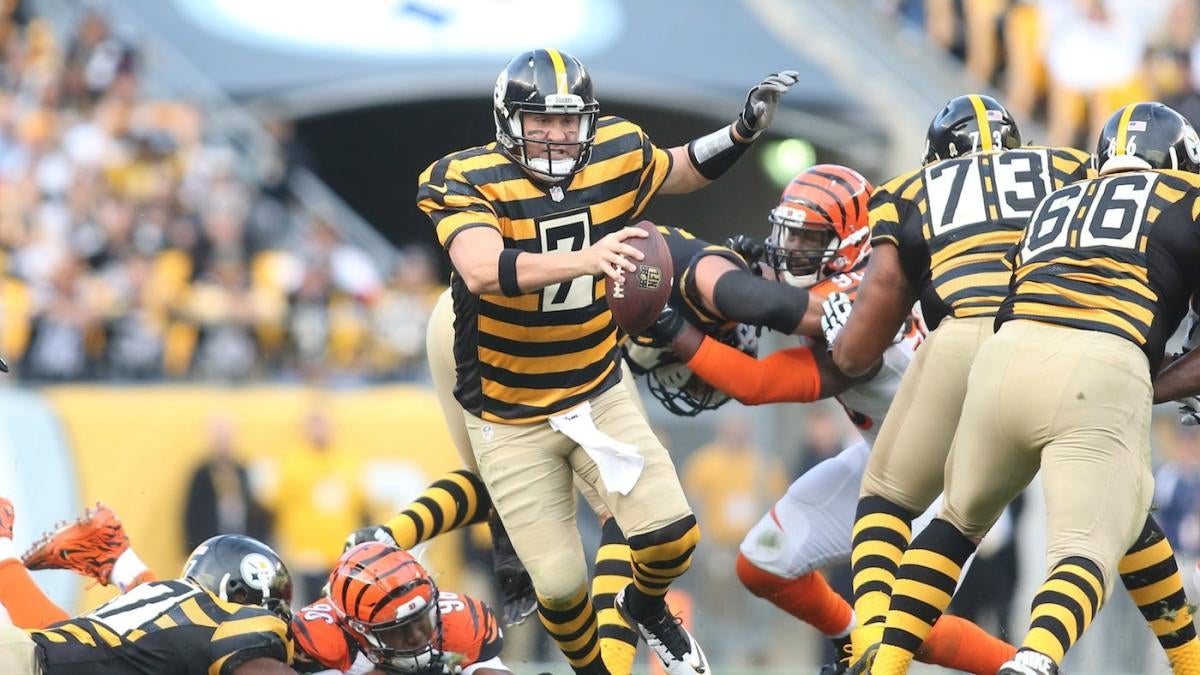
3. Pittsburgh Steelers, 1966-1967 “Golden Triangle” Uniforms
In 1966 and ’67, the Steelers wore an unusual jersey with a yellow, diamond-shaped shoulder yoke. The yoke supposedly referenced a part of Pittsburgh referred to as the Golden Triangle, but it looked more like a superhero’s cape, so this uniform set became informally known as the Batman design. The Steelers were a terrible team in those days, so the Batman uniforms have largely been forgotten, but they deserve a second act. I mean, if the Steelers can wear those 1930s bumblebee throwbacks, they can surely wear these, right?
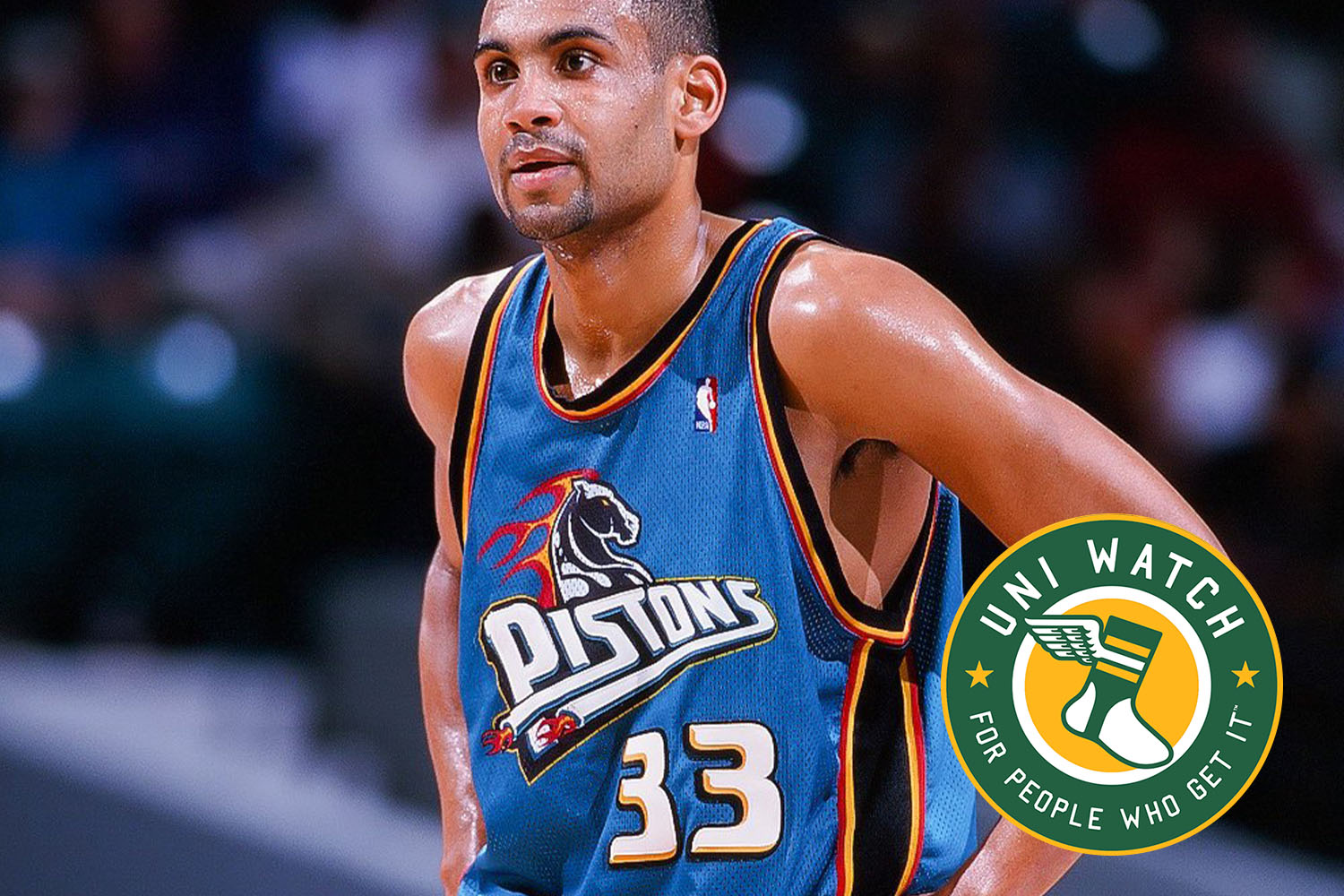
4. Detroit Pistons, late-1990s Road Uniforms

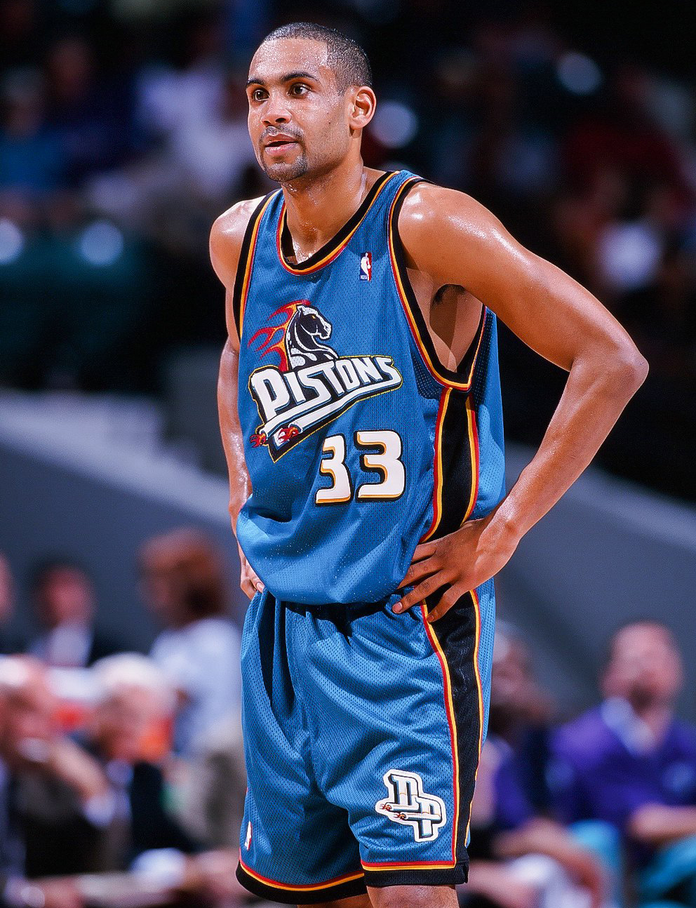
From 1996 through 2001, the Pistons — whose primary colors had always been red and blue — inexplicably wore a teal road uniform. But the color scheme was just the start. The uniform also had a bizarre chest logo featuring a flaming horsehead and a pair of fire-spewing tailpipes (hey, it was the ’90s). Ridiculed at the time, these uniforms have now marinated in the stew of nostalgia long enough to have achieved “So bad, it’s good” status. It would be a hoot to see them back on the court.
5. MLB’s 1999 “Turn Ahead the Clock” Uniforms

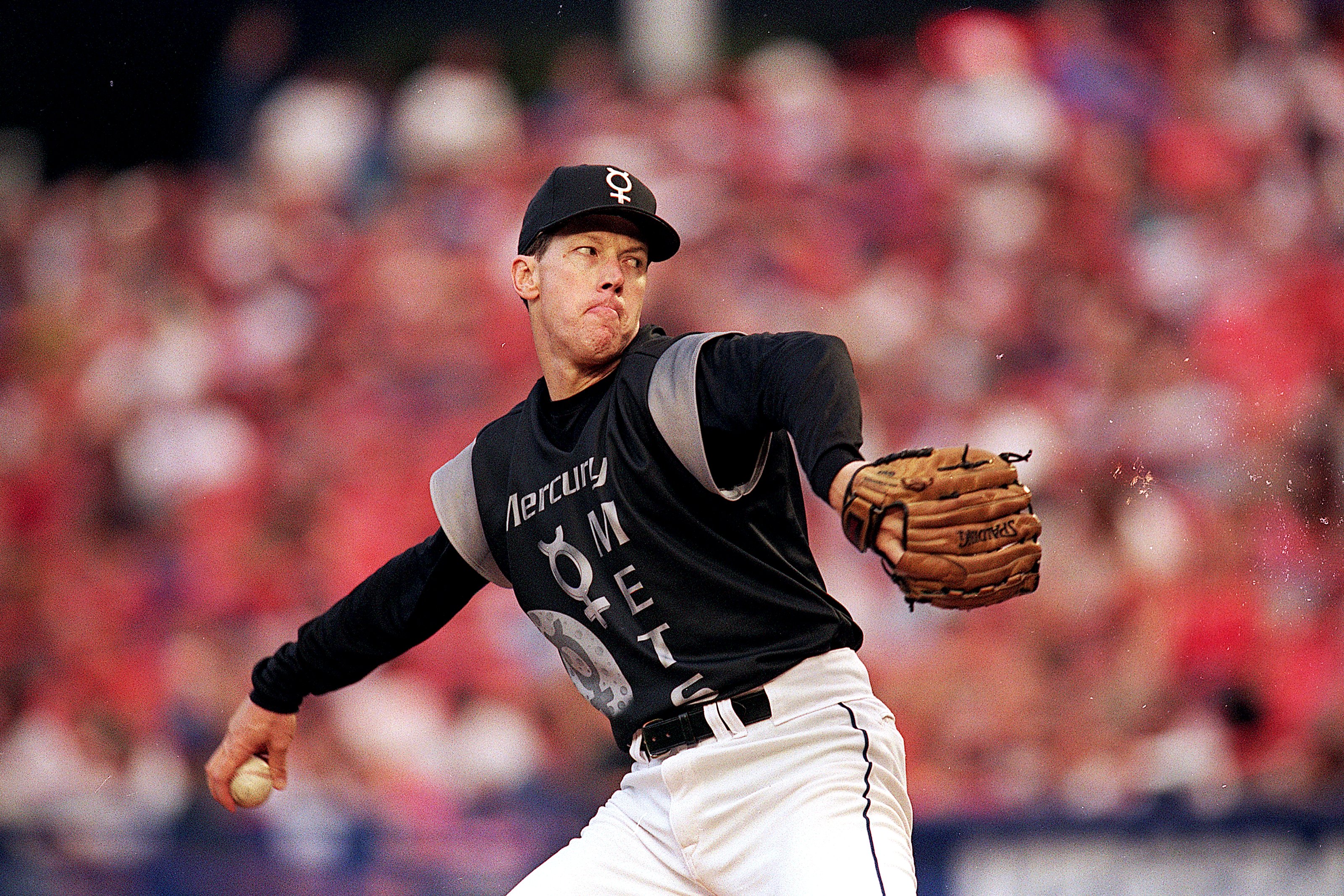
In 1999, 22 of the 30 Major League Baseball teams wore garish “futuristic” uniforms that supposedly showed how the sport would look in the year 2021. (Why that year? Because the promotion’s sponsorship partner was the real-estate company Century 21.) A quick glance at the calendar reveals that 2021 is next year, so MLB really needs to bring back these uniforms. Are they among the worst designs ever to grace a baseball diamond? Yes. But they’ve become an epic chapter in baseball uniform history — a chapter that deserves an encore, even if only so we can laugh about it. Think of it this way: Sure, the whole thing was probably a big mistake that should have been left on the drawing board, but isn’t it more fun to live in a world where that kind of mistake can be made?
6. San Francisco 49ers, 1991 “One-Day” [sic] Helmet
This one, admittedly, is in a slightly different category, because it’s a design that never made it onto the field. Here’s the deal: In 1991, the 49ers held a press conference to unveil a new helmet design. Their familiar “SF” logo had been replaced by an embarrassing, clownish-looking “49ers” mark. Although there was no social media at the time, fan response was loud and overwhelmingly negative. Six days later (not one day, as the popular myth would have it), the Niners basically said, “Never mind,” and scrapped the whole idea. That was probably for the best, but leaves a gaping “What if?” hole in the team’s aesthetic history. As it happens, next year will mark the 30th anniversary of this helmet not being worn — a perfect opportunity for it to finally make its on-field debut.
7. Minnesota North Stars, late-1970s Uniforms

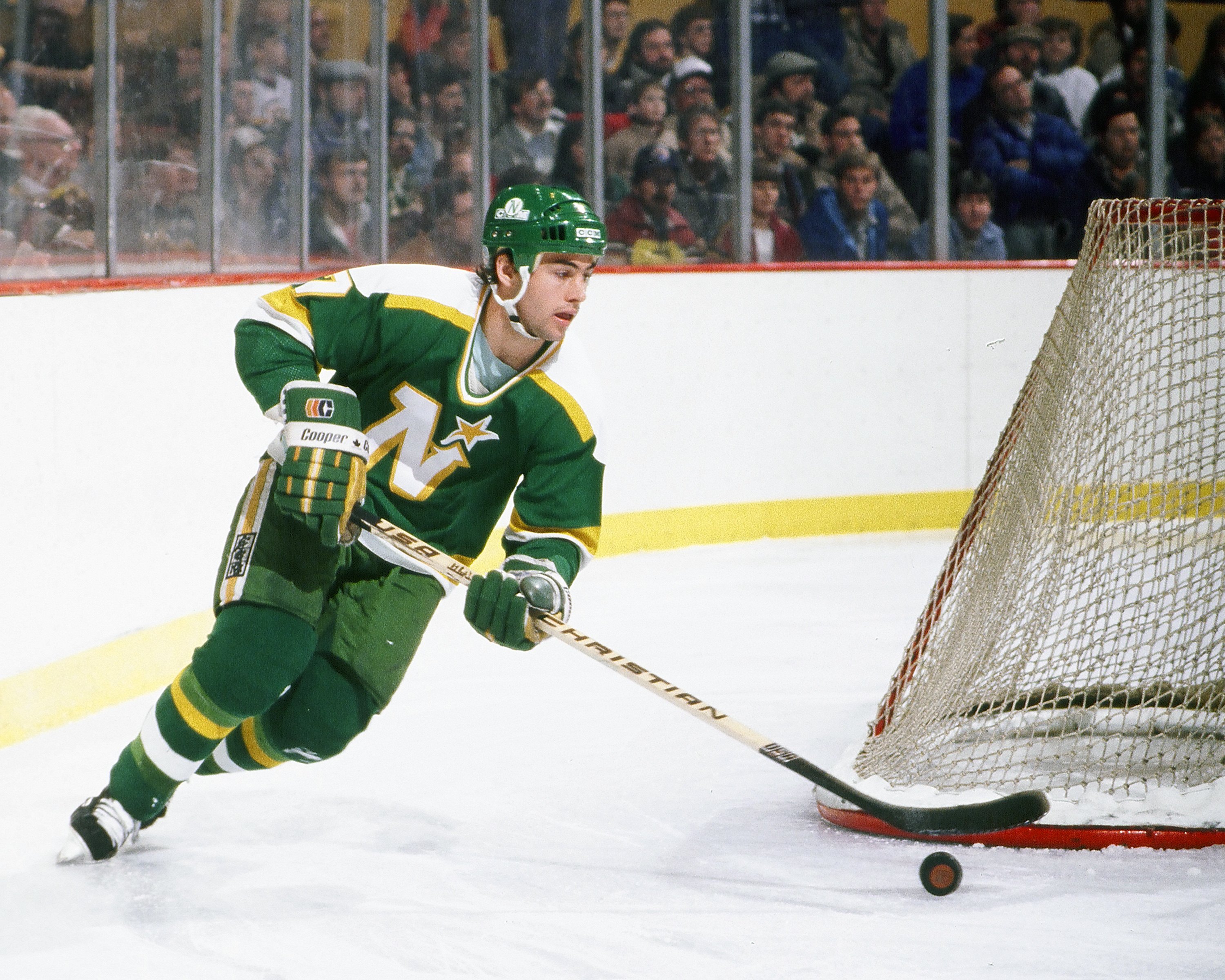
With a killer color scheme and an endearingly brilliant jersey crest, the Minnesota North Stars were the rare NHL expansion franchise that could compete with the Original Six teams, at least in terms of uniform design. They never had a bad uni, although the ones from the late 1970s were the best. In the 27 years since the North Stars moved to Texas and became the Dallas Stars, the old North Stars uniforms have been revived for old-timers’ games, but never for a regulation NHL game. It’s not clear who should get to wear them as throwbacks — the Stars or the Minnesota Wild — but clearly someone needs to bring back these threads pronto.
8. Marquette University Basketball, 1975-1982 Untucked Uniforms

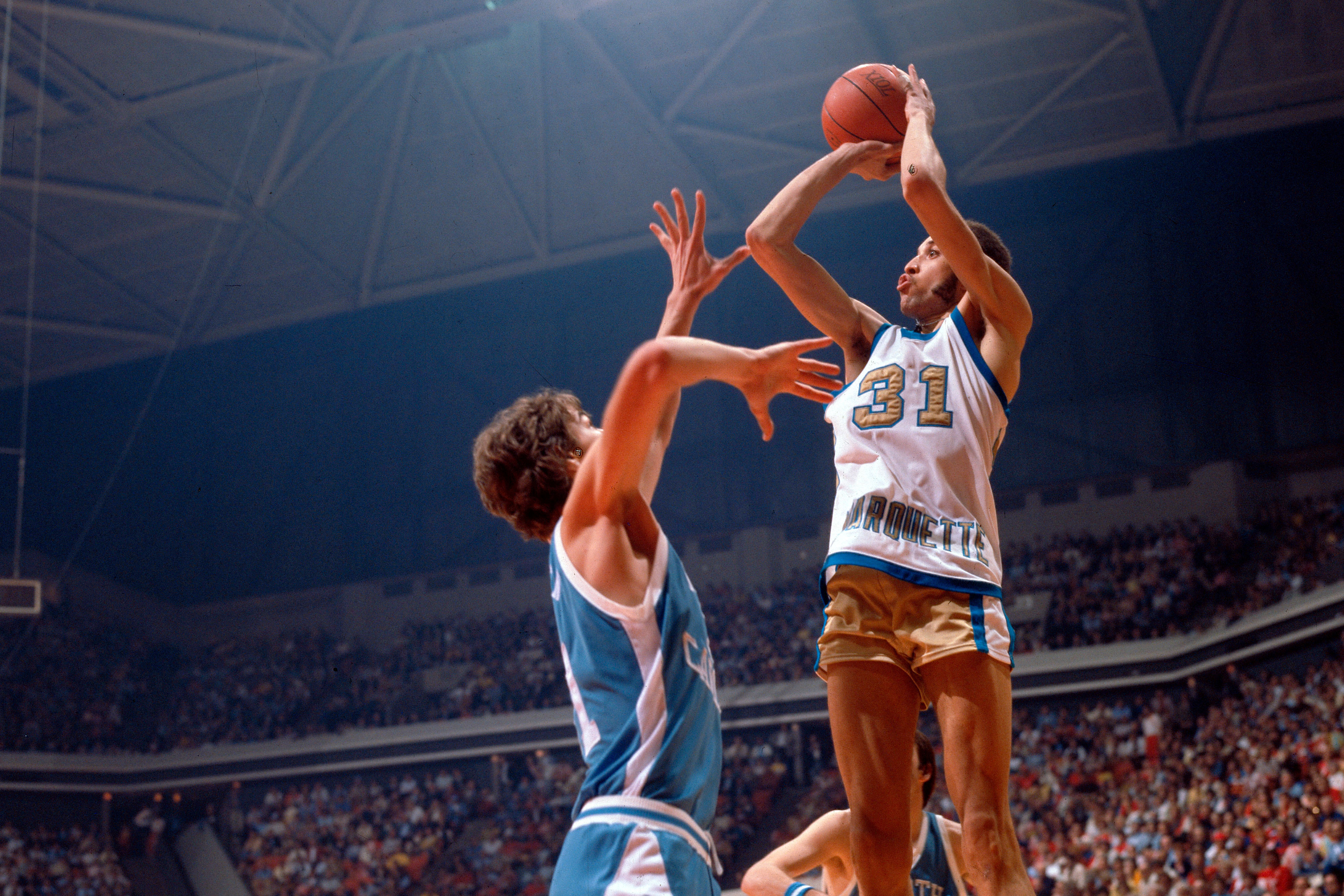
In 1975, Marquette coach Al McGuire allowed forward Bo Ellis, a junior majoring in fashion design, to design the team’s uniforms. The result was the start of Marquette’s famous “untucked” period, as the school wore a series of uni sets that departed from the longtime basketball protocol of the tucked-in jersey. The look was controversial and, ultimately, iconic (it was even the basis for an ESPN 30 for 30 film), but the NCAA eventually banned the untucked look. Surely they’d grant a waiver for a one-time throwback, though, right?
9. Seattle Seahawks, 1976-2001 Home Uniforms

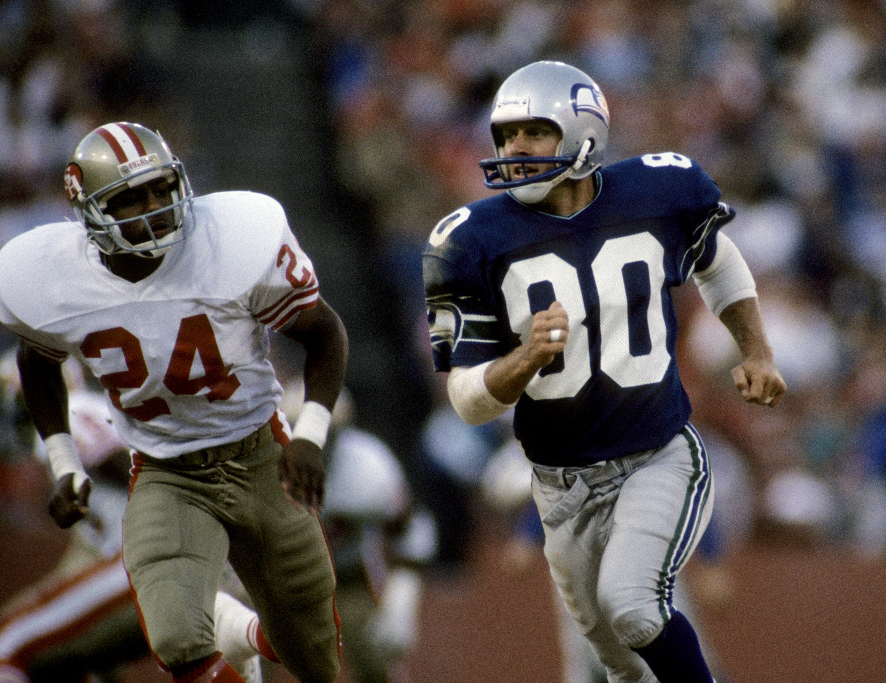
For nearly two decades now, the Seahawks have been wearing their navy-on-navy “scuba suit” uniform for home games. This look has never been popular here at Uni Watch HQ — football uniforms should have some contrast between the jersey and pants! And that’s exactly what the Seahawks had for the first quarter-century of their existence, as they wore gorgeous blue jerseys with silver helmets and silver pants. It was sooooo much better than what they wear now — even the emerald green accents were far superior to the team’s current shade of neon green. Having the team go back to the original uni set on a full-time basis is probably too much to ask for, but an occasional throwback cameo seems like a reasonable request.
10. Houston Astros, 1971-1974 “Shooting Star” Home Uniforms

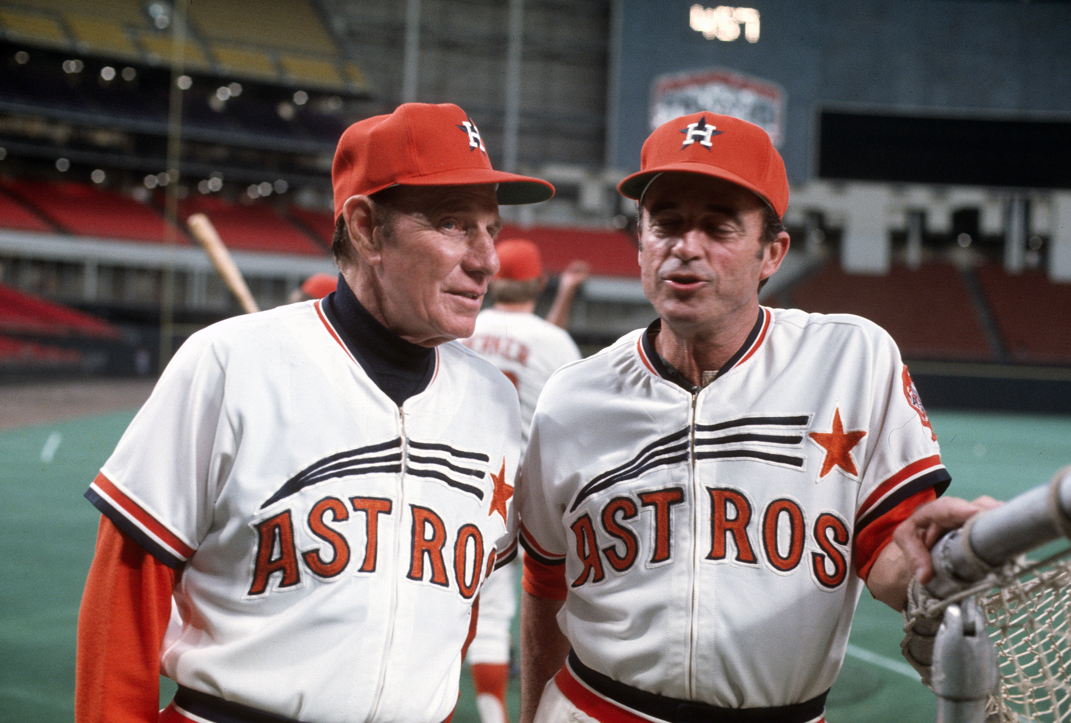
The Astros’ late-1970s “rainbow” uniforms have been worn many times as throwbacks, and deservedly so. But before the ’Stros came up with the rainbows, they wore what has become known as the “shooting star” design, which is arguably one of the most gorgeous uniform designs in baseball history. There were two iterations of it: the late-1960s version with dark-navy chest lettering and a navy cap (which has been worn before as a throwback) and the early-1970s version with orange lettering and an orange cap, which has never gotten the throwback treatment. The Astros were finally going to rectify that error this season, but the pandemic has scuttled those plans. Here’s hoping they regroup and give this uniform its long-overdue curtain call.
11. Seattle SuperSonics, 1980s-1990s Uniforms

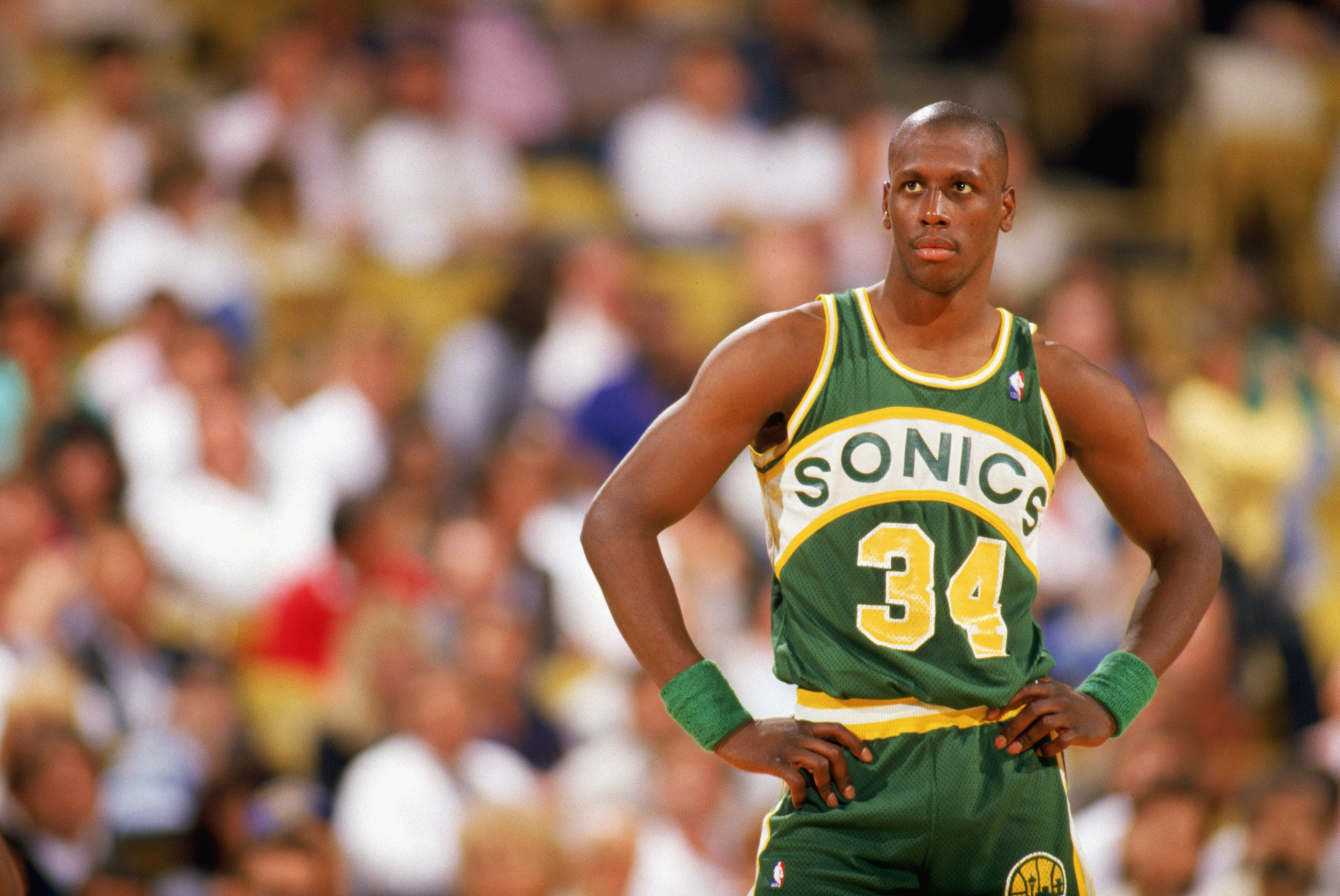
This is essentially the NBA’s version of the North Stars: a spectacular green-and-yellow uniform that’s been orphaned by franchise relocation. The Sonics moved to Oklahoma City and became the Thunder in 2008, and nary a hint of the Sonics’ old identity has appeared since then. Having the Thunder wear Sonics uniforms, even for a one-off throwback appearance, would probably be emotionally fraught for Seattle fans, who’d no doubt view it as salt in the wound. But the design is too good to be kept permanently in mothballs, and NBA fans too young to have seen it the first time around deserve to behold its magnificence. Free the Sonics!
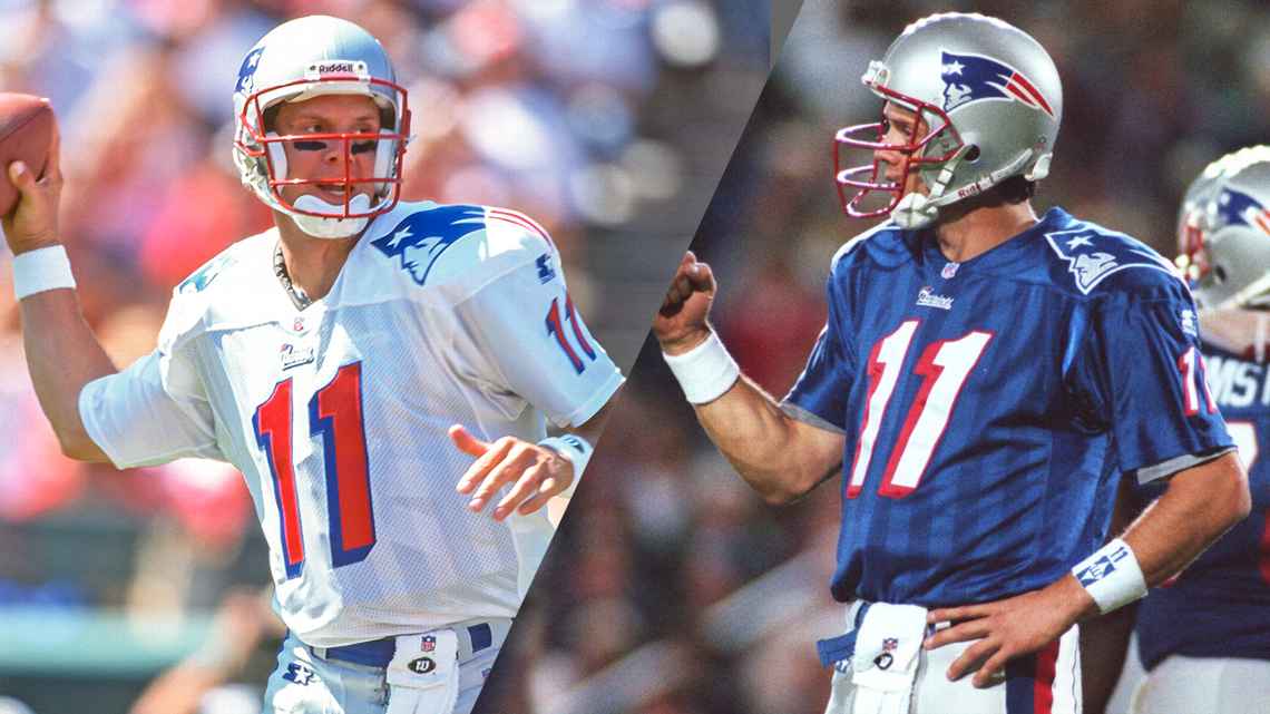
12. New England Patriots, 1994-1999 Uniforms

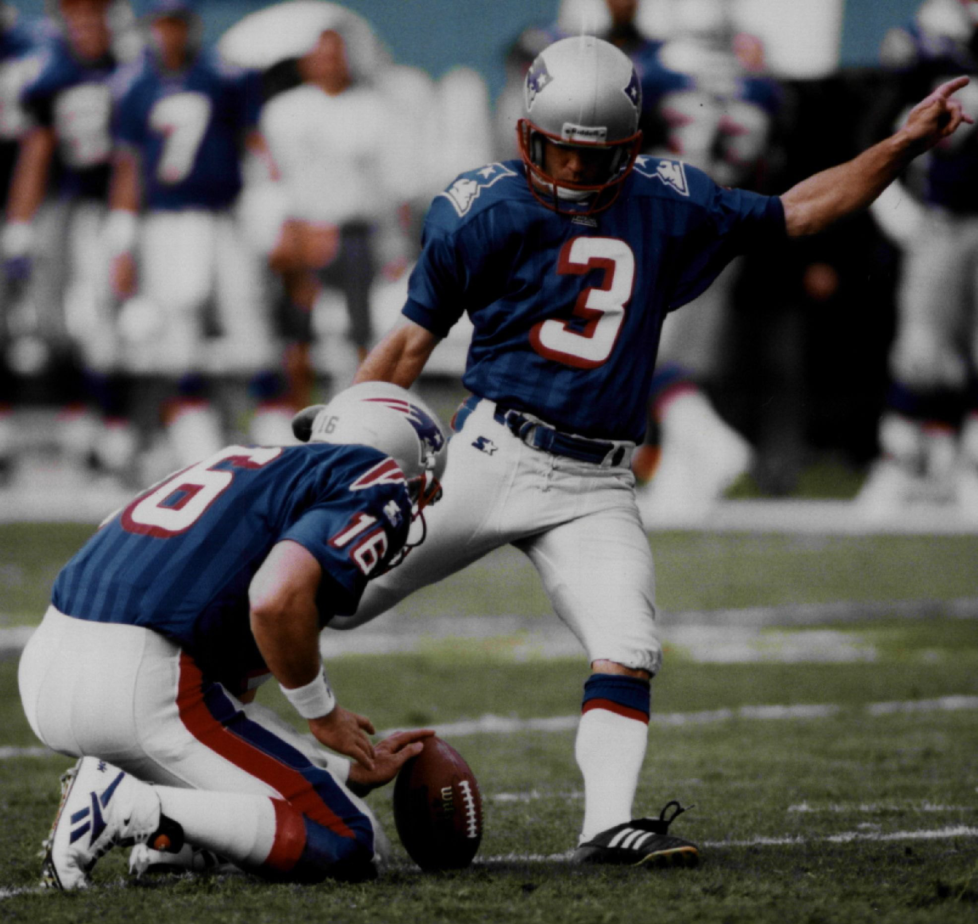
In between the Pat Patriot era (which has already gotten the throwback treatment) and the Flying Elvis dynasty era, the New England Patriots had a transitional period featuring unusual jerseys with tone-on-tone vertical striping. It wasn’t really a good uniform set — the striping was ridiculous, the shoulder logos were comically oversized and the number font felt better suited for the arena league than the NFL — but it was definitely unique and distinctive, and it’s what the Pats wore in Super Bowl XXXI. Tom Brady never wore this uniform (it was scrapped just as the team was drafting him), so now that he’s gone, why not bring it back for a throwback showcase?
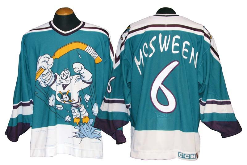
13. Mighty Ducks of Anaheim, 1995-96 “Wild Wing” Alternate


Here we have one of the most infamous designs in NHL history. With a bizarre comic book-style illustration on the front and nearly illegible typography on the back, the “Wild Wing” design was worn for just three games during the 1995-96 season but has achieved near-mythic status since then as an instant classic of the “What were they thinking?” genre. The Ducks did bring it back for pregame activities prior to a 2018 game, but it’s never been revived for actual game use. It’s long past time to make that happen.
14. Brooklyn Dodgers, 1944 Blue Satins
When night baseball started becoming more common in the 1940s, several MLB teams, including the Brooklyn Dodgers, experimented with shiny satin uniforms, thinking they’d be more visible to fans under the lights. The Dodgers revived their blue 1944 satin design as a throwback in 2011, but they had the jerseys made from contemporary polyester fabric, so they were ersatz satins — er-satins, if you will. Plus they wore the throwbacks for a day game, which defeats the whole point! If they really want to honor this chapter from their uniform history, they should go all the way with real satin unis at night. Hail satin!
15. New York Knicks, 1979-1983 Home Uniforms

The Knicks’ primary home uniforms have been mostly unchanged for more than half a century — but the key word there is “mostly.” Back in the early 1980s, they took a brief detour by changing their signature shade of orange to red, putting giant uni numbers on their chests, putting the team name under the numbers, and, for good measure, putting a Yankees-style “NY” on their shorts. Enormous lettering for the player names on the back, too. It made little sense then and is just an odd blip on the team’s uni radar now, but it would be great to see it return for a reprise, even if only to distract fans from how miserable the Knicks have become.
16. Quebec Nordiques, 1976-1995

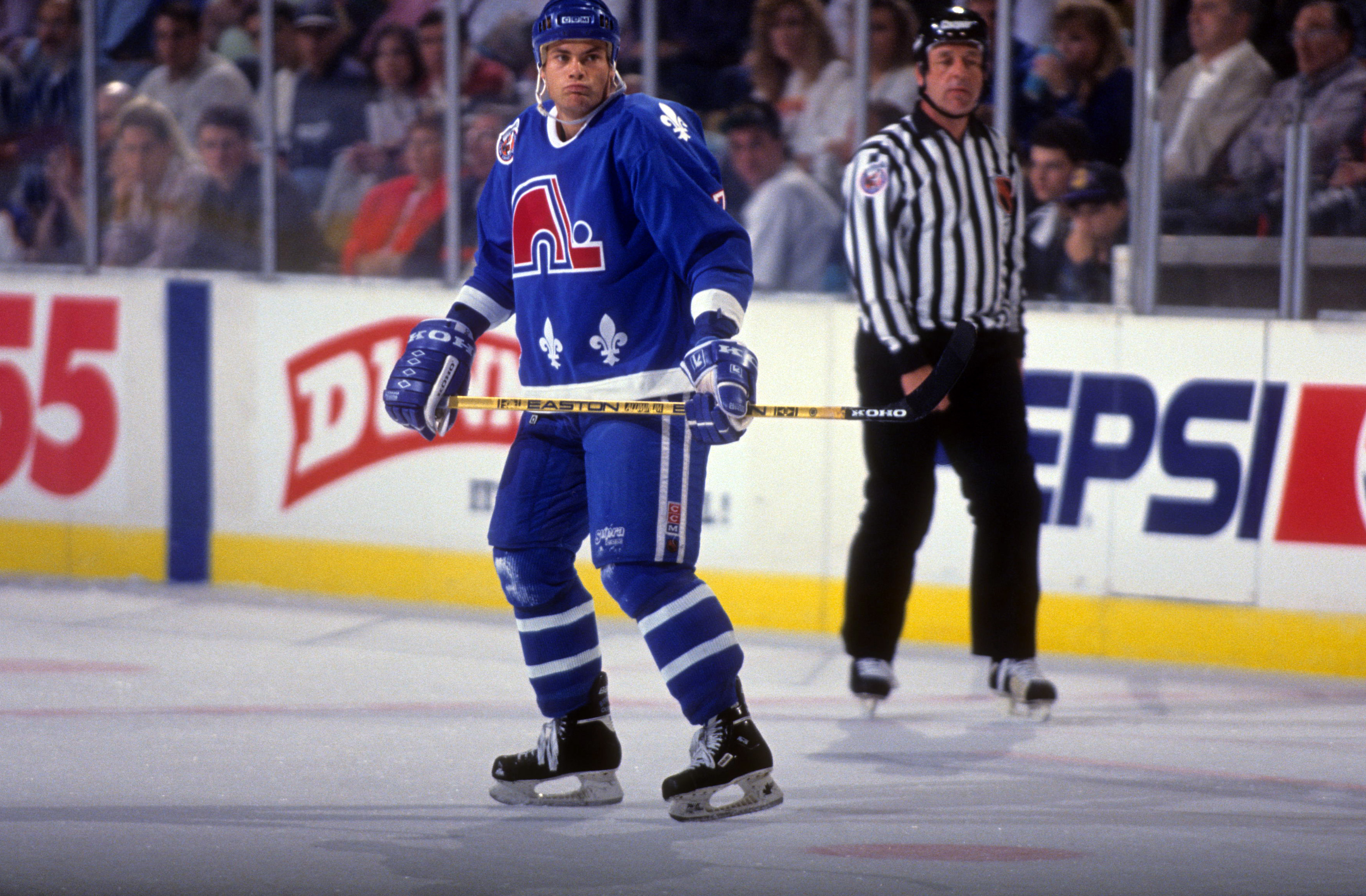
The Nordiques moved to Colorado and became the Avalanche in 1995, so this uniform set, like the North Stars’, is an example of a great design that’s been orphaned by team relocation. It’s hard to imagine that a team would use a logo like this today — an igloo holding a hockey stick? — but there’s something about it that captures the fun of hockey from that era. The Avs say they may actually honor their franchise history by wearing Nordiques throwbacks next year. That probably wouldn’t be a popular move among Quebecois fans who still resent the team’s departure, but the uniforms are too good to keep under wraps.
17. Baseball Sweaters
Nowadays, baseball players wear dugout jackets. But back in the day, they wore gorgeous cardigan sweaters featuring team logos. How cool would it be if MLB brought these back for cold-weather early-season games or, even better, for the playoffs and World Series, when there’s some autumn nip in the air? Sweater weather!
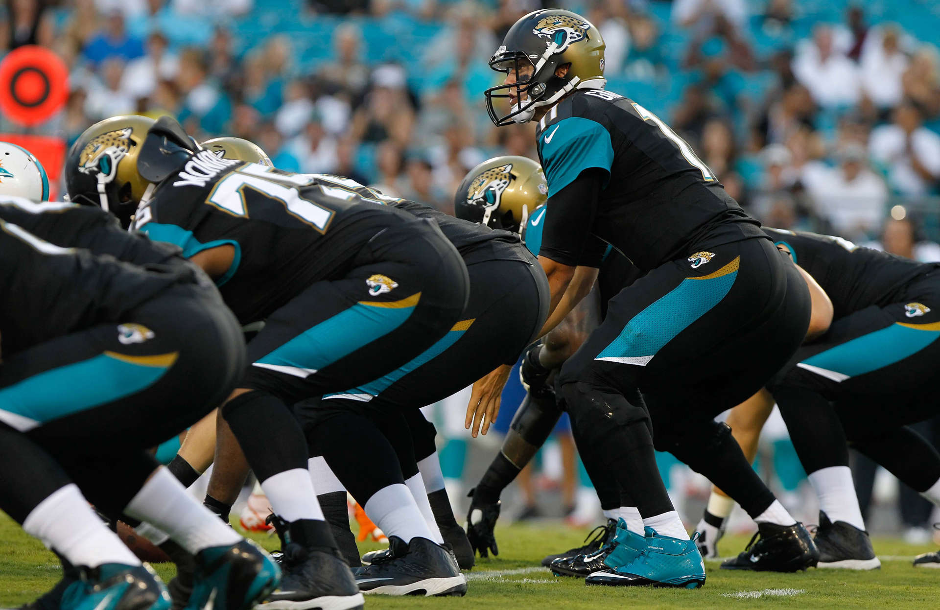
18. Jacksonville Jaguars, 1996-2008 Uniforms


The Jags were the rare NFL expansion team that got it right out of the box. For their first 13 years, they wore gorgeous threads that were near-perfection, anchored by a gold-accented teal/turquoise color that was utterly modern but nonetheless felt traditional. This uni would have become recognized as a modern classic if ownership had been smart enough to leave it alone. Unfortunately, that wasn’t the case, and the Jags soon descended into the nether realms of aesthetic embarrassment. They really need to bring back that original set — not just as an occasional throwback, but on a full-time basis.
19. New York Islanders: 1995-1997 “Fish Sticks” Uniforms

/cdn.vox-cdn.com/uploads/chorus_image/image/58475349/345860.jpg.0.jpg)
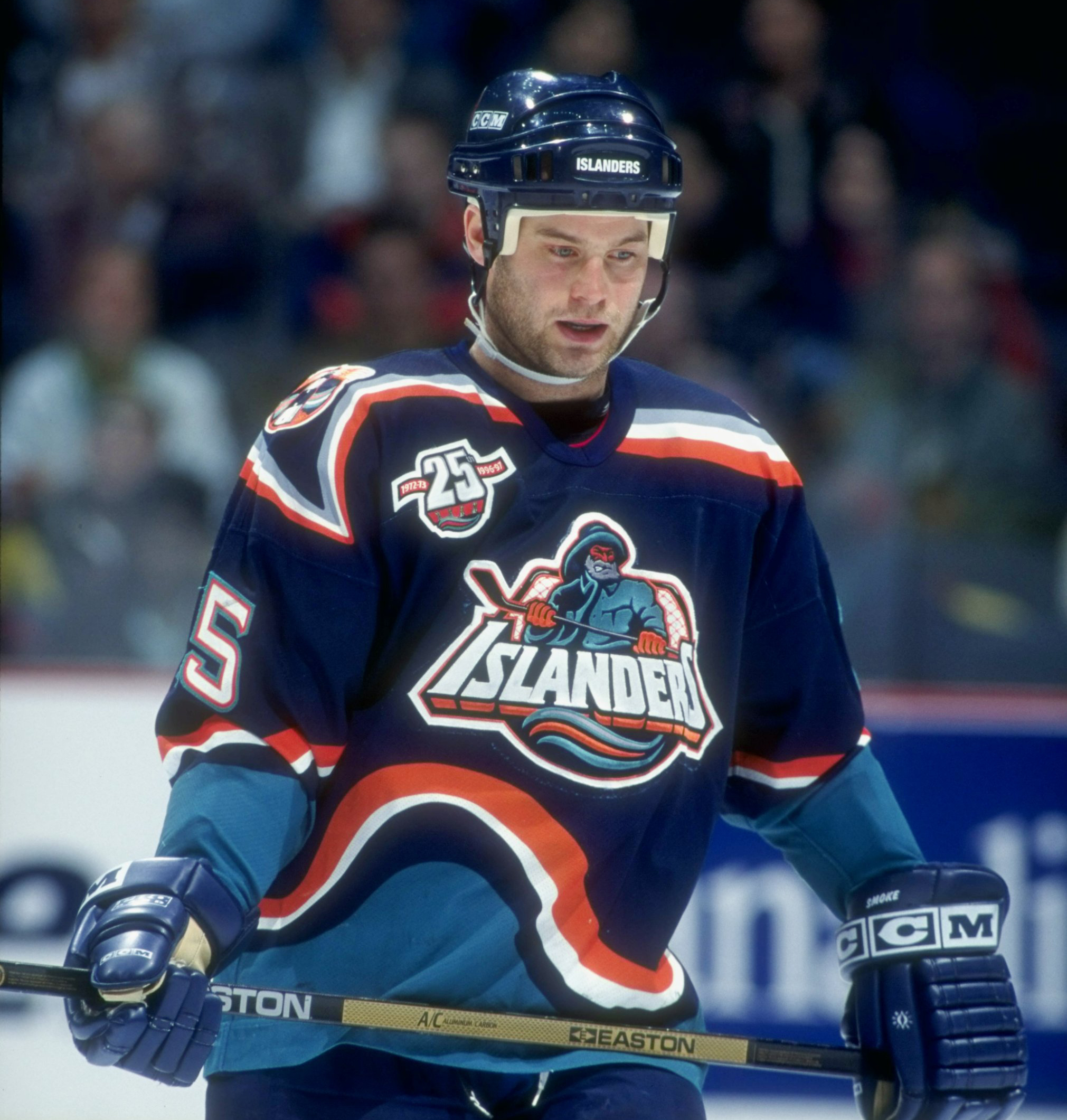
Much like the Wild Wing design, this is one of those legendarily bad NHL uniforms. But while Wild Wing was worn for only three games, the Islanders’ “Fish Sticks” set — so nicknamed because the jersey’s fisherman insignia looked like the Gorton’s mascot — was worn for two full seasons. As if the front of the jersey weren’t bad enough, the back was bad enough to induce seasickness. The net result was such an epic fiasco that an entire book has been written about it. A modified version of the jersey was worn once for pregame warm-ups in 2015, but the Isles need to go all the way and let the fisherman sail again in a real game.
20. Milwaukee Bucks, 1985-1993 “Irish Rainbow” Uniforms
See that multicolored striping that the Bucks currently have on the sides of their jerseys? That’s a visual shout-out to their old “Irish Rainbow” design, which featured multiple shades of green (because let’s face it, one shade of green isn’t enough). As is so often the case, the originals were better. The Bucks should bring these back — ideally with the socks that had the team name spelled out down the side.
/cdn.vox-cdn.com/uploads/chorus_image/image/66088367/usa_today_13873419.0.jpg)
Paul Lukas has been writing about uniforms since 1999. If you like this article, you’ll probably like his Uni Watch Blog, plus you can follow him on Twitter and Facebook and sign up for his mailing list so you won’t miss any of his future InsideHook columns. Want to learn about his Uni Watch Membership Program, check out his Uni Watch merchandise, or just ask him a question? Contact him here.
The Charge will help you move better, think clearer and stay in the game longer. Subscribe to our wellness newsletter today.