

(Alex Wong/Newsmakers)
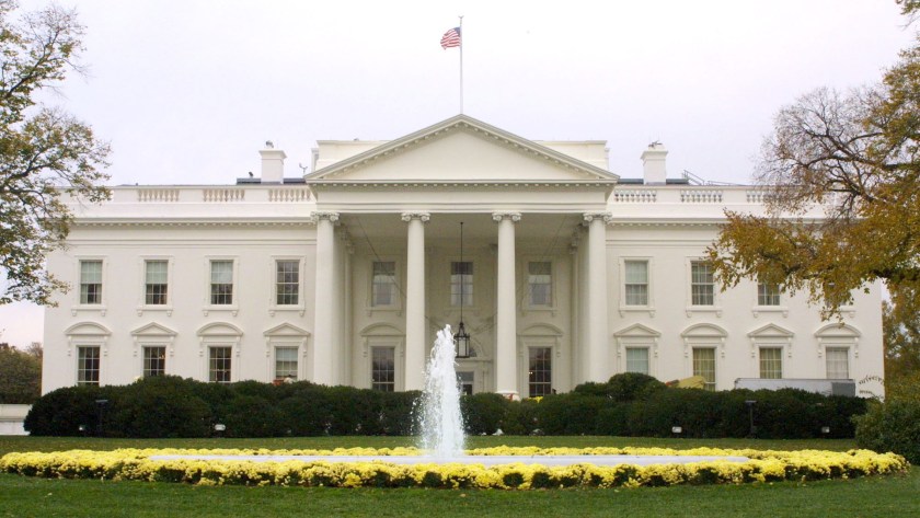
Whether or not you agree with what goes on inside the White House, it turns out that at least one thing is completely messed up: its logo. New York design agency Hello Monday recently wrote a post about being asked to help redesign the White House’s logo back in 2009. Doing its due diligence, the firm researched the north face of the White House, which appears on the logo—the same side you see on the back of the $20 bill. That’s when the agency started noticing some peculiar inconsistencies.
Compare the two logos below. Can you spot the differences and inconsistencies? Read Hello Monday’s post on Medium for all the answers.
2009 White House logo2016 White House logo
This article was featured in the InsideHook newsletter. Sign up now.