The last few months have abounded with changes and challenges for retail giant Amazon. The online retailer is facing a lawsuit from New York State over its working conditions during the pandemic, and an upcoming union vote in Alabama could also have significant effects on the company’s future.
And then there’s the matter of the app icon that looks like Hitler.
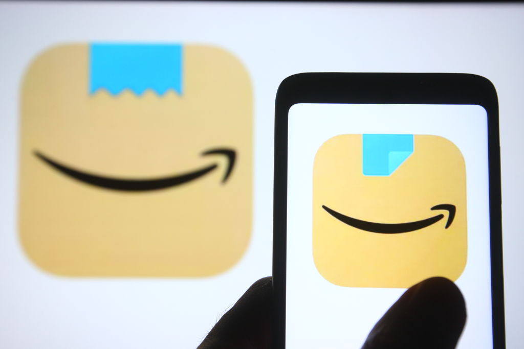
As the BBC reports, Amazon recently changed the logo for their shopping app. Why? The previous version featured Amazon’s ubiquitous smile with a strip of blue tape above it. The aesthetics of it evoke a box from Amazon, taped shut and ready to be opened — or at least that’s the idea. Unfortunately, the icon design also looks like a small square mustache above a mouth.
The BBC quotes one customer’s candid opinion of the old logo. “Looks like a happy little cardboard Adolf to me,” they said.
Amazon has since tweaked the logo slightly, with the tape now folded back in one corner — and thus not evocative of any genocidal world leaders. “We designed the new icon to spark anticipation, excitement, and joy when customers start their shopping journey on their phone, just as they do when they see our boxes on their doorstep,” the company said in a statement.
It’s fair to say that discovering things that unintentionally look like Hitler is a favorite pastime of the internet. A site chronicling cats that resemble the Nazi leader has been online since 2006. Could a gallery of ill-considered logos be next?
Thanks for reading InsideHook. Sign up for our daily newsletter and be in the know.
