As anyone who’s read Simon Garfield’s Just My Type or seen the documentary Helvetica knows, the history of fonts is a lot more detailed than you might expect. Fonts are one of the few places where centuries-old creations can coexist neatly beside work created a few years ago. The ways in which fonts are created blends a strong sense of aesthetics with an acute awareness of cultural history; it’s the multidisciplinary survey course you didn’t know you needed.
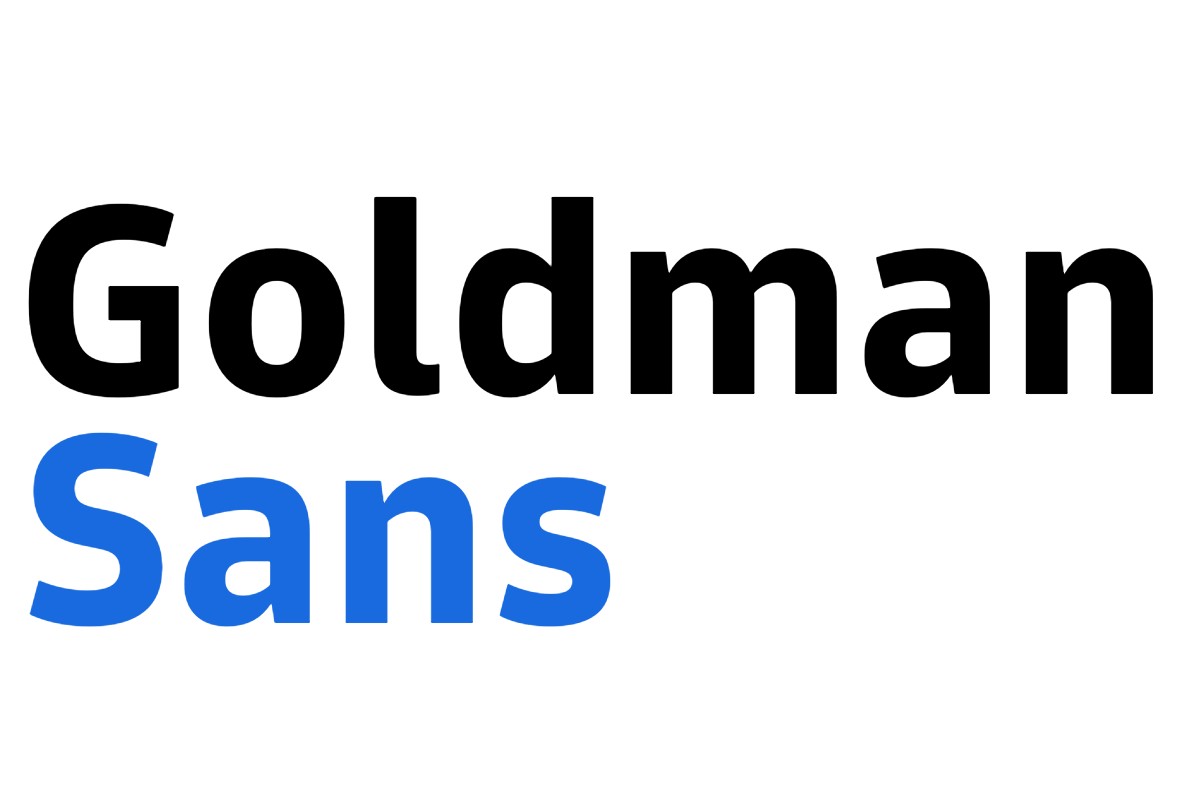
Writing at The New York Times, Josh Wagner and Joel Stein explored the latest entry into the font design world: the custom font commissioned by Goldman Sachs. The font, named Goldman Sans, first appeared in June. “By balancing optical weights of numerals and avoiding complex strokes that could disrupt clarity,” the company’s statement notes, “Goldman Sans helps data obsessed people find the information in the noise.”
More Like This
As Wagner and Stein point out in their article, the font — which is free to download and use — represents a step towards a more friendly, accessible Goldman Sachs. And they’re not alone in doing so:
Bespoke typefaces are an increasingly common corporate flex. Other companies that have recently commissioned them include Toyota, Duolingo, Southwest Airlines and CNN.
This might speak to a general public more savvy about design than in decades past. (See also: one of the best SNL sketches in recent years.) Though the article points out that some of the font’s qualities, particularly how it displays numbers, are legitimately groundbreaking.
One might call Goldman Sans the beginning of a new chapter in font history — though it also offers a memorable way to display that chapter on a page. Not a bad quality to have.
Subscribe here for our free daily newsletter.
Thanks for reading InsideHook. Sign up for our daily newsletter and be in the know.