There are a few things to consider when planning the next vacation: outdoor adventure versus luxury resort, ancient castles versus modern architecture, relax on sandy beaches or climb lush mountains? While food, places to stay and stuff to see all factor into where we might go on our next adventure, Carlsbad, California, a beach town just north of San Diego, reminds us of one more factor in our decision making: color.
“Trends in color, or what people gravitate to reflects what’s going on and reflects what they feel they need. What we saw this year was the shift away from some of the brighter and more vibrant colors toward more natural and organic colors from nature,” Laurie Pressman, Vice President of Pantone, explains to InsideHook.
While we used to depend on magazines or travel agents to help us figure out where our next adventure should be, today, millennials are using Instagram as a way to help pick a destination. What gets them? Sure, it could be some influencer they follow talking up a place, but likely it’s the hues of the scenery or details that catch their eye. We may have noticed the obvious upsurge in coral and millennial pink in Apple products and on book covers, but the palette of travel photography has an agenda of its own, and whether we’re aware of it or not, certain shades of pink, blue and gold are recurring regularly and luring us to vibrant destinations around the world.
Think about how you schedule little things on your vacation: we set our alarms for five in the morning to watch sunrises and sit outside on freezing beaches for sunsets, all so that we can experience and capture their tranquil colors. We travel far and wide for pink beaches, like Cane Beach in Barbados or Spiaggia Rosa in Sardinia. New England becomes a tourist hub in the fall, when the landscape looks like it has caught on fire with the turning leaves. Chefchaouen, Morocco, also known as the blue city, invites countless tourists every year who want to experience an architectural tone that offers a feeling of calm and contentment. Perhaps you visit Santorini, Greece and Jodhpur, India for the same comfort that can be extracted from their blue walls or domed roofs.
Whether or not we’re conscious of it, color plays a key role when we’re determining where to visit. Last year, Pantone Color Institute took this phenomenon a step further when they culled the four most common colors of travel photography in social media and partnered up with Visit Carlsbad to create the annual Colors of Carlsbad, a campaign that invites tourists to come visit this beach town where social media meets the real world. Like Mary Poppins stepping through the painting on the sidewalk and into a cartoon wonderland, you’ll be stepping through your phone screen and into your favorite travel influencer’s photos.
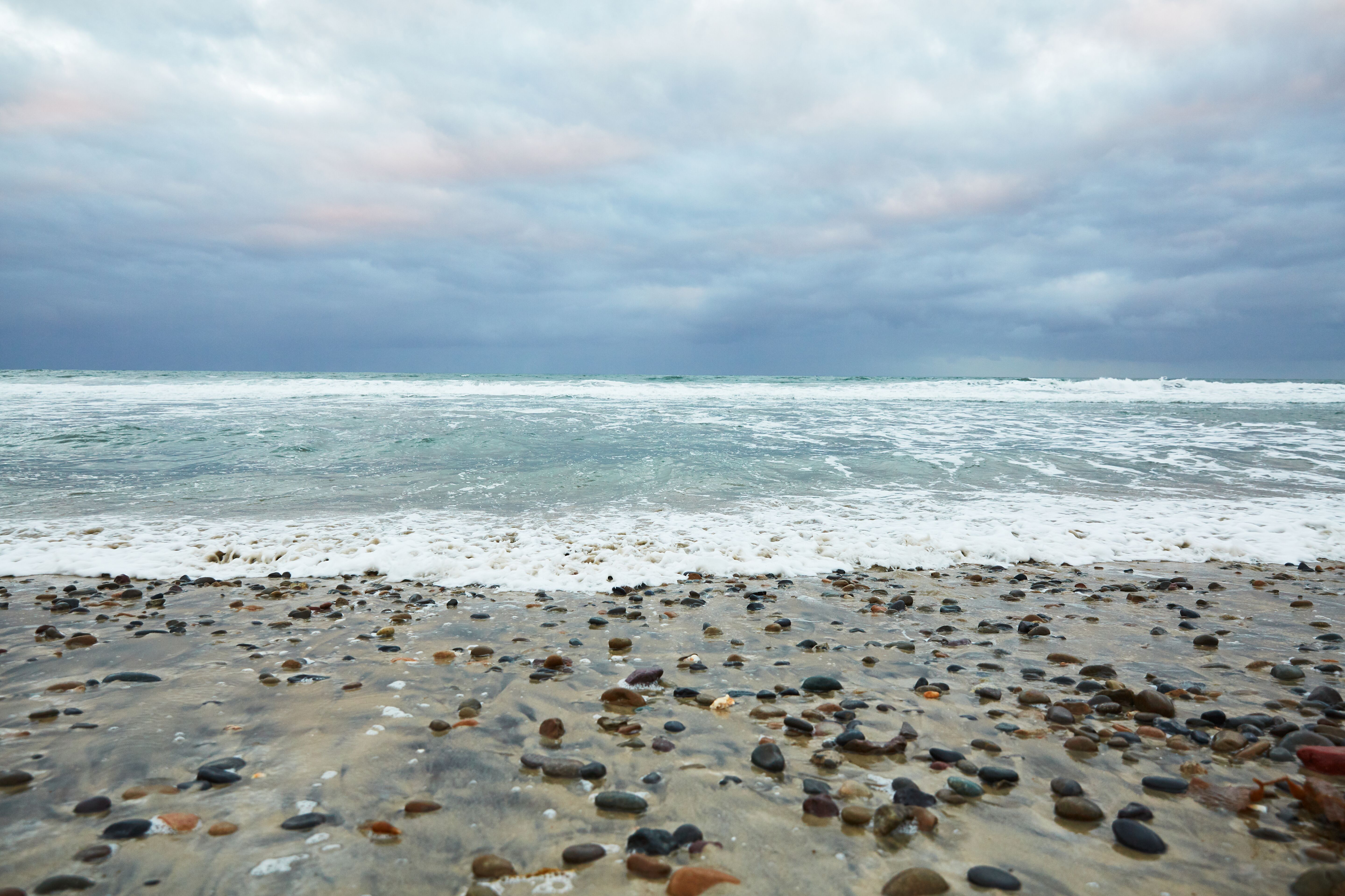
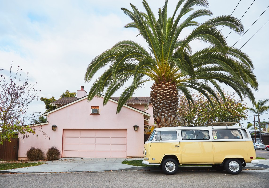
The colors that Pantone found to be the most popular of 2019 occur naturally in Carlsbad; in the water, the sky, the beach, the flora and fauna. The flower field that blooms in the spring boasts a dusted pink (Pantone 16-1522 Rose Dawn) that can also be found in the sky at sunset. The ocean offers a deep teal color (Pantone 19-4535 Ocean Depth) and the sky a calming light blue (Pantone 15-4323 Ethereal Blue). An autumnal mustard (Pantone 16-0948 Harvest Gold) can be seen in the muted morning sunrays. It’s these naturally occurring colors that kindled the idea of a color-inspired travel destination, and the town makes the most of their sought-after palette by offering culinary, wellness, and outdoor experiences saturated with these same Pantone shades.
“We’re looking for things that involve us, things that comfort us, and the more muted colors, the earth tones, it has a feeling of reality, it’s colors that you can reach out and touch in nature,” Pressman says. “And as the world becomes more bombastic, we want calm, we want quiet, we want what’s real and natural. We’re spending so much time in technology that you want to physically touch something, and not just the screen and that’s what the colors from nature give us.”
The Carlsbad tourism board had the resourceful idea to make the most of our color proclivities, but color-based travel decisions occur all over the world. The current color trends reflect a desire for familiarity and comfort, even in our adventures to unfamiliar places: a blue city may remind you of the dependable sky; a field of pink roses may remind you of the blush of a warm face.
Next time you pick a place to visit, think about the psychology behind your decision, and what the destination’s palette could mean to you. While they say you shouldn’t let certain things color your experience, in this case, it’s somewhat inevitable.
This article was featured in the InsideHook newsletter. Sign up now.
