Doesn’t it seem like it was just yesterday that we were finally crowning an NBA champion for the 2019-20 season?
Okay, so it wasn’t yesterday, but it was just a little more than two months ago, so it feels weird to be on the cusp of a new NBA season already. On the other hand, it also feels weird to be starting a new season so close to Christmas, instead of in late October. Hey, that’s 2020 for you — everything’s messed up in one way or another.
But messed up or not, the 2020-21 NBA season is almost upon us, which means it’s also time for the annual Uni Watch NBA Season Preview, with all the info you need about what you can expect to see on the court this season.
As has been fairly standard for the NBA in recent years, the biggest news is about the new “City” designs. Those are the alternate uniforms that are worn for one season and then discarded in favor of a new version the following year, creating a fairly insane level of uni churn. Since every team gets a new City uniform each season, it means every team will have at least one new on-court look this year:
We’ll take a closer look at each City uniform in a minute, along with the new throwbacks (for several teams) and new primary uniforms (for three teams), as well as everything you need to know about this season’s new patches, logos, court designs and related issues.
With the season set to tip off on December 22, here’s our annual team-by-team breakdown. Ready? Deep breath — here we go.
ATLANTIC DIVISION
Boston Celtics
The Celtics’ new City uniform — one of the rare white designs in the City program — is based on the look of the team’s championship banners:
Also, as you can see in the photos from that previous tweet, the Celtics have a new uniform advertiser. GE is out, Vistaprint is in. Here’s a closer look (additional info here):
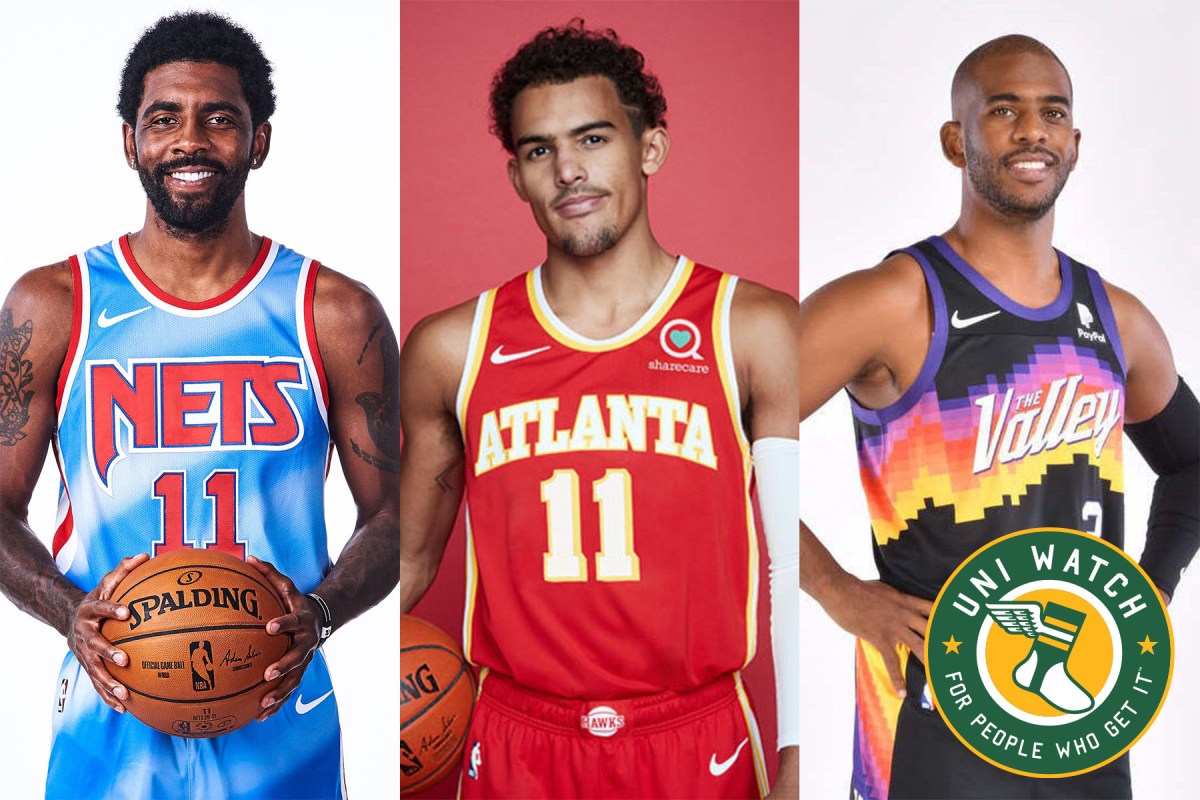
Brooklyn Nets
Lots of uni news for the Nets this season. First, they’re reviving their old “tie-dye” uniform as a throwback, with a retro court design to match (additional info here):
In addition, the Nets have what is arguably the most radical City uniform of the season. It’s a tribute to the late Brooklyn-based artist Jean-Michel Basquiat, designed in coordination with Basquiat’s estate, and let’s just say it’s — well, see for yourself (here are some additional photos and info):
The Nets have also changed their uniform advertiser this season. Infor is out and Motorola is in (additional info here):
The unusual thing about this is that Motorola is also the Pacers’ uni advertiser, so this is the first instance of a company buying ad space on the uniforms of two different NBA teams. (Now Motorola just needs to do that for the other 28 teams and then they can change the name of the league from NBA to MBA.)
New York Knicks
The Knicks’ new City alternate was designed by the streetwear brand Kith. The bad news is that it’ll be worn on Friday nights and for nationally televised games. The good news is that the Knicks probably won’t have many nationally televised games, so we won’t have to see this design so often (additional info here).
Philadelphia 76ers
The Sixers’ new City uniform is inspired by Philadelphia’s Boathouse Row, a series of 19th-century boathouses along the Schuylkill River (additional info here, and team president Chris Heck has some unusually candid comments about the uniform here):
Toronto Raptors
There’s a lot going on this season for the Raptors. First, due to pandemic-related health restrictions in Canada, the team will be playing its home games in Tampa, Florida (which has led to lots of “We the North South” jokes). The team even created a Florida-themed logo for its preseason training camp (additional info here):
Regardless of the venue, the Raptors will have new uniforms this season. They’ve taken the chevron-driven design that they used for several of their recent alternate uniforms and made it their primary motif (additional info here and here):
The new uniform set also comes with its own chevron-themed court design, which has been installed in the team’s temporary Tampa home:
In order to make the new digs feel feel a bit more like home, the Raptors will also be hanging their 2019 championship banner at the Tampa facility.
Additionally, the Raptors, like everyone else, have a new City uniform this year. Somewhat amazingly, it is chevron-free:
CENTRAL DIVISION
Chicago Bulls
The Bulls’ latest City uniform is a tribute to the Art Deco architecture style found throughout Chicago. Definitely a different look for this team (additional info here):
Cleveland Cavaliers
In theory, the Cavs’ new City alternate is a shoutout to the Rock and Roll Hall of Fame, which is located in Cleveland, with the letters on the chest insignia based on various rock bands’ logos. In practice, though, it’s just a mess that’s destined to become known as the “ransom note design,” with a really miserable gray court design to boot (additional info here):
Meanwhile, here’s a nice uni-related story: You know how NBA players are routinely photographed as they enter the arena prior to a game? Cavs player Larry Nance Jr. is turning that into a way to support the local community by wearing apparel that promotes various Cleveland businesses on his way to each game this season, plus he plans to sell his game-used jerseys and donate the proceeds to the business he’s repping each night. Full details here.
Detroit Pistons
The Pistons’ new City uniform is an unusually uninspired take on their “Motor City” identity, although it does have two distinctions: It includes a comma on the front of the jersey (a possible NBA first!), and it’s a near-total ripoff of the Nuggets’ Statement design:
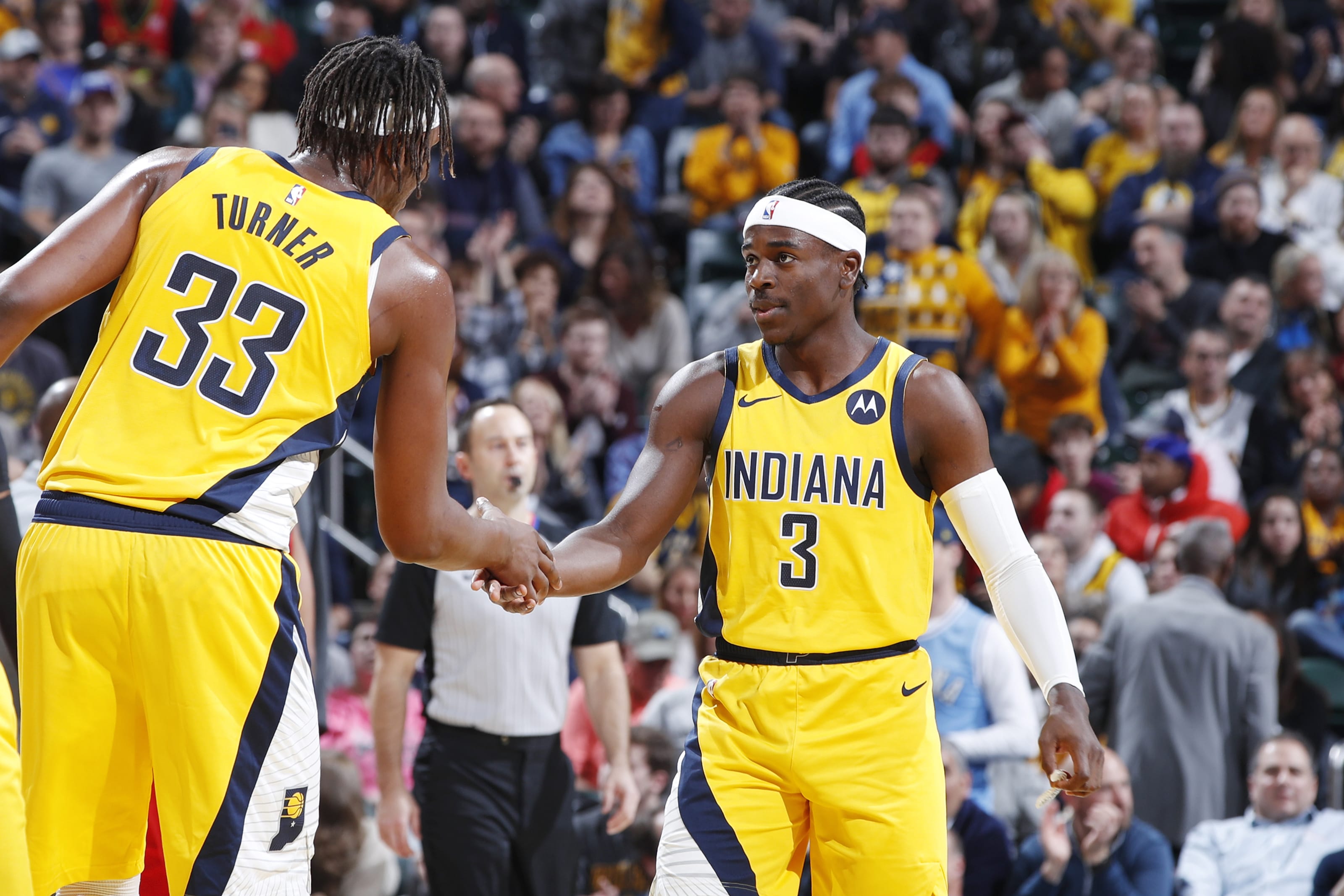
Indiana Pacers
The Pacers have one of this year’s better City uniforms, with a pinstriped motif that hearkens back to the team’s Reggie Miller era (additional info here):
Milwaukee Bucks
When you think of the Bucks, you probably think of just about any color other than blue — so of course that’s the color they chose for this year’s City uniform, one of the league’s weakest designs of the year (additional photos here):
Also: The Bucks’ three-year uniform-advertising deal with Harley-Davidson has expired, and they haven’t yet found a new ad partner. So for now, the team’s uniforms are blissfully, gloriously ad-free:
SOUTHEAST DIVISION
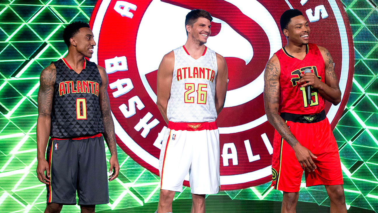
Atlanta Hawks
Big year for the Hawks, who have suddenly gone from being the league’s worst-dressed team to very solid aesthetic respectability. First, they’ve scrapped the crummy uni set that they’ve worn for the past five seasons — the one with the gimmicky quilted background pattern and neon color accents — and replaced it with a simple but effective set that draws upon the franchise’s design roots. The new court looks sharp, too (additional info here, and there’s a detailed assessment here):
Next, their City uniform for this year is a shoutout to the Rev. Dr. Martin Luther King Jr. The “MLK” chest lettering marks the first time a person’s initials have been featured on an NBA jersey (additional info here):
This uniform will be complemented by a new court design featuring a stained glass pattern inspired by the windows at Atlanta’s Ebenezer Baptist Church, where King was co-pastor (additional info here):
Charlotte Hornets
The Hornets have redesigned their primary white and teal uniforms, which will now feature double pinstripes on the jerseys — but not on the shorts, which looks a bit odd (additional info here):
As for Charlotte’s new City uniform, your friendly uniform columnist really likes it. Ignore all the marketing-speak nonsense about the mint-green base color somehow being tied to the old U.S. Mint in Charlotte and just enjoy the swell color combo. The accompanying court is a winner as well (additional info here and here):
Miami Heat
The Heat have taken now taken their Miami Vice alternate uniform theme about as far as it can go. Their latest version, which is serving as this year’s City uniform, is called “Vice Versa,” and it’s quite an eyeful (and maybe an eyesore). Regardless, you have to give them credit for taking the concept to its logical extreme (additional photos here):
Also: Due to a corporate merger and resulting name change, the Heat’s uniform advertiser has changed its patch design this season (additional info here):
Speaking of corporate machinations, the naming rights deal for AmericanAirlines Arena expired at the end of 2019, but Miami-Dade County still hasn’t found a new naming advertiser. For now, the building retains the old name, but the AmericanAirlines logo has been removed from the Heat’s court design.
Orlando Magic
The Magic’s new City uniform features pinstripes (a familiar visual element for this franchise) and the color orange (not familiar at all, but it’s Florida, so why not?). Overall, not bad (additional info here):
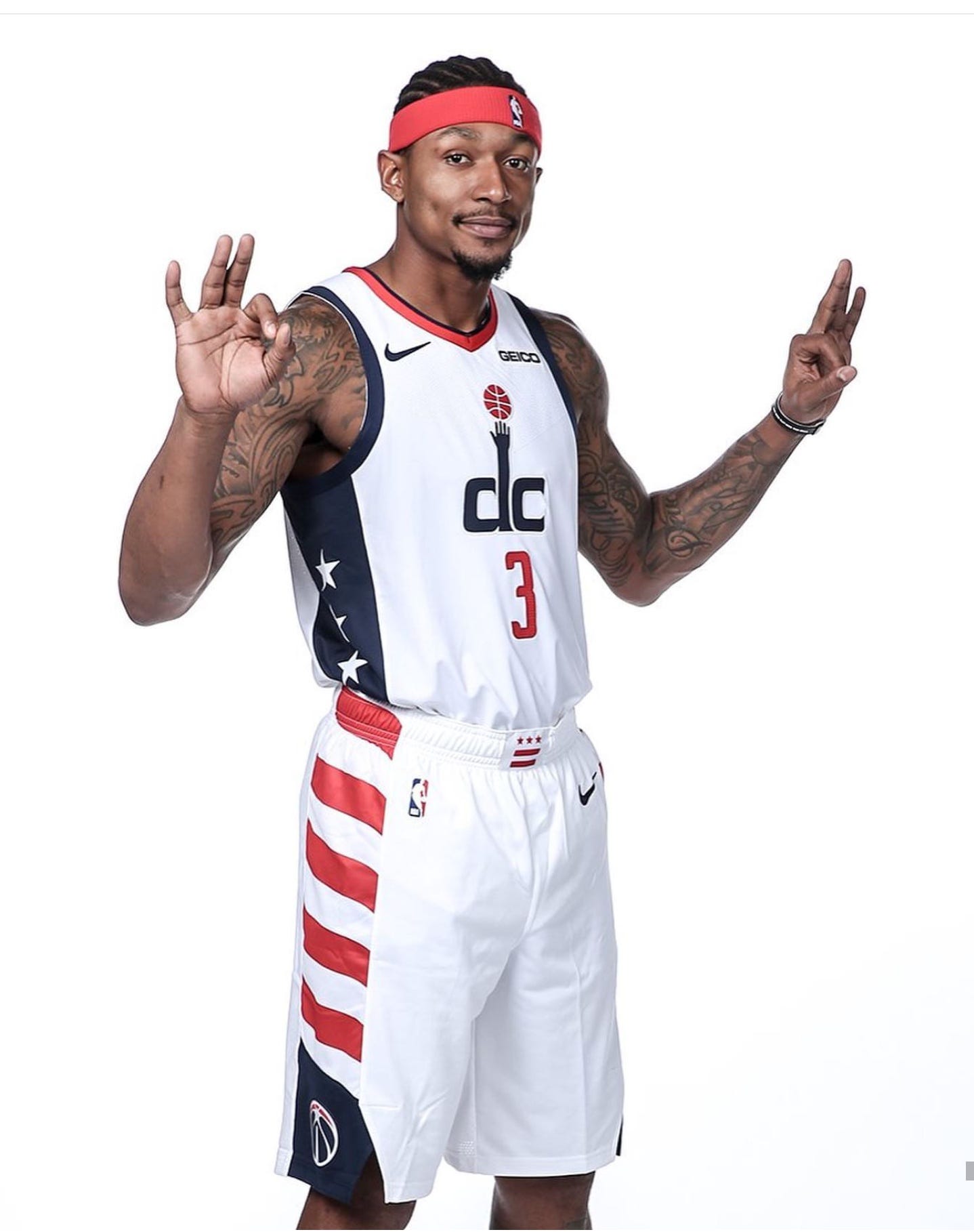
Washington Wizards
Honestly, why do basketball teams (or any sports teams outside of baseball) ever choose gray as a uniform color? It always looks drab, dull and, you know, gray. But that’s the route the Wizards have taken with this year’s City uniform (additional info here):
On top of the underwhelming color, it’s also a lazy design job, because last year’s City uniform was the same design but in white (and looked pretty good!). This really exposes a lot of the problems with the City program’s annual carousel of new uniforms — if you have a good design, you should be able to stick with it for more than one season. And if you’re switching to a “new” design, you should have do more than just change the base color from white to gray.
Also: The Wizards added a “41” memorial patch for former star Wes Unseld, who died in June, for the bubble portion of last season. Since their bubble season lasted only eight games before they were eliminated, they’ve decided to carry over the Unseld memorial to this season, but they’ve converted it from a patch to a shoulder band:
NORTHWEST DIVISION
Denver Nuggets
The Nuggets have had a variety of skyline/rainbow-themed uniform designs over the years, and most them have been great. Their latest one, which is serving as this year’s City design, feels more like the Jazz’s recent “red rock” alternate (additional info here):
Also, there are two Nuggets-related bits of corporate theater to address. First, Western Union, which has been the team’s uniform advertiser for the past three seasons, has re-upped for three more years. Also, the team’s arena has a new advertised name: Pepsi Center is out, Ball Arena is in.
Minnesota Timberwolves
The T-Wolves’ new City design has “MINN” across the chest and a neon-green star that’s supposed to represent the North Star (because Minnesota’s the North Star State, get it?). Someone should probably tell them that the North Star isn’t actually neon-green, but they seem very invested in that color so let’s not ruin their fun (additional info here):
Also: The Timberwolves are another team whose uniform-ad partnership — with Fitbit, in their case — has expired. They announced back in June that they’re seeking a socially progressive organization to be their new uni advertiser, but they haven’t found one as of yet, so for now their uniforms are ad-free:
And in one final note, forward Rondae Hollis-Jefferson, who’s previously played for the Nets and Raptors, recently signed with the Timberwolves and has been wearing a mask — the hard-shell kind, not the anti-coronavirus kind — to protect a facial injury during preseason action:
Oklahoma City Thunder
The Thunder’s new City design is more of a “state” design, as it simply has the word “Oklahoma” across the chest (additional info and photos here):
The Thunder have also made some adjustments to their primary court design. The biggest change is that the word “Thunder” no longer appears as part of the center-court logo:
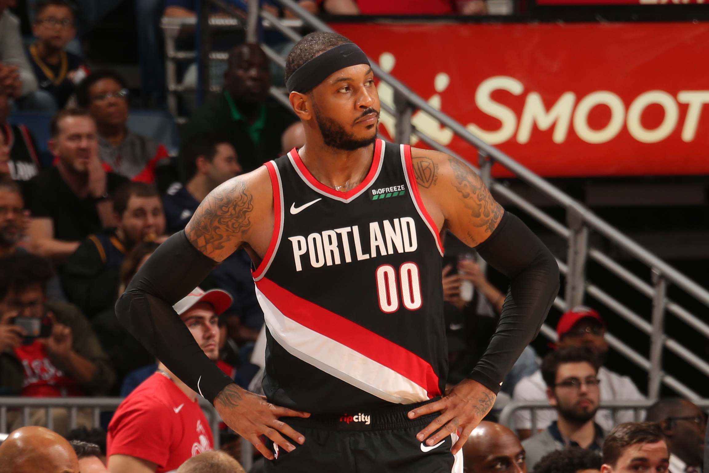
Portland Trail Blazers
Admit it: For years now, you’ve been thinking, “What the NBA really needs is a brown uniform. Sure, not a single NBA team has brown as one of its official team colors, but still — a brown uni. That’s the ticket.” My friends, the Trail Blazers’ new City design has you covered (lots of very silly additional info here, and there’s a detailed assessment here):
Meanwhile, the Blazers have also updated their primary court design (additional info here):
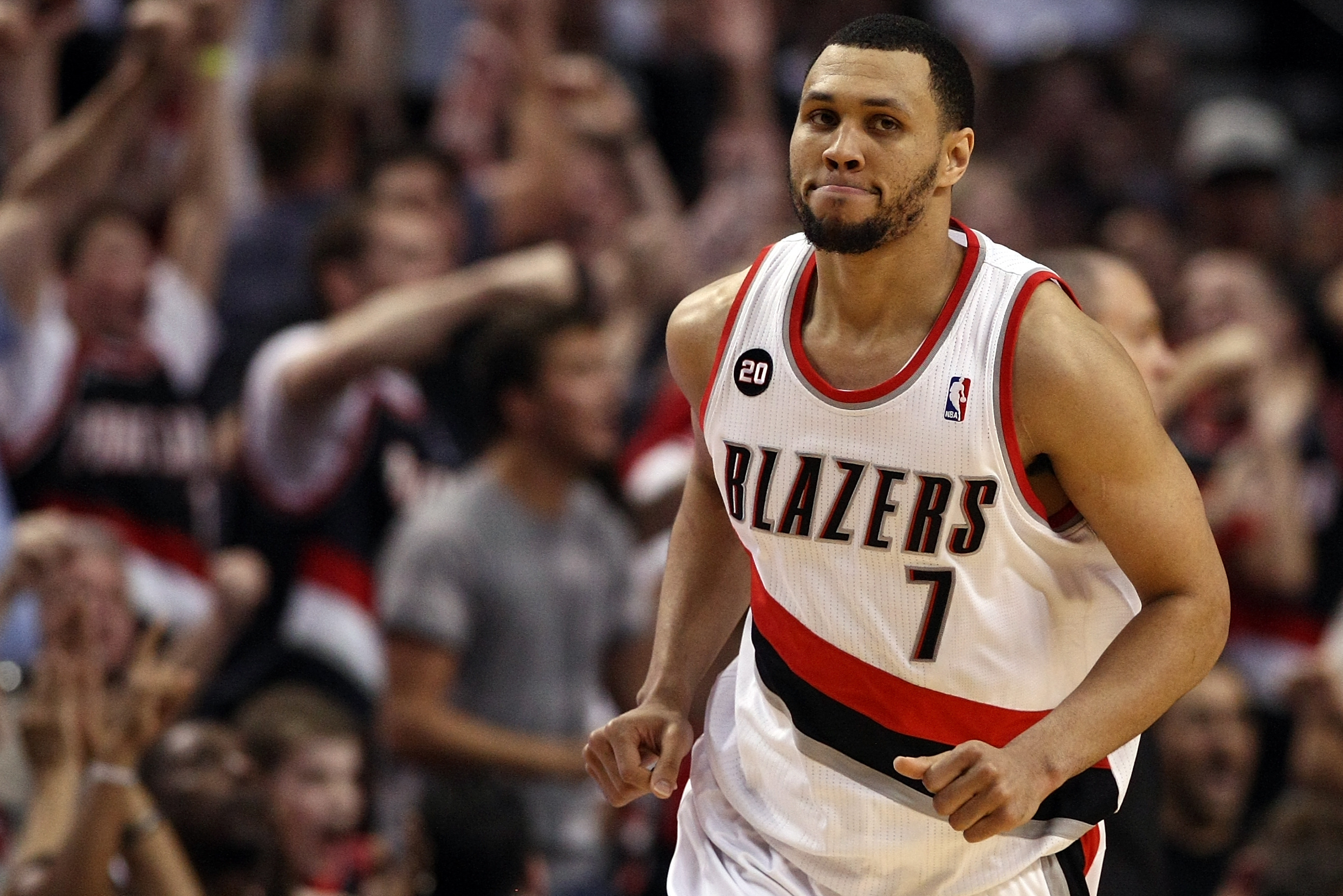
Finally, you may have heard some chatter during the off-season about forward Carmelo Anthony, who wore No. 00 after joining the Blazers shortly after the start of last season, possibly switching this year to No. 7, the number he wore for many seasons with the Knicks. Although No. 7 was technically available in Portland, the Blazers haven’t issued it to anyone since Brandon Roy retired in 2011. After Roy gave his blessing to the move, it looked like Anthony might switch numbers — but he ultimately decided not to, because too many of his No. 00 jerseys were already in the retail merchandise pipeline.
Utah Jazz
The Jazz’s “red rock” City alternate, unveiled back in 2017, was one of the more popular City designs in the league — so popular, in fact, that the team kept wearing it for three seasons, instead of the requisite one. This year they’re finally replacing it with a new design, which is sort of a dusk version of the previous one. It also comes with its own very cool court design (additional info here and here):
Also: After former Jazz coach Jerry Sloan died in May, the Jazz added a memorial patch for him when the season resumed in the Orlando bubble. Since the remainder of Utah’s season lasted only 15 games, they’ve decided to keep memorializing Sloan on their uniforms this season, but they’ve converted the gesture from a patch to a band (if this sounds familiar, it because it’s the Wizards are doing the same thing for Wes Unseld):
And in one additional note, the Jazz’s “Five for the Fight” cancer-awareness ad patch — the only NBA ad patch devoted to a charitable enterprise instead of a profit-making company — will remain on the team’s uniforms at least through 2023.
PACIFIC DIVISION
Golden State Warriors
So here’s a weird situation: The Warriors played in Oakland for 47 years and never once wore the word “Oakland” across their chests. But after leaving Oakland behind and moving across the bay to San Francisco last season, they’ve now decided to go with an “Oakland”-emblazoned City uniform, plus a matching court, with the design based on the team’s mid-2000s “We Believe” uniforms (additional info here):
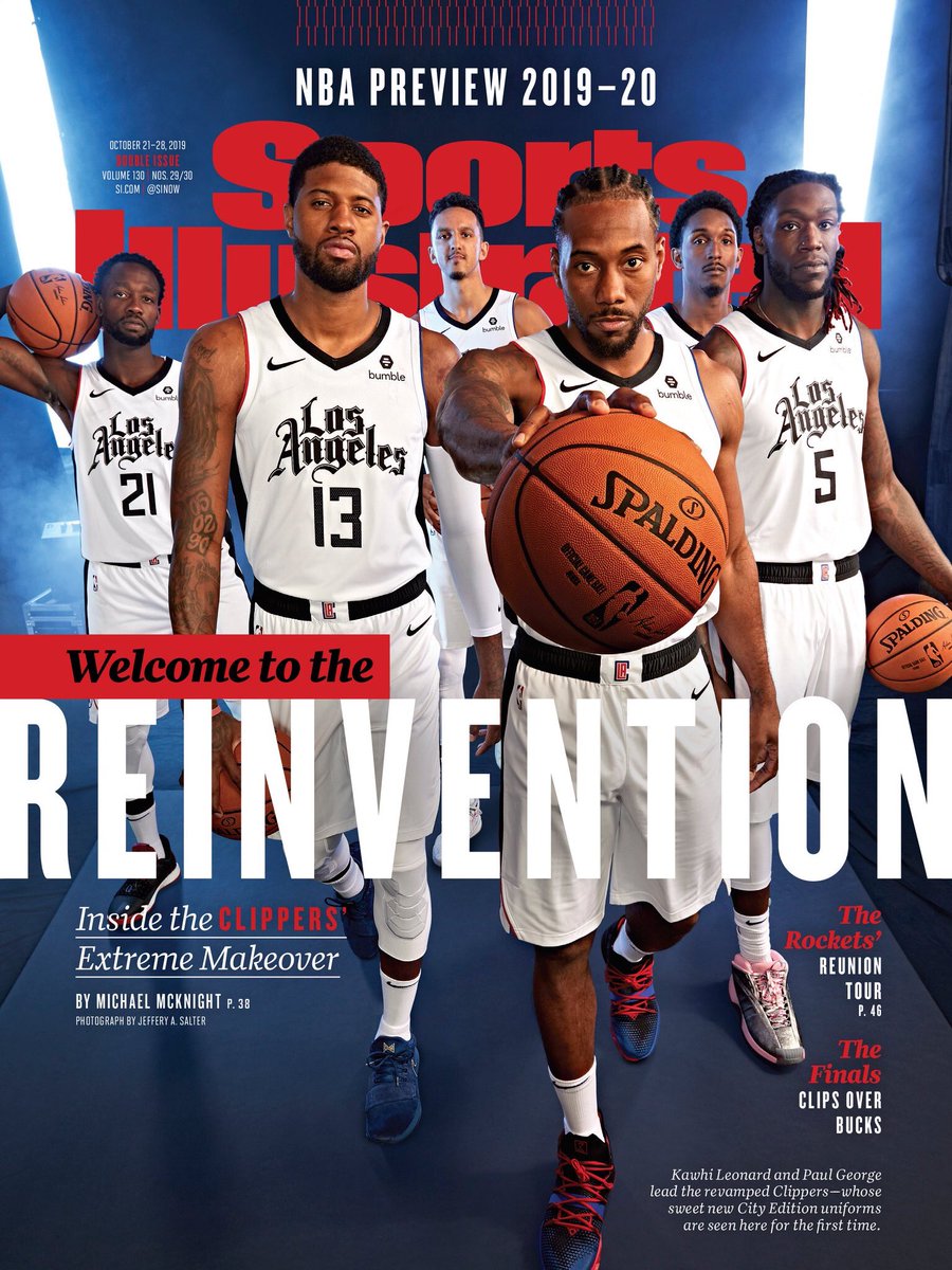
Los Angeles Clippers
Remember the the Clippers’ City uniform from last year? They’re going with the same basic design this season, but they’ve reversed the colors (additional info here):
The Clippers also have a new uni advertiser this year. Bumble is out and Honey is in (additional info here):
Los Angeles Lakers
The Lakers are the reigning NBA champs, which means the little gold tab that appears on the back of all their jerseys has been updated to reflect their 17th title:
In addition, the Lakers have two new uniforms this season: a blue 1960 throwback and a white City alternate. The white design, which honors Hall of Famer Elgin Baylor, is the latest entry in the team’s “Lakers Lore” series, each of which is dedicated to a past Laker (additional info on both designs here):
Also: The Lakers’ jersey advertiser, Wish, is adding the word “Shopping” to its ad patch:
Meanwhile, looking ahead, it appears that LeBron James will switch to wearing No. 6 next season and give his No. 23 to teammate Anthony Davis.
Phoenix Suns
The simplest uniform designs are usually the best. Every now and then, though, a team comes up with an over-the-top uni concept that actually works. That’s the case with the Suns’ new City design, which is a doozy (additional info here):
Sacramento Kings
The Kings’ new City uniform is a very plain design with “Sactown” across the chest (additional info here):
Also: The Kings’ uni ad deal with Blue Diamond Almonds has expired, and so far they have not found a new advertiser. So for now they are that rarest of creatures: an NBA team with ad-free uniforms. Enjoy it while it lasts.
SOUTHWEST DIVISION
Dallas Mavericks
The Mavs are marking their 40th anniversary this season with two new uniforms. The first is a green throwback that pays homage to their inaugural uniform set, with a matching retro court (the court makeover animation embedded below is very cool):
The second new uni is a white City alternate that’s supposedly inspired by Dallas’s iconic Pegasus sign, although a lot seems to have been lost in translation (additional info here):
Houston Rockets
In an unusual cross-sport move, the Rockets’ new City uniform uses the color scheme of the NFL’s old Houston Oilers. Fun idea, but the execution is a total snooze (additional info here):
Also: The Rockets’ ad-patch deal with ROKiT expired during last season’s pandemic break, so Houston’s uniforms were ad-free during the games played in the Orlando bubble. They haven’t yet found a new uniform advertiser, so their jerseys remain ad-free, at least for now:
Memphis Grizzlies
This year marks the Grizzlies’ 20th season in Memphis after relocating from Vancouver, and the team is marking the occasion with two new uniforms. First up is a 2001 throwback (additional info here):
Next is the team’s excellent new City alternate, which draws inspiration from the great Memphis R&B label Stax Records and soul man Isaac Hayes (additional info here and here):
New Orleans Pelicans
Having exhausted the Mardi Gras theme with their previous City uniforms, the Pelicans are basing this year’s design on the New Orleans city flag (additional info here):
In addition, the Pelicans have a new uniform advertiser this season. Zatarain’s is out, Ibotta is in (additional info here):
San Antonio Spurs
Spurs fans (and NBA uni fans in general) have been clamoring for the team to revive its old “fiesta” branding for years now. The Spurs have responded, finally, with this season’s City uniform, which is top-notch (and comes with a matching alternate court):
ADDITIONAL NOTES
- The “Statement” alternate uniforms — which are similar to the City designs but turn over at a slower rate — are getting a new manufacturer’s logo this season, with the Nike swoosh replaced by the Jordan logo. It’s essentially just bookkeeping, since Jordan is just a sub-brand of Nike (additional info here):
- In 2018-19, the NBA and Nike introduced the “Earned” uniform program — essentially an extra alternate uni that teams got to wear if they qualified for the playoffs the previous year (essentially a participation trophy, since more than half of the league’s teams advance to the postseason each year). The Earned program was quietly mothballed in 2019-20, but it’s back this season. The 16 designs won’t be officially revealed until later in the season, but a blogger recently leaked them after finding them on the NBA’s website (additional info and assessments here):
- No All-Star uniforms this season, because the game has been canceled. Indianapolis, which was slated to host this year’s game, will host the 2024 All-Star festivities instead.
- Remember how players were permitted to wear social justice messages on the backs of their jerseys for the Orlando bubble segment of last season? That program has now ended, so it’ll just be the players’ names on the jerseys this season.
- In order to keep things simpler during the pandemic, coaches will not be required to wear sport coats this season, so expect to see a lot of casual Friday looks out there.
- You can see the uniform matchup for every game on the schedule by checking out the NBA’s awesome LockerVision site.
- Looking ahead, next season will mark the NBA’s 75th anniversary, and it appears that they may be planning some very interesting uni designs that will combine various elements from each team’s uniform history. Here’s what we know about that so far.
- And in one last bit of news, this is the last season the NBA’s official ball will be made by Spalding. Starting next season, the league will be switching to Wilson.
And there you have it. Did we miss anything? Yeah, probably. If so, you know what to do.
Paul Lukas will have his annual NHL Season Preview in early January. If you like this article, you’ll probably like his Uni Watch Blog, plus you can follow him on Twitter and Facebook, and sign up for his mailing list so you won’t miss any of his future InsideHook columns. Want to learn about his Uni Watch Membership Program, check out his Uni Watch merchandise, or just ask him a question? Contact him here.
More Like This
Whether you’re looking to get into shape, or just get out of a funk, The Charge has got you covered. Sign up for our new wellness newsletter today.


