Ice, ice, baby. After a bit of a delay (okay, a significant delay), the start of the NHL season is finally upon us. Things are a bit different this year — fans won’t be in the arenas, travel restrictions have forced the league to rejigger the divisional alignments, teams will play only within those new divisions, the schedule has been reduced from 82 games to 56, and the start of at least one team’s schedule will be further delayed — but it’s still the start of another NHL season, and that’s always something to celebrate.
That means it’s also time for the annual Uni Watch NHL Season Preview, with all the news on this year’s new uniforms, logos, patches, ice designs and more.
And thanks to a pair of new league-wide initiatives, there’s more uni news this time around than ever before. The first of those is the NHL’s much-ballyhooed “Reverse Retro” uniform program (let’s call it “ЯR” for short). The storyline here is that every team has unveiled a new alternate uniform featuring a color-shifted version of a logo or design template from its past:
The other league-wide program with uni-related implications, sadly, is that the NHL is now allowing corporate ads on the players’ helmets, an opportunity that many teams are jumping at. Many fans seem willing to accept this as a way to make up for pandemic-driven revenue losses (although your friendly uniform columnist doesn’t see it that way), but the league is doing itself no favors with the way it’s rolling out this scheme. Many teams are referring to their new headwear advertisers as “helmet entitlement partners,” a tortured bit of language that sounds like a cross between George Orwell and Idiocracy:
In many cases (including the one shown above), the helmet advertiser is the same company that holds the naming rights to the team’s home arena.
We’ll take a closer look at all the helmet ads, as well as all the ЯR uniforms, in our team-by-team breakdown, so let’s proceed directly to that. With the season set to begin on Wednesday, Jan. 13, here’s what you can expect to see on the ice …
EAST DIVISION
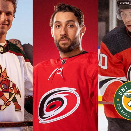
Boston Bruins
The big news for the Bruins this season is their ЯR design, which is one of the best in the league:
In a less pleasant development, the Bruins have also added a helmet advertiser:
Buffalo Sabres
Halle-freakin’-lujah, the Sabres are finally going back to royal blue and scrapping the front uni numbers! Their new uni set is very similar to their inaugural set from the 1970s, and a welcome return to aesthetic form (additional info here):
The new color scheme means there’s also a new center-ice logo:
The team’s new ЯR alternate isn’t quite so handsome as the primary set, but at least it sticks to the royal blue/yellow color scheme (additional info here):
Also, the Sabres will have two helmet advertisers — one for home games and one on the road:
New Jersey Devils
Remember how the Devils’ color scheme used to include green? They’ve made that the base color for their excellent new ЯR design (additional info here):
The Devils also have a new helmet advertiser:
New York Islanders
The Islanders’ ЯR design is nice enough, but it’s basically the same thing as their home design, with the only differences being a darker shade of blue and a tweak to the striping. It’ll look fine on the ice, but it’s a uniform that has no particular reason to exist. A wasted opport-uni-ty.
New York Rangers
The Rangers have revived their old Lady Liberty design for their ЯR alternate. Not bad, but it would be better if the gray elements were white:
Also: The Rangers play at Madison Square Garden, so they don’t have an arena naming-rights holder to double as their helmet advertiser. But that hasn’t stopped them from finding a new helmet advertiser anyway:
And in a fun typography development, it appears that rookie left wing Alexis Lafrenière will have the rare distinction of having a grave accent included on his nameplate:
Philadelphia Flyers
Sharp-looking orange design for the Flyers’ ЯR alternate this season:
Pittsburgh Penguins
The Penguins are reviving their old diagonal-lettering jersey for their ЯR alternate — one of the few ЯR designs that’s white (additional info here):
The Pens also have one of this season’s more unsightly helmet ads. As is the case with many teams, the helmet advertiser is also their arena name advertiser:
Washington Capitals
The Caps have made a small adjustment to their primary uniforms by adding three stars to their right pant leg. The stars, which match the ones just above the lettering on the team’s jersey crest, are based on the stars on the Washington city flag.
As for their ЯR alternate, the Caps are reviving their old “screaming eagle” design, this time rendered in red:
The Caps are also among the teams whose arena name advertisers are now doubling as their helmet advertisers:
NORTH DIVISION
Calgary Flames
Great news out of Calgary, where the Flames have redesignated their red throwback alternate as their new primary home uniform and paired with it a matching white design for road games. The resulting retro-styled set finally banishes black from the team’s color scheme and returns the Flames to their aesthetic roots (additional info here):
The return of the old-school uni set means there’s also a return of the old-school logo at center ice:
Meanwhile, Calgary’s old “Blasty” design (also known as the flaming horsehead) is returning to action on the team’s new ЯR alternate:
The Flames will also have a helmet advertiser this season:
Finally, if you want to delve into some Flames uniform history, here’s a recent Uni Watch interview with the designer of their mid-1990s uniforms.
Edmonton Oilers
The Oilers have added a “JM” memorial decal for former assistant coach and head coach John Muckler, who was with the team during its 1980s Stanley Cup dynasty period:
Turning to Edmonton’s ЯR alternate: On the one hand, it looks great. On the other hand, it’s kind of a lazy effort, because it just takes the team’s current road uni and color-swaps the blue and orange elements:
Not bad, but they could have been so much more creative by delving into the team’s uniform history, like this:
Also: Cool uni-related move by goalie Mike Smith, whose new mask features a shout-out to former Edmonton netminding great Grant Fuhr’s old jersey:
Meanwhile, the Oilers are another team whose arena naming advertiser is now doing double duty as their helmet advertiser:
Montreal Canadiens
Sacre bleu! The Habs’ ЯR alternate takes the near-heretical step of dressing the team in blue, yet it totally works. Definitely looking forward to seeing this one on the ice:
In a more disappointing development, even such a storied franchise as Montreal has not been able to resist the lure of helmet advertising:
Ottawa Senators
After years of requests from fans, the Sens have brought back their original jersey crest. The resulting uniform set is very similar to the team’s inaugural set from the early 1990s (additional info here):
The new on-ice look also means a new look for the ice itself:
As for Ottawa’s ЯR design, it basically adds a red version to the new uni set:
Also: No visuals yet, but the Sens will reportedly wear two different helmet ads this season — one at home and the other on the road:
Toronto Maple Leafs
Hard to fathom the point of the Leafs’ ЯR design, which has an oversized jersey crest but is still too similar to their home uni. Why did they even bother?
In addition, the Leafs’ arena name advertiser has now expanded its portfolio to become their helmet advertiser as well:
Finally, in a fun uni-numerical note, the Leafs have assigned two uniform numbers — No. 78, to defenseman T.J. Brodie, and No. 97, to center Joe Thornton — for the first time in team history.
Vancouver Canucks
The Canucks have sooooo many interesting chapters in their visual history to draw upon, but their mid-2000s gradient design isn’t one of them. Unfortunately, that’s the one they chose as the inspiration for their new ЯR alternate:
Winnipeg Jets
Two numbers are important to the Jets this season. The first is 10, because the franchise is marking its 10th season in Winnipeg. The original plan was to mark the occasion with a jersey patch featuring the Roman numeral X. But after the death of former Winnipeg star Dale Hawerchuk, the patch design was updated to include No. 10 — his old uni number (additional info here):
The other important number is 11. No player has worn that uniform number since the Thrashers relocated to Winnipeg and became the Jets in 2011. Center Rick Rypien was going to wear it for the 2011-12 season, but Rypien, who had a history of clinical depression, died by suicide before that season started. This year, however, center Nate Thompson, who’s had his own issues with addiction, will wear No. 11 as a tribute to Rypien.
In addition, the Jets’ practice jerseys now have an “11” patch. That’s the logo of Project 11, an arm of the team’s charitable foundation that’s devoted to raising awareness of mental health issues in youth:
Shifting from numbers to colors, the feeling here at Uni Watch HQ is that gray almost never works as a uniform color. But the Jets’ new ЯR design may be one of the rare exceptions. We’ll have to see it in a game to be sure, but the early indications are promising:
Last and least, the Jets’ arena name advertiser is now doubling as their helmet advertiser:
CENTRAL DIVISION
Carolina Hurricanes
Fans back in Connecticut say it’s felt like salt in the wound when the Hurricanes, who used to be Hartford Whalers before relocating to Carolina in 1997, have worn Whalers throwbacks in recent seasons. Those fans aren’t going to be any happier with the team’s new ЯR design:
Speaking of salt in the wound, the Canes have also added a helmet advertiser:
Finally, let’s give the Canes credit for releasing their season-long uniform schedule. Why doesn’t every team do this?
Chicago Blackhawks
Chicago’s ЯR alternate has a strong retro flavor:
It’s worth noting, incidentally, that Adidas’ original promo photos for this design didn’t show the front of the jersey, suggesting that either the team or Adidas is growing uncomfortable with the Blackhawks’ use of Native American imagery. It’s not yet clear if this will lead to a change in the club’s identity, but the team has announced that it will broadcast an Indigenous land acknowledgment prior to each home game this season, highlighting the history of the people who were here before Europeans arrived.
Columbus Blue Jackets
The Blue Jackets are celebrating their 20th anniversary this year and marking the occasion with a commemorative logo that’s also serving as a jersey patch (additional info here):
As for the team’s ЯR design, it’s a red version of their original 2000 “CB” jersey, which didn’t look so good the first time around and is even more garish in this new colorway:
In addition, Columbus has two different helmet advertisers this season — one for home games and one for the road (additional info here):
Dallas Stars
The start of the Stars’ season has been delayed due to a coronavirus outbreak. Once they start playing, they’ll have something for almost everyone this season. If you want a black uniform with absurd neon-green accents, they’ve got you covered (additional info here, and there’s a detailed assessment here):
On the other end of the spectrum, if you want a white uniform with nearly indiscernible silver graphics, the Stars’ ЯR design will do the trick:
The Stars will also have a helmet ad this season:
Detroit Red Wings
The Red Wings’ ЯR design isn’t bad, but it’s very similar to their primary road uniform, so there’s very little point to it. That’s the problem with maintaining the same uni design over so many decades — you don’t have much “retro” to reference:
Meanwhile, the Wings for some reason now have an “official mortgage provider,” which will be advertising on the team’s helmets this season:
Finally, it’s worth noting that one of NHL’s most endearing annual quirks did not take place this year because there were no preseason games:
Florida Panthers
The Panthers’ ЯR uni is one of the best of the bunch — a navy blue version of their old leaping panther design:
There’s also a new detail on the team’s ice, as the red line now features a star pattern:
In less savory news, the Panthers will have two helmet advertisers this season — one for practices and another for games:
Nashville Predators
The Preds’ ЯR uniform is one of several that fall into that “Nice, but…” category. Like, it’s not a bad design, but it’s so similar to the team’s standard home uniform that it feels redundant:
Meanwhile, the team’s arena naming advertiser is now its helmet advertiser as well:
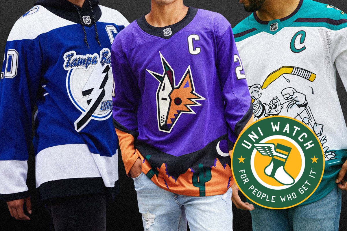
Tampa Bay Lightning
The defending Stanley Cup champs’ ЯR uni is a blue version of their mid-2000s design. Sure, the crest is a bit clunky and awkward, but it works nicely in blue — a fun variation:
Meanwhile, goaltender Andrei Vasilevskiy, whose previous masks have included one with temperature-activated design elements, has a new cage that glows in the dark (additional info here):
WEST DIVISION
Anaheim Ducks
Good call by the Ducks, who used their ЯR design as chance to revive one of the most bizarre jerseys in NHL history: the infamous Wild Wing design. Originally worn for only three games in 1996 and uni-versally ridiculed since then, it’s exactly the kind of thing that should be showcased in a program like ЯR:
In addition, the Ducks have updated the design of their red line:
Arizona Coyotes
The Coyotes are making a bunch of changes for their 25th season, beginning with a switcheroo for their two colored uniforms. The red design, which has been the primary home look since 2003, has been redesignated as an alternate, and the fan-favorite “Kachina” design, which has been a throwback alternate in recent seasons, is now the primary home uniform:
The Coyotes are also adding two 25th-season patches — one for the red-and-white uniforms and another for the Kachina uni:
Arizona also has one of the year’s boldest ЯR designs — an electric purple version of their “peyote coyote” uniform:
And speaking of purple, check out the Yotes’ new center ice design (additional info here):
Finally, the Coyotes also have separate helmet advertisers for home and road games:
Colorado Avalanche
Lots of uni news this season for the Avs, who are celebrating their 25th anniversary. Naturally, that calls for a jersey patch, plus the anniversary logo is also being used at center ice:
In addition, the Avs are changing all the black accessories on their home and road uniforms to blue (additional info here):
There have also been some adjustments to the alternate uniform, which now has white trim on the pants and glove cuffs:
Meanwhile: The Avs came into existence when the Quebec Nordiques moved to Colorado in 1995. The team is reviving the Nordiques’ old igloo design for its ЯR uniform, but rendered in Avs colors (additional info here):
And in one last noteworthy item, the Avalanche’s arena has a new naming advertiser.
Los Angeles Kings
L.A.’s ЯR alternate takes the team’s old Gretzky-era design and reimagines it with the even older purple/gold color scheme:
Minnesota Wild
The Wild are celebrating their 20th anniversary with a jersey patch, plus the patch logo is also being used at center ice:
In addition, Minnesota has one of the league’s best ЯR uniforms, featuring the team’s longstanding crest rendered in the colors of the old Minnesota North Stars:
The Wild are also another team whose stadium name advertiser is now their helmet advertiser:
San Jose Sharks
The Sharks are yet another team celebrating a milestone season — their 30th. They’ve risen to the occasion by producing what is probably the most detailed patch explainer ever:
The Sharks have also added a new “Heritage” throwback uniform based on their original 1990s design — a nice gesture, although the old design isn’t all that different from their current home look:
Swap the colors around a bit and you get the Sharks’ new ЯR design:
With the throwback and the ЯR being added to the team’s existing home, road, and alternate designs, the Sharks are now the only NHL team with five uniforms. Huzzah!
Finally, the Sharks have also tinkered with some of their secondary logos. You can learn all about that here.
St. Louis Blues
We all understand that color-swapping is one of the key aspects of the ЯR program. Still, it seems really odd for a team called the Blues to have a new red uniform:
The Blues will also have two helmet advertisers — one at home and another on the road (additional info here):
Vegas Golden Knights
After sticking with just home and road uniforms for their first three seasons, the Golden Knights finally have a third uniform — and it lives up to the team’s name (additional info here):
As for ЯR, the Golden Knights don’t have a visual history to draw upon because they’re such a young franchise, so they’ve taken their secondary logo (you can see it on the shoulder of the uniform shown above) and used it as the ЯR crest. Unfortunately, it works better as a secondary mark than as a primary:
Meanwhile, down on the ice, it’s not surprising that a Las Vegas team would go with casino chip-themed design. The only surprise is that they didn’t do it sooner:
ADDITIONAL NOTES
• Starting on Jan. 16 (the beginning of the Martin Luther King Jr. Day holiday weekend) and continuing through Feb. 28 (the end of Black History Month), all teams will wear a helmet decal celebrating Hall of Famer Willie O’Ree, the NHL’s first Black player (additional info here):
• No All-Star, Winter Classic, or Stadium Series uniforms this season, as those games have all been canceled due to the pandemic.
• However, four teams — the Avalanche, Bruins, Flyers, and Golden Knights — will be participating in a pair of outdoor games at Lake Tahoe on Feb. 20 and 21. All four teams will wear their ЯR uniforms. This promotion also has a nifty “Outdoors at Lake Tahoe” logo that will presumably be worn as a jersey patch or at least as a helmet decal, although that detail hadn’t been confirmed by press time:
• And finally, just in case the helmet ads weren’t enough for you, this season’s realigned division names also have corporate advertisers.
And there you have it. Did we miss anything? Yeah, probably. If so, you know what to do: plukas64@gmail.com.
Paul Lukas wishes all NHL players, staff, and fans a safe and healthy season. If you like this article, you’ll probably like his Uni Watch Blog, plus you can follow him on Twitter and Facebook, and sign up for his mailing list so you won’t miss any of his future InsideHook columns. Want to learn about his Uni Watch Membership Program, check out his Uni Watch merchandise, or just ask him a question? Contact him here.
More Like This
Whether you’re looking to get into shape, or just get out of a funk, The Charge has got you covered. Sign up for our new wellness newsletter today.